ISSS608 2016 17T1 Group1 Report
| PROPOSAL | POSTER | APPLICATION | REPORT |
Contents
Motivation of the Application
An Ezlink passenger travel record over 7 days has 500 millions + rows of data and 50+ variables. The raw data was too large for visualisation tools such as Tableau and D3.JS to read and process. Even loading the data into JMP proved to be a challenge and on average it took at least 30 mins to read in the csv data and convert into JMP format. Hence the ability to visualise the raw data was very limited.
The objective of the project was to prepare and manipulate the raw data into manageable data size for analysis on visualisation tools such as Tableau and D3.JS.
Review and Critic of Past Works
Data Exploration
The original Ezlink data (City nation ride data Full) had almost 50.7 millions rows of single trip transaction data. The ride data was captured from 15 to 21 Feb 2016, the week after Chinese New Year 2016. We could be assumed that the trend for bus ridership should be normal, and should not have have been influenced by the Chinese New Year holiday. The variables were comprised of 8 variables which captured the bus service number taken, boarding and alighitng date, time and bus stop numbers. The ride data was captured based on a single trip, starting from the bus stop that the commuter broaded from, on the date and time and align at the aligning bus stop on a given date and time. However the limitating on using bus stop number in our analysis would not be useful as the planners might not be able to visualise the graph. Hence location data would need to be used to supplement the City nation ride data.
The next critical file is the location data for LTA bus stop mapping over to URA planning zones (lta-bus_stop_URA), which was provided for by Prof Kam. This set of data would allow us to merge with the ride data and give a location name to the start and end point of every ride, instead of bus stop number. We were able to decide he level of details that we want to look into and significantly reduce the number of rows of data and make the data more manageable on our laptop, without the aid of any server for processing of this huge data.
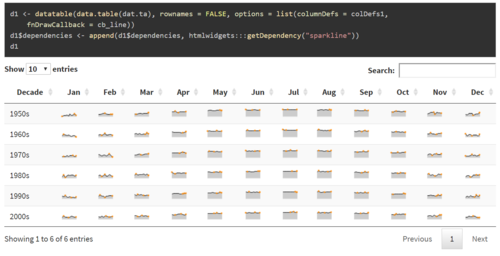
Sparklines in R
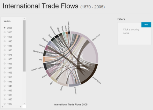
Chords Diagram in R
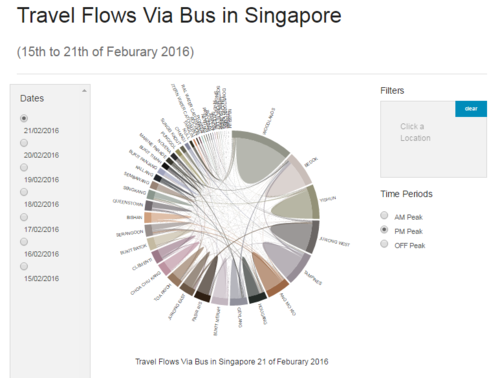
Chords Diagram in D3.JS
Design Framework
Selection of Tools
Demonstration
Discussion
Future Work
Installation guide
No installation is required.
Just download the folders from GitHub (link: https://github.com/BeiJiaKee/MITB_VisualAnalytics_SGBus) and unzip bower-components.zip.
Now you are ready to run!
User Guide
you may use any local web host you wish to.
Steps:
- Start up your local host (e.g. easy php)
- Navigate to the project folders to "MITB_VisualAnalytics_SGBus/demos/SG-Bus.html"
- Run SG-Bus.html
- On the dashboard produced, User may switch between dates and peak periods to explore the data
References
- Matthew Leonawicz (2010). Combining data tables and sparklines. URL: http://leonawicz.github.io/HtmlWidgetExamples/ex_dt_sparkline.html
- Steven Hall (2014). Interactive Chord Diagrams in D3. URL: http://www.delimited.io/blog/2014/11/18/interactive-chord-diagrams-in-d3
- Zuguang Gu (2016). Visualize Relations by Chord Diagram. URL: https://cran.r-project.org/web/packages/circlize/vignettes/visualize_relations_by_chord_diagram.pdf


