ISSS608 2016 17T1 Group1 Report
| PROPOSAL | POSTER | REPORT |
Contents
Motivation of the Application
An Ezlink passenger travel record over 7 days has 50 millions + rows of data and 50+ variables. The raw data was too large for visualisation tools such as Tableau and D3.JS to read and process. Even loading the data into JMP proved to be a challenge and on average it took at least 30 mins to read in the csv data and convert into JMP format. Hence the ability to visualise the raw data was very limited.
The objective of the project was to prepare and manipulate the raw data into manageable data size for analysis on visualisation tools such as Tableau and D3.JS.
Review and Critic of Past Works
Data Exploration
The original Ezlink data (City nation ride data Full) had almost 50.7 millions rows of single trip transaction data. The ride data was captured from 15 to 21 Feb 2016, the week after Chinese New Year 2016. We could be assumed that the trend for bus ridership should be normal, and should not have have been influenced by the Chinese New Year holiday. The variables were comprised of 8 variables which captured the bus service number taken, boarding and alighitng date, time and bus stop numbers. The ride data was captured based on a single trip, starting from the bus stop that the commuter broaded from, on the date and time and align at the aligning bus stop on a given date and time. However the limitating on using bus stop number in our analysis would not be useful as the planners might not be able to visualise the graph. Hence location data would need to be used to supplement the City nation ride data.
The next critical file is the location data for LTA bus stop mapping over to URA planning zones (lta-bus_stop_URA), which was provided for by Prof Kam. This set of data would allow us to merge with the ride data and give a location name to the start and end point of every ride, instead of bus stop number. We were able to decide he level of details that we want to look into and significantly reduce the number of rows of data and make the data more manageable on our laptop, without the aid of any server for processing of this huge data.
Sparklines in R
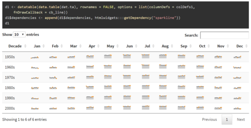
Sparklines are useful for a one glance visual inspection of multiple data streams over a time period and to detect any unusual patterns. The visual was created using Shiny library and Data Table in R. The arrangement of data using data table allowed the sparklines to be arranged in a neat table form. For our dataset, we would need to first bin each ride based on the start time travel, for example 1 bin equal 2 – 4 hours, depending on the number of bins that could give a better visual effect. Likewise, we would also need to create equal number of bins for the alighting time. So that this would allow us to visualise the flow out of the planning area and the flow into the planning area. Visualisation using R was initially explored as Bei Jia has a better understanding in R, and both of us were alien to D3.JS. Hence this visualisation method was one of the possible methods that we could explore.
Chords Diagram in R
The next visual aid that we were exploring was the Chords Diagram using R Shiny. Chords diagram was a useful visual method in showing relationship between inflow and outflow. Hence Chord diagram is definitely a must for our visualisation. This set of work in R was useful as it explained in detail on how to construct the chord diagrams and what are the features that could be added in.
Chords Diagram in D3.JS
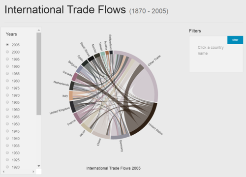
This Chords diagram was constructed in D3.JS, and the visual was used to explore the trade relationship between countries. The visual was contructed in a neat layout with filter function to filter the countries. This was a useful feature to explore any outlier or to exclude any countries of for analysing the visual output.
Design Framework
The Chords diagram in D3.JS was finally selected as the visual aid and the Interactive Chord Diagrams in D3 designed by Steven Hall was adored, as the design of the chords diagram was suitable for our needs. The level of visualisation was kept at Planning Area (48 planning areas), as it would be not that clustered as compared to the Subzones (306 subzones) or as sparse as the Region (5 regions). The design considerations for the visual aid was described as follows: main graph frame, date selection, countries filter and time period selection.
Data Preparation
The key to manage this huge dataset was to break down the data into “big bite” size for our laptop to process. It took the laptop (Intel® Core™ i7-5500U CPU @ 2.4GHz with 12.0 GB RAM) a good 10 minutes to read and process the CSV file (City nation ride data Full). The initial step was to filter the data by days into separate files, and smaller file size helped to speed up the processing of the data. After which the data was trasformed using JMP into the format required for our D3.JS programme. The initial data transformation took our team a good whole day to process the files and transform the data into the required format. Each file required as least 5 runs to merge and transform the data. Hence 7 files (7 days with 1 file to a day) required 35 runs. This data preparation process was subsequently simplify after Bei Jia had written an R programme to read in all the 7 files and merge with the bus stop data, before transform into the required format. The entire process for data transformation from the raw files into the required fomat for our experimentation was shorten into 1 hr with a single run of the R scrip using the same laptop. However, laptop with lesser RAM and slower processor speed might face a possiblities of lack of memory error. (link: https://github.com/BeiJiaKee/MITB_VisualAnalytics_SGBus/blob/master/data_tranformation_full.R)
Main Graph Frame
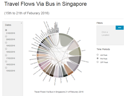
The Chord diagram was the main graph generated. The chord diagram could interactively transit based on the options selected. The chordDirective.js and matrixFactory.js scripts enabled the chord diagram to be drawn and transit between options.
Date Selection
Users could select to view the data by individual day, through selection option under Date Selection. The filtering was based on the variable as indicated in the picture below.
Planning Areas Filter
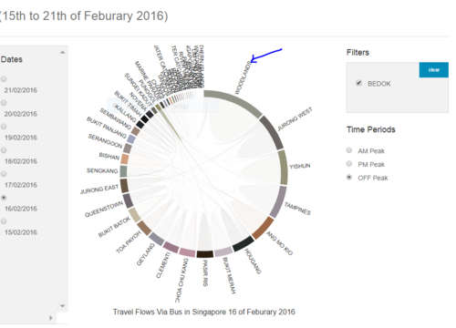
Users could click on the planning area name in the chord diagram to select it for filtering from the graph. This could be useful for excluding outliers or to make the visual more focus by selecting planning areas for filtering from the diagram.
Time Period Selection
The dataset as separated into 3 time bins, namely morning peak hours (AM Peak), evening peak hours (PM peak) and OFF Peak hours between the morning and the evening hours (OFF Peak). This could allow users to look at the direction of flow during the different hours.
Tooltip
Tooltip would show the summary of the flow out of the planning area when the mouse was hover over the graph flow area.
Demonstration
The chord diagram could visually and interactively transit based on the options selected.
Discussion
The chord diagrams have shown that there were limited bus journey taken across planning areas. Majority of the bus trips were taken travelling within the planning area. This could be due to a few reasons such as, (1) people travel to amenities such as markets, schools and workplace within the planning area, and (2) people travel to the MRT stations within the planning area and took the train to continue their journey for inter-planning area travel.
Another possibility was that the current bus services provided that travelled across planning areas did not really provide significant advantage that could meet the commuters’ travel need. The commuters could find that by changing transport mode could provide better time saving, as compared to sticking to the same mode of transport.
However planning areas that are more centrally located and better connected to other planning areas were observed to have a higher number of bus rides across the planning areas.
The number of bus trips taken were also observed to be relative to the size and capacity of the planning area.
Future Work
Future works could include visual such as the BEERVIZ, where planning areas within the same region could be cluster together so as to provide a clearer demarcation of the North-South-East-West of Singapore.
In addition, upon selection of the planning area, we could zoom into the subzones to look at how the commuters flowed within the planning area. This could help to verify whether majority of the commuters who were travelling regions were indeed heading towards a MRT station.
Installation guide
Sorry due to sensitive of data, we are unable to share the data!
Thanks for viewing our page!
User Guide
Sorry due to sensitive of data, we are unable to share the data!
Thanks for viewing our page!
References
- Matthew Leonawicz (2010). Combining data tables and sparklines. URL: http://leonawicz.github.io/HtmlWidgetExamples/ex_dt_sparkline.html
- Steven Hall (2014). Interactive Chord Diagrams in D3. URL: http://www.delimited.io/blog/2014/11/18/interactive-chord-diagrams-in-d3
- Zuguang Gu (2016). Visualize Relations by Chord Diagram. URL: https://cran.r-project.org/web/packages/circlize/vignettes/visualize_relations_by_chord_diagram.pdf


