ISSS608 2016-17 T1 Assign3 Parikshit Ravindra MAYEE
Contents
Overview
In this assignment I have tried to explore and visualize the communication patterns of the visitors, over 3 days, to DinoFun World (fictitious amusement park). All of my analysis and visualization has been consolidated in an interactive dashboard and published to Tableau public.
Approach
My approach for this assignment was focused on answering following questions:
1. Identify those IDs that stand out for their large volumes of communication. For each of these IDs
a. Characterize the communication patterns you see.
b. Based on these patterns, what do you hypothesize about these IDs?
2. Describe up to 10 communications patterns in the data. Characterize who is communicating, with whom, when and where. If you have more than 10 patterns to report, please prioritize those patterns that are most likely to relate to the crime.
3. From this data, can you hypothesize when the vandalism was discovered? Describe your rationale.
Data
Only Communication dataset for 3 days was used for the analysis of this assignment. Movement data was not used.
Following files were used:
• DinoFunWorld_CommData.zip consist of in-app communication data over the three days of the Scott Jones celebration.
• DinoFunWorld_LayoutMap.zip consists of a jpg file.
• DinoFunWorld_Website.zip consists of webpages of DinoFun World Park.
Data Preparation & Analysis
Communications data for park visitors was made available for each data. The dataset was structured to show the timestamp of each communication, who initiated the communication, who was the recipient of the communication and the location where the communication was sent from.
Basic data exploration & Combining 3 days data:
In order to simplify visualizing in Tableau I first analysed the data in SAS JMP pro.
I performed basic data exploration by plotting distributions of the columns. I observed that ‘To’ column consisted of text ‘external’ representing all communication where the recipient was out of the park and hence would not have an ID to be represented. I recoded (Cols ==> Utilities ==> recode) the ‘external’ communication to represent as ‘0’.
After recoding I modified the data type-modeling type for ‘From’ & ‘To’ columns to Numeric-Nominal.
I performed a quick check to identify any missing patterns (Tables ==> Missing data patterns). No missing values were observed in the dataset.
The combined dataset of 3 days consisted of 4,153,329 rows. I saved this combined dataset as a CSV file through JMP. The CSV file with combined dataset for 3 days was imported and used as the sources for analysis in tableau.
Next, I combined the 3 days data into one file using JMP’s Tables ==> Concatenate function.
Question 1: Identify those IDs that stand out for their large volumes of communication. For each of these IDs.
1. Characterize the communication patterns you see.
2. Based on these patterns, what do you hypothesize about these IDs?
By plotting the bubble chart for ‘From’ & ‘To’ columns from dataset, using the number of communications for each ID to represent the volume of communication, I was able to identify the IDs sending and receiving High volume of communications.
Based on above visualization, it can be concluded that IDs 1278894 & 839736 showed unusually high proportion of communication volume compared to the other IDs.
The high volume bubble with label ‘0’ represents the communications received by external source.
Next step was to identify the communication pattern for these 2 IDs.
I went back to JMP in order to prepare a new data set for these two IDs. Using Select Rows functionality, I selected all rows where the communication was sent by or received by 1278894 & 839736.
I created 2 new columns UID & Communication type. UID represents the ID for which the row contains information. Communication type explicitly specific if the communication is being sent (Out) or received (IN) by the UID.
There was no communication between 1278894 & 839736, so the formulas used to derive at the values would not violate any logic in this customized case.
This dataset was saved as CSV file imported to Tableau.
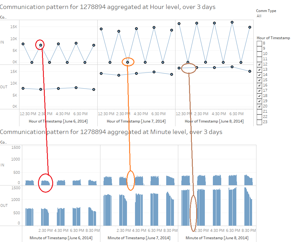
I analyzed the communication pattern for 1278894 first. My observations for the characteristics of communication patterns are documented below:
1) 1278894 sends out communication in a very precise manner. All communications sent by this ID originates from Entry Corridor.
2) First communication is sent out at 12 noon and ends at 8:55 PM. These communications are sent every alternate hour (12.x, 2.x, 4.x, 6.x, 8.x pm)
3) Also, these communications are sent with an interval of 5 minutes within the hour. i.e. Exactly 12 communications are sent every alternate hour.
4) These communications are sent to huge number of ID in the park. The unique IDs to which the communication is sent by 1278894, is not constant.
5) This ID receives communications after it has sent the first communication for the hour. The Communications are sent from all over the park.
Hypothesis based on communication pattern of 1278894:
ID 1278894 sends and receives communications from a very large number of IDs in Park. Realistically, it is not possible for any Park visitor to get acquainted with such a large number of people and communicate with them in a such a precise manner. I can hypothesis that this ID is likely to be associated with park services.
Also, since the communications are sent in very precise manner, I can further hypothesise that this ID is likely to be an automated system for sending and receiving messages.
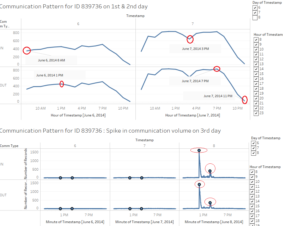
Next I analysed the communication pattern for 839736. My observations for the characteristics of communication patterns are documented below:
1) 839736 sends & receives communication throughout the day for all 3 days with no specific pattern in terms of timing or the IDs to which the communication is sent.
2) All communications sent by this ID originates from Entry Corridor. Communications received by this ID originates all over the park.
3) Communication starts at the start of the day around 8 am and ends with the end of park operations after 11pm.
4) One major observation from the communication pattern is the spike in the communication volume between 11am & 4pm on 3rd day.
5) By excluding the communications between 12 & 4 pm (which has extremely high number of communications and overpowers the other patterns), I observed a pattern which shows that the number of communications gradually increases from 8 am to 12 noon. After 12 noon the number of communications drops gradually until 3 pm after which it again increases until 7 pm. Finally, after 7 pm the number of communications drop continuously and dies out around 11:30 pm i.e. with the end of operations of park.
Hypothesis based on communication pattern of 839736:
ID 839736 sends and receives communications from a very large number of IDs in Park. Realistically, it is not possible for any Park visitor to get acquainted with such a large number of people and communicate with them in a such high. I can hypothesis that this ID is likely to be associated with park services.
I did not find any specific pattern in terms of timing of the communications. Communications are sent & received continuously throughout the day. This leads me to hypothesise that the ID 839736 is likely to be operated manually by park officials.
Also, an important observation differentiating ID 839736 from ID 1278894 was that, 839736 received very high volume of communications on 3rd day around 12 noon. I did not observe similar spike in communication for 1278894. This further strengthens my hypothesis that 1278894 is likely to be automated system rather than being operated manually.
Tools Utilized
1. SAS JMP Pro : Used for initial data analysis and data cleaning. Also used for creating Trellis plot visualization in Iteration 2.
2. Tableau : Used for exploratory data analysis and to generate visual representations.
3. Tableau Public : Visual dashboard was published to Tableau Public and the web url is shared above.
Results
Results for my visual analysis are available on Tableau Public: Sentiment analysis about Wikipedia as teaching resource (Updated)
The dashboard published above is interactive and can be used to explore the sentiments expressed through survey about Wikipedia as teaching resource. 1. Respondents tab from the published dashboard helps to answer my first question Who are my survey respondents? 2. Broken Down Sentiments tab helps to answer question about the changes in Sentiments with respect to varying factors. 3. Overall Sentiment tab helps to answer about the overall sentiments expressed through the survey for each of the question.
Citation & References
1. Meseguer, A., Aibar, E., Lladós, J., Minguillón, J., Lerga, M. (2015). “Factors that influence the teaching use of Wikipedia in Higher Educationâ€. JASIST, Journal of the Association for Information Science and Technology. ISSN: 2330-1635. doi: 10.1002/asi.23488.
2. http://www.datarevelations.com/visualizing-survey-data
3. https://community.jmp.com/community/academic
4. https://community.tableau.com/
5. http://www.datarevelations.com/likert-scales-the-final-word.html
6. https://wiki.smu.edu.sg/1617t1ISSS608g1/ISSS608_2016-17_T1_Assign2_PRASONGTHANAKIT_Kanokkorn


