ISSS608 2016-17 T1 Assign2 CHIA Yong Jian
Contents
Dataset Chosen
The dataset chosen is the US Stocks Fundamental Data (XBRL).
Theme of Interest and Motivation
The stock markets, other than allowing companies to raise equity from a pool of investors (https://www.theguardian.com/sustainable-business/stock-markets-no-longer-fit-purpose), also allow fund managers and retail investors to participate in the market to grow their capital through short term or long term investments in the companies.
For this dataset, I will explore three main questions, drilling down from the macro, to the micro:
- Overview of the US Market - Understand what is "out there" for fund managers and investors to invest in, with consideration to the sectors and market capitalisation of each company
- Use of Parallel Coordinates to explore relationships for some main items in each financial statement.
Data Sources
The following data sources are used:
- From https://www.kaggle.com/usfundamentals/us-stocks-fundamentals -
- indicators_by_company.csv - Provides the core information of indicators as reported by companies to the U.S. Securities and Exchange Commission
- companies.csv - Provides the mapping of the company name to the company ID.
- (ADDITIONAL) From http://usfundamentals.com/ -
- companies-names-industries.csv - Provides the NAICS industry sector (http://www.census.gov/eos/www/naics/) information for each company
- (ADDITIONAL) From http://www.fasb.org/jsp/FASB/Page/SectionPage&cid=1176164335312 -
- Taxonomy_2016.xlsx - provides some information on labels
Discussion of Results
Indicators Treemap
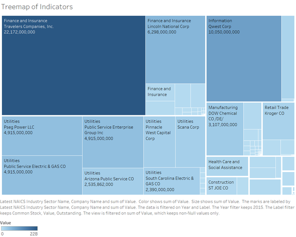
A treemap can be quickly constructed using Tableau to provide an interactive visual view of the companies by sectors and the size of the chosen indicator.
For example, the indicator "Common Stock Value Outstanding" shows that for the year 2015, Finance and Insurance companies dominated the chart, with utilities companies not far behind.
Balance Sheet
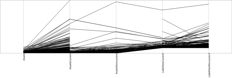
For illustration purpose, 2015 data was used. The following indicators which are some of the main items in the balance sheet were used to build the parallel coordinates as above:
- Assets
- Assets Current
- Assets Non Current
- Liabilities Current
- Liabilities Non Current
There are a few observations on outliers:


General Motors, Microsoft Corp and Google Inc tend to be in the upper range of their assets in comparison to other companies. General Motors topped the scale for non current assets, perhaps a reflection of the physical investments that the automobile manufacturer needed for producing cars, in comparison to Microsoft and Google, who are software houses.
Cash Flow Statement

For illustration purpose, 2015 data was used. The following indicators which are some of the main items in the cash flow statement were used to build the parallel coordinates as above:
- Net Cash Provided By (or used in) Financing Activities
- Net Cash Provided By (or used in) Investing Activities
- Net Cash Provided By (or used in) Operating Activities
With the use of parallel coordinates, we can quickly observe the how each company derives its cash from. For example, JP Morgan's operating revenue is top of the scale compared to other companies.


Income Statement
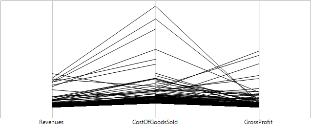
For illustration purpose, 2015 data was used. The following indicators which are some of the main items in the cash flow statement were used to build the parallel coordinates as above:
- Revenues
- Cost of Goods Sold
- Gross Profit
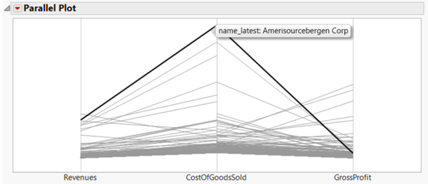
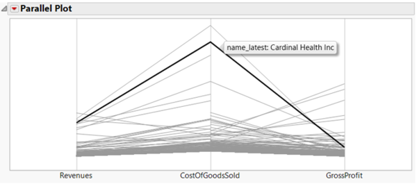
An interesting observation is that healthcare related companies tend to have very high cost of goods sold. Examples are below. Amerisourcebergen is an American wholesale drug company, while Cardinal Health provides healthcare solutions and logistics.
Discussion on Workings/Process
Data Sources and Analysis
Data Challenges:
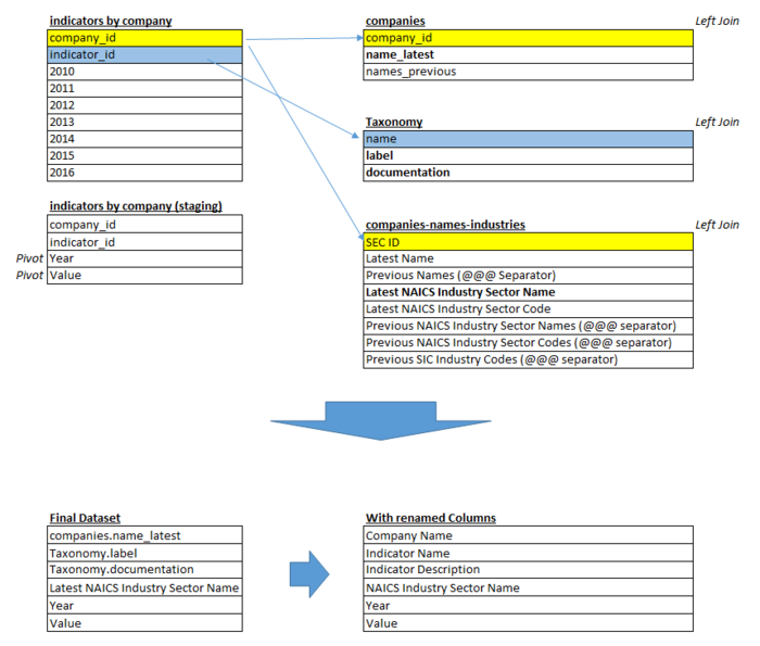
- Information scattered across multiple files - for example, the indicators_by_company.csv file do not have the company name. A join is necessary to
- Incomplete information for each file - not all companies have data across all available indicators
- Ambiguity of indicator meaning - a "common sense" understanding of the indicators are used to interpret the meaning of the indicators.
Initial draft for data model preparations:
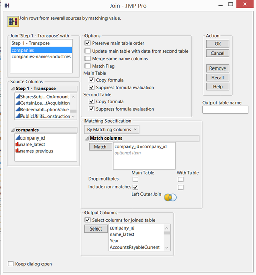
Revised data preparations performed in JMP:
Step 1. Open indicators_by_company.csv, perform a transpose
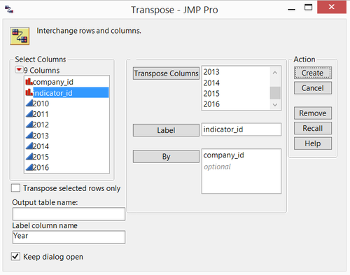
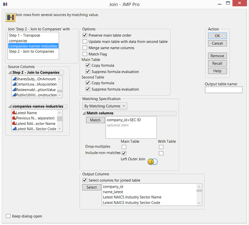
Step 3. Join to companies-names-industries.csv. There are records with missing NAICS industry names. These are inherent in source data, will be recoded to "Not Available". A Sample of Column Names are as below. Save to SAS7BDAT file
Step 4. Open in Tableau
However, the above steps generated a huge export file (of a few GBs), which causes loading issues with Tableau. A review of the process was performed.
For Tree Map:
- The files are joined in Tableau instead. Taxonomy file is not joined as not all labels available in the original indicators_by_company file is available in the Taxonomy file.
For Parallel Coordinates:
- The charts are generated directly in JMP, as Tableau do not have native Parallel Coordinates capability
Future Works
What's explained in this wiki is just the beginning, I would like to explore the following themes:
- Crucial financial ratios - Compare financial ratios across companies that are crucial for value investing, that is, buying stocks of companies that trade for less than their intrinsic value to profit from their long-term performance, while showing stability in their cash flows and debt servicing (http://www.goodreads.com/book/show/75893.The_Little_Book_of_Value_Investing).
- Portfolio Returns and Standard Deviations - Allow interactive construction of stocks and inputs to allow investors and fund managers to build portfolios
Charts:
- Explore workarounds for Parallel Coordinates in Tableau, or use alternate charts such as Stacked Charts
- Explore horizon charts for reviewing main indicators across years
Tools Utilised
- SAS JMP Pro 12
- Tableau 10
Data Visualization Link
Will be updated as soon as possible.
