ISSS608 2016-17 T1 Assign2 Kuar Kah Ling
Contents
Overview
In this digital economy age, massive and complex data have been captured and stored in organization databases and/or data warehouses. By and large, these data contain a large amount of variables of a particular product, customer or activity. Due to limitations in perceptual and screen space, graphical techniques available in traditional business intelligence systems tend to confine to univariate and bivariate data. As a result, many important relationships that live in these data remain undiscovered. To discover patterns and relationships in multivariate data sets, interactive data exploration and analysis techniques could instead be adopted, using off-the-shelf and open sourced software.
Data Set
For this assignment, I have selected to use the wiki4HE dataset, which is an ongoing research on university faculty perceptions and practices of using Wikipedia as a teaching resource. Based on a Technology Acceptance Model, the relationships within the internal and external constructs of the model are analysed. Both the perception of university faculty teaching staff’s opinion about Wikipedia and the perceived quality of the information in Wikipedia play a central role in the obtained model. The original data set can be found on the UC Irvine Machine Learning Repository’s website [1]. The original data set is formatted as a CSV file.
Theme
I have specifically selected to focus on the perceived usefulness of Wikipedia in improving students’ learning. It would be interesting to note if there is any relationship between personal online presence (i.e. contribution to blogs, participate in social networks, publish academic content on open platform), personal usage of Wikipedia and perceived usefulness of Wikipedia in improving students’ learning. Additionally, does being a Wikipedia registered user, coming from a specific faculty domain, and age have any relationship to the above relationship.
Some of the questions to be answered are:
- What is the most popular response for Perceived Usefulness of Wikipedia in Improving Students’ Learning?
- Are there more Wikipedia registered users or non-registered users in the survey population?
- Amongst those who rated Perceived Usefulness more favourably (i.e. 4 and 5 rating), are they more active in their personal usage of Wikipedia and personal online presence than those who rated Perceived Usefulness less favourably?
- Is there a relationship between being a Wikipedia registered user and Perceived Usefulness of Wikipedia?
- Do university faculty teaching staff of certain domain rate Wikipedia more useful in improving students’ learning than those of other domains?
- Is there any relationship between age of survey respondent and rating of Perceived Usefulness of Wikipedia in improving students’ learning?
Data Preparation
Before we can analyse and explore the data, it has to be prepped. JMP Pro was used to clean and prepare the data set.
Step 1: Use Microsoft Excel to find out number of rows of data exists in the dataset for completeness check when importing into JMP Pro later.
A total of 913 rows was noted.
Step 2: Import dataset into JMP Pro for data preparation but first, check for completeness of data imported.
A total of 913 rows were imported and this is complete, as noted in Step 1.
Step 3: Review data for missing values and data type.
There were numerous ‘?’ and data type was incorrect.
Step 4: Analyse Distribution to have an overview of the dataset.
Using the Distribution function, ‘Domain’ attribute has a response ‘6’ which is not explained in the metadata. However, as the frequency of response ‘6’ is significant (361 of 913 surveys or 39.5%), I kept this response and marked it as ‘Others’.
‘OTHER_POSITION’ attribute has a response ‘0’ which is not explained in the metadata. However, its frequency is 28.6% (261 of 913) thus, I kept this response and marked it as ‘Not Applicable’. I also noted that, in metadata, it is called ‘OTHER’ and changed it accordingly to avoid confusion.
Similarly, for ‘UOC_POSITION’, ‘0’ is not explained in the metadata. I marked it as ‘Not Applicable’ i.e. they do not work in UOC.
‘OTHERSTATUS’ has ‘0’ and ‘7’ which are not defined in the metadata. I marked it as ‘Not Applicable’ and ‘Others’ respectively. I also noted that it is called ‘OTHER_POSITION’ in metadata thus, I changed the naming accordingly to avoid confusion.
Step 5: Recode values and create new columns to give more meaning to the data set.
Based on the analysis in Step 4, recoding was performed to change ‘?’ to ‘0’ and the data types accordingly. For example, gender from continuous to nominal, YEAREXP from nominal to continuous. Response to survey questions (PU1 to EXP5) changed from nominal to ordinal. New columns were added for nominal dimensions data e.g. gender, domain, userwiki, stating the actual name (e.g. male/female) to facilitate the data visualisation later on.
Step 6: Exclude and hide unnecessary columns.
As the focus of my analysis is on relationship between personal online presence (i.e. contribution to blogs, participate in social networks, publish academic content on open platform), personal usage of Wikipedia and perceived usefulness of Wikipedia in improving students’ learning, questions that do not relate to the above were excluded and hidden.
Step 7: Save revised data into CSV format for importation into Tableau for visualisation.
Tool Exploration
JMP Pro and Tableau were used to explore different visualisations.
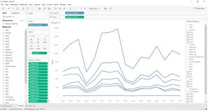
In order to have an overall view of the survey responses, a parallel plot was created. Tableau does not have this chart option in its selection.
Comparing to the parallel plot from JMP, as shown below, JMP’s parallel plot is more ideal in presentation and analysis.
However, parallel plot does not facilitate secondary filters. For example, if I want to filter by age, I would have to add it in my initial selection. Hence, it is not ideal for my visualisation.
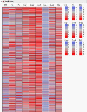
Cell plot in JMP gives a good summary perspective but it is hard to drill down. An example is shown below.
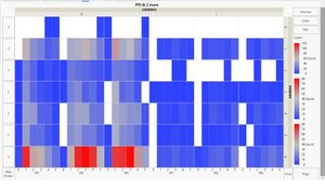
Heatmap was explored in JMP and it was easy to spot the most popular response based on colour. However, as with the parallel plot in JMP earlier, it does not facilitate secondary filters.
In the end, Tableau was selected for my visualisations as it is able to use secondary filters which aided in my analysis.
Data Analysis
Question 1: What is the most popular response for Perceived Usefulness of Wikipedia in Improving Students’ Learning?
Using the treemap (below) constructed for the Perceived Usefulness of Wikipedia in Improving Students’ Learning, it is easy to see that the most popular response was 3, followed by 4 then 2 as noted by the size of the boxes.
Question 2: Are there more Wikipedia registered users or non-registered users in the survey population?
From the treemap above, it is obvious that there are more non-registered users than registered users in the survey population as denoted by the colours (Blue = non-registered users, Orange = registered users). The tooltip which appears when users scroll over the boxes also provides more details to help them understand the data in the box better.
Question 3: Amongst those who rated Perceived Usefulness more favourably (i.e. 4 and 5 rating), are they more active in their personal usage of Wikipedia and personal online presence than those who rated Perceived Usefulness less favourably?
On the whole, they are not more active in their personal online presence. However, they consult Wikipedia more than those who rated Perceived Usefulness less favourably. One point to note, across all Perceived Usefulness ratings, contributions to Wikipedia and using Wikipedia to work with students are generally rated lower.
Question 4: Is there a relationship between being a Wikipedia registered user and Perceived Usefulness of Wikipedia?
Non-registered users’ rating of Perceived Usefulness of Wikipedia (by number of response) were as follow: 3, 4, 2, 5,1. Whereas registered users’ rating was: 4, 3, 5, 2, 0, 1. Thus, on the whole, registered users rated more favourably compared to non-registered users.
Question 5: Does university faculty teaching staff of certain domain rate Wikipedia more useful in improving students’ learning than those of other domains?
The popularity of ratings for perceived usefulness of Wikipedia in improving students’ learning by domain are as follows:
• Arts/Humanities: 3-2-4-5-1 • Engineering/Architecture: 4-3-2-5-1-0 • Health Sciences: 3-4-2-5-1 • Law/Politics: 3-2-4-0-5-1 • Others: 3-4-2-5-1 • Sciences: 4-3-2-5-0
While on the whole, the top 3 ratings for perceived usefulness are 3, 4 and 2 which is consistent with that of most domains, Engineering & Architecture and Sciences’ majority rating is 4, followed by 3 and 2.
Question 6: Is there any relationship between age of survey respondent and rating of Perceived Usefulness of Wikipedia in improving students’ learning?
There is no difference in the pattern of rating for Perceived Usefulness for age groups 23 – 30, 31 – 40, 41 – 50. Their rating pattern is 3-4-2-5-1. However, for age group 51 – 60, the rating pattern is 3-2-4-5-1 and for age group 61 – 69, the rating pattern is 3-4-5-2. It appears that age group 61 – 69 view Wikipedia most useful in improving students’ learning which is surprising as younger people are thought to embrace technology better and rate Wikipedia as more useful, as compared to those of higher age group.
Conclusion
Perceived usefulness of Wikipedia in improving students’ learning has a relationship with:
- Whether the survey respondent consults Wikipedia (those who consults Wikipedia rate higher)
- Whether the survey respondent is a Wikipedia registered users (registered users rate higher i.e. 4 and 5)
- Which domain the survey respondent is from (Sciences and Engineering/Architecture generally rate higher)
- The age group of the survey respondent (those in the age group 61 – 69 rates higher)
There is no obvious relationship between personal online presence (i.e. contribution to blogs, participate in social networks, publish academic content on open platform) and perceived usefulness of Wikipedia in improving students’ learning.
Data Visualisation
For the interactive visualisation, please visit https://public.tableau.com/views/ISSS608Assignment2/Dashboard1?:embed=y&:display_count=yes


