ISSS608 2016-17 T1 Assign2 Kuar Kah Ling
Contents
Overview
With the current, fast-changing digital times, it is important that higher education explore how they can make use of readily available technological resources to improve their teaching. Using a research survey conducted on university faculty teaching staff's perceptions of using Wikipedia as a teaching resource, a visualisation was created with the aim of investigating the relationship between these perceptions and attitudes and the background of university teaching staff.
Data Set
For this assignment, I have selected to use the wiki4HE dataset, which is an ongoing research on university faculty perceptions and practices of using Wikipedia as a teaching resource. Based on a Technology Acceptance Model, the relationships within the internal and external constructs of the model are analysed. Both the perception of university faculty teaching staff’s opinion about Wikipedia and the perceived quality of the information in Wikipedia play a central role in the obtained model. The original data set can be found on the UC Irvine Machine Learning Repository’s website [1]. The original data set is formatted as a CSV file.
Theme
I have specifically selected to focus on the Perceived Usefulness, Perceived Ease of Use and Perceived Enjoyment of using Wikipedia. It would be interesting to note if there is any relationship between the responses to the questions and the background of the respondents (i.e. gender, age group, domain, wiki registered user).
Some of the questions to be answered are:
- Is there a relationship between being a Wikipedia registered user/gender/age/domain and the responses?
- What are the characteristics of the respondents who selected Strongly Agree for the questions?
- What are the characteristics of the respondents who selected Strongly Disagree for the questions?
Data Preparation
Before we can analyse and explore the data, it has to be prepped. JMP Pro was used to clean and prepare the data set.
Step 1: Use Microsoft Excel to find out number of rows of data exists in the dataset for completeness check when importing into JMP Pro later.
A total of 913 rows was noted.
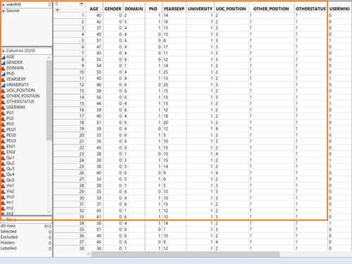
Step 2: Import dataset into JMP Pro for data preparation but first, check for completeness of data imported.
A total of 913 rows were imported and this is complete, as noted in Step 1.
Step 3: Review data for missing values and data type.
There were numerous ‘?’ and data type was incorrect.
Step 4: Analyse Distribution to have an overview of the dataset.
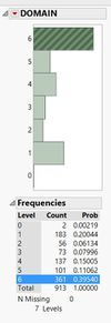
Using the Distribution function, ‘Domain’ attribute has a response ‘6’ which is not explained in the metadata. However, as the frequency of response ‘6’ is significant (361 of 913 surveys or 39.5%), I kept this response and marked it as ‘Others’. '0' is marked as 'Not Applicable' as they did not indicate their domain.
‘OTHER_POSITION’ attribute has a response ‘0’ which is not explained in the metadata. However, its frequency is 28.6% (261 of 913) thus, I kept this response and marked it as ‘Not Applicable’. I also noted that, in metadata, it is called ‘OTHER’ and changed it accordingly to avoid confusion.
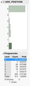
Similarly, for ‘UOC_POSITION’, ‘0’ is not explained in the metadata. I marked it as ‘Not Applicable’ i.e. they do not work in UOC.
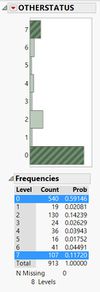
‘OTHERSTATUS’ has ‘0’ and ‘7’ which are not defined in the metadata. I marked it as ‘Not Applicable’ and ‘Others’ respectively. I also noted that it is called ‘OTHER_POSITION’ in metadata thus, I changed the naming accordingly to avoid confusion.
Step 5: Recode values and create new columns to give more meaning to the data set.
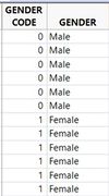
Based on the analysis in Step 4, recoding was performed to change ‘?’ to ‘0’ and the data types accordingly. For example, gender from continuous to nominal, YEAREXP from nominal to continuous. Response to survey questions (PU1 to EXP5) changed from nominal to ordinal. New columns were added for nominal dimensions data e.g. gender, domain, userwiki, stating the actual name (e.g. male/female) to facilitate the data visualisation later on.
Step 6: Save revised data into CSV format for importation into Tableau for visualisation.
Tool Exploration
JMP Pro and Tableau were used to explore different visualisations.
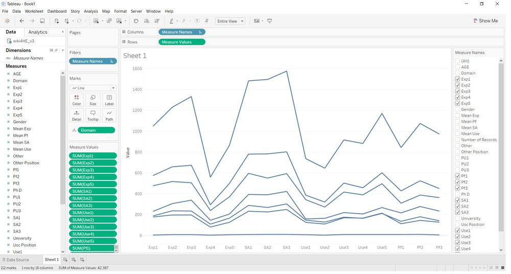
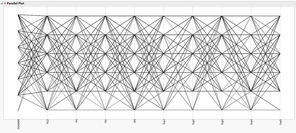
In order to have an overall view of the survey responses, a parallel plot was created. Tableau does not have this chart option in its selection.
Comparing to the parallel plot from JMP, as shown below, JMP’s parallel plot is more ideal in presentation and analysis.
However, parallel plot does not facilitate secondary filters. For example, if I want to filter by age, I would have to add it in my initial selection or use the coordinated link view.
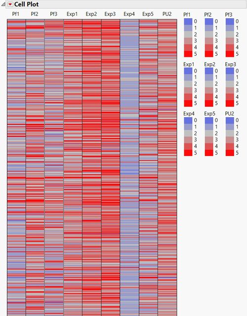
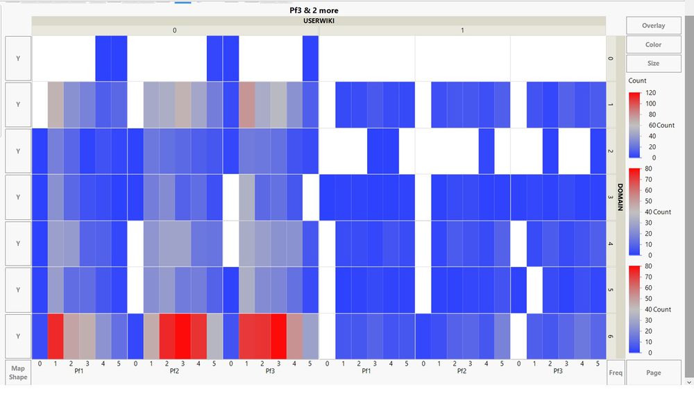
Cell plot in JMP gives a good summary perspective but it is hard to drill down. An example is shown below.
Heatmap was explored in JMP and it was easy to spot the most popular response based on colour. However, as with the parallel plot in JMP earlier, it does not facilitate secondary filters.
In the end, Tableau was selected for my visualisations as it is able to use secondary filters which aided in my analysis.
Data Analysis
Question 1: Is there a relationship between being a Wikipedia registered user/gender/age/domain and the responses?
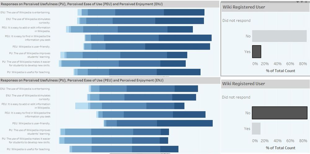
Wikipedia registered users generally have more favourable perceptions towards Wikipedia, as shown by the length of the darkest blue bar, than non-registered users.
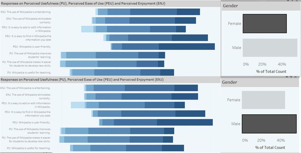
There is no obvious difference in the responses between male and female respondents.
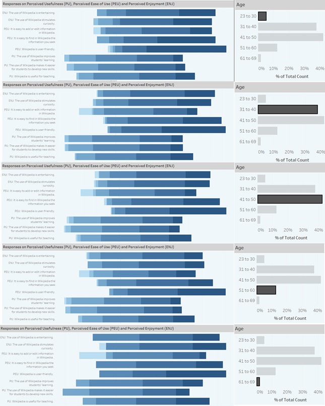
As the age group progresses, the responses tended more towards the Neutral, Disagree, Strongly Disagree. However, one question had the most "Strongly Agree" among all age groups and that is "Wikipedia is user friendly".
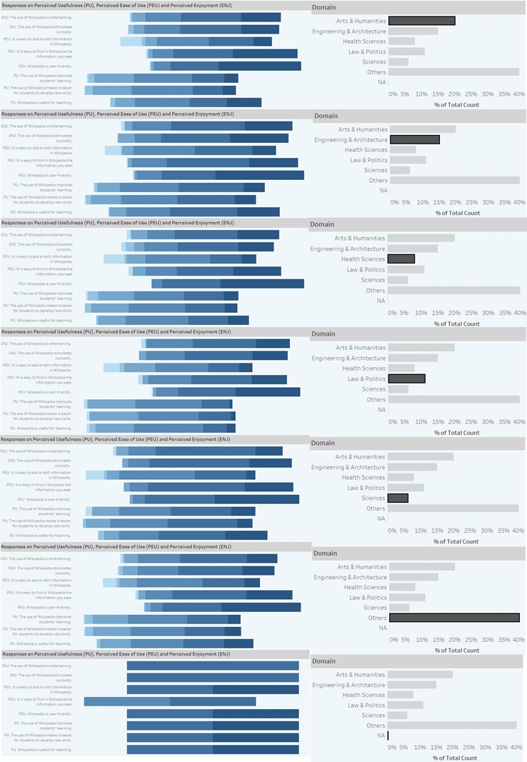
When it comes to questions on Perceived Ease of Use and Perceived Enjoyment, there is no clear difference in the responses between domains. However, regarding Perceived Usefulness, Engineering & Architecture and Sciences have higher proportion of Agree and Highly Agree. Law & Politics had the lowest proportion of Agree and Highly Agree among the domains.
Question 2: Who are the respondents who selected Strongly Agree for the questions?
For Perceived Enjoyment questions, the respondents came largely from the Others and Arts & Humanities domains, aged 31 to 40, male and are not Wikipedia registered users. For Perceived Ease of Use questions, the respondents have similar characteristics as that for Perceived Enjoyment questions. The only difference is age group 41 to 50 formed the bulk of such respondents, not aged 31 to 40. For Perceived Usefulness, the respondents are similar to those for Perceived Ease of Use. Amongst these three groups of questions, females contributed least to the Strongly Agree response for Perceived Usefulness.
Question 3: What are the characteristics of the respondents who selected Strongly Disagree for the questions?
For Perceived Enjoyment and Perceived Ease of Use questions, the respondents are largely females, from the Others and Arts & Humanities domains, aged 41 to 50, and are not Wikipedia registered users. This is interesting as, on the whole, females are the minority in this survey. For Perceived Usefulness questions, the respondents are similar to those for Perceived Enjoyment and Perceived Ease of Use. However, the majority gender is male.
Conclusion
The perception and attitudes towards Wikipedia has a relationship with:
- Whether the survey respondent is a Wikipedia registered users (registered users tended to rate more favourably)
- Which domain the survey respondent is from (Sciences and Engineering/Architecture tended to rate more favourably)
- The age group of the survey respondent (those in the lower age group tended to rate more favourably)
Data Visualisation
For the interactive visualisation, please download the Tableau workbook from https://public.tableau.com/profile/kuar.kah.ling#!/vizhome/Assignment2Final_0/FinalDashboard
