ISSS608 2016-17 T1 Assign2 Linda Teo Kwee Ang
Just trying to type in some stuff
Abstract
“If you can’t beat it, edit it”. This was mentioned in an article by Cornell University on how they embraced the use of Wikipedia as a teaching resource [1].Likewise, for this course ISSS608 Visual Analytics and Applications itself, we have been using Wiki to communicate and share course material, assignments, etc. Empirical studies showed that Wikipedia is heavily and frequently used by a large majority of university students to carry out different assignments and tasks (Wannemarcher and Schulenburg 2010) [2]
Introduction
In this study, the dataset was taken from a research project on factors that influence the teaching use of Wikipedia in Higher Education. That research project was based on an online survey of faculty members from two Spanish universities on teaching uses of Wikipedia, conducted in 2015 (Source: Factors that influence the teaching use of Wikipedia in Higher Education by Antoni Meseguer-Artola, Eduard Aibar, Josep Lladós, Julià Minguillón, Maura Lerga, published in JASIST, Journal of the Association for Information Science and Technology.[3]]. There, the team had used Technology Acceptance Model (TAM) to predict the “intention to use” and “acceptance of new information system”.
This study will aim to examine the dataset used for the above research project, and apply different data visualisation techniques to discover patterns.
Understanding the data
The dataset Wiki4HE was in csv format. It was first uploaded using JMP Pro for data analysis. There were various columns pertaining to the details of the respondent, followed by Likert scores on each question. To begin, each respondent was assigned with a unique ID. Thereafter, the variables in the dataset was compared to the research paper for better understanding of the data. Using JMP Pro, the data was checked for completeness using Missing Data Pattern, and Distribution to see the types of values captured in each column. It was noted that there were a number of “?” in some of the variables. For the purpose of this study, the “?” for the demographic details will be treated as “unknown”, while that for the responses will be treated as “null”.
Variables
It was mentioned in the research paper that there were six variables used:
- Job relevance: Degree to which an individual perceives the existence of institutional support initiatives that promote the use of open collaborative environments.
- Sharing attitude: Degree to which an individual considers it is important to participate in open collaborative environments.
- Social image: Individual perception of the colleagues’ opinions about Wikipedia.
- Profile 2.0: Characterization of an individual as a user of 2.0 tools. This is relevant to the Web 2.0 which describes the enhanced web technologies which emphasized user-generated content, usability and interoperability[3]].
- Quality of Wikipedia: Perceived quality of the information in Wikipedia
- Perceived enjoyment: Perception of Wikipedia as a resource of information that can be enjoyed in its own right, aside from any performance consequences resulting from its usage.
From these six variables, the team was able to derive the Perceived Usefulness and Perceived Ease of Use. The Perceived Usefulness would also lead to Behavioural Intention, resulting a Use Behaviour.
In the Wiki4HE dataset, it was noted that the Perceived Usefulness, Perceived Ease of Use, Behavioural Intention and Use Behaviour were also variables, in addition to the six mentioned above. There were three others, namely visibility, incentives and experience, which were not explicitly mentioned as variables in the research. Nevertheless, the matching of these variables into such groups should be noted for analysis later on in this study.
Demographics
The research target was as follows:
- 800 valid responses from full-time and part-time professors from Universitat Oberta de Catalunya (UOC), Bacelona Spain. This is an internet-based open university.
- 113 persons from UPF. This is likely to be Universitat Pompeu Fabra, a public university in Barcelona, Spain
There were six domains used, and the breakdown by university is as follows:
For UOC
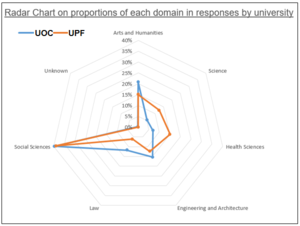
- Arts and Humanities: 20.8%
- Science: 5.3%
- Health Sciences: 7%
- Engineering and Architecture: 15.4%
- Law: 11.8%
- Social Sciences: 39.6%
- Unknown (denoted by “?”): 0.3% (2 persons)
For UPF
- Arts and Humanities: 15%
- Science: 12.4%
- Health Sciences: 15%
- Engineering and Architecture: 12.4%
- Law: 6.2%
- Social Sciences: 38.9%
A simple radar chart was drawn using Excel to do a visual comparison of the domains for both universities. It shows that the proportions of Social Sciences, Arts & Humanities and Engineering & Architecture were high for both universities, but UPF tend to be high in proportion for Health Sciences and Science. This point will need to be noted for subsequent analysis.
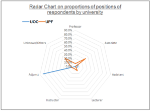
A simple visualisation was done on the positions of the respondents for each university. Of interest, there was an extremely high proportion of adjuncts in the respondents for UOC. This is verified with the data to ensure it was not due to any calculation mistake – the Adjunct formed 82% while the rest were between 0.3% and 9% in UOC. For UPC, the Associate Professors formed the majority at 32%, but there was a high proportion of Unknowns/Others (there were values of “7” and “?” in the data. The values “7” could not be matched to the coding legend of Wiki4HE, hence were taken as “others”). The above observations for positions need to be taken into consideration for the analysis later on.
Other relevant demographic details given were age, gender, years of experience in university teaching, whether the respondents had obtained PhD, whether they were part-timers, and whether they were Wikipedia registered users. We would explore the impact of each of these on the analysis results.
Data preparation
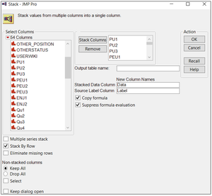
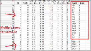
JMP Pro was used to stack the columns into multiple rows, to facilitate visual analysis using Tableau. Stacking was done by selecting Table\Stack, and adding all the individual question columns This would lead to multiple rows for the same ID, and the questions and responses are captured in two separate columns.
The JMP data is saved back into Excel using Save-As type = Excel. At Excel, columns on Question Type, Question nature and Question text were added to the data by using a legend and VLookup. This is to provide more details for display and filter later on in Tableau.
The question text was checked for spelling mistakes. It was noted that a question under Quality, QU4 was phrased in a reverse manner. All the questions would be responded using the Likert scale, which ranged from 1 to 5, for degrees of Strongly Disagree to Strongly Agree. Most of the questions were unfavourable towards Wikipedia at the “Disagree” codes, and favourable towards Wikipedia at the “Agree codes”. Only QU4, which stated “In my area of expertise, Wikipedia has a lower quality than other educational resources”, was favourable at the lower scale and unfavourable at the higher scale, hence is deemed reverse. The values for this question was specifically recoded inside Excel. For record purposes, this could also be done at JMP Pro earlier, and it should be a better method in JMP Pro using the Cols\Utilities\Recode, to avoid mistake due to confusion. After recoding the question, the question text itself was also rephrased to “In my area of expertise, Wikipedia has a higher quality than other educational resources”
Thereafter the Excel file is uploaded into Tableau for visual analysis.
Some housekeeping is required inside Tableau, as follows:
- Checking the data type and changing them to appropriate ones. All the demographic columns, except age and experience, had to be in String format. The question-related columns like question type and question itself were already in String, but the response has to be in numeric.
- Renaming the columns to make them more meaningful (and less confusing). For example “YEARSEXP” was renamed to “Years of experience”. Spacing and capital letters were also adjusted for consistency.
- Using Alias for the codes in the demographic columns (Alias can only be done for String items). This is important so that the data when presented in the Tableau charts and dashboards would be more meaningful instead of in numbers.
- Using Sorting for the codes so that we can keep the natural order of the values. In Tableau, the alphabetical values (due to Alias) tend to be reflected in alphabetical order by default. However we have a preferred order, eg Professor, Associate, Assistant, to be in accordance with their ranking. This can be done by right-clicking a String item, and select Default Properties and Sort.
Text is '''preformatted'''
with a style and
''markups'' '''''cannot''''' be done
Resources
Wannemacher, K.; and Schulenburg, F. 2010. Wikipedia in Academic Studies: Corrupting or Improving the Quality of Teaching and Learning?


