ISSS608 2016-17 T1 Assign2 Linda Teo Kwee Ang
Application of Visual Analytics Tools on Survey Results of the Use of Wikipedia as Teaching Resource
Contents
- 1 Introduction
- 2 Methodology
- 3 Creating visualisations using Tableau
- 4 Creating visualisations using Mondrain
- 5 Creating visualisations using Macrofocus Treemap
- 6 Creating visualisations using Macrofocus High-D
- 7 Evaluation of different visualisation applications
- 8 Analysis methodology
- 9 Analysis
- 10 Recommendations
Introduction
Visualisation is the bread and butter, as described by one of the data scientists featured in a recent article by TechTarget Inc. [1]. Visual analysis is an art in itself, as we seek to find the best possible way to present the present data in a way that stands out from the mass of competing data streams [2]. Take time-oriented data for example, there are at least 100 different techniques for visualisation [3]. In this assignment, we will seek to apply the interactive data exploration and analysis techniques we have learned by using commercial-of-the-shelf and opensource software, to evaluate the pros and cons of the tool in real world applications. The dataset used will be based on a survey was conducted on faculty members of two Spanish universities on the teaching users of Wikipedia.
Methodology
The dataset Wiki4HE was taken from UCI Machine Learning Repository [4]. This assignment will undergo the following stages:
- Understanding the data: basic statistical analysis of all the data to look for possible themes for further investigations. This include data-checking, data-cleaning and data-transformation.
- Selecting a theme/issue to focus on: this will be done through an iterative process, to pick out an area which stands out amongst the rest.
- Trying out different commercial-of-the-shelf and opensource software: this will be done for both above stages, and ultimately in finding suitable methods to present the selected theme/issue.
Understanding the data
The dataset wiki4HE was in csv format. It was first uploaded using JMP Pro for data analysis. The data contained Likert score values ranging from 0 to 5, ranging from strongly disagree / never (1) to strongly agree / always (5). The survey questions (arranged by question types) are found in the UCI website. There are also attribute data pertaining to the demographics of the respondents.
To begin, each respondent was assigned with a unique ID (for my easier reference in subsequent checks on data). Using JMP Pro, the data was checked for completeness using Missing Data Pattern, and Distribution to see the types of values captured in each column. It was noted that there were a number of “?”. There are also some values which do not match their corresponding ranges in the UCI website. For the purpose of this assignment, the treatment will be as follows:
- “?” for the demographic data: will be treated as “unknown”, taken as information not collected at point of survey. It may also be Not Applicable for some of the demographic variables, which will be addressed individually below.
- “?” for survey responses: will be treated as “null”.
- Values not matched to the value ranges for the demographic data: will be treated as “others”.
Demographics
The dataset was analysed using Tableau. As the values are coded, I had added Alias to each of the codes to make the visualisations more meaningful.
- University, Domains and Positions
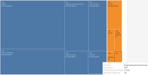
UOC formed a vast majority of the respondents in the survey. This was visualised using Tableau Treemap, given the ease of adding totals and proportions across the entire table for the number of records. Tableau is also very user-friendly in the customisation of colours, labels and tooltips. However the cons with this is that the Tableau Treemap is not able to display the entire label in the boxes for items which are smaller in size – we can see that the UPF labels are missing from the Treemap, although we are still able to see the details if we add them to the Tooltip.
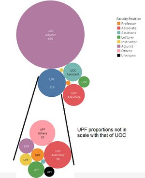
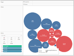
Below are two visualisations of the differences in domains and positions between both universities. The Tableau packed bubbles was used to visualise the positions within each university, using a dashboard because the values for UOC and UPF are captured in separate dimension fields. Similar to the limitations of Treemap, the packed bubbles’s labels were also missing for the smaller bubbles. Adjustments were also made on the image outside Tableau, to draw lines to show the breakdown for UPF in the second packed bubbles.
From the above visualisations, two main points emerged: Majority of the respondents were from the “Others” domain (more than one-third of all respondents); and were UOC Adjuncts (more than 70% of all respondents)
- Gender, Age and Years of Experience
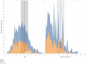
Tableau area charts were also used to visualise the breakdowns by gender, on the age and years of experience for the respondents. Both age and years of experience were placed side by side for ease of comparison. Bins were created and set as filters, to allow interactive exploration of the age and experience.
Given that Wikipedia is considered a use of technology, it is often stereotyped that it will be less favoured by the elder generation. From the visualisations, we may want to explore the type of responses by age bins above 60 years old, and also compare their levels of experience.
- Userwiki and PhD
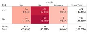
The dataset contains information on whether the respondents were Userwiki and whether they are PhD holders. Using highlight table, the proportions can be seen clearly – vast majority of the respondents were actually not Userwiki, though there is not much difference between whether they have PhDs or not.
Survey Responses
In the Wiki4HE dataset, there were a total of 13 survey response types. Each response type comprises between 2 and 5 questions. A brief read-through of the questions, while some of the questions may not be directly relevant to their type (in my opinion), it is noted that one question QU4 (under Quality) is particularly phrased in a reverse manner compared to the rest. All the questions would be responded using the Likert scale, which ranged from 1 to 5, for degrees of Strongly Disagree to Strongly Agree. Most of the questions were unfavourable towards Wikipedia at the “Disagree” codes, and favourable towards Wikipedia at the “Agree codes”. Only QU4, which stated “In my area of expertise, Wikipedia has a lower quality than other educational resources”, was favourable at the lower scale and unfavourable at the higher scale, hence is considered "reverse". For ease of comparison (and minimise need to cater to a different scale), the values for QU4 is recoded inside JMP using Cols\Utilities\Recode.
Based on the research paper of this survey, it was hypothesized that the question types could affect one another, for example Perceived Usefulness would lead to Behavioural Intention, resulting a Use behaviour. The variables had to be converted to nominal scale first, and at the same time, their distributions were checked for any need for transformation. Pairwise correlation was tested using in JMP, based on both individual questions and aggregated score per question type. The former saw high correlations between many of the variables. The latter saw moderate to high correlations for Behavioral Intention (BI), Use Behaviour (Use), Experience (Exp), Perceived Usefulness (PU), Quality (Qu) and Visibility (Vis). The results are summarised below:
| Question Type | Questions | Correlation with | Need for transformation |
|---|---|---|---|
| Perceived Usefulness (PU) |
PU1: The use of Wikipedia makes it easier for students to develop new skills |
Correlated with Use Behavior (USE): 0.68 (almost strong) Correlated with Behavioral Intention (BI): 0.67 (almost strong) |
No need |
| Perceived Ease of Use (PEU) |
PEU1: Wikipedia is user friendly |
Nil | Johnson Sl |
| Perceived Enjoyment (ENJ) |
ENJ1: The use of Wikipedia stimulates curiosity |
Nil | No need |
| Job Relevance (JR) |
JR1: My university promotes the use of open collaborative environments in the Internet |
Nil | No need |
| Quality (QU) |
QU1: Articles in Wikipedia are reliable |
Correlated with Perceived Usefulness (PU): 0.58 (moderate) Correlated with Use Behaviour (Use): 0.58 (moderate) |
No need |
| Social Image (IM) |
IM1: The use of Wikipedia is well considered among colleagues |
Nil | Weibull recommended but not transformed |
| Visibility (VIS) |
VIS1: Wikipedia improves visibility of students' work |
Correlated with Use Behaviour (Use): 0.56 (moderate) Correlated with Behavioural Intent (BI): 0.52 (moderate) |
No need |
| Incentives (INC) |
INC1: To design educational activities using Wikipedia, it would be helpful: a best practices guide |
Nil | No need |
| Sharing Attitude (SA) |
SA1: It is important to share academic content in open platforms |
Nil | Johnson Sl |
| Profile 2.0 (PF) |
PF1: I contribute to blogs |
Nil | No need |
| Behavioral Intention (BI) |
BI1: In the future I will recommend the use of Wikipedia to my colleagues and students |
Correlated with Use Behaviour (USE): 0.79 (strong) Correlated with Perceived Usefulness (PU): 0.67 (almost strong) |
No need |
| Use Behavior (USE) |
USE1: I use Wikipedia to develop my teaching materials |
Correlated with Behavioral Intention (BI): 0.79 (strong) Correlated with Experience (EXP): 0.69 (almost strong) |
No need |
| Experience (EXP) |
EXP1: I consult Wikipedia for issues related to my field of expertise |
Correlated with Use Behaviour (USE): 0.69 (almost strong) Correlated with Behavioral Intention (BI): 0.63 (moderate) |
Weibull recommended but not transformed |
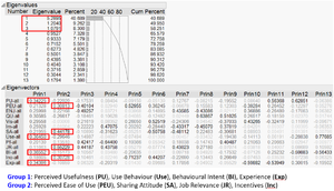
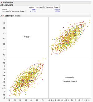
Using Principal Component Analysis in JMP, it was noted that Behavioral Intention (BI), Use Behaviour (Use), Experience (Exp) and Perceived Usefulness (PU) may be grouped together, while Perceived Ease of Use (PEU), Sharing Attitude (SA), Job Relevance (JR) and Incentives (Inc) can form a second group. Two separate columns were created by aggregating the variables, and one of them transformed using Johnson Sl. Of interest, while the individual variables showed low correlations initially, when grouped, they had a strong correlation of 0.78. Based on the research paper which had mentioned some causal hypothesis, there is a likelihood that Group 1 is actually the behaviour towards using Wikipedia, and Group 2 may be the motivating factor towards using Wikipedia, hence when motivations are high, use behaviour is high too. A quick check was done by brushing over the distributions of demographic variables, but no distinct patterns were noted.
Creating visualisations using Tableau
Import and cleaning of data
As the responses were on the Likert scale, it was decided that all responses are to be visualised using an appropriate Likert chart before selection of any team. There is some online assistance in how to create a Likert chart using Tableau – I had selected this particular one as it has a Tableau workbook which I downloaded to access the formula within each measure [5]. There is a need to prepare the dataset so that it can fit the example downloaded. I had used JMP to stack the columns into multiple rows, as it is a straight-forward function by just using Table\Stack, and adding all the individual question columns This would lead to multiple rows for the same ID, and the questions and responses are captured in two separate columns.
The JMP data is saved back into Excel using Save-As type = Excel. At Excel, columns on Question Type, Question nature and Question text were added to the data by using a legend and VLookup. This is to provide more details for display and filter later on in Tableau.
As earlier we had recoded question QU4 (under quality), there is a need to rephrased the question text too, to “In my area of expertise, Wikipedia has a higher quality than other educational resources". Thereafter the Excel file is uploaded into Tableau for visual analysis.
Below is a list of housekeeping required inside Tableau, as follows:
- Checking the data type and changing them to appropriate ones. All the demographic columns, except age and experience, had to be in String format. The question-related columns like question type and question itself were already in String, but the response has to be in numeric.
- Renaming the columns to make them more meaningful (and less confusing). For example “YEARSEXP” was renamed to “Years of experience”. Spacing and capital letters were also adjusted for consistency.
- Using Alias for the codes in the demographic columns (Alias can only be done for String items). This is important so that the data when presented in the Tableau charts and dashboards would be more meaningful instead of in numbers.
- Using Sorting for the codes so that we can keep the natural order of the values. In Tableau, the alphabetical values (due to Alias) tend to be reflected in alphabetical order by default. However we have a preferred order, eg Professor, Associate, Assistant, to be in accordance with their ranking. This can be done by right-clicking a String item, and select Default Properties and Sort.
The following steps were taken in creation of the Likert scale:
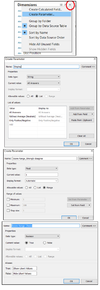
- Step 1: Create a new “Display” parameter, by clicking the small triangle at Dimensions, and selecting “Create Parameter”. Fill up the options below.
- Step 2: Create a new “Score Range_Strongly disagree” parameter, using above method, but selecting the values below. Use the same method, create “Score Range_Disagree”, Score Range_Neutral”, “Score Range_Agree” and “Score Range_Strongly agree”. The values to be in ascending order according to these names.
- Step 3: Create a new “Sort By” parameter, using above method, but selecting the values below.
- Step 4: Create a new “Score Range Choice” parameter, using above method, but selecting the values below.
- Step 5: Create a calculated field "# of Respondents X" using Countd([ID]).
- Step 6: Create calculated field "# of Respondents" using WINDOW_SUM([# of Respondents X]).
- Step 7: Created a calculated field “Count Negative” using IF [Response]<3 THEN 1 ELSEIF [Response]=3 THEN .5 ELSE 0 END
- Step 8: Created a calculated field "Count Negative Parameter" using IF [Response]<3 THEN 1 ELSEIF [Response]=3 AND [Display]="All Answers" THEN .5 ELSE 0 END
- Step 9: Created a calculated field "Count Positive Parameter" using IF [Response]>3 THEN 1 ELSEIF [Response]=3 AND [Display]="All Answers" THEN .5 ELSE 0 END
- Step 10: Created a calculated field "Count Response Parameter" using IF [Display]="All Answers" THEN [Number of Records] ELSEIF [Response]<>3 THEN [Number of Records] END
- Step 11: Created a calculated field "Total Count" using TOTAL(SUM([Number of Records]))
- Step 12: Created a calculated field "Total Count Negative" using TOTAL(SUM([Count Negative]))
- Step 13: Created a calculated field "Total Count Negative Parameter" using TOTAL(SUM([Count Negative Parameter]))
- Step 14: Created a calculated field "Percentage" using SUM([Number of Records])/[Total Count]
- Step 15: Created a calculated field "Percentage Parameter" using SUM([Count Response Parameter])/TOTAL(SUM([Number of Records]))
- Step 16: Created a calculated field "Gantt Start" using -[Total Count Negative]/[Total Count]
- Step 17: Created a calculated field "Gantt Start Parameter" using -[Total Count Negative Parameter]/[Total Count]
- Step 18: Created a calculated field "Gantt Percent" using PREVIOUS_VALUE([Gantt Start])+ZN(LOOKUP([Percentage],-1))
- Step 19: Created a calculated field "Gantt Percent Parameter” using PREVIOUS_VALUE([Gantt Start Parameter])+ZN(LOOKUP([Percentage Parameter],-1))
- Step 20: Created a calculated field " Score Range Score" using CASE [Response] when 5 then [Score Range_Strongly agree] when 4 then [Score Range_Agree] when 3 then [Score Range_Neutral] when 2 then [Score Range_Disagree] else [Score Range_Strongly disagree] end
- Step 21: Created a calculated field "Score Range Parameter" using IF [Score Range Choice] AND FIRST()==0 THEN TOTAL(AVG([Score Range Score]))-3 END
- Step 22: Created a calculated field "Score Range Total" using TOTAL(AVG([Score Range Score]))
- Step 23: Created a calculated field "Sort" using -IF [Sort By]="Score Range Choice" THEN [Score Range Total] ELSE TOTAL(SUM(IIF([Sort By]="Least Negative",-[Count Negative Parameter],[Count Positive Parameter])))/TOTAL(SUM(1)) END
- Step 24: Drop the capsules as follow in the fields below. It may look strange in the beginning. Do remember to change the Marks type to Gantt Bar and Gantt Percent to calculate using Gantt Percent. If the chart still does not look well, do check the calculations for Percentage and Gantt Percentage to ensure that they are using Response.
- Step 25: The labels need to be adjusted so that they appear in the middle of each section. This can be done by clicking the Label and aligning them to the centre.
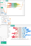
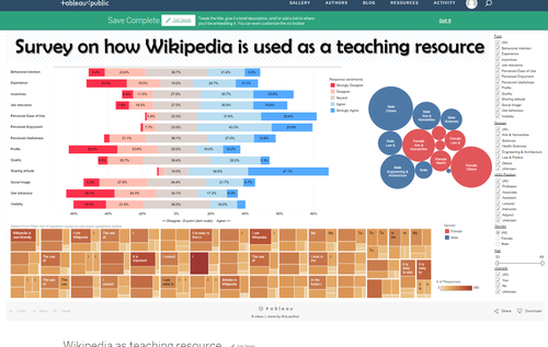
Other changes can be done to the colour of the Response, font sizes/colour, alignment, axes titles and such. Droplines were also added, unfortunately these droplines did not appear in the web version due to Tableau issues. Next, as it was not so clear (to readers) if we use values of “1” to “5” for the responses, a new column was created and named “Response Text”. There, the codes “1” to “5” were replaced with their exact descriptions “Strongly Disagree…” etc. This new capsule then replaced the Response capsule in the worksheet, with necessary adjustments to the earlier hard-codes. Filters were also added to allow interactive exploration. The final worksheet looked as follows:
For information, some of the parameters used in the Tableau workbook where these steps were learnt from, were not used in the building of this Likert scale. It is not clear why they were created by the Tableau user who shared his workbook. Nevertheless, there should be greater possibilities in using more of such parameters to improve on the visualisation system.
Create a Tableau Treemap for in-depth visualisation on questions
While the above Likert scale showcased the responses by their types, it might be interesting to go into individual questions. From an earlier preview of the individual questions and their responses, it was noted that not all questions within the same categories were answered in the same degree. Hence it may be useful for readers to examine the questions in details to understand the context. The Tableau Treemap was thus created to display the question details, with size and colour intensity according to the number of responses for each Likert scale value. It was set at earth colour to differentiate from the Likert chart. For records, the colour was set by number of responses for each question, hence if a particular response for a question (eg EXP4) was exceptionally high in Strongly Disagree (eg 580 respondents), it will have a much darker colour compared to another response in another question (eg QU3 which had only 30 respondents for Strongly Agree). The size of each box, is based on their distribution of response within the same question.
In case the contents were too long and were truncated in the Tableau Treemap, readers can still use the tooltip to view them. The good feature with Tableau, is that the font colours were automatic, hence the font would be white against a light shade, and black against a dark shade, for ease of reading.
Create a Tableau Bubble chart to look at domain and gender
There are some variables on the demographics of the respondents. After a few iterations, it was decided to show the visualisation of domain and gender using Bubble charts. This was created using Show Me at Tableau. It should be noted that the domain and gender would should be independent of the different question types, i.e. if we toggle from a Quality type to a Behavioural Intent type, there is unlikely to be vast changes in the domain and gender, except in the event of null values which is also low.
Create a Tableau Boxplots for statistical analysis
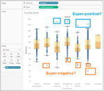
It may be worthwhile to take a look at outliers, although there may not be a need to include it for publish. Boxplots were created inside Tableau to examine the responses by Domain and Position. Comparisons of the median total responses was done. Special attention was given to the outliers, to check if there were any patterns with their responses.
Create a Tableau Dashboard and publish it online
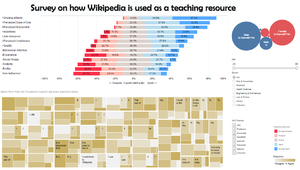
A Tableau Dashboard was created by dragging the Likert chart, Treemap and Bubble chart into the Dashboard. Filters were created at the Likert chart worksheet, and Apply to Worksheets\All using Related Data Sources). The choice of the representation of filters, whether single/multiple, list/drop-down/slider was subject to mix-and-match to suit the needs. As the Likert chart was the “main attraction”, it was placed right at the top, with Treemap below it. The Bubble chart was more related to demographics, hence placed to the right, close to the filters. A title was created separately outside Tableau, and imported by clicking Image at Objects at the bottom-right. One may also choose to just type in the title by selecting the Show dashboard title.
It is necessary to click on the small white filter at the top right-hand corner of the Likert chart, Treemap and Bubble chart. This would allow interactions between these frames, eg if I select an item in the Treemap, there will be corresponding filtering at the Likert chart and Bubble chart. It may be quite difficult to find this small filter, we will need to select the entire frame first to see three options revealed at the top right-hand corner. These three options are a drop-down list of more options, “Use as Filter” and “Remove from Default”. Clicking on the “Use as Filter” would change it to dark colour. The filters were changed to “floating” to facilitate ease of shifting their locations. This can be done by clicking the drop-down list at the filter’s top right-hand corner, and clicking “Floating”.
To publish the Dashboard, simply select from the top bar Server\Publish Workbook. Give the workbook a title inside the small window that pops up, eg “Wikipedia as teaching resource”. After clicking OK, it would just take a few seconds to load into Tableau Public. Prior to this, we would need to ensure that we are registered with Tableau Public, and connected to its server.
The link to the online Dashboard can be copied from the browser URL. This was the first iteration of my visualisation on the overall survey results. The link to the website is:
https://public.tableau.com/profile/lindateo#!/vizhome/Wikipediaasteachingresource/Dashboard. Do note that in this first iteration, the size of the Dashboard was set too big, hence it cannot be viewed in one page.
For records, the alignment of the Dashboard did not look exactly the same when published (more experience with publishing should help on this). Some filters and legends may overlap. Hence there was a need to shift the alignment on the Tableau using trial-and-error, and publish them online to take a look. To play safe, we can get another Tableau Public user to check out the website to see if it is working well and looking fine.
One other trick is to create a white box image and upload it. This white box may act as a “blanko” to cover any items which we do not want to show on the screen. For example I was toying with the idea of making the “Unknown” values fixed in the filters, hence by blocking it from view, the readers cannot unselect it.
Creating visualisations using Mondrain
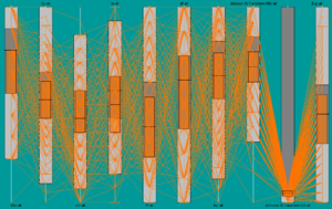
Mondrian is a general purpose statistical data-visualization system [6]. It is an .exe application, and was able to import text files. As such the dataset was converted to csv format and imported into Mondrain. Mondrain is relatively easy to use, despite its dull appearance. Running of parallel coordinates and boxplots and subsequent selections were done swiftly. One merit in Mondrain’s parallel coordinates, is that it is considerate to plant the axes at both upper and lower ends, at alternate intervals, to make it easier for visualisation.
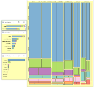
Mondrain is also quite powerful in Mosaic plots – it is able to plot 3 dimensions, and coupled with barcharts, it allows further breakdowns for visual comparisons. Colours can be applied using colour brushing.
Creating visualisations using Macrofocus Treemap
Treemap is a Macrofocus application which, similar to Mondrain, is a .exe application [7]. We need to draw a distinction between this Treemap and the treemap created using Tableau earlier, as such we will term it as “Macrofocus Treemap”. To import data into Macrofocus Treemap, the data has to indicate the datatype at the second row, eg INTEGER, STRING, etc, and convert it into .txt file. One major problem with using Macrofocus Treemap for this assignment, is that Macrofocus Treemap does not accept blank values. However, in this dataset on survey results, there are many empty fields. For the purpose of testing out the application for this assignment, the empty values were replaced with zeros.
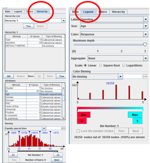
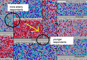
After successful import of the data, the initial screen looks dull in black and white. We will need to start setting the hierarchy based on our areas of interest, to segregate the data. At the same panel, the age and years of experience can be binned. Thereafter, go to Legend to fix the size and colours. In this case, I had set the size to be age, and colour to be response. Therefore, for each panel, we can expect the top-left squares to pertain to the more elderly respondents, and conversely, the younger ones are diagonally opposite. For the colours, although the value of zero was added (manipulated so that there are no blanks), we can set the colour to black to distinct it away.
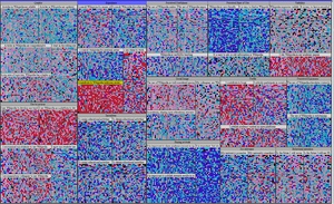
From the initial treemap created below, we can clearly identify the survey questions which scored unfavourably, i.e. the panels with more reds/pinks and the questions which scored favourably, i.e. panels with more blues. However that there are no observable patterns between age and the responses for every survey question, because the colours are mixed across the age spread.
After a few iterations by switching between different attributes for the treemap, still no discernible patterns were noted. However it was noted that the treemap is an excellent platform for drilling up and down the data. The distinct colours used for the responses made it easy to compare the sentiments of the respondents at a glance. When we drill down, we can always continue to filter further, and then drill up again to analyse other aspects of the subject.
On a side note, the Macrofocus Treemap has other layout algorithms, like circular layout, and Treeplot view. However it is currently not working for my application, likely to be due to licence issues. The Macrofocus Treemap can also be published in webpages, using the Treemap Server (which comes with a price). For the purpose of this assignment, an example of how to drill up and down data using Macrofocus Treemap is recorded – please see the Youtube video from the following link:
https://www.youtube.com/watch?v=4MnRJ0ihWgM
Creating visualisations using Macrofocus High-D
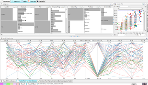
The High-D is also an application under Macrofocus [8]. In fact, Macrofocus Treemap is also incorporated into High-D. It comes with a suite of different visualisations in a dashboard display, with distribution charts, scatter plots, parallel coordinates, treemap, etc, all-in-one. Though it is supposed to be a very versatile and powerful visualisation tool, I personally did not like it as it is lacking in performance – the application hung a few times, else was slow. The Treemap feature within High-D is not as robust as the standalone Macrofocus version.
Evaluation of different visualisation applications
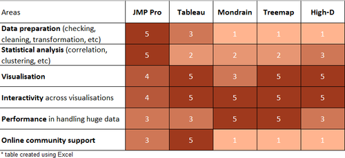
This is my evaluation of the applications, using a Likert scale of 1 (strongly disagree) to 5 (agree). The opinions are also subjected to expertise in using the applications at the point of writing, for example Tableau has some wonders which I have yet to learn of.
Analysis methodology
At the beginning of this assignment, while using Tableau, I had thought of a number of areas which can be probed into the Wikipedia topic:
- Whether any relationship exists across the different variables
- Whether the different domains were different on the responses
- Whether the different positions held had any impact on the responses
- Is there any distinction between results for UOC (an open university) and UPF (a public university)? By virtue of the former being an open university without any campus, higher acceptance towards online learning is expected.
- Whether the higher proportion of Adjunct in UOC had any impact on the responses
- Whether gender and/or age between the respondents made any difference
- Whether a Userwiki respondent would respond more favourably
- What about the outliers? Were there any gaps in the project, eg it was done online and respondents did not respond truthfully?
However, through experimentation with other applications and visualisation techniques, one big issue emerged: is there a difference between respondents who answered all questions and respondents who did not answer all questions? As per all surveys, the respondents may choose to leave certain questions unanswered. The reasons behind such actions are unknown, possibly because they did not know how to answer the question(s), they felt there were no purpose in answering the question(s), they were skeptical over the entire survey, etc.
Secondly, arising from the correlations and PCA performed using JMP earlier, we were able to derive two groups, on Behaviour and Motivations towards Wikipedia. There may be scope in zooming into these two groups specifically, to see if there are any differences in the behaviour and motivations across the different domains and positions of respondents.
Analysis
Overview of responses using Tableau
The link to the dashboard can be found here. This is a second iteration to improve on the visual presentation of the first dashboard https://public.tableau.com/profile/lindateo#!/vizhome/Wikipediaasteachingresource_v2/Dashboard
From the Likert chart, it was noted that the sentiments towards Sharing Attitude was most favourable, with less than 5% in the “Disagree” groups. By selecting the Dashboard filter to zoom down to the type “Sharing Attitude”, it can be seen from the treemap of the questions below, that the responses with “Strongly agree” and “Agree” formed high proportions for all three questions. During interactive exploration, if there is a need to check the data of the visualisations, one can right-click on the individual treemap cell, eg select the “Strongly Disagree” for first question, and select View Data, then Full Data. To unselect the Treemap cells, just click on any blank space outside the cells within the chart boundary, eg above its legend. It was briefly observed that there were more respondents who were non-Userwiki.
Other than Use Behaviour and Behavioural Intent, it was also noted that Profile, Visibility, Social Image and Experience had scored high on “Disagree”. In particular, Profile had more than 50%, and from the analysis of the questions, many of the respondents stated that they did not contribute to blogs, did not publish academic content in open platforms, and were not active on social media. This result came out quite strongly within the Health Sciences domain. – only 16% “Agrees”.
From the web-based Dashboard, readers could use the list filers for domain to observe how the Likert chart changes - the type variables were already sorted in the order of most favourable to least favourable, for ease of comparison. Interestingly, the Engineering & Architecture domain appeared to be most favourable towards Wikipedia compared to the other domains. Although there was still high proportion of negative sentiments towards Profile and Use behaviour, Experience and Visibility, it should be noted that most of the other domains were also quite comparable. The Law & Politics, and Health Sciences respondents appeared to be least favourable towards Wikipedia. The former gave low scores mainly for Use behaviour, while the latter was mainly on Profile. For Profile, the questions asked were whether the respondent was active in social network, participate in blogs and publish academic content in open platforms. Apparently this did not really relate to the respondents in UOC and UPF. Probably only the Arts & Humanities respondents are less resistant towards this Profile, as they had a high proportion of respondents who were neutral towards participation in social networks.
For Use behaviour, it is also interesting to note that the respondents were mainly letting their students use Wikipedia, but they themselves were not agreeable to use Wikipedia. Such disjointed sentiments seem to point to a certain level of insecurity or distrust in the Wikipedia contents. This is despite their moderate sentiments in the Quality questions. Hence it is possible that while they felt that the Wikipedia has good contents, they still preferred not to use it as teaching resources. This "matter of choice" observation, is also noted in the high proportions under Perceived enjoyment, that most of the respondents stated "Disagrees" in using Wikipedia to develop their teaching materials.
Despite the negative sentiments towards using Wikipedia, there was actually high proportions of favourable responses in the Sharing attitude. There, many respondents stated that it is important to share academic/research online. However, the survey question did not explicitly point towards sharing in Wikipedia, hence the respondents could be referring to other online channels. This is highly possible, because UOC being an open university, should have their own inline platforms for sharing. Hence the respondents do have a sharing culture, but just not into Wikipedia. It is also likely, that the respondents lack of knowledge in how to use Wikipedia is affecting their choice. Under incentives, there were high proportions of respondents who stated that specific training, a practices guide, and colleague's instructions would be helpful. It is also possible that UOC (and UPF) did not or have yet to encourage the use of Wikipedia, hence there were no incentives to pursue it.
Earlier through the use of Scatterplots, some outliers were noted, although they are not high in numbers. Two of the outliers were noted to accord Strongly Agree to almost questions posed. Unless these two respondents were truly in favour of Wikipedia, otherwise they may fall under the category of response bias, where respondents deliberately answer in a way which shows that they are positive towards the subject. Another possibility is that the respondents had filled up the online survey hastily. Having perused through the data, it is deduced that both respondents did not take the survey seriously, because they had answered the reverse-coded question QU4 with value "Strongly Agree" along with the rest. They probably did not read the questions, and blindly selected "Strongly Agree" for all questions thinking that they were all normally scaled.
Specific theme on Non-Respondents
Taking into consideration the 2 groupings of Behaviour and Motivations, and the possibility that non-respondents may have vastly-different responses compared to respondents, a new Tableau Dashboard was created. Please see link: https://public.tableau.com/profile/lindateo#!/vizhome/Tableau_revamped2/Overview
A new field on Non-respondents was created, to segregate between respondents who had answered to all questions, and respondents who did not answer to all questions. As such, the responses which were earlier treated as Null, are now coloured black in the Likert Chart. It can be clearly seen, that the non-responses came mainly from Visibility, Job Relevance, Perceived Ease of Use and Intention. The exact questions can be known by clicking on the respective black sections on the Likert chart. For Visibility, there were as many as 117 respondents who did not respond to the question Vis3, which stated “It is easy to have a record of the contributions made in Wikipedia”.
With this interactive dashboard, further filtering can be done into the different domains and professions, to see which category of respondents tend not to respond. For example, a high proportion of the Professors did not respond to questions on Incentives and Job Relevance (but do note the numbers of Professors are small at 11 persons in the first place).
A scatter plot was included with Use Behaviour as the y-axis and Motivating Factors as the x-axis. They represent Group 1 and Group 2 variables respectively. A positive linear relationship may be seen between both groups. When filtering across the different domains, we can see that the gradient of the linear relationship changes – for example, less steep for Arts & Humanities, and more steep for Engineering & Architecture. This may imply that motivating factors work better with the Engineering & Architecture faculty, and not as well for Arts & Humanities. Likewise, the line is steeper for Lecturers and Instructors, as compared to Professors, indicating the latter’s use behaviour is less likely to be affected by the motivating factors.
Recommendations
From the analysis of the survey results, it was possible that the faculty members of UOC and UPF were not in favour of using Wikipedia as a teaching resource, although they believed there were merits in using Wikipedia. It could be a matter of choice, that they simply did not want to adopt the platform, or because they were already having an alternative online platform, which was recognised by their universities. One way to tackle this issue, could be to provide training to these faculty members, because their lack of expertise in using Wikipedia could be one of the major hurdles. Another way would be to go through the university to sell the idea of using Wikipedia as another platform, so that there would be greater acceptance towards it.
Also noted was certain distinct behavioural differences between respondents and non-respondents. Perhaps more probes may be done to check on the reasons behind these differences.
Exploring other visualisation techniques
Through other classmates' work, it was noted that the use of other visualisation applications like QlikSense with D3.js scripts had delivered excellent visualisations.
