ISSS608 2016-17 T1 Assign1 XU Qiuhui
Contents
Abstract
<TBD>
Problem and Motivation
Data
Data Acquisition
Dataset Variables
Data Modelling
The following are changes made before charting was done on Tableau: <TBD>
| Variable | Changes Made and Rationale |
|---|---|
| Month | A new variable "Date" was created to parse the YYYY-MM format of the Month variable. The formula DATEPARSE('yyyy-MM',[Month]) was used in the calculated field. |
| Town | The variable is set to a State/Province geographical role for purpose of applying it to filled maps in the analysis. |
Approaches
General Colour Scheme for Charts
A consistent colour scheme was used in the charts to retain a sense of familiarity with the readers and reduce confusion.
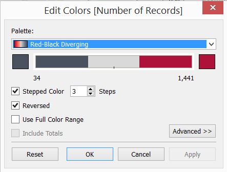
Several colour schemes was experimented for use across the charts. The final colour scheme selected deliberately used contrasting colours. Depending on the chart used, either 3 steps or 5 steps colours was used to allow readers to easily understand the concept of "high, medium, low" without further explanation.
Data Analysis
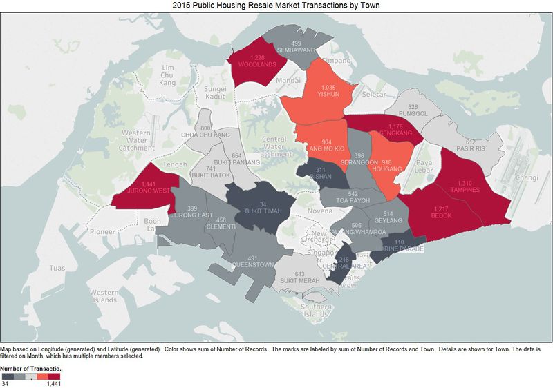
An overlay of the number of resale transactions by each HDB town or estate on the Singapore Map reveals that towns with the most resale flat transactions are from Jurong West, Tampines, Bedok, Sengkang and Woodlands. It can be observed that most of these areas are well built-up, and includes amenities such as shopping centres.
Visualisation rationale: <TBD>
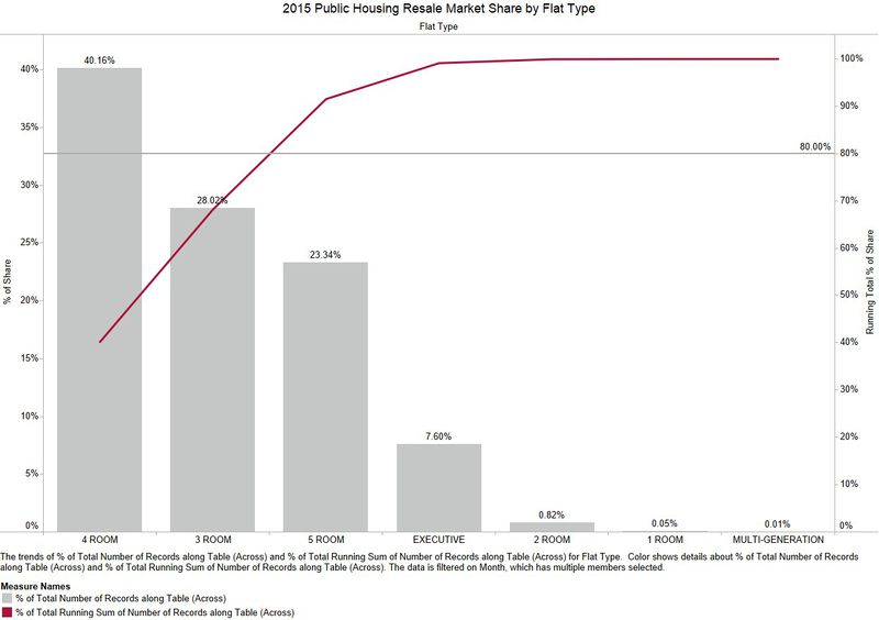
Most popular: 4 Room, 3 Room.
Visualisation rationale: <TBD>
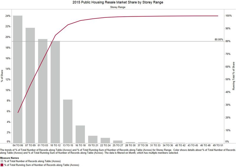
Lower floors are sold more. House owners prefer to keep higher floors?
Visualisation rationale: <TBD>
Distribution of the resale public housing prices in 2015
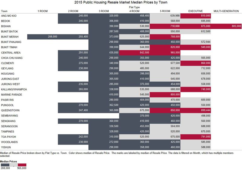
No surprises here. Median prices are higher in mature estates and areas near the city centre such as Central area, Queenstown.
Visualisation rationale: Median avoids outliers. <TBD>
Since primary flats sold are 4 Room, let's focus on 4 Room. Focus on families on a budget.
Visualisation rationale: <TBD>
No surprises on the estates.
Visualisation rationale: <TBD>
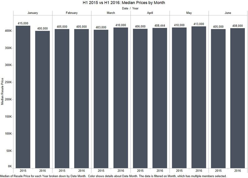
Comparison of patterns of the first-half of 2016 with the patterns of 2015
Visualisation rationale: <TBD>
Visualisation rationale: <TBD>
Visualisation rationale: <TBD>
Infographics
Tools Utilised
- SAS JMP 12 – for initial data exploration and analysis
- Tableau 10.0 – for charting
- Microsoft Powerpoint – for Infographics layout
Results
