ISSS608 2016-17 T1 Assign1 Lim Hui Ting Jaclyn
Contents
Abstract
Problem and Motivation
The property market in Singapore used to experience huge fluctuations, with large and rapid price growth of about 20% each year. To curb these high prices, the government introduced various cooling measures in 2013. Since then, it has been reported that the prices of resale houses in the property market has gone down, with the supply increasing. As such, there has been debate about whether the cooling measures should be relaxed or not.
Hence, through this assignment, I hope to verify if the phenomenon reported is correct. The increase in supply and decrease in transaction prices can be attributed to many internal and external factors, such as economic downturn. However, I will retain the scope of this assignment to internal factors, such as the number of years of lease left, and the town the resale public houses are situated in.
From my analysis, I will try to answer the question of whether the cooling measures have been working effectively, in the public resale housing market.
Approaches
Data Preparation
Data Set
The data set, Resale Flat Prices Based on Registration Date from March 2012 Onwards, has been retrieved from: http://data.gov.sg, as it is a publicly available dataset provided by the government. This set of data helps us to look at the shares of the resale public housing supply, as well as the distribution of the resale public housing prices.
In order to prepare the data for the analysis, I had to make modifications to the given dataset. This can be seen in the section below.
Another set of data that I used was Singapore's Planning Area SHPFile, and it was also retrieved from http://data.gov.sg. This was retrieved in order to create a visualisation on the map of Singapore.
Data Cleaning
The first thing I did was to split the the "Month" field, so as to retrieve the exact month and the year of each transaction. The new columns are seen in the screenshot below, and they are shaded in blue.
After which, I created a date column with the actual date, as the current data set only has Month and Year. I did this by creating a calculated field Month+”-01” and rename new column as “Date” File:File
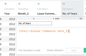
Another column called "No of Years" was created to represent the difference between the day of the transaction as well as the lease commencement date.
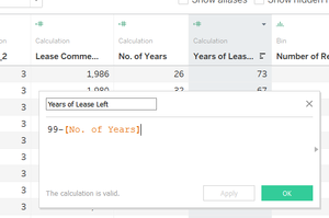
To find the number of years of lease left, a column named “Years of lease left” was created to represent the number of lease left on the property, before the property reaches 99 years of leasehold. The formula was “99-[No of Years]. This can be seen below.
Through the data exploratory process, I have also discovered that there had to be additional modifications made to the data set or the analysis process itself.
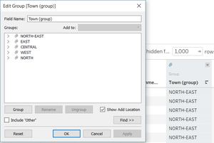
One of the issues that I found was that there were too many "Towns", and in fact, they could be separated into the Regions that they were situated in. Hence, I created a new group for the column "Towns" to group some of the variables together.
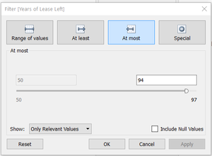
In my analysis, I also added a filter of “Year:2015, 2016” and another filter of “Years of Lease Left” of at most 94 years. This is because of the requirement by the government that resale flats can only be sold after the five-year minimum occupation period (MOP). Resale flats that have Years of Lease left of above 95 years will have been sold back to the government at cost price. Hence, they are removed from the distributions. The filter can be seen in the figure below.
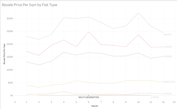
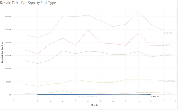
I added one more filter to my analysis, as I discovered that there was a lack of data of the multi-generational flats as well as the 1-room flats in 2015 and 2016. Hence, I also filtered "Flat Type" at some points in my analysis. Examples of the lack of data can be seen below.
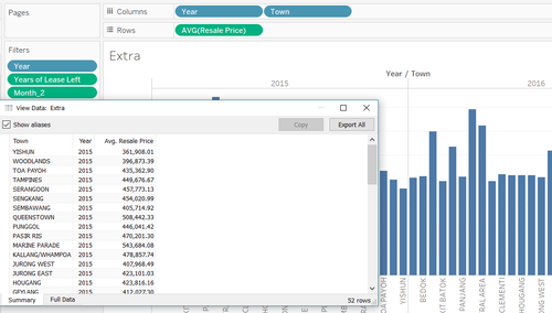
To prepare the data for the geospatial image, I created a distribution on Tableau, viewed the data and exported it into a csv format. As I was planning to create a visual distribution of the average transaction prices of each planning area (or Town) on the map of Singapore, the input in the "columns" and "rows" were as follows:
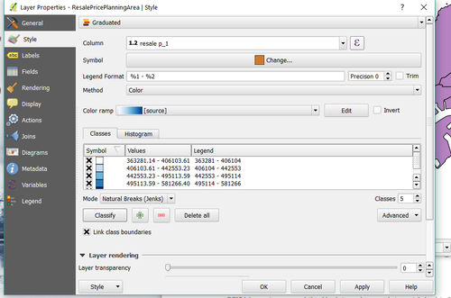
Last but not least, to create the distribution on QGis, I merged the csv file with the Planning Area SHPfile, and changed the layer properties of the SHPfile as follows:
Data Exploration
Supply
Prices
Comparison between 2015 and 2016
Tools Utilised
- Tableau
- Qgis

