Difference between revisions of "ISSS608 2016 17T1 Group2 Report"
Dan.li.2015 (talk | contribs) |
|||
| Line 58: | Line 58: | ||
And the barchart at the bottom reveals the incidence counts between 1999 and 2013. Actually it’s a filter and uers could select the specific time quantum to check the corresponding sunburst and line chart. Besides, the Play button would change the sunburst by year. Our design is both dynamic and static. | And the barchart at the bottom reveals the incidence counts between 1999 and 2013. Actually it’s a filter and uers could select the specific time quantum to check the corresponding sunburst and line chart. Besides, the Play button would change the sunburst by year. Our design is both dynamic and static. | ||
| + | [[File:sunburstD3.png|800px|frameless|center]] | ||
===Design in R Dashboard=== | ===Design in R Dashboard=== | ||
====Cancer By States==== | ====Cancer By States==== | ||
This tab is ‘state-oriented’, it enables users to expore the difference of the 50 states in terms of the specific cancer type and time period. The scatterplot is designed to examine how certain states differs from other states in terms of specific cancer mortality rate and incidence rate, while 2 corresponing boxplots are created to give user more infomation about how certain states were positioned while comparing with the statistics such as median and quartiles. In addition, the state’s ranking details can be observed from the data table on the right. The search and sort function are enabled for the flexibility of exploring. | This tab is ‘state-oriented’, it enables users to expore the difference of the 50 states in terms of the specific cancer type and time period. The scatterplot is designed to examine how certain states differs from other states in terms of specific cancer mortality rate and incidence rate, while 2 corresponing boxplots are created to give user more infomation about how certain states were positioned while comparing with the statistics such as median and quartiles. In addition, the state’s ranking details can be observed from the data table on the right. The search and sort function are enabled for the flexibility of exploring. | ||
| + | [[File:Rtab1.png|800px|frameless|center]] | ||
====Cancer By Demographics==== | ====Cancer By Demographics==== | ||
The 2nd tab of the dashboard focuses on visualizing demographic information such as age, sex and race. To discover the difference of incidence rate and mortality rate of different cancer, parallel coordinanates with boxplot is designed for their realtion with age group while heat maps are built for their proportional relation in terms of races and sex. | The 2nd tab of the dashboard focuses on visualizing demographic information such as age, sex and race. To discover the difference of incidence rate and mortality rate of different cancer, parallel coordinanates with boxplot is designed for their realtion with age group while heat maps are built for their proportional relation in terms of races and sex. | ||
| + | [[File:Rtab2.png|800px|frameless|center]] | ||
==Demonstration== | ==Demonstration== | ||
| Line 90: | Line 93: | ||
# The Visualization of this project is mainly descriptive analysis with statistical measures. With more variables, such as weight, diet, living habits or jobs of cancer patients, to be collected in the future, it is possible to apply machine learning algorithms to accurately predict the chances of people getting infected by certain cancers. In this way, people should be alert to take prevention before cancers get to them. | # The Visualization of this project is mainly descriptive analysis with statistical measures. With more variables, such as weight, diet, living habits or jobs of cancer patients, to be collected in the future, it is possible to apply machine learning algorithms to accurately predict the chances of people getting infected by certain cancers. In this way, people should be alert to take prevention before cancers get to them. | ||
# Depending on the kinds of information needed, other interactive plots can be created to look at the data at different perspectives. | # Depending on the kinds of information needed, other interactive plots can be created to look at the data at different perspectives. | ||
| − | |||
| − | |||
| − | |||
Revision as of 00:05, 28 November 2016
|
|
|
|
|
Contents
Motivation of the application
Cancer remains to be an significant cause of death around the world. The cancer types and early treatment are fatal to the chance of survival. The average five-year survival rate of people with cancer is 66% in the U.S.. One among 5 people who passed away is killed by cancer each year in the United States, and the number in the world is 100-350 per 100000.
This project aims to offer guidance for cancer prevention and treatment at a high level by presenting the following:
- One D3 sunburst diagram to identify hierarchical, proportional relationship between leading cancer sites and its sub categories. It also shows how the relationship changes over time.
- One R Shiny dashboard to enable users to interactively exploring the geographic and demographic features of cancers.
Dataset
The dataset is sourced from Centers for Disease Control in USA, see CDC America
- Cancer Sites: There are 20 leading cancer sites and 4 hierarchies in total.
- Age_Group: The group standard was 5 years in one group. The details are <1 year, 1-4 years, 5-9 years, 10-14 years, 15-19 years, 20-24 years, 25-29 years, 30-34 years, 35-39 years, 40-44 years, 45-49 years, 50-54 years, 55-59 years, 60-64 years, 65-69 years, 70-74 years, 75-79 years, 80-84 years, 85+ years.
- Region: The United States is split into 4 regions: Northeast, Midwest, South and West.
- States: All 50 states and the District of Columbia are represented for all years. Data for Puerto Rico are available for years 2006 and later.
- Sex: Female and male.
- Race: There are 4 racial categories included in the data: "American Indian or Alaska Native," "Asian or Pacific Islander," "Black or African American," and "White."
- Incidence Counts: The number of diagnoses of cancer in living persons.
- Death Counts: The number of deaths.
- Age-Adjusted Rates for Incidence and Mortality:
Note that Age-adjusted rates are calculated with age distribution ratios from the world standard million population, and the rates are shown per 100,000 population.The potential confounding effect of age is reduced when comparing age-adjusted rates computed using the same standard million population. See more at CDC Documentation
Review on Past Works
With the dataset, there has been CDC Dashboard
On the CDC(Centers for Disease Control and Prevention) official website, the dashboards it published don’t include any information about cancers. Cancers information is a vacancy of CDC. However cancer is a catchy disease for human due to its cruel and horrible. So our work fill the gaps between CDC and cancers.
Design framework
Design in D3
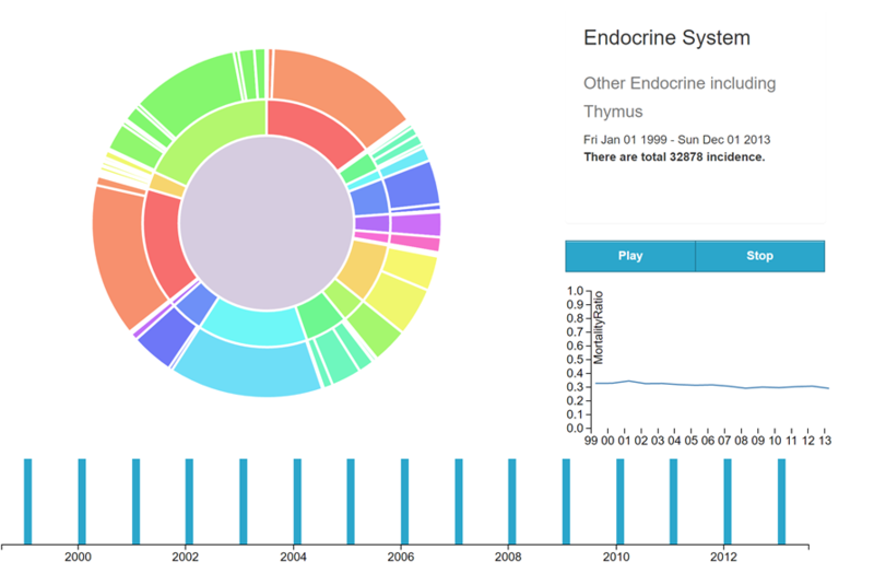
Sunburt is the main part of our D3 dashboard due to the special nested relation of cancers. In our dataset, there are 20 kinds of cancers, and every kind of cancer has a lot of small classes. This nested relations is easier to be shown in this form. The inner part represents various cancers, and the circle outside stands for their small classes.
In order to make it to understand easier, the corresponding content where your mouse hovers would be shown at the upper left coner, as while as its incidence counts. Below the display box, the line graph shows the trends of mortality incidence rate ratio by year.
And the barchart at the bottom reveals the incidence counts between 1999 and 2013. Actually it’s a filter and uers could select the specific time quantum to check the corresponding sunburst and line chart. Besides, the Play button would change the sunburst by year. Our design is both dynamic and static.
Design in R Dashboard
Cancer By States
This tab is ‘state-oriented’, it enables users to expore the difference of the 50 states in terms of the specific cancer type and time period. The scatterplot is designed to examine how certain states differs from other states in terms of specific cancer mortality rate and incidence rate, while 2 corresponing boxplots are created to give user more infomation about how certain states were positioned while comparing with the statistics such as median and quartiles. In addition, the state’s ranking details can be observed from the data table on the right. The search and sort function are enabled for the flexibility of exploring.
Cancer By Demographics
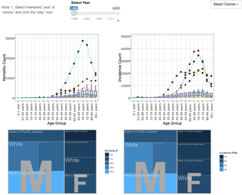
The 2nd tab of the dashboard focuses on visualizing demographic information such as age, sex and race. To discover the difference of incidence rate and mortality rate of different cancer, parallel coordinanates with boxplot is designed for their realtion with age group while heat maps are built for their proportional relation in terms of races and sex.
Demonstration
The Demo is introduced in detail at Application
Result
- Lung and bronchus is the primary fatal disease as it shows a significant spike for death counts.
- Breast cancer, in terms of death counts, is second to Lung and bronchus cancer. People begin to suffer from it around 25 years old.
- Prostate Cancer, though with high incidence count, is a low risk cancer as its death counts only raise slowly after the age 50.
- Men has higher mortality age adjusted rate that women. But researchers also don’t know why.
- As for the incidence counts of leading cancer sites, digestive system(3,935,477) ranks first, followed by respiratory system(3,296,761).
- The top 3 in sub-category are female breast(3,094,550), prostate(3,096,329) and lung and bronchus(3,070,707), respectively.
- Both Incidence age adjusted rate and mortality age adjusted rate have experienced overall downward trends over the 15 years.
- District of Columbia and Wyoming have been leading in terms of Mortality age adjusted rate from 1999 to 2013.
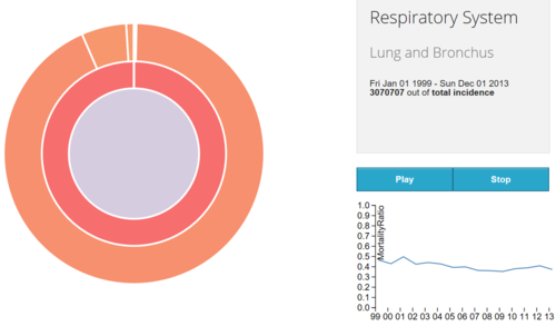
Interestingly in 2001, the respiratory system cancer has peaked abruptly, see the picture below. The fact is that , in 2001, America suffered from anthrax attacks. Letters containing anthrax spores were mailed to several news media offices and two Democratic U.S. Senators, killing five people and infecting 17 others. And the letter subjected more than ten buildings to anthrax pollution.
Overall, tobacco use is the single most important risk factor for cancer and it causes about 20% cancer deaths in the worldwide and up to 70% global lung cancer deaths. In addition, another 10% cancer death is due to obesity, poor diet, lack of physical activity and drinking alcohol. At last, certain infections, exposure to ionizing radiation and environmental pollutants are also the factors causing cancer death.[1]
Discussion
For common people, the work could attract people’s attention by the novel expression form. Furthermore, it would cause people pay attention on cancers and focus on which kinds of cancers they are easy to have.
For relevant organizations, this would facilitate them understanding which cancers should focus on. For example, which cancers should be given key publicity? Which cancers should be paid close attention to their treatment methods?
Future Work
- The Visualization of this project is mainly descriptive analysis with statistical measures. With more variables, such as weight, diet, living habits or jobs of cancer patients, to be collected in the future, it is possible to apply machine learning algorithms to accurately predict the chances of people getting infected by certain cancers. In this way, people should be alert to take prevention before cancers get to them.
- Depending on the kinds of information needed, other interactive plots can be created to look at the data at different perspectives.


