ISSS608 2016 17T1 Group2 Application
|
|
|
|
|
Contents
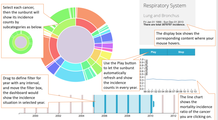
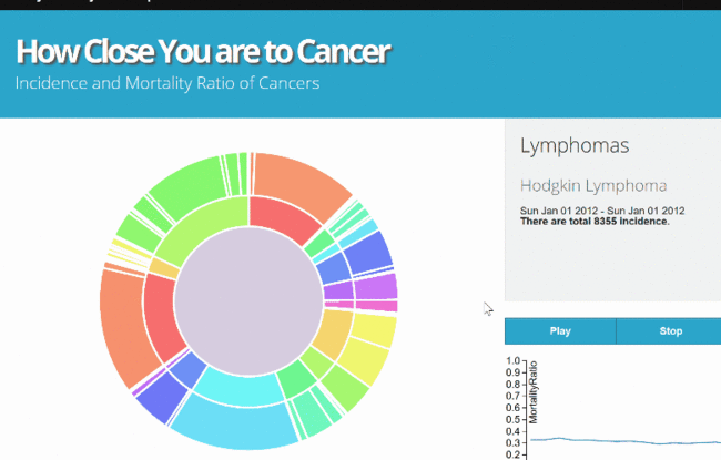
Sunburst of cancer incidencs & mortality
Installation Guide
Please follow the following two steps to explore the sunburst:
1. Download the zip file from the link. Sunburst package
2. After unzipping the package, launch the ‘cancerSub.html’ using Mozilla Firefox.
User Guide
Sunburst Demo
Shiny Dashboard of Cancer
The Shiny dashboard is based on the web server, you can simply click the link to explore. Dashboard1
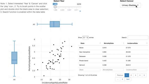
Tab 1: Cancer by States
- Step 1: Under the filter ‘Select Cancer’, select one interested cancer, say ‘Breast’;
- Step 2: Brush points in the scatter plot, say ‘District of Columbia’ is selected;
- Step 3: Sort the data table by Mortality rate in desending order;
- Step 4: Under the filter ‘Select Year’, click the ‘play’ icon
It can be oberserved from the demo below that, in 1999, District of Columbia standouts for its top 1 breast cancer mortality rate and high incidence rate. Actually it has ranked top 1 for mortality rate and incidence rate both for 11 years between 1999 to 2013.
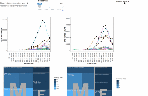
Tab 2: Cancer by Demographics
- Step 1: Under the filter ‘Select Cancer’, select interested cancers, say ‘Breast’, ‘Lung and Bronchus’, ‘Prostate’, ‘Colon and Rectrum’ and ‘Liver’;
- Step 2: Under the filter ‘Select Year’, click the ‘play’ icon
it is showing in the following gif that Lung and Bronchus cancer has been the most dangerous cancer with both outstanding motality count and incidence count, while liver cancer was also fetal with similar counts of mortality and incidence. Besides, poeple suffered from breast and prostate cancer have low risk of death.


