Difference between revisions of "ISSS608 2016-17 T1 Assign1 Ye Jiatao"
(ver_09) |
|||
| (15 intermediate revisions by 2 users not shown) | |||
| Line 23: | Line 23: | ||
=== Approaches Summary === | === Approaches Summary === | ||
To come up with a reasonable resolution for the problems discussed above, we mainly used bar chart, Pareto chart, histogram, time series analysis and box-and-whisker plot in this project. As a result, we will have several different plots to answer correspond problems. In addition, we can have a whole picture about the Singapore resale housing market from combining all the charts together. | To come up with a reasonable resolution for the problems discussed above, we mainly used bar chart, Pareto chart, histogram, time series analysis and box-and-whisker plot in this project. As a result, we will have several different plots to answer correspond problems. In addition, we can have a whole picture about the Singapore resale housing market from combining all the charts together. | ||
| + | |||
| + | === Data Preparation === | ||
| + | Before using the dataset to preform data visualisation, we need to carefully check and clean the raw dataset. In this case, the only 2 data preparation as following: | ||
| + | # Splitting the variable "Month" to get "Year", which would be used later in filtering and data grouping. | ||
| + | # Creating new variable "Record_ID" to mark each record individually, which can used in box-and whisker plot later. | ||
| + | <br /> | ||
| + | [[File:date_pre.png|600px|thumbnail|center]] | ||
=== Resale Hosing Supply === | === Resale Hosing Supply === | ||
| Line 29: | Line 36: | ||
| − | [[File:01.jpg|center| | + | [[File:01.jpg|center|500px|thumb]] |
<br /> | <br /> | ||
From the Pareto Chart above, we can know that resale public houses with 4 ROOMs (40.16%) are most popular and common in the market, following by houses with 3 ROOMs (28.02%) and 5 ROOMs (23.34%), respectively. In addition, by looking at the cumulative curve, we can draw the conclusion that resale house with 3, 4 and 5 ROOMs take account for large proportion in the supply share, which add up to 91.52%. On the contrary, it is hard to find resale houses with 2 or 1 ROOMs and MULTI-GENERATION house in Singapore comparing to other flat types. | From the Pareto Chart above, we can know that resale public houses with 4 ROOMs (40.16%) are most popular and common in the market, following by houses with 3 ROOMs (28.02%) and 5 ROOMs (23.34%), respectively. In addition, by looking at the cumulative curve, we can draw the conclusion that resale house with 3, 4 and 5 ROOMs take account for large proportion in the supply share, which add up to 91.52%. On the contrary, it is hard to find resale houses with 2 or 1 ROOMs and MULTI-GENERATION house in Singapore comparing to other flat types. | ||
| + | |||
| + | '''Viz Design:''' In this step, we are interesting about the '''share''' of resale house in term of various flat type, so using Pareto chart is appropriate. We sorted the bar from high to low, so that the chart would be more easy to read and understand. At the cumulative curve, we print out 2 important point marker. As a result, our viewer can more precisely to know the number at these 2 significant levels. | ||
<br /> | <br /> | ||
| Line 38: | Line 47: | ||
The figure above shows the resale housing supply in terms of different location (Town) in Singapore in 2015. We can know that JURONG WEST have the most sufficient resale housing supply in 2015, which provided over 1400 houses (over 8%) in the whole year, while BULIT TIMAH have the least housing supply (around 2%). In addition, we can clearly understand that there are only a few towns providing resale houses with 1 or 2 ROOMS. For example, we can only purchase resale houses with 1 ROOMs in BUKIT MERAH. | The figure above shows the resale housing supply in terms of different location (Town) in Singapore in 2015. We can know that JURONG WEST have the most sufficient resale housing supply in 2015, which provided over 1400 houses (over 8%) in the whole year, while BULIT TIMAH have the least housing supply (around 2%). In addition, we can clearly understand that there are only a few towns providing resale houses with 1 or 2 ROOMS. For example, we can only purchase resale houses with 1 ROOMs in BUKIT MERAH. | ||
| + | |||
| + | '''Viz Design:''' In this case, we rotate the chart as show above, so that our viewers can easily read the town name. The bar chart has been sorted by descending order, so that the view can quickly have a impression about the highest and lowest housing supply towns. We marked different type of flat by colour within bar, which can provide another dimension of information. | ||
<br /> | <br /> | ||
| Line 44: | Line 55: | ||
The bar chart above illustrates the resale housing supply change toward different floor range in 2015. Actually, we can can get a rough impression that the housing supply decrease when the floor range increase. There are 2 reasonable explanation for this phenomena. Firstly, most of public houses in Singapore may commonly contain less than 30 floors. In addition, another reason is that people in Singapore more like to live in apartment at high floor, so that most of owners of high-floor houses would not resale their houses. | The bar chart above illustrates the resale housing supply change toward different floor range in 2015. Actually, we can can get a rough impression that the housing supply decrease when the floor range increase. There are 2 reasonable explanation for this phenomena. Firstly, most of public houses in Singapore may commonly contain less than 30 floors. In addition, another reason is that people in Singapore more like to live in apartment at high floor, so that most of owners of high-floor houses would not resale their houses. | ||
| + | |||
| + | '''Viz Design:''' Firstly, the bar chart has been rotated for easy to read the storey range. Secondly, we sorted the bar by Storey range, because it can more clear to show the relationship between storey range and supply, although the storey range here are not numeric. | ||
=== Resale Housing Price Distribution === | === Resale Housing Price Distribution === | ||
| Line 52: | Line 65: | ||
<br /> | <br /> | ||
| − | The Histogram above show the distribution of sale housing price in 2015. | + | The Histogram above show the distribution of sale housing price in 2015. From the chart, the distribution of resale housing price in 2015 looks similar to normal distribution with slightly right-skew. Most of the resale houses are around 400K, while the highest price can actually reach 1100K. |
| + | '''Viz Design:''' In this step, we just need to simply showed up the distribution of resale housing price in 2015, so there is little thing can be designed here. Because we want to visualise the distribution of resale price, histogram is a prefect choice which is for continual data. To providing more information to our viewers, double-axis also be created here. | ||
| + | |||
| + | <br /> | ||
| + | [[File:05.jpg|500px|thumbnail|center]] | ||
| + | <br /> | ||
| + | |||
| + | This plot above show the detailed information of price in different location. Form the plot, we can get that the most expensive resale house appear in CENTRAL AREA and most of areas provide a wide range of choice in terms of price to buyers. In addition, although most of resale houses in YISHUN have a relatively low price comparing to that of other town, the up outlier can actually reach 800K. | ||
| + | |||
| + | '''Viz Design:''' Box-and-whisker plot is a convenient way of graphically depicting groups of numerical data through their quartiles, which can actually provide more information than bar chart can do. On the other hand, it is less straightforward for people who did not used or know this plot before and sometime can look messy. In this case, we used box-and-whisker plot to illustrate the detailed distribution of resale price in different towns. We can get the lowest, median and highest price in terms of various towns quickly from this plot. Outliers would be another observation we interesting about, which can also get from this plot quickly. In this case, we rotated the chart to a easy-to-read format and resize the chart a little bit wider, because the dots in original chart are too intensive which reduce the readability of the chart. | ||
| + | |||
| + | <br /> | ||
| + | [[File:06.jpg|400px|thumbnail|center]] | ||
| + | <br /> | ||
| + | |||
| + | From the plot, we can obviously draw a conclusion that there is a positive correlation between resale housing price and number of rooms. However, there are some resale houses with only 3 rooms have a higher price than that of the most expensive resale house with 4 rooms. In addition, the lowest price of resale houses with 1, 2 and 3 rooms, respectively, are all around 200K. | ||
| + | |||
| + | === Time Series Analysis === | ||
| + | |||
| + | The price and supply of resale houses change over time in the market. Understanding the patterns of price and supply change monthly would help buyers to determine when would be a good timing to purchase their dream houses. In this step, we perform the time series analysis in terms of these variables, namely, resale housing price and supply. | ||
| + | |||
| + | <br /> | ||
| + | [[File:07.jpg|500px|thumbnail|center]] | ||
| + | <br /> | ||
| + | |||
| + | The chart above illustrates how the average resale housing price change monthly from Jan 2015 to Jun 2016. The 3 trend lines highlighted represent 3 towns whose average housing price change dramatically month to month. The average housing price of BUKIT TIMAH ranges from 955,000 to 455,000, while that of CENTRAL AREA and MARINA PARADE range from 826,495 to 511,741 and 739,489 to 449,750, respectively. The dramatical movement of resale housing price demonstrate a high volatility in term of house price in these 3 areas. | ||
| + | |||
| + | '''Viz Design:''' Time series analysis focus on studying the how the thing or target change over time, we can recognise the pattern of historical data and make a prediction about the trend in the future. In this case, resale price change along the time, so it is reasonable to leverage time series analysis. In this case, we are interesting about how the resale price change over time in different town, so we represent different town by a wide range of colour. In addition, the number of town involved is big, which means that the plot would certainly look messy. To let our viewers note the most important message, we highlighted 3 most volatile town in terms of resale housing price. In addition, showing up the number of the highest and lowest point of these 3 towns can provide a more direct way for viewers to understand the dramatic change of price of theses towns. | ||
| + | |||
| + | <br /> | ||
| + | [[File:08.jpg|400px|thumbnail|center]] | ||
| + | <br /> | ||
| + | |||
| + | The chart above is the resale housing supply change monthly, It looks would be a down trend of supply of resale houses with 4 rooms in Jul 2016, because the supply just reach the historical highest level in May 2016 in these one and a half years. In addition, 1 room and multi-generation resale houses cannot alway be found in the market. | ||
| + | |||
| + | === 2015 VS 2016 (Q1 & Q2)=== | ||
| + | Finally, we compare the pattern of Singapore resale housing price and supply distribution in 2015 and 2016 to check out whether they are similar or not. Basically, the figures below show the pattern of resale housing are very similar from 2015 to 2016. In this case, the data collection cut-off is Jun 2016, so that we compared the pattern of resale hosing in first half of 2015 and 2016, which keep the comparison in same time framework. | ||
| + | |||
| + | '''Viz Design:''' In the final step of this project, we need to compare the patterns of resale housing between 2015 and 2016 from various point of view, so that the best way of presentation is to align the same plot of 2015 and 2016 side by side, which can make our infographic more concise and easy to compare. On the other hand, one of the drawback of this alignment is that it is easy to get messy and hard for viewers to pick up the main point from first glance. | ||
| + | |||
| + | <gallery mode = "traditional" perrow = 2 heights = 350px widths = 400px> | ||
| + | File:09.jpg|Resale Housing Supply by Flat Type (2015 vs 2016) | ||
| + | File:10.jpg|Resale Housing Supply by Town (2015 vs 2016) | ||
| + | File:11.jpg|Resale Housing Supply by Storey Range (2015 vs 2016) | ||
| + | File:12.jpg|Resale Housing Price Distribution (2015 vs 2016) | ||
| + | File:13.jpg|Resale Housing Price by Town (2015 vs 2016) | ||
| + | File:14.jpg|Resale Housing Price Flat Type (2015 vs 2016) | ||
| + | </gallery> | ||
| + | |||
| + | == Infographics == | ||
| + | <br /> | ||
| + | [[File:FFF.jpg|1000px|thumbnail|center]] | ||
| + | <br /> | ||
== Tools Utilised == | == Tools Utilised == | ||
| + | Tool used: Tableau | ||
| + | <br /> | ||
| + | Chart used:bar chart, Pareto chart, histogram, time series analysis and box-and-whisker plot | ||
| + | <br /> | ||
| + | technologies used: Univariate analysis, Bivariate analysis, Time Series analysis | ||
== Result == | == Result == | ||
| + | In conclusion, from this project, our viewers can have whole picture about the Singapore public resale housing market from a wide range of point of view. The creation of infographic is based on the several most significant questions a resale housing a buyer would definitely counter in real life, which can impact hardly in their decision making in purchasing houses. From a series of charts and figure we presented in infographic, we transformed the raw data into a more straightforward way for viewers to easily understand and refer to in true life. | ||
| + | |||
| + | '''Key Finding:''' | ||
| + | # The 3 rooms flat is most common public resale houses in Singapore, while the 2 rooms and multi-generation houses are very rare in the market in both 2015 and 2016. | ||
| + | # The 2015 and 2016 resale housing supply in JURONG WEST are most sufficient, following by TAMPINES, while the supply are very low in BUKIT TIMAH. | ||
| + | # The 1 room flats can only be found in BUKIT MERAH. | ||
| + | # The is a negative correlation between storey range and housing supply, which means the higher the storey, the less housing supply. | ||
| + | # The most expensive flat appear in CENTRAL AREA, the median price drop from 2015 to 2016 in this area. | ||
| + | # The resale housing price are very volatile among BUKIT TIMAH, CENTRAL AREA and MARINA PARADE. | ||
| + | |||
| + | |||
| + | =Feedback= | ||
| + | Congratulation! The initial visuals prepared look very interesting. | ||
| + | |||
| + | Please kindly consider the comments I gave to your classmate in this page [https://wiki.smu.edu.sg/1617t1ISSS608g1/ISSS608_2016-17_T1_Assign1_Kanokkorn]. | ||
Latest revision as of 16:49, 28 August 2016
Contents
Abstract
In Singapore, everyone wants to own their dream house. For the young who just start working, resale house would be a good choice as their first bulk commodity. In this project, we would present some useful information and insight regarding to resale housing market in Singapore using data visualisation, which can help our viewers grab a whole picture about the resale housing market in SG. In this case, we would focus on answering several significant considerations firstly come to mind when we want to purchase a house in SG, such as, location, price, flat type and so on. The dataset we used in this project is Resale Flat records from March 2012 to Jun 2016 took from data.gov.sg.
Problem
Imagine you want to buy your new house in Singapore, what questions do you need to answer yourself before you take action. In this project, we provide some insight about 3 most important considerations we need to go through before we come to the final decision to purchase a new house in Singapore. These 3 issues we include are:
- Price. The price of a resale house definitely would be the first thing come into mind when we want to buy a new house, which can be further separate into 2 question -- "How much can I afford?" and "What is the resale housing supply condition within my budget in market?".
- Attributes of Resale House. What kind of house do we want to buy would be another aspect we need to go through. Actually, this issue can be decoded into several subset in this case -- "What about the location for the house?", "What is the type of the flat?" and "What floor range do you like?" .
- Time Series of Price and Supply Change. The price and supply would change time to time in housing market. Form historical data, we may find some pattern in terms of the price and supply change of resale houses, which make us a advantage in resale housing market.
To come up with the answers for the 3 problems above, the main variables and considerations we take into account in this project include:
- Resale Housing Supply in terms of various flat types.
- Resale Housing Supply in terms of various location (Town).
- Resale Housing Supply in terms of various floor range.
- Resale Housing Supply change monthly in 2015.
- Resale Housing Price Distribution.
- Resale Housing Price in terms of various location.
- Resale Housing Price in terms of various flat type.
- Resale Housing Price change monthly.
Approaches
Approaches Summary
To come up with a reasonable resolution for the problems discussed above, we mainly used bar chart, Pareto chart, histogram, time series analysis and box-and-whisker plot in this project. As a result, we will have several different plots to answer correspond problems. In addition, we can have a whole picture about the Singapore resale housing market from combining all the charts together.
Data Preparation
Before using the dataset to preform data visualisation, we need to carefully check and clean the raw dataset. In this case, the only 2 data preparation as following:
- Splitting the variable "Month" to get "Year", which would be used later in filtering and data grouping.
- Creating new variable "Record_ID" to mark each record individually, which can used in box-and whisker plot later.

Resale Hosing Supply
Firstly, let take a look about the shares of the resale public housing supply in 2015 from different aspects, including flat type, location and floor range. Form the 3 chart below, we can have a rough judgement about supply condition for different kinds of resale house in Singapore housing market.

From the Pareto Chart above, we can know that resale public houses with 4 ROOMs (40.16%) are most popular and common in the market, following by houses with 3 ROOMs (28.02%) and 5 ROOMs (23.34%), respectively. In addition, by looking at the cumulative curve, we can draw the conclusion that resale house with 3, 4 and 5 ROOMs take account for large proportion in the supply share, which add up to 91.52%. On the contrary, it is hard to find resale houses with 2 or 1 ROOMs and MULTI-GENERATION house in Singapore comparing to other flat types.
Viz Design: In this step, we are interesting about the share of resale house in term of various flat type, so using Pareto chart is appropriate. We sorted the bar from high to low, so that the chart would be more easy to read and understand. At the cumulative curve, we print out 2 important point marker. As a result, our viewer can more precisely to know the number at these 2 significant levels.

The figure above shows the resale housing supply in terms of different location (Town) in Singapore in 2015. We can know that JURONG WEST have the most sufficient resale housing supply in 2015, which provided over 1400 houses (over 8%) in the whole year, while BULIT TIMAH have the least housing supply (around 2%). In addition, we can clearly understand that there are only a few towns providing resale houses with 1 or 2 ROOMS. For example, we can only purchase resale houses with 1 ROOMs in BUKIT MERAH.
Viz Design: In this case, we rotate the chart as show above, so that our viewers can easily read the town name. The bar chart has been sorted by descending order, so that the view can quickly have a impression about the highest and lowest housing supply towns. We marked different type of flat by colour within bar, which can provide another dimension of information.

The bar chart above illustrates the resale housing supply change toward different floor range in 2015. Actually, we can can get a rough impression that the housing supply decrease when the floor range increase. There are 2 reasonable explanation for this phenomena. Firstly, most of public houses in Singapore may commonly contain less than 30 floors. In addition, another reason is that people in Singapore more like to live in apartment at high floor, so that most of owners of high-floor houses would not resale their houses.
Viz Design: Firstly, the bar chart has been rotated for easy to read the storey range. Secondly, we sorted the bar by Storey range, because it can more clear to show the relationship between storey range and supply, although the storey range here are not numeric.
Resale Housing Price Distribution
Secondly, every potential buyer would interesting about the price of resale housing, which basically another important factor would impact the decision to purchase a house. In this step, we will examine price distribution from different aspects. After that, our viewers would have a better understanding of Singapore resale housing market from a financial point of view.

The Histogram above show the distribution of sale housing price in 2015. From the chart, the distribution of resale housing price in 2015 looks similar to normal distribution with slightly right-skew. Most of the resale houses are around 400K, while the highest price can actually reach 1100K.
Viz Design: In this step, we just need to simply showed up the distribution of resale housing price in 2015, so there is little thing can be designed here. Because we want to visualise the distribution of resale price, histogram is a prefect choice which is for continual data. To providing more information to our viewers, double-axis also be created here.

This plot above show the detailed information of price in different location. Form the plot, we can get that the most expensive resale house appear in CENTRAL AREA and most of areas provide a wide range of choice in terms of price to buyers. In addition, although most of resale houses in YISHUN have a relatively low price comparing to that of other town, the up outlier can actually reach 800K.
Viz Design: Box-and-whisker plot is a convenient way of graphically depicting groups of numerical data through their quartiles, which can actually provide more information than bar chart can do. On the other hand, it is less straightforward for people who did not used or know this plot before and sometime can look messy. In this case, we used box-and-whisker plot to illustrate the detailed distribution of resale price in different towns. We can get the lowest, median and highest price in terms of various towns quickly from this plot. Outliers would be another observation we interesting about, which can also get from this plot quickly. In this case, we rotated the chart to a easy-to-read format and resize the chart a little bit wider, because the dots in original chart are too intensive which reduce the readability of the chart.

From the plot, we can obviously draw a conclusion that there is a positive correlation between resale housing price and number of rooms. However, there are some resale houses with only 3 rooms have a higher price than that of the most expensive resale house with 4 rooms. In addition, the lowest price of resale houses with 1, 2 and 3 rooms, respectively, are all around 200K.
Time Series Analysis
The price and supply of resale houses change over time in the market. Understanding the patterns of price and supply change monthly would help buyers to determine when would be a good timing to purchase their dream houses. In this step, we perform the time series analysis in terms of these variables, namely, resale housing price and supply.

The chart above illustrates how the average resale housing price change monthly from Jan 2015 to Jun 2016. The 3 trend lines highlighted represent 3 towns whose average housing price change dramatically month to month. The average housing price of BUKIT TIMAH ranges from 955,000 to 455,000, while that of CENTRAL AREA and MARINA PARADE range from 826,495 to 511,741 and 739,489 to 449,750, respectively. The dramatical movement of resale housing price demonstrate a high volatility in term of house price in these 3 areas.
Viz Design: Time series analysis focus on studying the how the thing or target change over time, we can recognise the pattern of historical data and make a prediction about the trend in the future. In this case, resale price change along the time, so it is reasonable to leverage time series analysis. In this case, we are interesting about how the resale price change over time in different town, so we represent different town by a wide range of colour. In addition, the number of town involved is big, which means that the plot would certainly look messy. To let our viewers note the most important message, we highlighted 3 most volatile town in terms of resale housing price. In addition, showing up the number of the highest and lowest point of these 3 towns can provide a more direct way for viewers to understand the dramatic change of price of theses towns.

The chart above is the resale housing supply change monthly, It looks would be a down trend of supply of resale houses with 4 rooms in Jul 2016, because the supply just reach the historical highest level in May 2016 in these one and a half years. In addition, 1 room and multi-generation resale houses cannot alway be found in the market.
2015 VS 2016 (Q1 & Q2)
Finally, we compare the pattern of Singapore resale housing price and supply distribution in 2015 and 2016 to check out whether they are similar or not. Basically, the figures below show the pattern of resale housing are very similar from 2015 to 2016. In this case, the data collection cut-off is Jun 2016, so that we compared the pattern of resale hosing in first half of 2015 and 2016, which keep the comparison in same time framework.
Viz Design: In the final step of this project, we need to compare the patterns of resale housing between 2015 and 2016 from various point of view, so that the best way of presentation is to align the same plot of 2015 and 2016 side by side, which can make our infographic more concise and easy to compare. On the other hand, one of the drawback of this alignment is that it is easy to get messy and hard for viewers to pick up the main point from first glance.
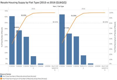
Resale Housing Supply by Flat Type (2015 vs 2016)
Resale Housing Supply by Town (2015 vs 2016)
Resale Housing Supply by Storey Range (2015 vs 2016)
Resale Housing Price Distribution (2015 vs 2016)

Resale Housing Price by Town (2015 vs 2016)
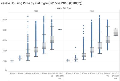
Resale Housing Price Flat Type (2015 vs 2016)


Infographics

Tools Utilised
Tool used: Tableau
Chart used:bar chart, Pareto chart, histogram, time series analysis and box-and-whisker plot
technologies used: Univariate analysis, Bivariate analysis, Time Series analysis
Result
In conclusion, from this project, our viewers can have whole picture about the Singapore public resale housing market from a wide range of point of view. The creation of infographic is based on the several most significant questions a resale housing a buyer would definitely counter in real life, which can impact hardly in their decision making in purchasing houses. From a series of charts and figure we presented in infographic, we transformed the raw data into a more straightforward way for viewers to easily understand and refer to in true life.
Key Finding:
- The 3 rooms flat is most common public resale houses in Singapore, while the 2 rooms and multi-generation houses are very rare in the market in both 2015 and 2016.
- The 2015 and 2016 resale housing supply in JURONG WEST are most sufficient, following by TAMPINES, while the supply are very low in BUKIT TIMAH.
- The 1 room flats can only be found in BUKIT MERAH.
- The is a negative correlation between storey range and housing supply, which means the higher the storey, the less housing supply.
- The most expensive flat appear in CENTRAL AREA, the median price drop from 2015 to 2016 in this area.
- The resale housing price are very volatile among BUKIT TIMAH, CENTRAL AREA and MARINA PARADE.
Feedback
Congratulation! The initial visuals prepared look very interesting.
Please kindly consider the comments I gave to your classmate in this page [1].