ISSS608 2016-17 T1 Assign1 Kanokkorn
Contents
ISSS608_2016-17_T1_Assign1_PRASONGTHANAKIT Kanokkorn (Lin)
Abstract
From the study of HDB resale in 2015 and early 2016. There are few takeaways per below:
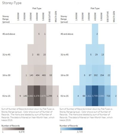
- 3 to 5 room flat comprised of more than 90% of overall flat resale market. The trend was similar in early 2016 and 2015 and this group offered wide range of flat storey in addition to had more units to offered.
- The share of town is more dispersed and did not followed 80/20 rule.
- The price of flat was positively skewed both in 2015 and early 2016. Central Area had highest mean but due to many flats transaction in Cantonment Rd. which was sold in higher price.
Problem and Motivation
Purchasing a room is a big decision which involves large amount of money and long-term commitment. Therefore, purchaser needs to consider information in all aspects before making purchase decision. This study aimed to provide the overview of public housing flat resale in 2015 and first-half of 2016.
Approaches
1. Data Acquiration
The first step to meet the goal was to acquire data. The data was found at Government database (https://data.gov.sg/dataset/resale-flat-prices). Concerned with the price in 2015 and 2016, we used the file named “Resale Flat Prices (Based on Registration Date), From March 2012 Onwards” which covered from March 2012 to June 2016 [as stated in the website].
2. Data Transformation
The data given was quite clean already when importing the text file to Tableau. There was only one transformation of ‘Month’/’Lease commence date’ to be data-time format instead of numeric / text. The transformation is to create calculated field by using ‘DATE’ function and text join (In Tableau, joining text uses ‘+’ instead of ‘&’ in excel). For example, we can transform month field using DATE(""+left([Month],4)+"-"+RIGHT([Month],2)+"-01").
3. Data Analysis
Only descriptive analysis techniques were used in this project.
Tools Utilised
Tableau
Only tableau is used as data analysis tool from data cleaning to output.
Result
The outcome is summarized in the infographic below (click to enlarge)
Note: The tone of color is blue / grey to convey meanings -In upper part of infographics, blue means 2016 and black means 2015. -In lower part of infographics, blue and grey in order to make it easier to see
Flat Type
In 2015, the most common flat type resold is 4-room. Followed by 3-room and 5-room. The trend was the same in 2015 and in the first-half of 2016. However, looking at Singapore average household size in 2015 was only 3.37 (http://www.singstat.gov.sg/statistics/latest-data). Does this mean that Singaporean are sharing flat with others?

Floor
When it comes to which floor the flat is located, with more supply from 3-room, 4-room, and 5-room flat, these group provides buyer choices of both high floor and lower floor units. Also, there are plenty of lower floor units from this group of units offered. The trend is similar in the first half of 2016 and 2015.
Flat Town
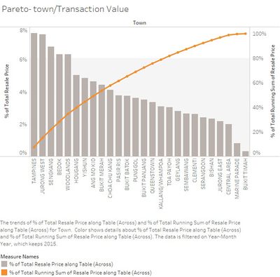
For the town of units in 2015 based on transaction value, 80% of the records came from top 32 towns (out of total 52 towns) the shares of township did not seem to follow ‘80/20 Pareto rule’.
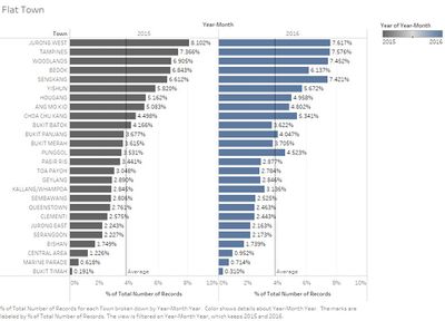
The distribution of the town showed the increase of flat sold shares in Sengkang, Choa Chu Kang, and Punggol.
Resale Price
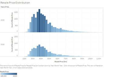
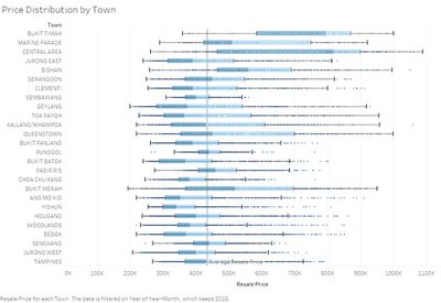
The distribution of resale price was positively-skewed for both 2015 and 2016. Looking at each of the town, some had wide spread such as Central Area and some had narrower spread such as Sembawang. Central Area was where the highest median of resale price located and had largest spread.
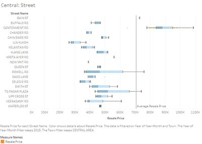
Central Area : Price Distribution from Streets
Drilling down the distribution of resale price from each street in central area, large amount of transaction from ‘Cantonment Road’ (which was resold at significantly higher than other areas) was the reason why the median of Central Area was high as well as the mean.
Feedback
Congratulation. The first iteration looks very good. You have created several very useful data visualisation. Please find below my two cents' worth for your considerations:
- When building a data visualisation, it is important for us to tell the truth using appropriate data. Do you think it is appropriate if I use 2015 whole year data compared to first half year data of 2016?
- Visual analytics is not beauty contest. It is nothing wrong to keep using similar visual representation as long as it is appropriate. By doing so, it also helps the user to focus on the interpretation.
- Use the discussion in Lesson 2 to ensure that the data visualisation created are conformed to the suggested best practices.
- Use the sample provided in Assignment 1 page as a reference to benchmark your analytical inforgraphic.
--Tskam (talk) 10:09, 28 August 2016 (SGT)
Thank you for the feedback. It's very helpful and I'll incorporate those in future assignments. I've edited some visuals in the final infographic to compare 2015 first-half with 2016 first-half.
--Kanokkornp.2016 (talk) 18:56, 29 August 2016 (SGT)

