Difference between revisions of "ISSS608 2016-17 T1 Assign2 Agrim Gairola"
Agrimg.2016 (talk | contribs) (Created page with "ISSS608 2016-17 T1 Assign1_Agrim Gairola =Abstract= <br/>The assignment involves study of data based on a survey conducted among the faculty of two Spanish Universities on...") |
Agrimg.2016 (talk | contribs) |
||
| (8 intermediate revisions by the same user not shown) | |||
| Line 17: | Line 17: | ||
=Data Preparation= | =Data Preparation= | ||
The following steps were carried out to prepare the data for effective analysis: | The following steps were carried out to prepare the data for effective analysis: | ||
| − | <br/><br/> | + | <br/> |
| + | <b>Data Manipulation</b>: A unique ID was given to each record for the ease of analysis.<br/> | ||
| + | <b>Data Type Conversion</B>: On importing the data into JMP, age and work experience was kept in continuous data type. All the remaining data was converted to nominal data type.<BR/> | ||
| + | <B>Missing data analysis</B>: Missing data analysis was performed on the data in order to identify the missing data and suitably recoding them.<br/> | ||
| + | [[File:1.jpg|500px|frameless|center]] | ||
| + | <B>Assumption</B>: There were several unambiguous values that could be noted throughout the data set. These values were recoded based on the below assumptions:<Br/> | ||
| + | [[File:2.jpg|200px|frameless|center]] | ||
| − | + | <I>All “?” values in survey items were taken as 2.5 such that it does not hamper the analysis while comparing the mean scores.</I> | |
| − | |||
| − | |||
| − | + | <B>Additional Columns for Categories</B>: Additional columns were created for each of the categories such that it represented the survey items under it. For e.g.: A new column was created for Quality which would have the mean of values in QU1,QU2,QU3,QU4,QU5 thus representing the overall score for quality for the ease of analysis.<br/> | |
| − | + | [[File:Ag4.jpg|400px|frameless|center]]<br/> | |
| − | [[File: | ||
| − | + | =Demographics= | |
| − | |||
| − | |||
| − | |||
<br/> | <br/> | ||
| + | In order to understand the data set accurately, let us first analyse the demographics. <br/> | ||
| − | + | <b>Treemap</B>: Below is a screenshot along with the link to the video of a treemap with several different hierarchies. This treemap accurately shows the demographics of the data in one look.<br/> | |
| − | + | https://www.youtube.com/watch?v=BnRFP_Xuwvg&feature=youtu.be | |
| − | + | [[File:Ag5.jpg|800px|frameless|center]] <br/> | |
| − | + | ||
| + | <b>Distribution</b>: On analysis of the distribution of the data, the following interesting patterns can be seen regarding the demographics of the participants:<br/> | ||
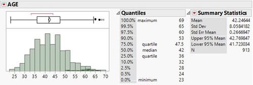
| + | Age: Most participants (80%) who took part in the survey were between the age 32-53<br/> | ||
| + | [[File:Ag6.jpg|500px|frameless|center]] | ||
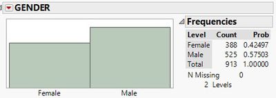
| + | Gender: The survey comprised of 58% males and 42% females.<br/> | ||
| + | [[File:Ag7.jpg|400px|frameless|center]] | ||
| + | Experience: 50% participants have over 4-15 Years of experience. This shows that the data set has a wide range of experience among participants<br/> | ||
| + | [[File:Ag8.jpg|400px|frameless|center]] | ||
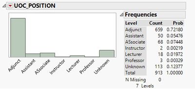
| + | UOC Position:It is interesting to note that almost 72% of the faculty is adjunct staff.</br> | ||
| + | [[File:Ag9.jpg|400px|frameless|center]] | ||
| + | Domain: For 39.5% of the participants domain mentioned as 6 which has been assumed as “others”. A large number of participants belong to Arts and Humanities and Science. | ||
| + | [[File:Ag10.jpg|400px|frameless|center]] | ||
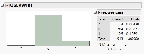
| + | Registered User: Another interesting thing to note is that majority of users of Wikipedia are unregistered. | ||
| + | [[File:Ag11.jpg|500px|frameless|center]] | ||
| + | |||
| + | =Exploration and Analysis= | ||
<br/> | <br/> | ||
| − | + | Lets try to answer the following questions from the data sets using visual analytics techniques<br/> | |
| − | + | <b>Q1: Which is the best rated and worst rated survey Item? </B> <br/> | |
| − | + | To answer the above question, we plot a bar graph between the survey categories and their mean score. We notice that Sharing attitude has obtained the highest mean score while use behavior has been scored the least. From this we can infer that the general perception of the survey participants is that Wikipedia is an excellent platform for sharing information due to its open platform, availability of academic journals and online collaborative material. On the other hand, the use behavior has been rated poorly since apparently the participants are not using it to create teaching material or develop educational activities.<br/> | |
| − | [[File: | + | [[File:Ag12.jpg|800px|frameless|center]]<br/> |
| − | + | <b>Q2 How have the question under category Sharing Attitude been rated?</B> <br/> | |
| + | We can arrive onto the answer to the above question by deepdiving into the category of Sharing Attitude. For this, we analyse SA1,SA2,Sa3 and plot them as shown below.<br/> | ||
| + | [[File:Ag13.jpg|800px|frameless|center]] <br/> | ||
| − | [[File: | + | On inspecting the outlier, we notice that it is represents the rating of just 1 person (ID 40) and hence can be ignored as the opinion of one person could be biased and cannot be taken as a general trend. Hence it would be safe to say that the general perception is that Wikipedia is an excellent source for Sharing. |
| + | [[File:Ag14.jpg|500px|frameless|center]] <br/> | ||
| − | |||
| − | + | <B>Q3 Is there a difference in the perception of registered Users and unregistered users?</B> <br/> | |
| + | The below line plot compared the rating by Registered Wiki users and unregistered wiki users indicating that there is a clear difference in the opinion between registered and unregistered users specially for the categories of Behavioural, Intention, Experience, Profile 2.0, Use Behaviour and Visibility.<br/> | ||
| + | [[File:Ag15.jpg|500px|frameless|center]]<br/> | ||
=Results= | =Results= | ||
From the above graphs, the following conclusions can be made:<br/> | From the above graphs, the following conclusions can be made:<br/> | ||
| − | * | + | *Sharing Attitude is the best rated category of the question where as Use behaviour is the most poorly rated category.<br/> |
| − | * | + | *It can be seen instructors and associate who do not have a PHD have scored a 5 for SA1,SA2 and SA3 indicating that the Non-PhD Instructors and associate professors use Wikipedia to publish, share and collaborate with other members of the group <br/> |
| − | * | + | *Majority of the participants of the Survey are unregistered members. This could lead to inaccuate reviews on the survey as unregistered users might not be aware of the full use of Wikipedia<br/> |
| + | *There is apparent disparity between opinions of the registered and unregistered users in various categories of questions.<br/> | ||
<br/> | <br/> | ||
| − | |||
| − | |||
| − | |||
| − | |||
| − | |||
| − | |||
| − | |||
| − | + | =Interactive File= | |
| − | + | https://public.tableau.com/profile/publish/ASsignment2/Dashboard1#!/publish-confirm | |
| − | |||
| − | |||
| − | |||
| − | |||
| − | |||
| − | |||
| − | |||
| − | |||
| − | |||
Latest revision as of 18:11, 26 September 2016
ISSS608 2016-17 T1 Assign1_Agrim Gairola
Contents
Abstract
The assignment involves study of data based on a survey conducted among the faculty of two Spanish Universities on various aspects of Wikipedia. A set of 44 questions were asked from 913 members of the University on 13 different subjects of perception. The task at hand is to identify interesting patterns revealed in the survey regarding the perception of Wikipedia
Motivation
The assignment would enable us to gather interesting insights and patterns into the perception of people on Wikipedia based on its use, image, ease and several other factors.
Tools Used
- Tableau version 10.0
- JMP Pro
- Treemaps HCI
- Microsoft Office
Data Preparation
The following steps were carried out to prepare the data for effective analysis:
Data Manipulation: A unique ID was given to each record for the ease of analysis.
Data Type Conversion: On importing the data into JMP, age and work experience was kept in continuous data type. All the remaining data was converted to nominal data type.
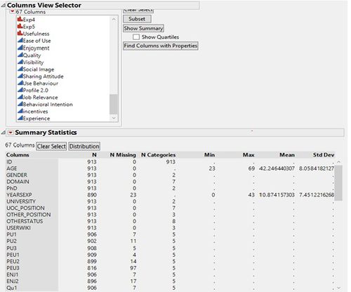
Missing data analysis: Missing data analysis was performed on the data in order to identify the missing data and suitably recoding them.
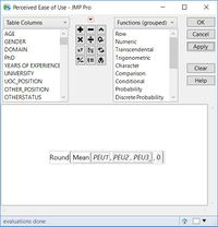
Assumption: There were several unambiguous values that could be noted throughout the data set. These values were recoded based on the below assumptions:
All “?” values in survey items were taken as 2.5 such that it does not hamper the analysis while comparing the mean scores.
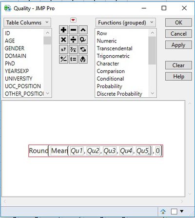
Additional Columns for Categories: Additional columns were created for each of the categories such that it represented the survey items under it. For e.g.: A new column was created for Quality which would have the mean of values in QU1,QU2,QU3,QU4,QU5 thus representing the overall score for quality for the ease of analysis.
Demographics
In order to understand the data set accurately, let us first analyse the demographics.
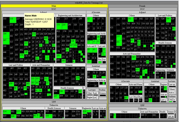
Treemap: Below is a screenshot along with the link to the video of a treemap with several different hierarchies. This treemap accurately shows the demographics of the data in one look.
https://www.youtube.com/watch?v=BnRFP_Xuwvg&feature=youtu.be
Distribution: On analysis of the distribution of the data, the following interesting patterns can be seen regarding the demographics of the participants:
Age: Most participants (80%) who took part in the survey were between the age 32-53
Gender: The survey comprised of 58% males and 42% females.
Experience: 50% participants have over 4-15 Years of experience. This shows that the data set has a wide range of experience among participants
UOC Position:It is interesting to note that almost 72% of the faculty is adjunct staff.
Domain: For 39.5% of the participants domain mentioned as 6 which has been assumed as “others”. A large number of participants belong to Arts and Humanities and Science.
Registered User: Another interesting thing to note is that majority of users of Wikipedia are unregistered.
Exploration and Analysis
Lets try to answer the following questions from the data sets using visual analytics techniques
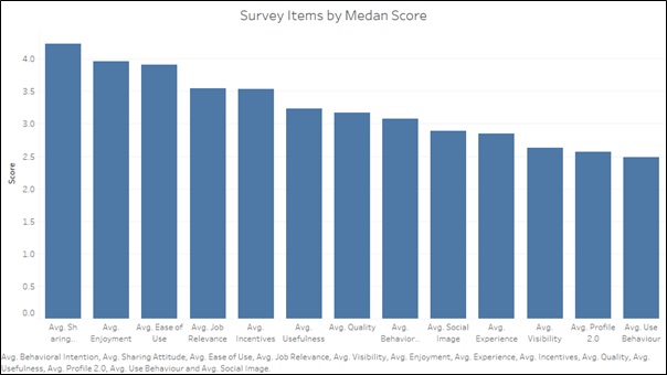
Q1: Which is the best rated and worst rated survey Item?
To answer the above question, we plot a bar graph between the survey categories and their mean score. We notice that Sharing attitude has obtained the highest mean score while use behavior has been scored the least. From this we can infer that the general perception of the survey participants is that Wikipedia is an excellent platform for sharing information due to its open platform, availability of academic journals and online collaborative material. On the other hand, the use behavior has been rated poorly since apparently the participants are not using it to create teaching material or develop educational activities.
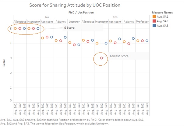
Q2 How have the question under category Sharing Attitude been rated?
We can arrive onto the answer to the above question by deepdiving into the category of Sharing Attitude. For this, we analyse SA1,SA2,Sa3 and plot them as shown below.
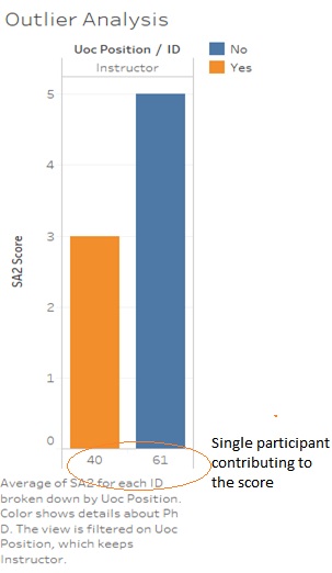
On inspecting the outlier, we notice that it is represents the rating of just 1 person (ID 40) and hence can be ignored as the opinion of one person could be biased and cannot be taken as a general trend. Hence it would be safe to say that the general perception is that Wikipedia is an excellent source for Sharing.
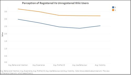
Q3 Is there a difference in the perception of registered Users and unregistered users?
The below line plot compared the rating by Registered Wiki users and unregistered wiki users indicating that there is a clear difference in the opinion between registered and unregistered users specially for the categories of Behavioural, Intention, Experience, Profile 2.0, Use Behaviour and Visibility.
Results
From the above graphs, the following conclusions can be made:
- Sharing Attitude is the best rated category of the question where as Use behaviour is the most poorly rated category.
- It can be seen instructors and associate who do not have a PHD have scored a 5 for SA1,SA2 and SA3 indicating that the Non-PhD Instructors and associate professors use Wikipedia to publish, share and collaborate with other members of the group
- Majority of the participants of the Survey are unregistered members. This could lead to inaccuate reviews on the survey as unregistered users might not be aware of the full use of Wikipedia
- There is apparent disparity between opinions of the registered and unregistered users in various categories of questions.
Interactive File
https://public.tableau.com/profile/publish/ASsignment2/Dashboard1#!/publish-confirm
