Talk:Lesson06
Slopegraphs in Tableau
This week's introduction to new chart types for visualising time series data has been an eye opener. Doing the hands-on exercise on slopegraphs using Tableau did create some interesting observations and questions.
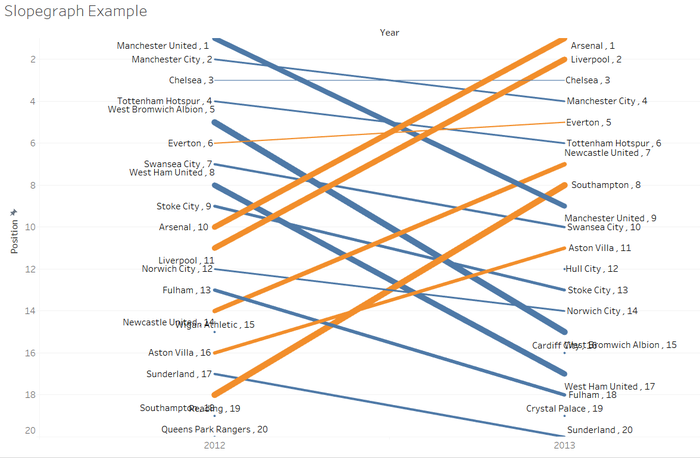
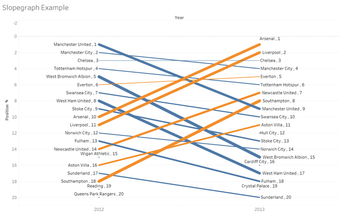
In the slopegraph below, I am comparing the English Premier Positions of Clubs across 2 seasons. I attempted to set the axis to a fixed range from 1 to 20 (representing 20 clubs), however Tableau seems to cut off the top and bottom of the axis. In addition, labels overlap are not resolved properly.
Attempting to "zoom out" in Tableau introduces another interesting observation - the axis does not stick to what you have fixed, and it is auto adjusted based on how much you zoomed out.
Appreciate any best practices or tips on the above observations of formatting axis and labels for slopegraphs in Tableau. In the meantime, I'm going to experiment more :)
Yongjian.2015 (talk) 14:23, 19 September 2016 (SGT) Chia Yong Jian

