Question 2
|
|
|
|
|
|
Describe up to 10 communications patterns in the data. Characterize who is communicating, with whom, when and where. If you have more than 10 patterns to report, please prioritize those patterns that are most likely to relate to the crime. Note: Please limit your response to no more than 10 images and 1000 words.
Answer:
From ID perspective:
1. Overview of the network: division of two types of visitors.
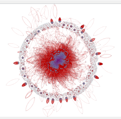
This graph is plotted using Hu Yifan layout in Gephi. The size of the nodes represents the total degree of an ID, and the colour of the nodes represents the out-degree of an ID. “External” is not included in this diagram, as it is not a single entity but rather the combination of many external entities. Including “External” will cause confusion in terms of betweenness analysis.
From this layout, we recognise that there is a central core and an outer circle. The central core expands from the very centre of the graph. The nodes at the very centre are closely located and have darker colour. Further and further from the centre, the nodes become more and more scattered and lighter and lighter in colour. The outer circle is mainly made up of isolated groups and individuals who are not connected with the nodes at the centre.
2. High degree usually means high out-degree.
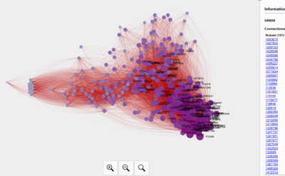
This is a zoomed-in picture of the network connection, selecting ID 549850. From this graph, we can see that a larger node tends to have darker colour, which means a larger total degree implies high out-degree. (However, if external appears as a node on the graph, it will show up as a very large node at the centre but with the lightest colour, because it has no out-degree). Hence, we can deduce that the communication among visitors in the theme park is fairly balanced. The numbers of messages sent and received by an ID do not differ much relatively.
From type of ID perspective:
3. The central chunk with 3265 nodes, each with more than 50 mutual connections.
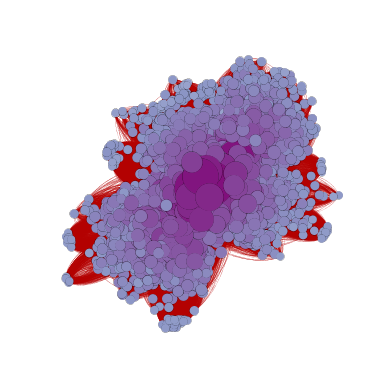
Picture 3 shows the central chunk in the Hu Yifan layout. From this graph we can see these 3265 nodes are extremely tightly connected. This group represents the hyper active communicators in the park. They appear to be in multiple groups and send many group messages, thus having large number of edges and high degrees.
4. The middle central group and the heavily communicated isolated groups.
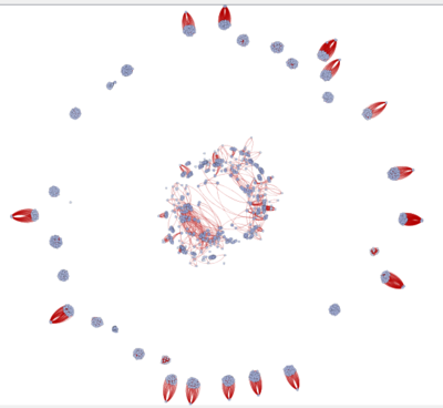
There are 1738 nodes in this group, each with 10 to 49 mutual connections. The middle group nodes act as bridges between the mass messengers at the centre and more scattered nodes, which will be shown in the next graph. They should be the visitors who are in one of the groups but also contact friends or families who are not in any group.
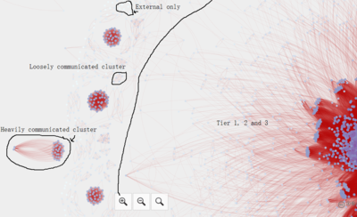
At the outer circle we can spot the small isolated clusters which heavily communicate within themselves. These should be individual groups who contacts one another very often but none of them joined any group. Arguably, these groups are the most suspicious for crime, but further investigations are needed.
5. Scattered points at the centre and the small clusters at the outer circle.
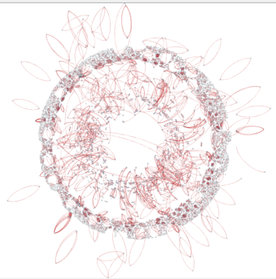
There are 4443 nodes in this group, each with 0 to 9 mutual degrees. The scattered ones at the centre are connected by the middle group to the core nodes, which means they do not talk to the core IDs but they have contacts who talk to the core IDs. The small clusters/pairs at the outer circle are likely to be families or friends who move together, hence they do not need messages very often. White colour ones at the outer range only communicated with external but no internal IDs.
This image further elaborates the groups mentioned in Pattern 4 and 5:
6. Betweenness distribution is different from degrees distribution.
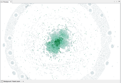
In this diagram, the colour represents betweenness, which means appearing on the shortest paths between two nodes (excluding external). The darker the colour, the higher the betweenness of the node. The outer circle nodes have extremely low betweenness. Surprisingly, many dark colour nodes are the scattered nodes further from the centre rather than the core nodes at the centre. This can be due to the fact that the visitors at the park are quite divided, so the nodes who are connected to both groups play a more important role overall in connecting all the IDs in the park.
From messaging perspective:
7. Messages tend to be group messages.

In this diagram, we can see that the time difference between messages sent by the same ID are mostly 0. This means the messages are mostly group messages rather than individual conversational messages. Hence, we can deduce that big groups are the most active users of the messaging function in the app.
For Pattern 8, 9 ,10:
8. In general, more messages are sent in Wet Land.
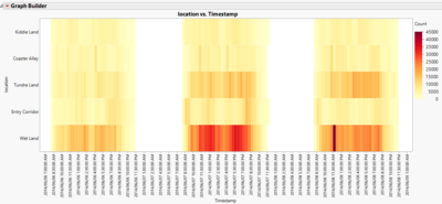
From the heatmap, we can see on all three days, Wet Land has a darker colour than the other four areas. This could be because people text a lot when they are at the Creighton Pavilion for the Scott event, or they are resting on the green area and text their companions. Also, since people cannot walk very fast when they text, we can deduce that people move the most slowly in Wet Land.
9. More messages sent in Wet Land appears with more messages sent in Tundra Land on Saturday and Sunday.
From the same heatmap, we can see that darker colour in Wet Land appears together with darker colour in Tundra Land. This hints that most of the people go to Wet Land via Tundra Land, perhaps because there are many Everyone Rides who are suitable for all visitors. For crowd management, the park should pay attention to Tundra Land in addition to Wet Land.
10. On Friday and Saturday there were two bi-modal patterns at the Wet Land as well as overall number of messages.
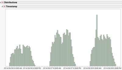
These surges in messages as shown in both the heatmap and the distribution happen mostly during the lunch and dinner time. Between 2 to 4, when the Scott event is happening, there were fewer text messages sent. Hence we can conclude that people tend to text during meal times and during the event they do not text as much.