ISSS608 2016 17 T1 Project Team 1 Report
|
|
|
|
|
Contents
Motivation
As students trained in Visual Analytics, we have volunteered to help them provide user-friendly and informative visualizations to cater to its users by utilizing visualizations tools and tapping on our knowledge gained from school, work, independent learning and by referencing reputable resources in the analytics industry.
The game industry data has attracted gamers such as ourselves to to apply insightful visualization techniques in order to have a better understanding about the gaming industry. It provides a sense of fulfillment whenever a new discovery is made. (e.g. Nintendo’s Wii was a one-hit wonder in the period of 06-09. Presently, it no longer generates any revenue). As both gamers and data analysts we feel a mix of emotions ranging from sadness to happiness. Sadness knowing that gamers such as ourselves have caused this and also what we used to play no longer exists (Wii Sports, Wii Boxing, Wii Tennis) and at the same time we feel a sense of happiness coming from the discoveries made.
We would like to empower users to be able to use our visualizations tools and experience what we have in a fun an interactive manner which presently does not exist. The power of knowing and understanding beats any other feeling in the world. Our aim is to give you this intangible form of satisfaction.
Present Visualizations: Vgchartz
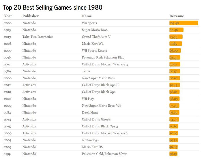
The present visualizations which can be found on Vgchartz, are not as user friendly and interactive as many end-users would have hoped for.
A static visualization on the top performing Platforms by Region An interactive visualization on the top performing Platforms by Region and Year
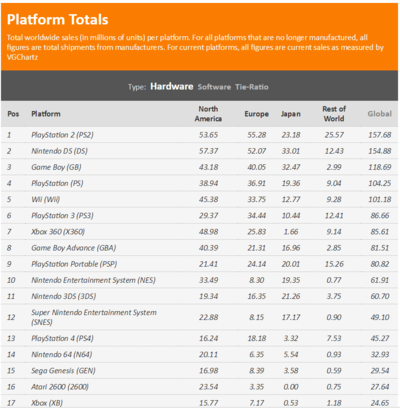
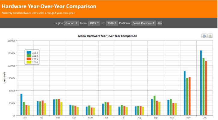
These graphs are visually pleasing but have limited interactivity. A user may want to see how a platform is performing and see which games are the top performer, however, they are limited by the "interactive-ness" of changing the year and region. They are also not intuitive and easy to decipher.
Design Methodology
At the beginning of our project, we discussed a lot about our application framework. At last we decided to use the object-oriented framework for our application.
Object-oriented (OO) application frameworks are a promising technology for reifying proven software designs and implementations to reduce the cost and improve the quality of software. A framework is a reusable, “semi-complete” application that can be specialized to produce custom applications. And the three features of object-oriented framework are:
Modularity -- Frameworks enhance modularity by encapsulating volatile implementation details behind stable interfaces. Framework modularity helps improve software quality by localizing the impact of design and implementation changes. This localization reduces the effort required to understand and maintain existing software.
Reusability -- The stable interfaces provided by frameworks enhance reusability by defining generic components that can be reapplied to create new applications. Framework reusability leverages the domain knowledge and prior effort of experienced developers to avoid re-creating and re-validating common solutions to recurring application requirements and software design challenges. Reuse of framework components can yield substantial improvements in programmer productivity, as well as enhance the quality, performance, reliability, and interoperability of software.
Extensibility -- A framework enhances extensibility by providing explicit hook methods that allow applications to extend its stable interfaces. Hook methods systematically decouple the stable interfaces and behaviours of an application domain from the variations required by instantiations of an application in a context. Framework extensibility is essential to ensure timely customization of new application services and features.
Inversion of control -- The run-time architecture of a framework is characterized by an “inversion of control”. This architecture enables authorized application processing steps to be customized by event handler objects that are invoked via the framework's reactive dispatching mechanism. When events occur, the framework's dispatcher reacts by invoking hook methods on pre-registered handler objects, which perform application-specific processing on the events. Inversion of control allows the framework (rather than each application) to determine which set of application-specific methods to invoke in response to external events (such as window messages arriving from end-users or packets arriving on communication ports).
Based on the theory, here’s our application framework:
At the home page, you can find the information about our team as well as the method to contact us.
Besides these two pages, we have 5 main features which can be accessed easily as navigation is predictive due to the website layout. The five main features are:
- Dashboard – To display video game sales data in a fun and interactive manner. A unique visualization to help you view data from a different perspective!
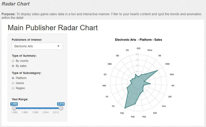
- Radar Chart – To display video game sales data in a fun and interactive manner. Filter to your hearts content and spot the trends and anomalies within the data!
- Data Maps – To display video game sales data in a fun and interactive manner. Search by type of genre and see the results!
- Multi Visualization – To display video game sales data in a fun and interactive manner. Various cool visualizations!
- Data Table – To display video game sales data, sort, search and examine!
Demonstration
Here is overview of our application.Users can select what they want to know, and there are links to the branch of analytics.
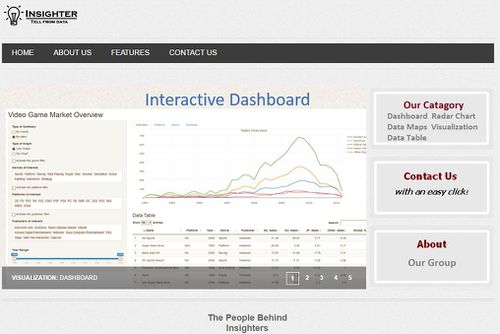
There are five features in our application.
- Interactive dashboard
Here shows the sales overview dashboard, users can easily see and compare sales of different video games. In addition, it is interactive, in other words, users can filter the data by themselves, they can add or drop filter conditions as their requrie.
- Data Table
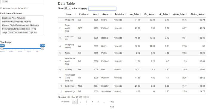
If users want to see the details of the data, they can use the data table feature as above. Users can do the filters such as years and publishers as well, in addition, it can provide the search function so that users can find their target more quickly.
- Radar Chart
The Radar chart can allow users easily compare their interesting video games' situation of sales or the number of publishers' work in different platform. For example, this screenshot shows how EA publishes its work in different platform.
- Data map
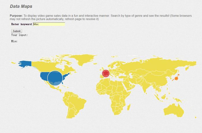
Users can use the search feature to search their interesting keywords, for example, in the sample datamap, searching Misc genre and then get the Misc genre revenue distribution by rigonals. The size of circle means the scale of revenue.
- Various Visualizations
Here are various visualizations show the video game sales.
Discussion
What has the audience learned from your work?
- The US is the biggest video games market.
- The video game sale shows an increasing trend since 1995, when computer started to be used by people all over the world, and reach the peak at 2008. Then a decreasing trend is observed till now.
- Using the radar chart, we can find that the when sort by company-platform-sale, Sony only has video games on few platform but have good performance in all the platforms. To the contrary,
What new insights or practices has your system enabled?
Our system is able to give the insights that have not been noticed by people before as we apply various forms of data visualization within a single view. This innovative form of visualizations enables users to easily compare across multi-platforms, company, year and etc.
Another perspective of looking at it, is at our system; it user friendly, well-organized and helps you to achieve your goal of gaining insightful information. Our system is interactive and allows user-customization based on the users needs. For example, we have placed the data table within the dash board in a single view, with the objective of letting users have the flexibility to view the data in a graphical form and also view the details of the data if required. In this manner, users are able not only see what happened, but why it happened.
Future Work
- Allow users to upload their dataset and use our visualization tools to assist them in helping them explore the data in a fun and interactive environment while gaining new insights.
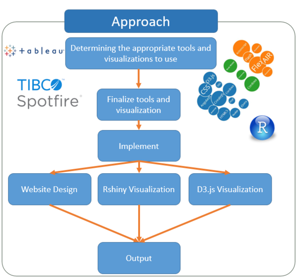
- Utilize more visualizations techniques through RShiny, Javascript and other available tools.
- Improve interactivity by using D3.js to rebuild the main layout design instead of using Rshiny control bar to realize all the interactivity.
- Improve on the web layout (all web design was learnt via w3schools).
Installation Guide
To view online:
Upload all files into encased within the .zip file provided. You are good to go!
Disclaimer: Rshiny requires users to have internet access in order to view the visualizations.
(However, we have included all visualizations in the RShiny script folder should you not have access to the internet/RServers)
User Guide
The website is user-friendly and best viewed on Mozilla Firefox for the optimum experience. Works well on both Desktop and Mobile.
Please access our link at:
https://rawgit.com/christhng/vaproject/master/index.html
Video Game Market Overview
This section of our design is to let you have the ability to explore the data by yourself. Although we only built few graph type inside, you still can find plenty of information by leveraging our powerful control bar designed by Rshiny.
Control Bar
You can do the following things with the help of the control bar:
1. Choose the type of summary which will be shown in the right graph panel.
"By counts" means summary is done by counting how many games.
"By sales" means summary is done by summing up the global sales of the games.
2. Choose the type of graph which can let you switch the layout between line graph and pie chart.
P.S.: When "Pie Chart" and "By counts" are selected, the pie chart is replaced by its line graph because it is not available to show a pie chart here.
3. Leverage the Filters of the data set if interested.
For Genre only, all the 12 genres are listed. For Platform and Publisher, there are too many lines or pieces of pie in the visualization part if not using filter.
So our default settings for the right visualization tabsetpanel when Platform, Genre or Publisher is activated(in the right visualization part, not in the control bar) is what you have seen in the left control bar: only the main categories are included, no matter the filter is activated or not.
Kindly Reminder: Do remember to activate the filters you want by ticking the check boxes above the filter input windows. Otherwise the filter won't work!
4. Select the year range you like
By moving the year range bar, the user will can notice the movement of the industry and find very interesting stuff.
Visualization Panel
Because we design this part by leveraging R package Ployly, you can find some useful built-in functions of Plotly when hanging your mouse over the section.
The useful functions are:
- Zoom -- Pan, Zoom in, Zoom out, Reset.
- Two types to show data on hover.
- Cancel or add in the line or piece of pie you want or do not want by clicking the respective legend.
Data Table
The data table is to let users have direct feeling of the data, the games. Due to the top ranked games are very familiar to us, it is very good to show the data directly to our users who are gamers and eager to see those well-know games. And the data table is linked with the control bar, which means once the data is filtered, the data table will tell what games are in usage.
We design this part by using R package DT. Just like Plotly, DT also has some fantastic built-in functions. Those are:
- Searching
- Sorting data in ascending or descending order.
- Page view.
Data Map
Datamap features can allow users search their interesting keywords(Video game's name or genre). When users input their keywords and then click the submit button, then they can get the datamap based on the keywords.
Main Publisher Radar Chart
This section of our design is to explore the features of different main publishers such as Sony, Nintendo and EA. you can also leverage our powerful control bar designed by Rshiny to check the area of your interest.
You can do the following things with the help of the control bar:
0. Select the Publisher you want to explore.
Of course, this is the first step.
1. Choose the type of summary which will be shown in the right graph panel.
"By counts" means summary is done by counting how many games.
"By sales" means summary is done by summing up the global sales of the games.
2. Choose the area of your interest: Genre? Sale Regions? Platforms?
3. Select the year range you like
By moving the year range bar, the user will can notice the movement of the industry and find very interesting stuff.
P.S.: The pie chart won't show up if "By counts" and "Region" are selected at the same time. The reason is the same as the exception in the Video Game Market Overview.
References
w3schools.com - Website Design & Functionality
Vgchartz.com - Comparison Model
Kaggle.com - Data visualization references
shiny.rstudio.com - Rshiny tutorials and hosting services
Github.com - Data repository
Rawgit.com - Web hosting service
leanpub.com/d3noob - d3.js references
bl.ocks.org/d3noob - d3.js references

