ISSS608 2016 17T1 Group8 Report
|
|
|
|
|
Contents
Motivation
Zika virus was first discovered in 1947 and is named after the Zika Forest in Uganda. In 1952, the first human cases of Zika were detected and since then, outbreaks of Zika have been reported in tropical Africa, Southeast Asia, and the Pacific Islands. Zika outbreaks have probably occurred in many locations. Before 2007, at least 14 cases of Zika had been documented, although other cases were likely to have occurred and were not reported. Because the symptoms of Zika are similar to those of many other diseases, many cases may not have been recognized.
In Singapore, the first case was found in August 2016. Within 2 months, there are more than 400 cases identified locally. In this project, we will exam the spread pattern of the Zika virus, all over the world, to check out whether there is any correlation between the weather or geolocation and the spread of this virus leveraging data visualization. After that, we would also dig deeper in terms of the local cases in Singapore to figure out how can we take some appropriate action to prevent the spread of Zika in Singapore.
Dataset
- Global Zika Cases Dataset
- https://www.kaggle.com/cdc/zika-virus-epidemic
- This dataset shares publicly available data related to the ongoing Zika epidemic. It is being provided as a resource to the scientific community engaged in the public health response
- The dataset includes the following fields:
- report_date - The report date is the date that the report was published. The date should be specified in standard ISO format (YYYY-MM-DD).
- location - A location is specified for each observation following the specific names specified in the country place name database. This may be any place with a 'location_type' as listed below, e.g. city, state, country, etc. It should be specified at up to three hierarchical levels in the following format: [country]-[state/province]-[county/municipality/city], always beginning with the country name. If the data is for a particular city, e.g. Salvador, it should be specified: Brazil-Bahia-Salvador.
- location_type - A location code is included indicating: city, district, municipality, county, state, province, or country. If there is need for an additional 'location_type', open an Issue to create a new 'location_type'.
- data_field - The data field is a short description of what data is represented in the row and is related to a specific definition defined by the report from which it comes.
- data_field_code - This code is defined in the country data guide. It includes a two letter country code (ISO-3166 alpha-2, list), followed by a 4-digit number corresponding to a specific report type and data type.
- time_period - Optional. If the data pertains to a specific period of time, for example an epidemiological week, that number should be indicated here and the type of time period in the 'time_period_type', otherwise it should be NA.
- time_period_type - Required only if 'time_period' is specified. Types will also be specified in the country data guide. Otherwise should be NA.
- value - The observation indicated for the specific 'report_date', 'location', 'data_field' and when appropriate, 'time_period'.
- unit - The unit of measurement for the 'data_field'. This should conform to the 'data_field' unit options as described in the country-specific data guide.
- https://www.cdc.gov/zika/geo/index.html
- Singapore Zika Cases Dataset
- There are limited information on Singapore Zika cases. National Environment Agency (NEA) has published Media Releases and Updates regarding the local cases from Aug when the first case was annoucned. But there is no update on the exact location of the new cases found after Sep. In order to better visualize the spreading of the virus geographically, we only extract the data with location information from Aug to Sep which consists of about total 400 Zika cases. This dataset includes following attributes:
- date - the date when the Zika case was reported
- location - where the Zika case was found
- Besides the data we found in NEA, the report filed in The Straits Times also provide us some details of these cases.
- There are limited information on Singapore Zika cases. National Environment Agency (NEA) has published Media Releases and Updates regarding the local cases from Aug when the first case was annoucned. But there is no update on the exact location of the new cases found after Sep. In order to better visualize the spreading of the virus geographically, we only extract the data with location information from Aug to Sep which consists of about total 400 Zika cases. This dataset includes following attributes:
Design Framework
Filled Map
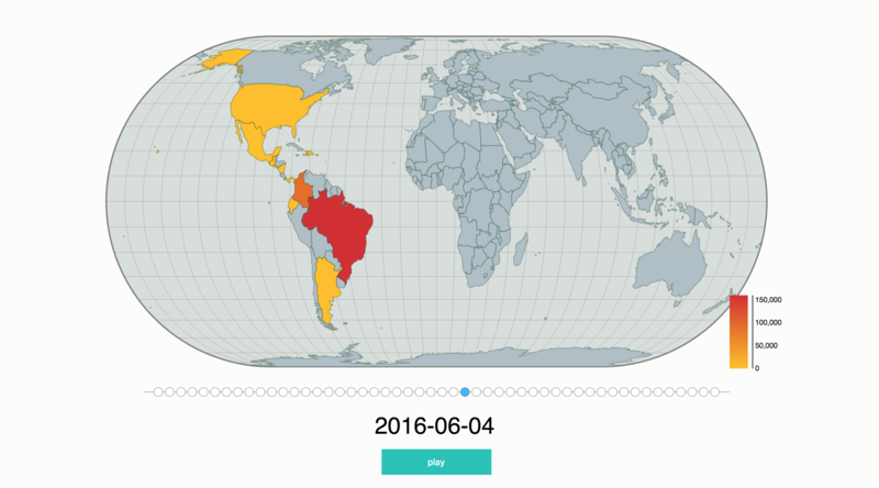
Using map can easily and intuitive show the geolocation information of the data. In the meanwhile, the filled map also can show the intensity of infection by colouring or shading the cumulative value of cases in different area. Since the Zika virus data is related to different country, we use filled map.
In this case, the redder the colour is, the more infection cases have, the heavier the intensity is. We can find from the map “the most countries where the virus is actively spreading are in South and Centre America.” We can easily find that the epi-centre of the Zika outbreak is in Brazil. Our map also has a function of filter the date, which can provide the user an option to choose the time period as they want.
Use guide:
- Click play, the map will automatically show the situation of infection. Then you can pause by pressing the stop button at any point of time you want.
- You also can choose the date directly by clicking the circle point below the map.
- You also can put your mouse on different area to look the number of the cases in particular time.
Line Graph
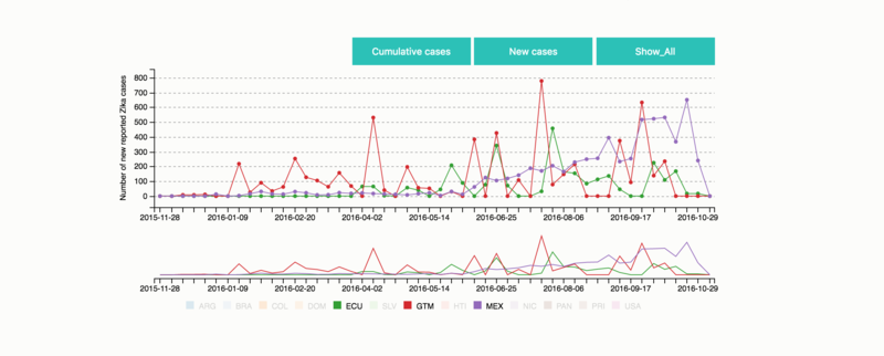
The line Graph which displays information as a series of data points called 'markers' connected by straight line segments. In the meanwhile, the line graph also can show the trend of the data. Since we want to see the cumulative data and new cases of different country in separate, we use the line graph.
In this case, the line chart shown the number of the cumulative cases and the number of new cases in different country. We can find that Brazil has a large increasing number on 23 April 2016. The new cases of other countries keep steadily all the time. By the end of October 2016, more than 16000 cases of Zika virus had been found in Brazil, which is the largest affect area. In the meanwhile, the number of infected person in Colombia also had an increasing trend.
Use guide:
- There are three nodes above the chart, “cumulative cases”, “new cases” and “hide/show all” respectively. You can choose to see cumulative cases or new cases by clicking the first two buttons.
- You also can click the legend below the chart to hide the line of the country you do not want to see. Or you can click “hide_all” (all line will disappear) then click the legend below the chart to choose the particular country you want to see.
- If you click “show_all”, all line will appear.
- You also can scroll you mouse to see the data in particular time period.
- When your mouse is on any marker of the chart, you can see the specific value of each country.
Scatter plot
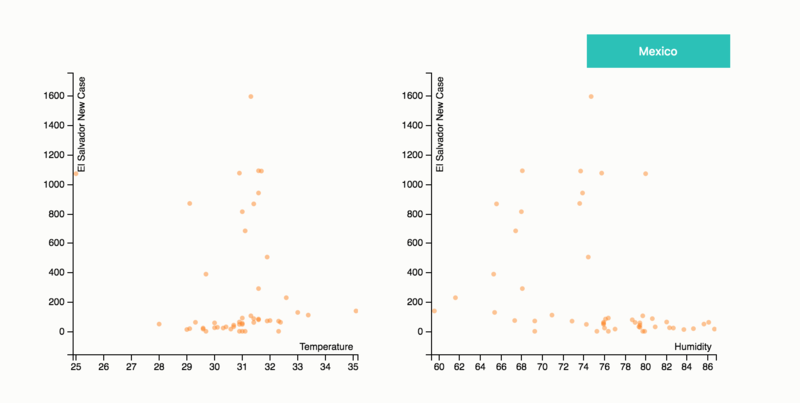
Scatter plot is a type of plot or mathematical diagram using Cartesian coordinates to display values for typically two variables for a set of data. Since we want to see the correlation between temperature/humidity and the spread of Zika virus of different area, we use scatter plot to show the relationship.
In this case, we just use the data of two different countries. The horizontal axis represented the temperature/humidity and the vertical axis represented the new cases. We can see that there is a positive relationship between temperature/humidity and the spread of Zika virus in El Salvador and Mexico.
Use guide:
- You can click the button above the scatter plot to change the country.
Singapore Map
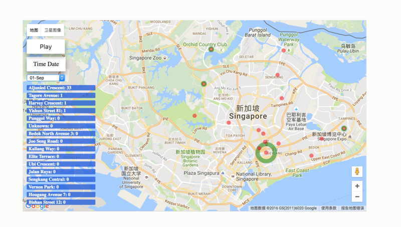
Our Singapore map is based on google map which offers satellite imagery and street maps service. Since we want to know the outbreak of Zika virus in different area of Singapore, we use map.
In this case, the map shown the details and locations of the Zika cases confirmed by the Ministry of Health between Aug 27 and Sept 22. We use red point to represent the location where the Zika virus has already out broken. We use green circle to represent the scale of the outbreak of Zika virus in different area.
Use guide:
- Click play, the map will automatically show the situation of infection. Then you can pause by pressing the stop button at any point of time you want.
- When you play it, you will not only see the changing of data point, you will also see the data table sorted by descending.
- You also can choose the date directly.
- When you mouse is on the data point, you will see that location will be highlighted on the data table.
Bar chart
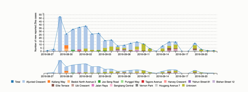
Bar chart can present grouped data with rectangular bars with lengths proportional to the values that they represent. With bar chart we can see proportion of different area, also can see the total value.
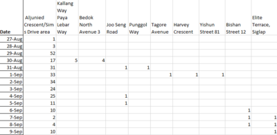
In this case, we can see that Singapore's first and largest Zika cluster was in the Aljunied area and had nearly 300 cases. Just four days after the first locally transmitted case emerged in Singapore, it appears that the virus has quietly spread. The outbreak potentially spread to other clusters Kallang and Bedok North, Joo Seng Road and Punggol also find themselves on Singapore's Zika map.
Use guide:
- When your mouse is on any bar of the chart, you can see the specific value of each area of Singapore.
- You also can scroll you mouse to see the data in particular time period.
- You also can click the legend below the chart to choose which area you want hide or show on the graph.
Leaflet Map
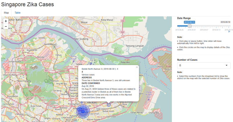
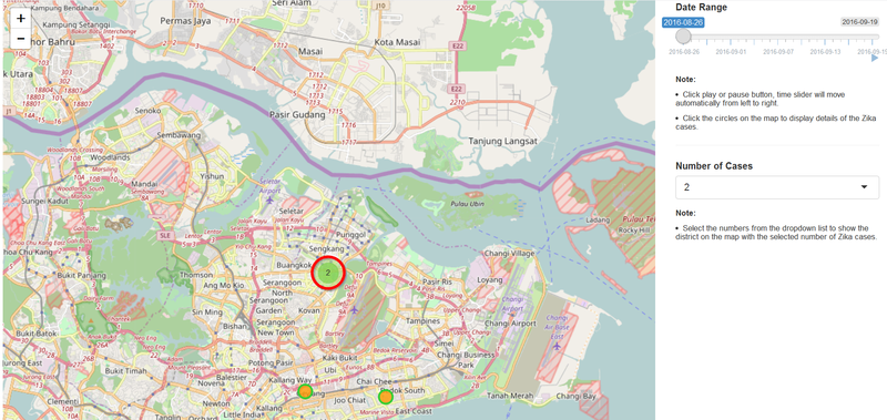
Leaflet map allows us to create interactive web map. Using the Singapore Zika case dataset, we show the time frame in a slider bar. When the slider bar plays, users can easily see how Zika virus spreads in different districts. Size of the circles indicates the number of cases reported for each day, the bigger the size, the more cases found. Furthermore, users can click on the circles to show details of the Zika case reported.
It's possible to filter districts based on the number of Zika cases reported. The dropdown list contains the distinct (deduplicated) cases reported for each day. For example, select 2 from the dropdown list, there are 3 main clusters highlighted on the map. They are Aljunied Cresent, Elite Terrance and another near east north part of Singapore. There are 2 more sub clusters shown by clicking on the number 2 as shown in the screenshot below.
Line Chart & Data Table
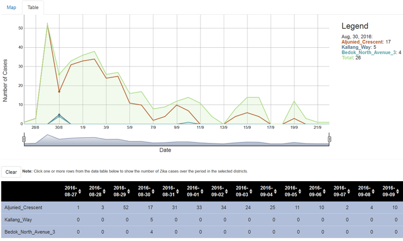
The line char shows the trending of the Zika virus for all districts over the entire period. Each line represents a district reported Zika cases. Not only the data table shows the raw data but also allows users to focus on one or several districts to compare their trending.
Future Work
- What are the other factors affecting the spread of Zika Virus besides temperature?
- Explore other visual analytics approaches to visualize the time series data apart from the map, line graph and bar chart presented in this project.
