ISSS608 2016-17 T1 Assign2 XI QIUYUN
Abstract
We all know that US stock market is one of the biggest markets in the world. In that market, there are many companies, of course, it will have better companies and terrible companies. So we can observe these listed companies from their financial index or fundamental value. Based on these data, analyse these data, find some interesting things and finally we can have some conclusions about US listed companies.
Problem
- What’s the most important or common indicators of a company?
- What’s the correlation between those common indicators?
- How the values of common indicators changed in different years?
- What’s the difference among companies with the same indicators?
- Are there existing some unique companies?
Approaches
Data preparation
Split
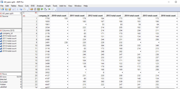
Through splitting the original table, I split “indicators” row to columns by every year. Then calculate the number of indicators of every company in each year.
At last, combine these table into a table which have the total number of indicators of each company by year.
Stack
Another change is stacking. After sorting important indicators, I stack years to observe time series variable.
Observations in indicators
Distribution
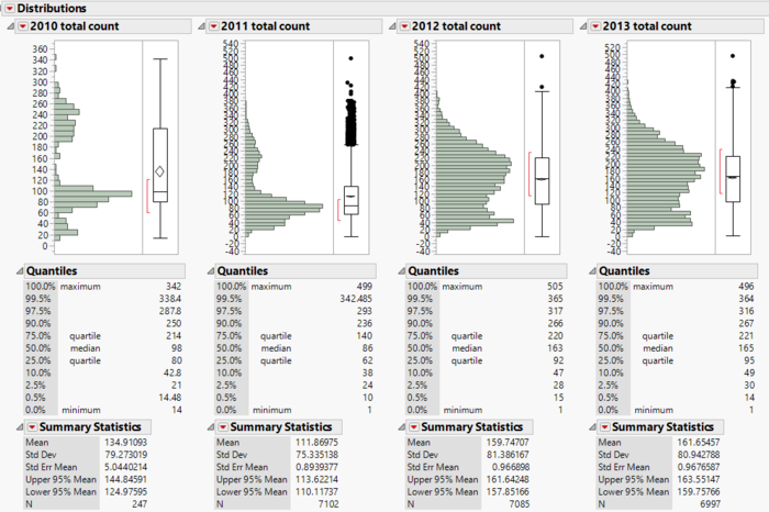
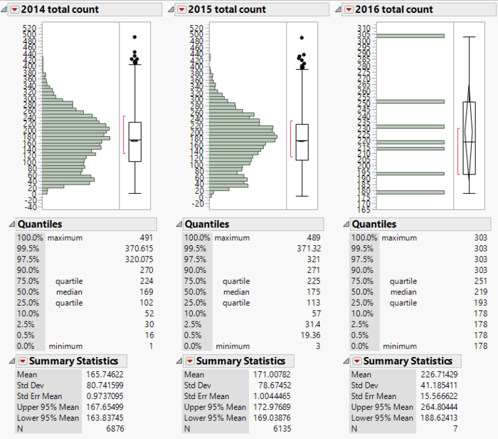
The following two pictures show the distribution of the number of indicators by company in 2010-2016. We can see that except 2010, 2011 and 2016, in other years, the number of indicators of companies are around 100 to 270.
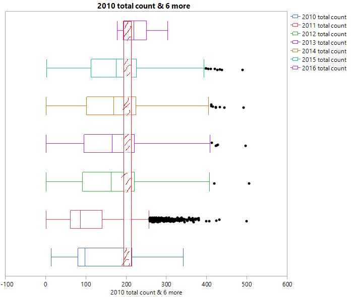
I noticed that the maximums are all relatively big. It must have some indicators that most companies have just as the following boxplot shown. So next step is finding those indicators.
Common Indicators
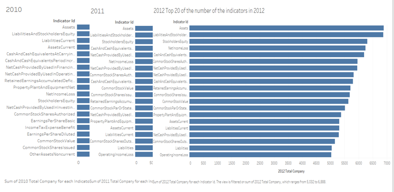
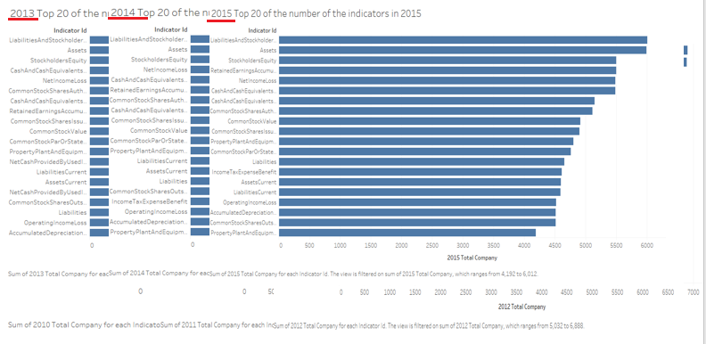
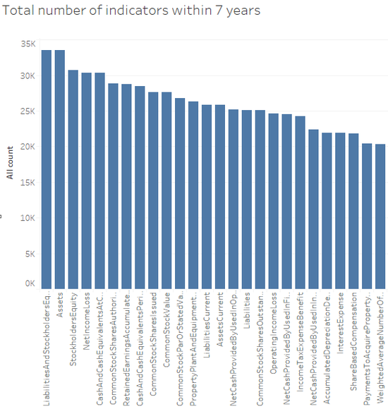
I counted the number of each indicator in 2010 to 2016. Then I sorted top 20 of them. From above pictures, we can see that most of companies all have some same indicators. Maybe I can conclude that those indicators are all common and important to each company. Through comparing and calculating the whole number of indicators within 7 years, I listed the most common indicators and splited them into 9 categories. There are:
ASSETS: Assets, AssetsCurrent
CASH: Cash and Cash Equivalents at Carrying Value, Cash and cash equivalents Period Increase Decrease
LIABILITY: Liabilities, Liabilities and stockholders Equity, Liabilities Current
Net CASH: Net cash provided by used in operating activities, net cash provided by used in financing activities, net cash provided by used in investing activities
STOCK: Stockholders equity, common stock value, common stock shares authorized, common stock shares issued, common stock shares outstanding, common stock par or stated value per share
RETAINED EARNING: Retained earning accumulated deficit
PROPERTY: Property plant and equipment net
INCOME: Operating income loss, Net income loss
TAX: Income tax expense benefit
Analysis of important indicators
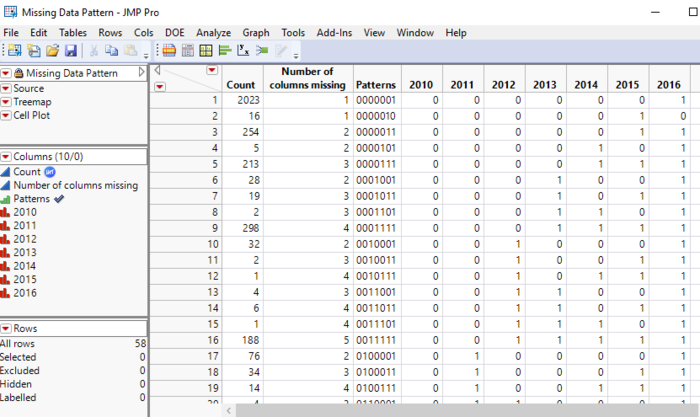
According to the “Missing data pattern” in JMP, I can find that there are plenty of missing data in 2010 and 2016, so I would like to analyse 2011 to 2015
Multivariate
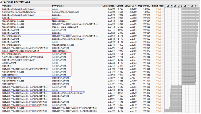
In JMP, used “Multivariate-->Pairwise Correlation-->sort by correlation”, I used data in 2011. I noticed that assets and liabilities are the most important indicators. According to the following picture, liabilities, liabilities stockholders equity, operating income loss, net income loss and net cash provided are all have strong correction with assets and assets current. As for liabilities, the previously mentioned indicators also have strong correlation with liabilities. What’s more, most of those indicators have positive correlation with assets and assets current except net cash provided.
Principal components analysis
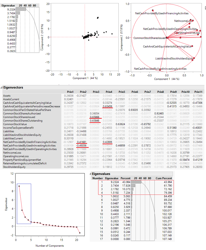
Used “Multivariate--> Principal components”, I want to find indicators which no correlation with each other and which are correlated. According the principal components analysis, it generates 17 principals. But, obviously, the first four principals are the major principals, they contain around 80% of the whole information.
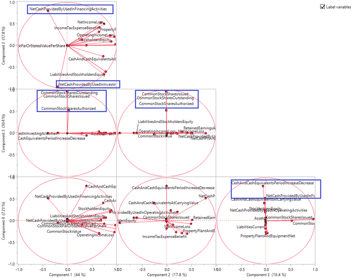
From “Elgenvectors”, I noticed that Cash and cash equivalents Period Increase Decrease, common stock shares issued, common stock shares outstanding, net cash provided by used in operating activities, net cash provided by used in financing activities are more correlated with principal which have the highest values from principal 1 to principal 4. So I let JPM generate loading plot among principal 1 to principal 4. We can find that in components 1 and component 2, “net cash provided by used in operating activities” and “net cash provided by used in financing activities” are in opposite direction, as for in component 3, “common stock shares issued” and “common stock shares outstanding” are in the same direction, “Cash and cash equivalents Period Increase Decrease” and “net cash provided by used in financing activities” are in the same direction.
Ternary Plot
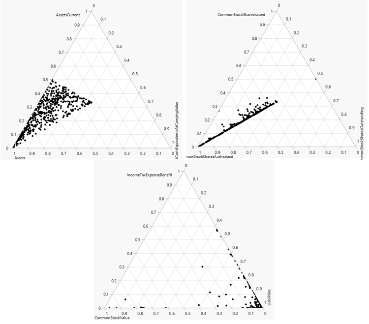
In this part, I want to find three variables correlation. In JMP, use “graph-->Ternary Plot”, I built some interesting graphs. Relatively, I find that the value of assets current, cash and cash equivalents at carrying value, common stock value, common stock shares issued and common stock shares outstanding are low which proportion are around 0-0.5, while liabilities common stock shares authorized is higher which proportion are around 0.5-1.
Parallel Plot
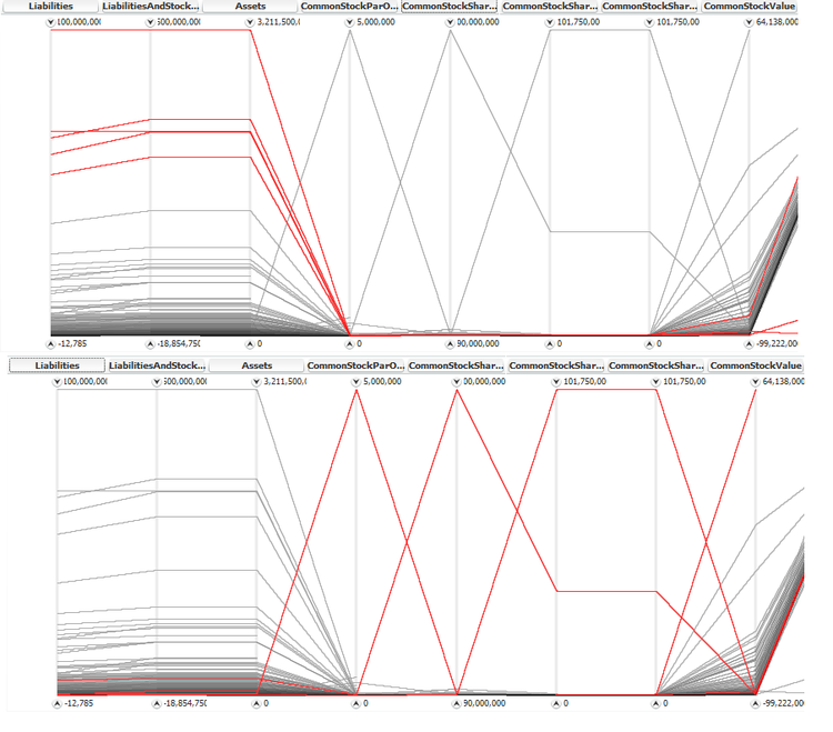
In High-D, I built a parallel plot among those common indicators. I noticed that there is negetive correlation between “liabilities, liabilities and stockholders Equity, assets” and “common stock value, common stock shares authorized, common stock shares issued, common stock shares outstanding, common stock par or stated value per share”. According the following graph, we can easily find that when the value of “liabilities, liabilities and stockholders Equity, assets” are high, the value of “common stock value, common stock shares authorized, common stock shares issued, common stock shares outstanding, common stock par or stated value per share” are low.
Observation in Values
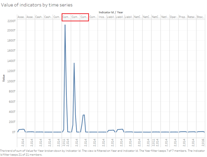
In this part, I would like to analyse the how the value of important indicators above mentioned changed by years. Firstly, I chose all 21 indicators and all 7 years. As the following graph shown, I noticed that there are three indicators which have significant trend. Next I zoomed these three indicators.
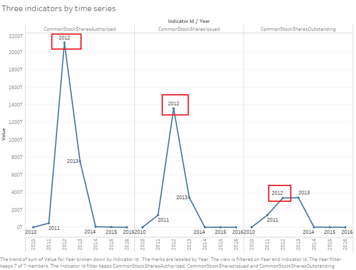
I noticed that the significant points are common stock shares authorized, common stock shares issued and common stock shares outstanding even more they are all in 2012. We can conclude that 2012 is a stock market flourishing year that most of the company issues stock.
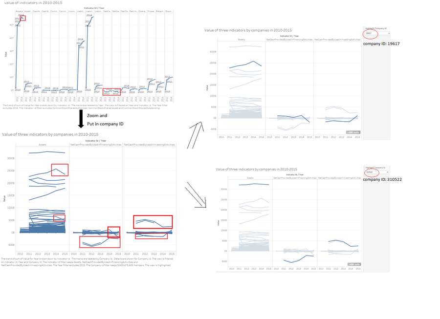
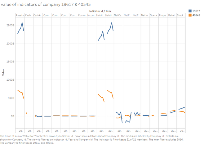
The second step, I exclude previous three indicators and 2016, because there are lots of missing data in 2016. From the second graph, I noticed two things. One is that the value of assets has an obvious decrease in 2015, the other is the value of net cash provided by used in financing activities and net cash provided by used in investing activities are negative. Both of these things are strange, so I zoomed those three indicators and put in company ID as the fourth variable. I found that there some significant trends in graph then I highlighted those trend to observe which specific company caused these. Then I found that those significant trends almost come from two companies which ID are 19617 and 310522. At last, I picked the two companies and saw their every indicator in 2010-2015.
As the following graph shown, company19617 and 310522 not only have significant value in assets, net cash provided by used in financing activities and net cash provided by used in investing activities but also in liabilities and liabilities and stock holders equity. What’s more, they both have the similar tendency in assets and liabilities.
Tools Utilized
Tableau 10
Built graph with different number of indicators.
Built time series chart.
JMP Pro 12
Analyze variable's distribution.
Analyze indicators' correlation.
High-D
Built Parallel Plot.
Excel
Change data type in order to allow Tableau to load suitable data.
Results
After analysing those data, I have some results as follows:
- There are total 8535 indicators involved, but most companies just have 100-300 indicators.
- There are 21 indicators which most common and important to a company.
- Assets and liabilities are the centre indicators which have strong correlation wither other common indicators.
- Surprisingly, Net cash provided by used in financing activities and net cash provided by used in investing activities are uncorrelated, but common stock shares issued and common stock shares outstanding have highly correlation.
- Value of assets current, cash and cash equivalents at carrying value, common stock value, common stock shares issued and common stock shares outstanding are relatively low while liabilities common stock shares authorized is higher.
- Liabilities, liabilities and stockholders Equity, assets and the value of common stock value, common stock shares authorized, common stock shares issued, common stock shares outstanding, common stock par or stated value per share are negative correlation.
- In 2012, most companies issued stock. 2012 is a boom-year for stock market.
- The total value of net cash provided by used in financing activities and net cash provided by used in investing activities are negative in 2011-2014, there are too many companies had deficit of net cash. Especially company 19617 and 310522.

