ISSS608 2016-17 T1 Assign2 Wan Xulang
Contents
- 1 Abstract
- 2 Problem
- 3 Data Introduction & Preparation
- 4 Approaches
- 4.1 What are the participants’ distribution?
- 4.2 Who and which kind of people are more likely to give higher overall evaluation score to Wiki?
- 4.3 Who is more likely to become a registered user?
- 4.4 According to the survey, how do the faculty members perceive Wikipedia in different perspectives?
- 4.5 According to the feedback, what impacts behavioural intention the most?
- 5 Interactive Dashboard
- 6 Summary
- 7 Tool Utilized
Abstract
Wikipedia, probably the most powerful knowledge base in the world. It’s open, web-based and free. Nearly everything you want to know can be searched in this online library. One reason for its successful is that everyone in the world can contribute what they know which makes sharing knowledge become easy and free. In this assignment, with a dataset about people’s perceiving on Wikipedia, we’ll explore some deep insights on how people using and thinking about this great project.
Problem
Before starting our journey, we have set some problems before. They are:
- What are the participants’ distribution?
- Who and which kind of people are more likely to give higher overall evaluation score to Wiki?
- Who is more likely to become a registered user?
- According to the survey, how do the faculty members perceive Wikipedia in different perspectives?
- According to the feedback, what impacts behavioural intention the most?
Data Introduction & Preparation
Data Introduction
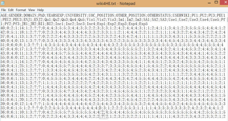
The dataset is from UCI. It’s collected from a survey of faculty members of two universities which are UOC and UPF. In this dataset, we’ve 53 attributes and 913 records. These 53 attributes can be divided into two parts, the first one is about the faculty member’s personal information while the second part is the feedback of a series of Likert Scale Questions regarding to a wide range of user experience of Wikipedia. The raw data is looking like this:
Data Preparation
While this dataset is quite massive, we would like to do some clean works first. Several steps are taken, they are:
- Import the raw set into Excel
- Build two category variables named “AGE-GROUP” and “YEARS-GROUP”. They are grouped from “AGE” and “YEARSEXP” which are two interval columns.
- Replace the index number of “GENDER”, “Domain”, “PhD”, “UNIVERSITY”, “UOC_POSITION”, “OTHER_POSITION”, “OTHERSTATUS” and “USERWIKI” with readable English words according to data dictionary.
- Generate a new category variable named “POSITION” from “UOC_POSITION” and “OTHERSTATUS”. The logic is: If UOC_POSITION != ?, then POSITION = UOC_POSITION, else POSITION = OTHERSTATUS.
- Replace the missing values of all interval variables with the mean of that specific variable.
- Calculate the total score of the survey for each person. It’s calculated by the sum of all answers divided by 215(which is the full mark of this survey). So we can know that this variable is actually a percentage number which can generally represents to a person’s perceiving on Wikipedia.
- As the survey is actually divided into 13 kinds of questions, we would like to calculate the average score a person give to a specific kind of questions. Thus, we’ve built 13 new variables which are the average of answers belong to different part.
- Delete the rows who have miss values on category variables.
- Delete unnecessary variables such as the answer for each question since we’ve generated new variables which can represent them.
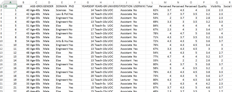
Finally, we’ve a cleaned data set like this:
Approaches
What are the participants’ distribution?
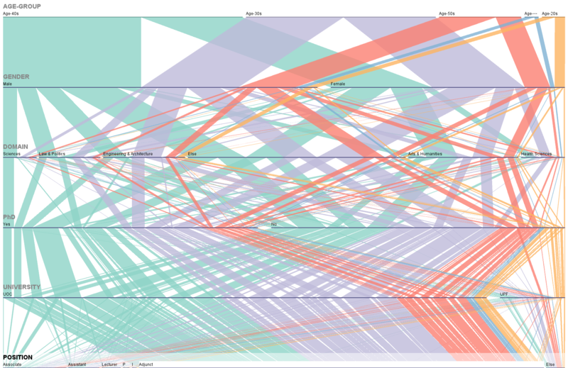
To explore the distribution of the participants, we choose to use a parallel set to help us. The result is like this:
From this graph, we can roughly understand the details of our participants in this survey. From the perspective of age, participants from group 30s to 50s have consist for 91% while other two groups only take about 9%. In the perspective of domain, except “Else”, participants from arts & humanities have taken about 20% while others are taken less than 15% respectively. Another significant label is university as almost 88% of participants are came from UOC. For participants’ position, most of them are adjuncts which have taken 73%.
Who and which kind of people are more likely to give higher overall evaluation score to Wiki?
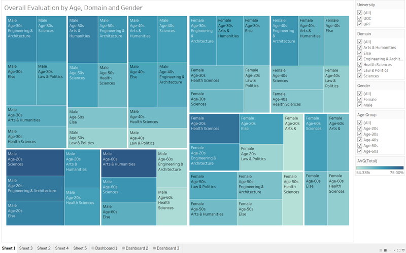
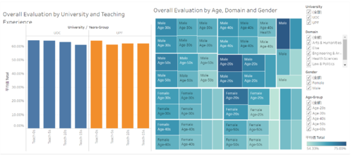
With so many attributes, it's not easy to answer this problem with normal visualization graphs. So we choose to build a tree map to solve this question. The tree map is like this:
The colour for each square represents to the average of total evaluation percentage for that specific sub-set. The deeper the colour is, the higher the average evaluation is. Squares from left part belong to male while the rest belong to female. We could find that the overall depth of colour from the left part is deeper than the same from the right part. It means that males are more likely to give high evaluation results to Wikipedia. Another significant finding is that faculty members who are less than 30 years old have given the highest evaluation result to Wikipedia.
Who is more likely to become a registered user?
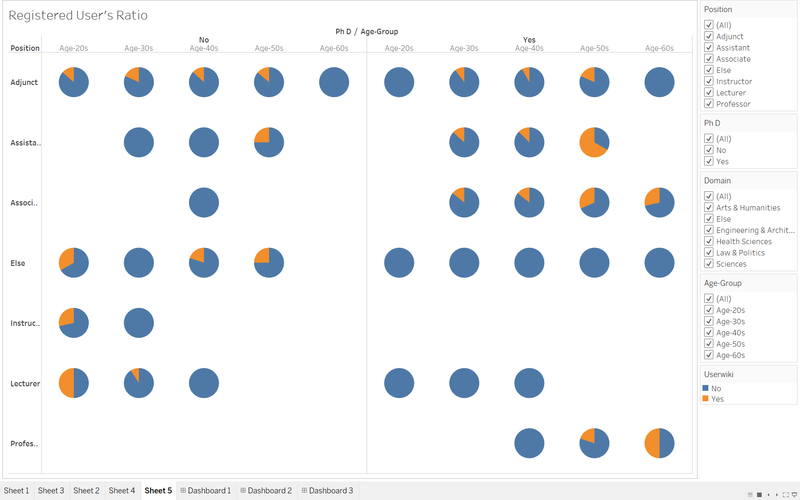
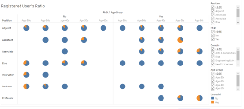
In this part, we would like to use a pie chart to help us understand the ratio of registered user in different groups of participants.
Generally, we can find that the ratio of registered user for all participants is quite low. It seems that age and domain don't have significant impact on becoming a registered user. But an interest finding is that a faculty member without a PhD title is more likely to become a registered user especially in those groups belong to position-adjunct. One reason for this situation could be that PhD people prefer to get what they want from more technical papers.
According to the survey, how do the faculty members perceive Wikipedia in different perspectives?
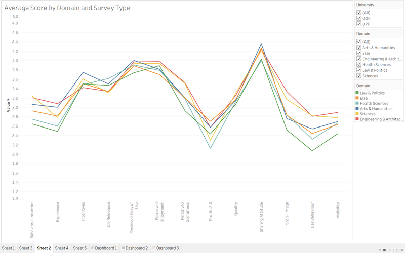
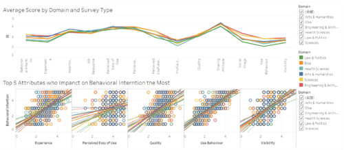
In this problem, we’ve built a trend-line to help us understand people’s perceiving on Wikipedia.
We can find that we’ve 6 different lines on this graph while different colour represents to different domain. The general trend of each line is almost the same which we can know which part of Wikipedia is good or not. More generally, the green line of law & politics is almost the lowest line among all lines. It seems that people from this domain are stricter thus they won’t give a high evaluation easily. In the opposite, the blue line of arts & humanities is the highest one. Among all kinds of survey questions, people generally have given high score to sharing attitude while negative feedbacks are given to behavioural intention, experience, use behaviour and visibility. Fickle feedbacks are given to behavioural intention, experience, profile 2.0, social image, use behaviour and visibility. For the rest types of questions, people basically are holding the same option.
According to the feedback, what impacts behavioural intention the most?
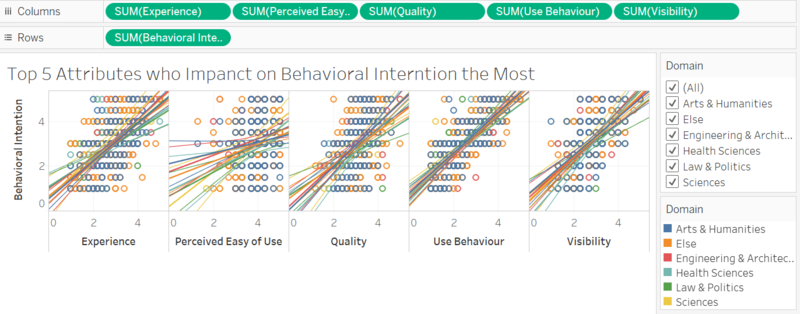
To answer this problem, we’ve built scatter plots to understand the correlation between behavioural intention and other questions.
Since they are 12 types of questions except behavioural intention, after my evaluation, we just take the top 5 ones to build the graph. They are experience, perceived easy of use, quality, use behaviour, visibility. Again, we use different colours to label the regression line of different domain in each scatter plot. Among this five, use behaviour has the most strong correlation as the R-square is around 0.65 while visibility and experience have some correlations as their R-square values are generally between 0.3 to 0.5. It seems that quality and perceived easy of use are not correlated to behavioural intention as their R-square values are generally lower than 0.3. The insights indicate that if Wikipedia want to in crease users' behavioural intention, they could begin with user behaviour, visibility and experience which are high correlated to the behavioural intention.
Interactive Dashboard
Since this dataset contains so many information, we can’t represent all of them in a few of graphs. To solve this problem, we’ve also built some dashboards for users to get what they want by themselves.
| Dashboard 1 | Dashboard 2 | |
|---|---|---|
| The first dashboard is by tree map and bar chart with several filters, in this dashboard you can click on every group to do filtering for both graphs. This dashboard is mainly shown the overall evaluation result of different groups of participants. | In the 2nd dashboard, we've embedded a trend line graph and five scatter plots to show people's perceiving on different types of questions and the correlations between behavioural intention and other five attributes. Again, you can filter the graph by just clicking on different lines or using filters on the right side. | |
| Dashboard 3 |
|---|
| The third dashboard is build by pie chart to show the ratio of registered users in different groups of faculty members. In this dashboard, you can use the filters on the right side to add or delete conditions of plotting pie charts. |
Summary
- Male faculty members who are less than 30 are much more likely to give higher evaluation result.
- A faculty member without a PhD title is more likely to become a registered user especially in those groups belong to position-adjunct.
- Fickle answers are given to behavioural intention, experience, profile 2.0, social image, use behaviour and visibility. For the rest types of questions, people basically are holding the same option.
- Use behaviour has the most strong correlation as the R-square is around 0.65 while visibility and experience have some correlations as their R-square values are generally between 0.3 to 0.5.
Tool Utilized
Software: JMP Pro, Tableau and Parallel Sets Visualization Graphs: Pie chart, scatter plot, trend line, tree map and bar chart
