ISSS608 2016-17 T1 Assign2 Vaishnavi AMS
Contents
Abstract
This project aims to work on the Wiki data set provided and extract observations and establish relationships between the various parameters in the data set.
I have chosen the Wiki data set for this assignment as we are currently making use of Wiki for our Visual Analytics learning and assignments and better understanding of scenarios in other universities will help us realize the importance of Wikipedia as a teaching resource.
Background and Motivation
In this project we will aim to apply interactive data exploration and analysis techniques to discover patterns in the multivariate dataset provided.The data set is from the following link Wiki data set
This dataset is from a survey of faculty members from two Spanish universities (UOC, UPF) on teaching uses of Wikipedia.
Theme of interest
The theme of interest of this project is to evaluate how effective Wikipedia is as a teaching resource based on the responses in the survey.
Questions for investigation
Few of the questions we will be investigating and looking to find answers through data visualization are
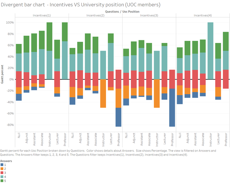
- Is there a relationship between the response to incentives and the position held by the faculty?
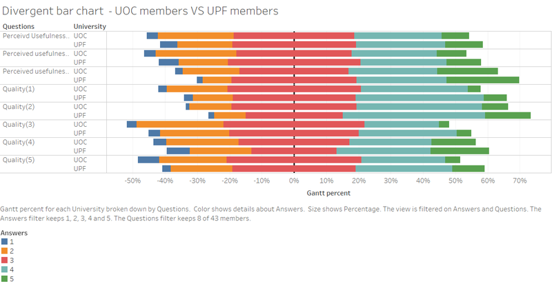
- Is the usage the same in both universities surveyed ? Or has any university made more effective usage of the Wiki tool ?
- Is there a relationship between quality , Perceived Usefulness and Perceived Ease of Use ?
Find appropriate data attributes
The wiki data sets are downloaded in CSV format from the link Wiki data set.
It is then converted to a file we can use for further analysis using Excel and JMP Pro.
Tools utilized
- Microsoft Excel 2016 – Data cleaning and data preparation
- JMP Pro 12 – Data cleaning and data preparation
- Tableau 10.0 – Data visualization and analysis
Approaches
- Data preparation: Examine the data and make appropriate changes wherever necessary using Excel and JMP Pro 12 to make the data fit for analysis.
- Data visualization and Analysis: Construct multi variate graphs and charts to examine the underlying insights and patterns and draw conclusions.
Data preparation
The data provided is from a survey and has various limitations and missing values. The following steps are done to clean the data to make it useful for further analysis.
- There are 913 instances in the data set provided. But there is no “ID” column to identify each instance in the column. Create a new column “ID” with Series fill option in the CSV file after opening the file in Microsoft Excel 2016.
- Open this new file created in JMP Pro. The data set provided in the website has only numbers to represent the different attributes. We will make use of the “Recode” Option in JMP Pro to substitute the digits in the columns with the appropriate meaning. This information is taken from the data dictionary provided online. This facilities ease of use of the data set during analysis. The below columns are recoded
Gender
Domain
PhD
University
UOC position (academic position of UOC members)
OTHER (main job in another university for part-time members)
OTHER_POSITION (work as part-time in another university and UPF members)
USERWIKI (Wikipedia registered user)
- The column OTHER (main job in another university for part-time members) and OTHER_POSITION (work as part-time in another university and UPF members) is named wrongly in the given data set. The column names are changed as per the data dictionary.
- We then look for missing values in the data set. We can find that there are missing values which are denoted by a ‘?’ as well as values in certain columns with values that are not denoted in the data dictionary.
- The ‘?’ was replaced by spaces in the below columns
OTHER POSITION(part time in another univ& UPF)
USERWIKI
OTHER(Main job in another univ)
UOC Position
Domain
- “Domain “column had a value ‘6’ not defined in data dictionary. It was replaced by “Unknown” for better readability.
- “OTHER_POSITION (work as part-time in another university and UPF members)” had a value ‘7’ not defined in data dictionary. It was replaced by “Unknown” for better readability.
- The columns of the survey data were renamed with their group name (e.g.) “Perceived Usefulness (1) instead of “PU1”
- The missing data in the survey items were replaced with “Did not answer” instead of the ‘?’
- The columns were converted from numerical to categorical to match the values in the dataset.
Gender
Domain
PhD
University
- All the survey item columns were converted to categorical
- The new dataset was saved as a new CSV file to be used for further data exploration using tableau
- The new CSV file is loaded onto Tableau 10.0
- The Survey items columns are all selected and “Pivot columns” is selected. Rename the columns to “Questions” and “Answers”
- Check if all the columns in the data source have the appropriate data type. It is not right for some. They are replaced appropriately.
- Proceed to construct charts and graphs in tableau
Data Visualization and Analysis
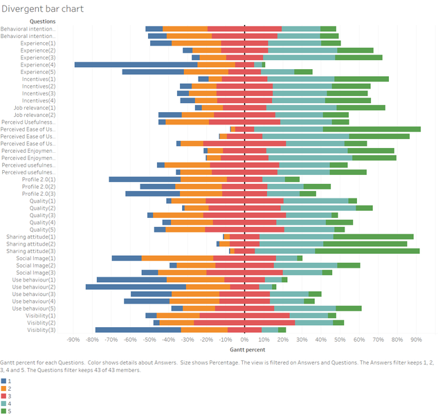
The survey data is in Likert form scale. The best form of visualization for Likert scale would be divergent bar chart. It is constructed as follows
1. Create a new calculated field “Sum (Number of records)” using the formula
SUM ([Number of Records])
2. Create a new calculated field “Count Negative” with the below formula
IF [Answers]='5' THEN 0
ELSEIF [Answers]='4' THEN 0
ELSEIF [Answers]='3' THEN .5
ELSEIF [Answers]='2' THEN 1
ELSEIF [Answers]='1' THEN 1
END
This is to identify all the “Strongly disagree – 1” and “Disagree – 2” values to go to the left of the zero, along with half of the “Neutral” responses.
3. Create a new calculated field “Total count negative” with formula
TOTAL(SUM([Count Negative]))
Also change the default table calculation so that the total is summarized from the “Answers” column.
This tells Tableau to take the TOTAL of the SUM of all the Count Negative values addressing along the Answer field.
4.Create a new calculated field “ Total count” from formula
TOTAL(SUM([Number of Records]))
This gives us the total number of responses for each question.
5. Create a new calculated field “Gantt start” using formula
-[Total Count Negative]/[Total Count]
We will use this calculation to determine the left / right offset for the block of Gantt bars. That is, for each question we have a bunch of bars that are stacked together and spread out horizontally. This calculation will determine how far to the left or right of the center (0) the stack should start.
6. Create a new calculated field ”Percentage” using formula
SUM([Number of Records])/[Total Count ]
This is to determine the size (thickness) of the Gantt bars once we’ve determined exactly where to place them. We determine the exact placement using Gantt Percent.
7. Create a new calculated field “Gantt percent” using formula
PREVIOUS_VALUE([Gantt Start])+ZN(LOOKUP([Percentage],-1))
This tells Tableau to look grab the previous Gantt Percent value (if there is no previous, for the first record in the partition, use Gantt Start value as the previous) then “lookup” the previous row’s Percentage value and add that to what you have. If there is no “previous row” the ZN() function converts the NULL value to a zero.
8. Drop the “Gantt percent” on the columns and “Questions” on Rows.
9. Drop “ Answers” column on colours.
10. Drop “Answers” on filters
11. Filter out the “Did not answer” values as we are not sure how these people would have responded and may not help the analysis
12. Select “Gantt Bar” from the Marks card
13. Drop “Percentage” on Size card
14. The divergent bar chart is constructed
15. Formatting is done to make the chart more presentable
Zero line is made thicker to show the demarcation between the positive side and negative side response
16. The Gantt percent is formatted to represent the values in percentage format
The percentage column is also formatted to represent the values in percentage format
17. The Questions column is added to filter so that we can make it more interactive and choose only the appropriate questions for our analysis
Observation 1
- When observing the relationship between the University position held by UOC university members against their response to the incentive questions we can draw some interesting insights
- Most of the professors in UOC university agree with the notion that the usage of Wikipedia as a teaching resource is definitely an incentive especially as a best practices guide and also helps them receive greater institutional recognition
- It is also interesting to note that Professors do not consider the Wikipedia as a good tool when it comes to getting instructions from colleagues or getting specific trainings. People in other hierarchies do not seem to share the same idea as agreement from the other positions are higher for these two questions. This may be attributed to the fact that professors are the highest in this hierarchical order and may not use Wiki for this purpose.
Observation 2
- This graph depicts the response of the members of both the universities towards the quality of the data available in Wiki and the perceived usefulness of the Wiki tool
- The general observation is that UPF members agree more with the quality and the usefulness of the Wiki. The approval from UPF members is close to or more than 60% for every question of the survey for quality and usefulness whereas UOC members have approval close to 50%
- This shows that more than half the population surveyed finds the Wiki tool useful
Observation 3
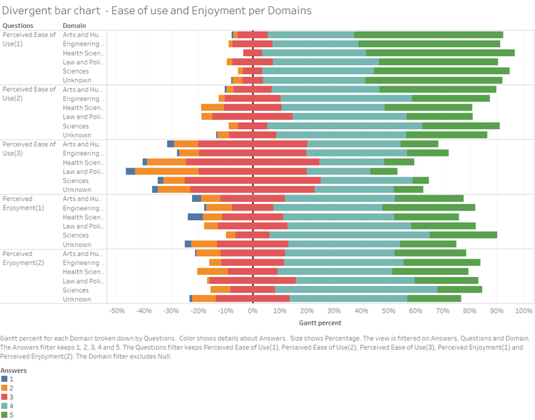
- We can observe from the above graph that all domains unanimously agree on that Wikipedia is user friendly and it’s easy to look for information on Wikipedia with high approval ratings close to 90% on questions (1) and (2).
- But it should also be noted that there is high disapproval for the third question in the survey. The members of the universities in all domains agree that it is not easy to add or edit information on Wikipedia. This is an important area of concern because if the university faculty are not able to handle the tool they will not be able to use it to update new information. Steps should be taken from university end to provide more training on editing wiki page and also they should make use of the help guides available online.
Observation 4
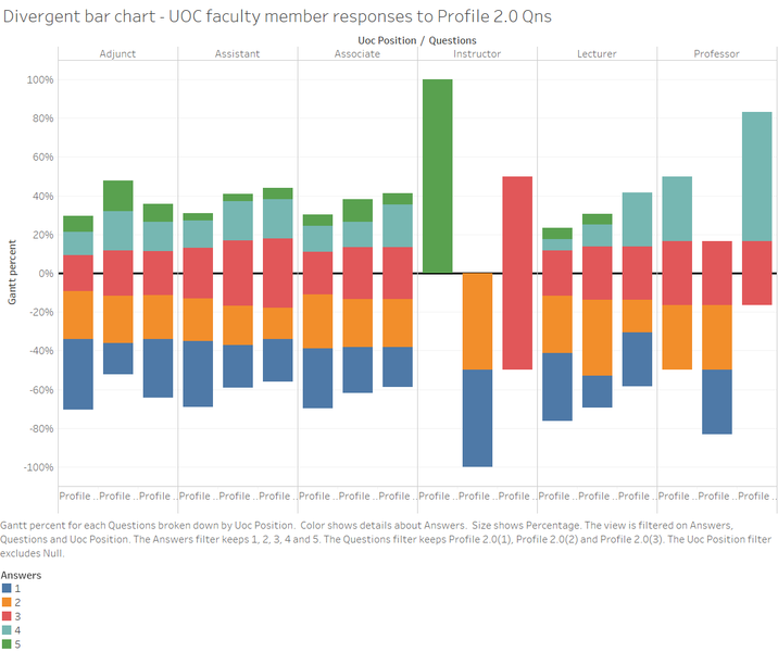
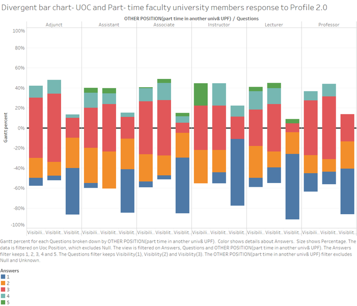
- In this we aim to compare the response of UOC university faculty members and UPF university faculty members/part time faculty in other universities. The most distinct observation in this graph is the response of the instructors in UOC university. They contribute to blogs but do not actively participate in social networks. They also remain neutral in publishing academic content in open platforms.
- On the contrary, instructors from other universities hover between 60 to 80 % when using profile 2.0. Majority of them do not contribute to blogs nor actively participate in social networks. This can be attributed to lack of awareness of usage of Profile 2.0 among other universities in comparison to UOC university.
Observation 5
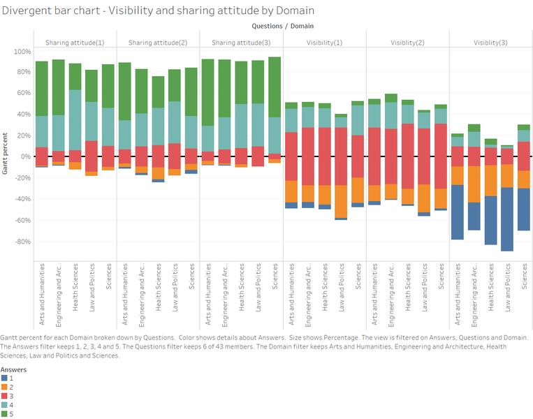
- In this chart we aim to compare the visibility and sharing attitude across different domains of study
- From the chart it is evident that the sharing attitude is very high with a total approval of 80% to 90 %. This shows that the faculty agree that sharing academic content on social platforms is important as it will be beneficial to the learning community at large.
- But when we see Visibility Question responses we observe a contradiction to the above drawn point. Less than 20% population cite Wikipedia in their academic papers. This can mean that faculty has been using resources and content from Wikipedia for their research and not citing them in their papers. This could mean the content got from research may not be available to everyone when the research papers are published in social platforms
- In terms of improving visibility of student's work and having student's contribution recorded in Wikipedia , the general response seems to be neutral with percentage close to 50%. This could mean that students are aware of the usage of Wikipedia to store their content but not prevalent in use. Faculty should take more steps to enhance their usage among students
Interactive Tableau Dashboard
The interactive tableau dashboard is created by using three different graphs created
- Divergent bar chart - This chart basically establishes relationship between the questions posed in the survey and the response to each question by the members of the two universities. The score ranges from 5 (Strongly agree) to 1 (Strongly disagree)
- Stacked bar charts - This bar chart also establishes the relationship of the survey responses to the position held by the faculty members in UOC university. This chart can also be filtered by Domain.
- Bubble Chart - This chart aims to differentiate the difference of response of Ph.D members to those with no Ph.D. This chart can be filtered using the questions posed in the survey.
Here is the link for the dashboard published in tableau public https://public.tableau.com/shared/QFMRDP25G?:display_count=yes
Results
From the above analysis , the following conclusions can be drawn
- UPF faculty members agree more with the quality and usefulness of the Wiki tool when compared to the faculty members from UOC university
- Wikipedia has been unanimously agreed uopn as user friendly and and easy to search for information. This is a very important aspect as data and knowledge is vast and it is important that Wiki makes it easier for the faculty as well as students in this respect
- Wiki should provide more help guides or contact universities to hold sessions to educate the faculty on how to add and edit information on Wiki. This will help bring more information to the Wikipedia website and help faculty and students alike.
- Universities should take more steps to encourage students to make use of Wiki to share their data and also store it.
- The sharing attitude is prevalent in the general population but sharing the knowledge on social platforms are low which need to be improved
- Very less citations are done of Wiki when they are used in research for papers. This should be improved among faculty in order to facilitate sharing of knowledge
From the above points we understand that Wikipedia has many pros barring a few drawbacks and that more than 60% of the sample population surveyed agree with its effectiveness. We can thus conclude that Wikipedia can be used effectively as a teaching resource with a few improvements required.
Reference
Wiki data set : https://archive.ics.uci.edu/ml/datasets/wiki4HE
Meseguer, A., Aibar, E., Lladós, J., Minguillón, J., Lerga, M. (2015). “Factors that influence the teaching use of Wikipedia in Higher Educationâ€. JASIST, Journal of the Association for Information Science and Technology. ISSN: 2330-1635. doi: 10.1002/asi.23488.
Likert scale - Divergent bar chart: http://www.datarevelations.com/likert-scales-the-final-word.html
