ISSS608 2016-17 T1 Assign2 Thian Fong Mei
Contents
Abstract
This assignment delves into data discovery of high dimensional Data, using Visual Analytics techniques and methods. The data set used here is the wiki4HE Data Set (https://archive.ics.uci.edu/ml/datasets/wiki4HE)
Problem and Motivation
Wikipedia is an open collaboration model. There are certain reservations towards the use of Wikipedia in academia, as it was commonly perceived as a “flawed knowledge community” and "a collaboratively generated encyclopedia (which) cannot meet the high standards of quality." The said data set relates to the research/survey on university faculty perceptions and practices of using Wikipedia as a teaching resource, and taps on the Technology Acceptance Model (TAM) to examines the interrelationships. It was said from the Wiki4HE webpage that the "both the perception of colleagues' opinions about Wikipedia and the perceived quality of the information in Wikipedia play a central role in the obtained model".
Theme and Questions of Interest
This assignment does not seek to validate the TAM, but seeks to uncover highlights of the results, and the relationship between the profile of the faculty survey participants and the results.
The below image attempts to classify the survey categories according to the TAM model. One would attempt to use the below to assist in the discovery process.
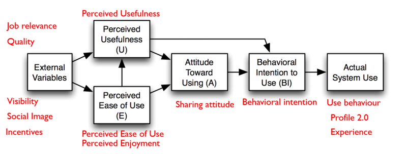
Questions of interest can be far-ranging. In this assignment, one seeks to uncover a few aspects of them for further examination. They are:
- What is the profile of the survey participants?
- What are the most agreeable and disagreeable responses received? How does they tie in with the TAM model?
- Quality of Wikipedia is often cited as a concern - are the survey findings consistent with this common perception?
- How do perceptions of Wikipedia stand in the survey?
- In the TAM model, Perceived Usefulness and Sharing Attitude influence Behaviour Intention - does it show here?
- Does the age group of the participants matter?
- Does the domain of the participants matter?
Approach
Data Source
The data source used wiki4HE Data Set (https://archive.ics.uci.edu/ml/datasets/wiki4HE). There are 913 records/survey participants, with 53 variables. 10 of the variables are user profile information. The 43 survey questions variables are classified into 13 main categories.
Data Preparation & Approach
Data preparation is mainly done with JMP, with some analysis conducted in JMP.
1st iteration: The data is imported into JMP for a first round of exploration.
- The GENDER,DOMAIN, PhD, YEARSEXP,UNIVERSITY, UOC_POSITION, OTHER_POSITION, OTHERSTATUS and USERWIKI variables are recoded from nominal score to categorical names so to make these user profile variables more meaningful, and easier to interpret.
- Missing values of profile related variables are recoded as "Unknown" accordingly.
- It is observed that the OTHER_POSITION, OTHERSTATUS variable names are swapped when the attribute information given is compared. These 2 variable names are changed to better reflect the variables.
- Univariate/Bivariate/Multivariate distribution, Scatterplot and Graph Builder are run to provide an overview of the data's distribution.
2nd iteration:
- Missing values in the survey questions are recoded as 0 in the interim to denote no response.
- The individual survey questions scoring are totaled up under 13 categories (where 13 additional columns are created).
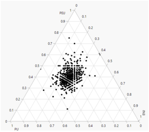
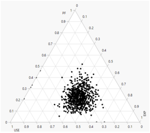
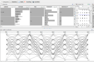
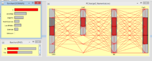
- Ternary plots are run to for observation of any association/pattern between any 3 variables. Parallel plots are also run to check for relations between each survey question. Secondary tools like Mondrian, Treemap, High-D are also used.
The work from 1st and 2nd iteration do not prove to be very useful.
3rd iteration:
- The survey questions are transposed/stacked in JMP, with survey faculty participant tagged with a new creation of a column ID.
- Additional 2 columns are created for survey category and recoding of numeric survey responses to nominal/text.
- Subsequently, a metadata is also created for the survey question wording for greater clarity.
- The age and years of experience are also binned in bins of 5. This is for easier comparison.
- 2 created formula for each and every type of response are also computed.
- Example:
- New Calculated Formula Variable, Survey_A = IIF([Survey Scale]="Agree",1, NULL)
- New Calculated Formula Variable, Survey_A (%)= sum([Survey_A])/913*100
These creation will help to compute the number/% of responses for each question. In this 3rd iteration, Tableau is used to create divergent bar chart, heatmap and treemap.
Colour Encoding
As there are 5 scales, the Tableau built-in colorblind-friendly palette designed by Maureen Stone is adopted.
Findings
The interactive visualization, using Tableau, can be found in the following link. (https://public.tableau.com/profile/christine.thian#!/vizhome/Wiki4HESurvey/FacultyProfile)
Note:
- The numbers and percentages at the lowest details (i.e. survey questions) (by expanding the Hierarchy) will add up to 913 responses and 100% respectively.
- Rolling up (Collapsing the Hierarchy) will cause the numbers and percentages to exceed 913 and 100%. However, the relative proportion of the diverging bar charts will not bee affected.
- There are 5 scales (1-5) in this survey and were recoded to Strongly Disagree, Disagree, Neutral, Agree, Strongly Agree respectively.
- The 'No Response' is taken as a scale indicator on the negative end. Hence, the scale is centred at 0 with 3 scale indicators on either side - Strongly Disagree, Disagree, No Response, Neutral, Agree, Strongly Agree.
- As majority - 85.87% of them are not WikiUser, the reasoning is that having even a neutral stand towards Wikipedia would bode well, and having a no response is taken to be perceived as more negative than Neutral stand.
Who took the survey: Faculty Participants Profile
Faculty Profile
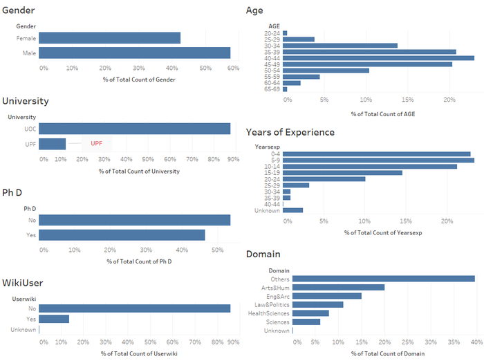
- Male participants forms 57.5% of survey participants.
- Majority - 87.62% of them come from UOC.
- 46.44% of them have PhD.
- Majority - 85.87% of them are not WikiUsers.
- The biggest age group - 23.3% of them comes from the 40-44 age range. The age groups generally follows a normal distribution.
- Close to half of the participants (46.22%) have less than 10 years of experience.
- The biggest domain group - Others - accounts for 39.54% of the participants, followed by Arts & Humanities (20.04%), Engineering & Architecture (15.01%).
Faculty Position
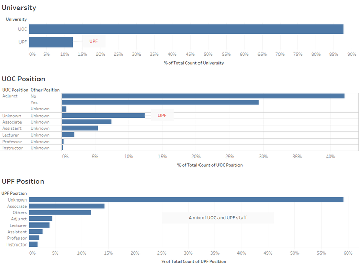
- Majority - 87.62% of them come from UOC. 12.38% comes from UPF.
- Most of the UOC staff are adjunct staff, with 29.35% of them having main job in another university. Those denoted with Unknown UOC position comes from UPF university.
- For those are UPF members, and work part time in another university, those with unknown positions stood at 59.15%.
Response Across Survey Categories and Questions
What are the most agreeable and disagreeable responses received? How does they tie in with the TAM model?
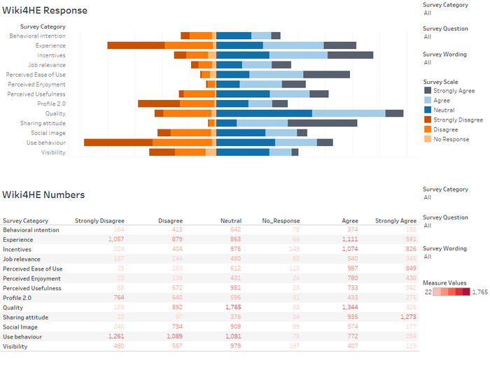
- Strongly Disagree: Looking at the proportion of 'Strongly Disagree' responses, one observes Use Behaviour, Experience, and Profile 2.0 are the top 3 categories, in descending order. When one observes the questions under these 3 categories, it relates to the use of "Actual System Use" in the TAM model. Hence, we know the 'consult and use' of Wikipedia for HE academia is not high.
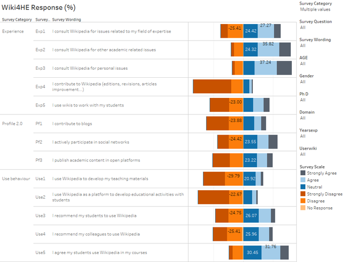
- Experience: Drilling down, EXP4: I contribute to Wikipedia (editions, revisions, articles improvement...) and EXP5: I use wikis to work with my students are the 2 top ranking 'Strongly Disagree' response in descending order
- Profile 2.0: Similarly, PF1: I contribute to blogs and PF3: I publish academic content in open platforms are the 2 top ranking 'Strongly Disagree' response in descending order.
- Use Behaviour: Likewise, USE1: I use Wikipedia to develop my teaching materials and USE2: I use Wikipedia as a platform to develop educational activities with students are the 2 top ranking 'Strongly Disagree' response in descending order. Interestingly, though about 20% strongly disagree to recommend students or colleagues to use Wikipedia. Only 6% will strongly disagree to students using Wikipedia in their courses.
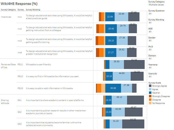
- Strongly Agree:Looking at the proportion of 'Strongly Agree' responses, one observes Sharing attitude, Perceived Ease of Use and Incentives are the top 3 categories, in descending order.
- While there is a high proportion who strongly disagree on the Experience category, there is roughly similar proportion who agree on the Experience category.
Quality of Wikipedia is often cited as a concern - are the survey findings consistent with this common perception?
- Quality is an external variable. It is also interesting more than half are either neutral or agreeable/strongly agreeable on the Quality of Wikipedia. Quality in this survey do not seem to be a very strong factor of concern.
How do perceptions of Wikipedia stand in the survey?
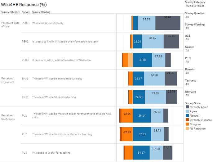
- Among the 3 categories of perceptions, Perceived Usefulness (PU) appears to be least agreeable among the 3.
- In the TAM model, Perceived Ease of Use (PEU) and Perceived Enjoyment (ENJ) are said to influence Perceived Usefulness. However, it is not clear from the survey results it is so.
- In PEU, there is room for improvement for adding or editing information in Wikipedia.
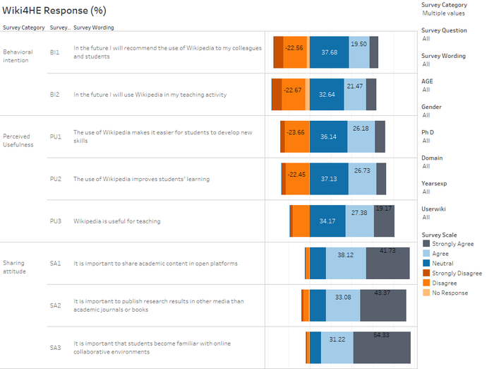
- It is also interesting to note while more found Wikipedia to be useful for teaching, less found them to be helpful to improve learning, and develop new skills.
In the TAM model, Perceived Usefulness and Sharing Attitude influence Behaviour Intention - does it show here?
- In the TAM model, Perceived Usefulness (PU) and Sharing attitude (SA) are indicated to influence Behavioral intention (BI).
- The survey results show that BI performs the worst among the 3 categories in term of 'disagree-ability'. Hence, it is not clear if PU and SA influence BI.
- If this model holds true, it also infers PU has a greater influence on BI, than SA.
Response Across Participants' Profile
In comparing the responses, we focus on the area of 'Actual System Use'. Hence, we would be more interested in the responses from Experience, Profile 2.0, and Use Behaviour. These 3 categories also happen to be the worst performing categories.
One also examines the most agreeable categories Sharing attitude, Perceived Ease of Use and Incentives
Does the age group of the participants matter?
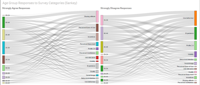
- All age group rank Use Behaviour to be most disagreeable, apart from the age group of 60 to 64 who rank Experience to be the most disagreeable.
- In general, increasing age group do cause Perceived Ease of Use and Incentives to become more disagreeable. The only exception happens for the age 65-69 group, which like the age 20-24 group, does not disagree on Perceived Ease of Use and Incentives However, having said so. the sample size for age 20-24 and 65-69 is very small.
Does the domain of the participants matter?
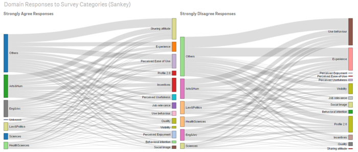
- Among the domains, Others, followed by Arts& Humanities, and Law & Politics, are the 3 top domains in descending order, disagreeing on using Wikipedia (observed from survey of Experience and Use Behaviour.)
- The Sciences domain is most agreeable on the use of Wikipedia among the domains.
Usefulness of Other Tools/Visualization
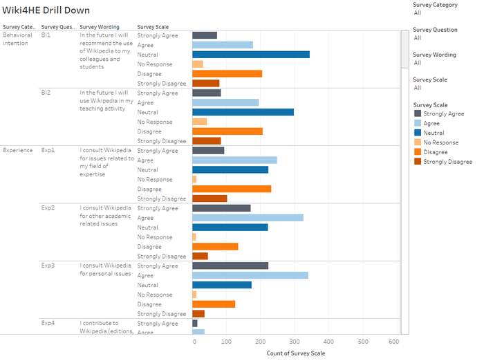
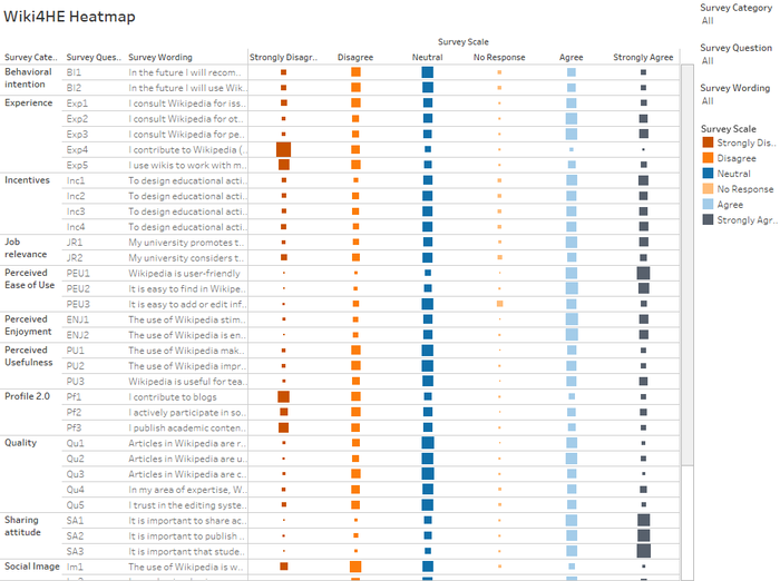
- In Tableau, additionally, separate non-stacked bar chart format, and heat map are explored.
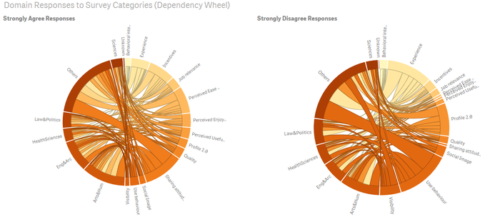
- In QlikSense, one can compare the Strongly Disagree and Strongly Agree response across Domains, and Survey Categories, using the Dependency Wheel. If numbers are not necessary, this visualization provides a quick comparison of responses.
- In QlikSense, one can compare the Strongly Disagree and Strongly Agree response across Age Group with Survey Categories and Domains with Survey Categories, using the Sankey. If numbers are not necessary, this visualization can provides a quick comparison of responses.
YouTube Link for QlikSense Dependency Wheel and Sankey Visualisation: (https://www.youtube.com/watch?v=_3Q89LK3QZM)
In comparison with the above tools, diverging bar chart still appears to work the best for survey data.
Not So Useful Visualization
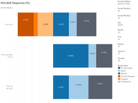
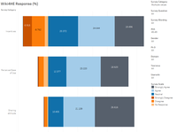
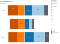
In contrast, the below visualizations of Ternary plot, Parallel Coordinates, and Treemap have not proven to be very useful in this context.
Ternary plot
Parallel Coordinates
Treemap
Tools Utilised
The main tools used are Microsoft Excel, JMP Pro 12, Tableau 10.0, Tableau Public, QlikSense and Extensions. Supplementary tools include Mondrian, Macrofocus High-D, and Macrofocus Treemap.
Conclusion
High-dimensional data is challenging to visualize due to the number of variables. For survey data, divergent bar chart is really useful. The findings also show that the 'perceived causation' (directions of arrows) depicted by the TAM model does not always translate to actual survey results. For example, one would expect that better scoring of Perceived Ease of Use and Perceived Enjoyment would lead to a better score of Perceived Usefulness. However, yet among the 3 categories, Perceived Usefulness has the highest 'dis-agreeability'. In addition, although Quality has always been cited as a concern in the use of Wikipedia, Quality has a better scoring than Experience, Profile 2.0, and Use Behaviour (which form the 'Actual System Use') responses. While academics have skepticism towards Wikipedia,as about 20% strongly disagree to recommend students or colleagues to use Wikipedia, only 6% will strongly disagree to students using Wikipedia in their courses. It is also interesting to note while more found Wikipedia to be useful for teaching, less found them to be helpful to improve learning, and develop new skills. Therefore, Wikipedia may serve better as a source of information rather than a tool to be used to effectively engage learning.
