ISSS608 2016-17 T1 Assign2 Liu Jialin
Contents
- 1 Initial Question
- 2 Dataset
- 3 Question Refinement based on the Dataset
- 4 Data Transformation
- 5 Iteration Process
- 6 Data Visualisation
- 7 Analysis Tools Evaluation
- 8 Suggested Improvements on Questions
- 9 Reference
Initial Question
Wikipedia is a free online encyclopedia that allows its users to contribute and edit almost any article. It is the most popular general reference work on the Internet and is ranked among the ten most popular websites.[1] While Wikipedia is extremely popular among ordinary Internet users, in this assignment we are interested in how academia people--the true professionals in their specialty, perceive the usefulness of Wikipedia in the following aspects:
- Research and teaching
- Recognition of Wikipedia among colleagues
- Perception on students using Wikipedia
- General quality of Wikipedia.
- Other online contributions made by the same group of academia people.
Dataset
The dataset is taken from UC Irvine Machine Learning Repository: wiki4HE Data Set.[2], which is:
“[an]Ongoing research on university faculty perceptions and practices of using Wikipedia as a teaching resource. Based on a Technology Acceptance Model, the relationships within the internal and external constructs of the model are analysed. Both the perception of colleagues’ opinion about Wikipedia and the perceived quality of the information in Wikipedia play a central role in the obtained model.”
Metadata of the Dataset
Attribute Information:
AGE: numeric
GENDER: 0=Male; 1=Female
DOMAIN: 1=Arts & Humanities; 2=Sciences; 3=Health Sciences; 4=Engineering & Architecture; 5=Law & Politics
PhD: 0=No; 1=Yes
YEARSEXP (years of university teaching experience): numeric
UNIVERSITY: 1=UOC; 2=UPF
UOC_POSITION (academic position of UOC members): 1=Professor; 2=Associate; 3=Assistant; 4=Lecturer; 5=Instructor; 6=Adjunct
OTHER (main job in another university for part-time members): 1=Yes; 2=No
OTHER_POSITION (work as part-time in another university and UPF members): 1=Professor; 2=Associate; 3=Assistant; 4=Lecturer; 5=Instructor; 6=Adjunct
USERWIKI (Wikipedia registered user): 0=No; 1=Yes
Survey Questions
The survey items are Likert scale (1-5) ranging from strongly disagree / never (1) to strongly agree / always (5).
There are 43 survey questions in total, out of which 30 were selected to be analysed and presented. The 30 questions were divided into 5 categories:
A. Research and Teaching:
- VIS3: I cite Wikipedia in my academic papers
- EXP1: I consult Wikipedia for issues related to my field of expertise
- EXP2: I consult Wikipedia for other academic related issues
- QU4: In my area of expertise, Wikipedia has a lower quality than other educational resources
- USE1: I use Wikipedia to develop my teaching materials
- PU3: Wikipedia is useful for teaching
- BI2: In the future I will use Wikipedia in my teaching activity
B. Recognition of Wikipedia among colleagues:
- IM1: The use of Wikipedia is well considered among colleagues
- IM3: My colleagues use Wikipedia
- USE4: I recommend my colleagues to use Wikipedia
- BI1: In the future I will recommend the use of Wikipedia to my colleagues and students
C. Perception on students using Wikipedia:
- USE2: I use Wikipedia as a platform to develop educational activities with students
- EXP5: I use wikis to work with my students
- USE5: I agree my students use Wikipedia in my courses
- USE3: I recommend my students to use Wikipedia
- ENJ1: The use of Wikipedia stimulates curiosity
- PU1: The use of Wikipedia makes it easier for students to develop new skills
- PU2: The use of Wikipedia improves students' learning
D. Other online contributions:
- SA2: It is important to publish research results in other media than academic journals or books
- SA1: It is important to share academic content in open platforms
- EXP4: I contribute to Wikipedia (editions, revisions, articles improvement...)
- PF1: I contribute to blogs
- PF3: I publish academic content in open platforms
- PF2: I actively participate in social networks
- IM2: In academia, sharing open educational resources is appreciated Students
E. General quality of Wikipedia
- EXP3: I consult Wikipedia for personal issues
- QU1: Articles in Wikipedia are reliable
- QU2: Articles in Wikipedia are updated
- QU3: Articles in Wikipedia are comprehensive
- QU5: I trust in the editing system of Wikipedia
Question Refinement based on the Dataset
After viewing the dataset, the following questions came to consideration:
- What is the sample make-up in terms of positions?
- What is the sample make-up in terms of domains?
- Does having a PhD or not affect a teacher's perception towards Wikipedia?
- Do age and Years of Experience affect a teacher's perception towards Wikipedia?
- Do the above questions differ for UOC and UPF?
We will answer these questions together with findings from the data.
Data Transformation
Data transformation using JMP (used for JMP):
- Change data into correct data type (ordinal, nominal). Likert scale is treated as ordinal.
- Recode the numbers into respective responses according to metadata. Discover that there are some numbers not described in the metadata.
- For Domain, recode "6" and "?" as Others.
- For UOC Position, filter on University=UPF, copy Other_Position into UOC_Position, replacing the "?".
- For the remaining "?" in UOC_Position, recode as Others.
- Rename UOC_Position as "University Position"
- For User Wiki: recode "?" as Unknown.
- Save file as wiki4HE cleaned.csv
After using JMP, transform wiki4HE cleaned.csv using Excel add-in:
- Download Tableau Add-In for Reshaping Data in Excel.[3]
- Select all answers to the questions to be reshaped, reshape the data.
- Save as wiki4HE cleaned for Tableau.csv, use data for Tableau analysis.
Iteration Process
- Screen through the questions to see the contents of the questions. Realised the need to re-group the questions and grouped them into different categories. Took out the less relevant questions to teaching, researching and comparing.
- Try to find the emphasis in sample description. Realised that one chart cannot describe all, hence resorted to different charts to highlight different aspects of the data (in Dashboard 1 and 2).
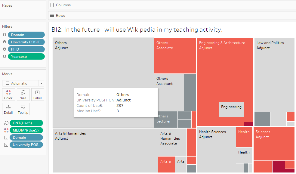
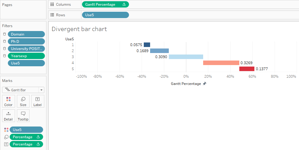
- Use Treemap showing median to determine the overall responses. Realised it does not represent the full picture, gave up on Treemap and used divergent bar chart.
- Try to use divergent bar chart without using the Excel add-in tool. Failed to do so.
- Try to use parallel coordinate chart. The implementation is hard without D3.js therefore interactive visualisation is not achievable. More evaluation of parallel coordinate chart is given in the later part of the report.
- Most of the respondents come from UOC.
- The domain compositions of respondents are similar across the two schools.
- UOC has large proportion of Adjunct faculty.
- UPF has a rather mixed faculty. There are more Associates than any other position. However, nearly 30% of the faculty did not give a specific indication of their position, which needs serious follow up to correct.
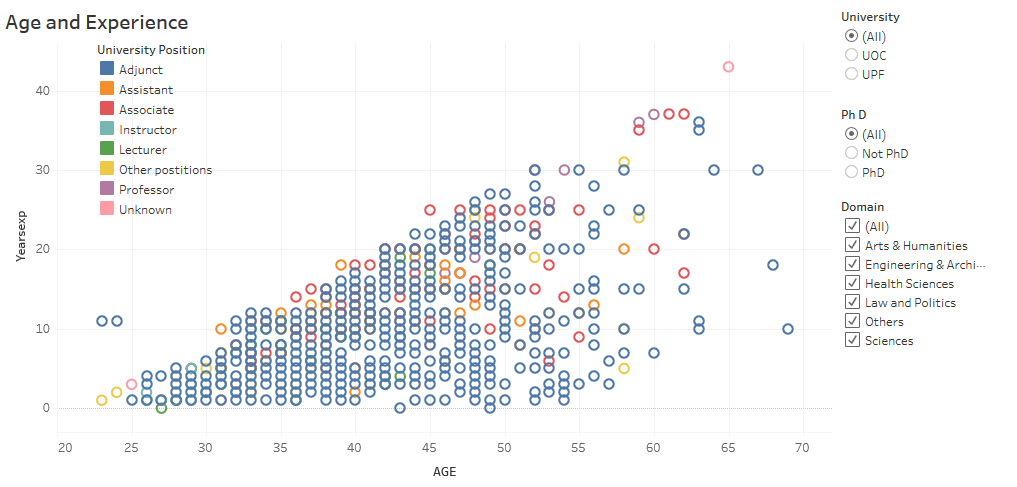
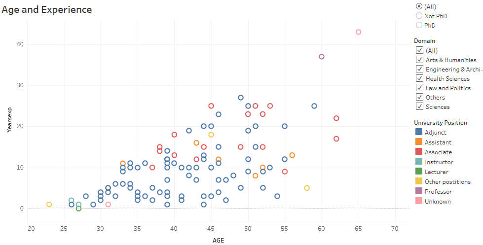
- Presence of linear correlation between age, experience and position.
- Excluding Adjunct, there is evidence of linear relationship between age and experience.
- Filters allow interactive display of specific information.
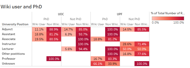
- In UOC, holding PhD and Positions constant, non wiki users far outnumber wiki users. PhD does not seem to be a differentiating factor when comes to registered Wikipedia membership.
- In UPF, PhD holders are seldom registered Wikipedia users. However, for faculties without PhD, the proportions of wiki users increase slightly.
- By selecting PhD and non PhD, there are roughly equal number of PhD who are Wiki user as number of non PhD who are Wiki user.
- Most of the Wiki users are below 55 years old. However, there are also Wiki users above 55 years old. For example, a teacher who is 65 years old with 43 years of experience is a registered Wiki user.
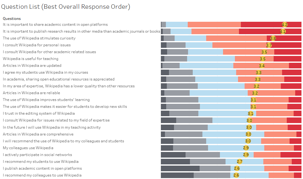
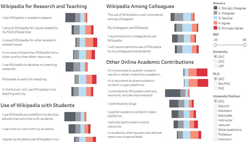
- Faculties agree the most that it is important to share academic content in open platforms. To the uttermost irony, they agree the least that they contribute to Wikipedia.
- Faculties have an overall positive view that Wikipedia is useful for teaching, but they also indicate that they do not use Wikipedia to develop their teaching materials.
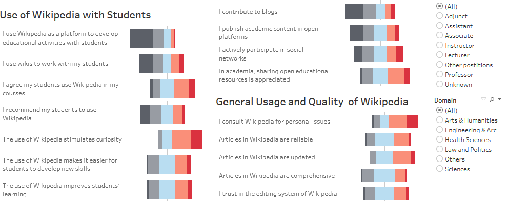
- Usage of Wikipedia as a platform to develop educational activities with students is low.
- Citation on Wikipedia in academic papers is low.
- However, faculties do consult Wikipedia for personal issues. They believe Wikipedia stimulates curiosity.
- Faculties in general trust the quality of Wikipedia. They consult Wikipedia for personal issues.
- Faculties contribute the least to Wikipedia, followed by blogs and academic content in open platforms.
- Law faculty has the worst responses overall, whereas Engineering and Architecture has, in comparison, the best responses overall.
- Very good performance on divergent bar chart, which other softwares are not able to accommodate.
- Good display of heatmap, mosaic plot and line charts. Allows interactive features to be implemented through filters.
- Able to incorporate interactive data display nicely.
- Unable to implement parallel plot and spider plot.
- Needs Excel plug-in before data can be displayed properly
- Very convenient to check missing data, recode content and change data type.
- Decent display for Mosaic plot.
- Not table to incorporate as interactive data visualisation. Interactive html does not support Mosaic plot.
- Readily built Add-in to transform the data. Easy to use.
- Limited display of other types of charts.
- Indication of positive impression and negative impression should be standardised. For example:
Data Visualisation
Dashboard 1: Visualisation of the survey respondents
Output:Sample description

User Guideline for Dashboard 1
For University and Domain plot, put mouse over the chart for more details. The legend is on the right side of the dashboard. Click bars for group selection.
For Positions plot, put mouse over the chart for more details. Click bars for group selection.
For Age and Experience chart, the filters for Age, Gender, University, Phd and Domain are on the right side of the dashboard. The filter for Position is on the chart. Use filters for selective views, and use mouse for individual and group selection.
University and Domain Plot
Using Mosaic plot to show the number of respondents in UOC and UPF, and the domains they belong to.
Point of interest: domain composition and school composition of the sample.
Highlights:
University and Positions Plot
Highlights:
Age and Experience plot:
Plotting Age against Experience for all respondents. Colours represent different positions. Filters on age, gender, university, PhD, gender and domain.
Point of interest:
Highlights:
Dashboard 2: Visualisation of sample profile and Wiki user
Output:Profile and Wiki
User Guideline for Dashboard 2
For Wikiuser and PhD chart, put mouse over chart for more details. The legend is next to the chart.
For Age and Experience chart, the filters for Age, User Wiki, University, Phd, Domain and University Positions are on the right side of the dashboard. Use filters for selective views, and use mouse for individual and group selection.
Profile Make-up table
Using heatmap to show the distribution of Wikiusers in both universities, the positions they hold and if they have a PhD degree.
Colour and text labels are percentages of row total in the same pane.
Point of interest: PhD research process will have significant impact on a person’s research habits. We are interested in finding out the distribution of registered Wikipedia users across PhD degree holders and their positions in the two universities.
Highlights:
Age and Experience Plot
This is the same plot as in Dashboard 1 but a filter on Wiki user is added.
Highlights:
Dashboard 3: Visualisation of questions by the order of best overall response.
Output:Question list

User Guideline for Dashboard 3
Put mouse over the chart for more details.
Using stacked bar chart to represent the percentage of each answers in every question.
Point of interest: overall representation of the responses. The questions with best response overall and worst response overall. Prepare for detailed question analyses by categories.
Highlights:
Dashboard 4: Visualisation of questions by category.
Output:Question categories
User Guideline for Dashboard 4
Put mouse over the divergent bar charts for more details. The legend is on the top right corner of the dashboard.
Filters for Age, University, PhD,Position and Domain are on the right hand side of the dashboard. Change filter settings to view different groups.
Using divergent bar chart to represent the answers for questions under each category.
Filters on age, university, PhD, position and domain.
Point of interest: across the same category, how do the views change depending on activities of various formalities.
Highlights:
Analysis Tools Evaluation
Here are the evaluations for the tools recommended in the assignment:
Tableau: the main tool used for display
Advantage:
Disadvantage:
JMP: the main tool used for data cleaning
Advantage:
Disadvantage:
Excel: the data cleaning tool before data can be used for Tableau analysis
Advantage:
Disadvantage:
And specialised visual analytics techniques:
Ternary diagram
This tool was not used because it is not suitable for Likert scale data.
Parallel coordinates
This tool is best implemented in High-D. However, High-D does not incorporate interactive data visualisation, neither does it support coloring of the lines.
JMP was able to plot parallel coordinates too. However, it does not incorporate interactive data visualisation. Also, due to Likert scale, lines overlaps very much for parallel coordinates. It is hard to distinguish individual observations or density of observations.
Eventually, parallel coordinates is not used.
Trellis
This is suitable for displaying overall responses for each question using bars. However it is less optimal than divergent bar chart. Hence, eventually Trellis is not used.
Mosaic plot
This is best implemented in Mondrian. However, Mondrian has limited colours for the Mosaic plot, which can be confusing in this case. JMP is able to have Mosaic plot, but it does not incorporate interactive visualisation. Eventually, Mosaic plot is implemented using Tableau.
Divergent bar chart
The most effective tool for Likert scale and only implementable in Tableau. Involves creating of many calculation fields, and must set colours
Treemap
Treemap was originally considered in the iteration steps. However, because it does not give the full picture, it is not used eventually.
Suggested Improvements on Questions
A highs score for "VIS3: I cite Wikipedia in my academic papers." means a positive impression but a high score for "QU4: In my area of expertise, Wikipedia has a lower quality than other educational resources" means a negative impression. Instead, it could be changed to "Wikipedia has a higher quality than other educational resources". Consideration was given to reverse the direction of divergent bar chart, but it was decided not, in order to keep the original responses of the data.
Reference
About Wikipedia:en.wikipedia.org/wiki/Wikipedia
Dataset:wiki4HE
Tableau Excel Add-in:Reshaping data for tableau