ISSS608 2016-17 T1 Assign2 Lee Mei Hui Cheryl
Contents
Abstract
The data provided was a survey response from faculty members at 2 universities in Spain regarding their perception and attitudes toward Wikipedia, which is the theme of interest for this investigation.
At a first glance, looking at attributes that were given, further questions were formed:
- What are the general trends in the survey?
- Is there a relationship between demographic and response?
Data Preparation
Before analysing the dataset to glean further information, it first has to be formatted appropriately. JMP was utilized for this purpose.
Recode missing values
First, the dataset was opened in JMP, and attributes compared against the metadata from the website, to check if the all variables were categorized into the right data type. It was noted that most of the variables were categorized as a character although they contained numerical values. Next, a univariate analysis was conducted, which revealed that columns with “missing values” were labelled as “?”. All columns were then re-coded from “?” to blank and separate new columns created. This was with the exception of UOC_Position, which was recoded from "?" to "NIL".
Recode demographics to their corresponding meaning
Next, the demographic columns were recoded to their respective values. For instance, in the gender column, 0 recoded to M and 1 to F. This was repeated for all columns, from Gender to UserWiki. From the univariate analysis, the “DOMAIN” column contained values from 1 to 6 although in the metadata, it was only from 1 to 5. The value of 6 was recoded to "Others" as it could be a possibility that individuals did not come from any of the above specified faculties. For instance, they could have been a graduate from Business. Hence, the value of 6 was assumed to represent "Others" since a significant proportion of individuals chose this option.
For the “Other_Status”, there were values from 1 to 7 but the metadata only specified from 1 to 6. Unlike the "DOMAIN" column however, the meaning of the additional value 7 could not be guessed. Hence, this column was dropped from the analysis.
Recode Question QU4
Looking at the questions in the metadata, question QU 4 was phrased in a negative way, asking if Wikipedia had a lower quality than other educational resources. Other questions in that the category however, were phrased in a positive way about quality. Hence, the data for QU 4 was recode such that 5 will now by 1, 4 be 2 and vice versa. This was done to ensure that all questions within the category had the same meaning and impacted the overall category in the same way.
Creating ID column
The dataset provided did not label each row as an individual response. Hence, column for ID was created through the use of the formula Row().
Stack column
The stack function was then used on all questions to create a modified dataset showing each individual survey data with question stacked into 1 column instead of across multiple columns. This was done to create a single column for all responses, making it easier for subsequent analysis.
Results and evolution of visualization
The formatted dataset from JMP was then saved in .csv format and opened in Tableau for visualization of data to answer the questions that were defined in the beginning. In Tableau, columns that were not utilized were hidden (eg. Pre-corrected recoded columns of data). Questions were given aliases according to their respective question as stated in the metadata before I started experimenting with data visualization in Tableau.
What are the general trends in the survey?
General trends can be seen from Demographics as well as within Question and Responses.
Demographic
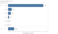
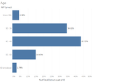
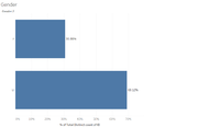
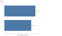
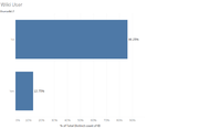
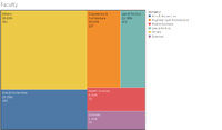
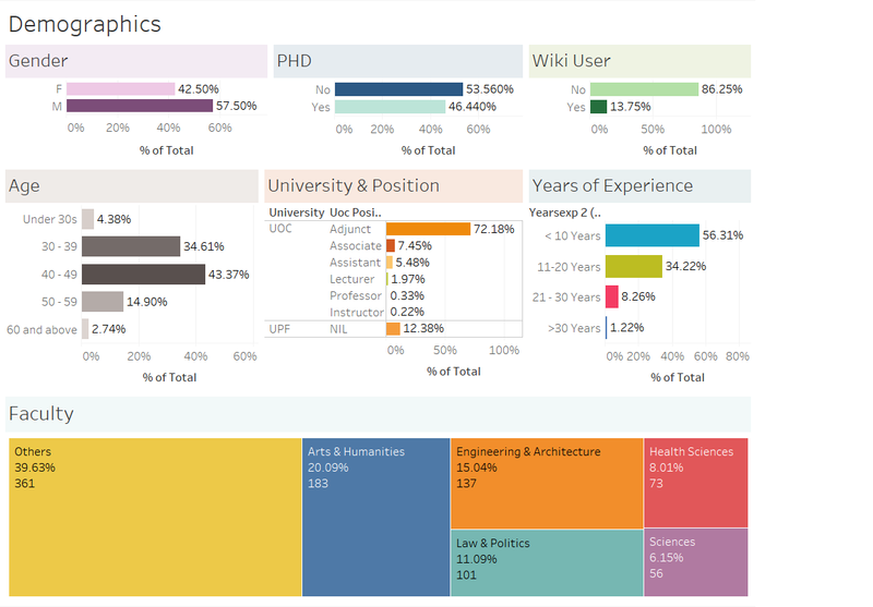
To start of, it is necessary to understand the demographic distribution from the data provided (ie. Gender, University, etc.). Individual bar graphs were created for these attributes to obtain a visualization of the individuals who responded. For Age and Years of Experience, which were stored as measures rather than dimensions, the age/years were grouped into general intervals of 10. For age, groups created were Under 30s, 30-39, 40-49, 50-59 and 60 and above, while for Years of Experience the groups created were <10 years, 11-20 years, 21-30 years and >30 years. Finally, the column "Domain" was renamed to "Faculty", and I decided to use a mosaic plot instead, since unlike the other demographic attributes, this had a longer naming system and I didn't want the axis to take up too much space.
All categories were analyzed in terms of distribution and shown as follows:
General Observations
- More males than females
- More individuals that do not have a PHD
- Normal distribution of age, with the largest proportion being the 40-49 group
- Most individuals were not Wikipedia registered user
- Most individuals in UOC were Adjuct, and all who had NIL response for UOC position were from UPF
- Highest proportion of identifiable disciple (faculty) was the Arts & Humanities, and lowest was Sciences
Questions and Responses
While trying to look for relationships in questions and distribution of answers, I realized that there were too many questions to visualize in a single view. Questions were thus grouped into their respective categories. A graph was created with question group against number of responses for category together with the average response for each category.
The initial visualization created was as follows:
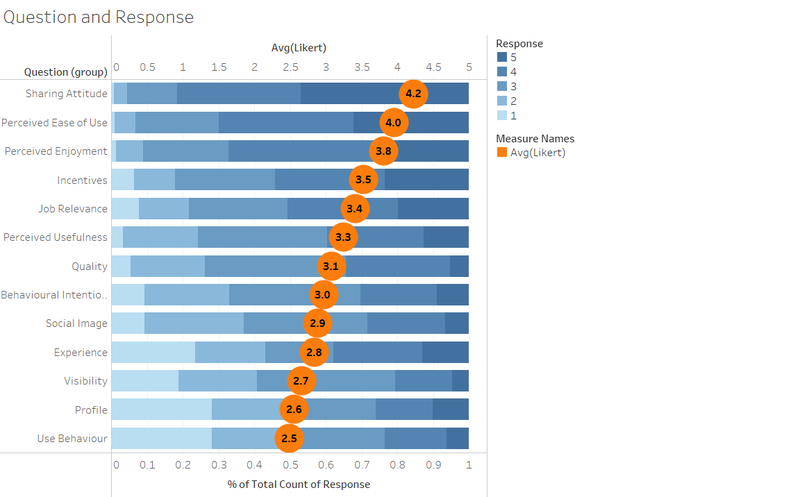
This was a stacked bar graph created using the results and sorted by descending order of average Likert score.
Observations
From the above graph, some basic information was derived:
- Sharing attitude scored of all categories and use behaviour the lowest
- Most categories score above the neutral value of 3, with only 5 categories – Social Image, Experience, Visibility, Profile and Use Behaviour scoring below 5
- Although most questions were above the neutral level, there were more categories that had an average score of less than 3 (5 categories) than categories that scored above 4 (only 2)
Evolution of Visualization
Although the initial graph gave a good representation of scores per question category, it did not give a break down on the distribution of responses for all individual questions. This distribution is important as it shows whether responses were similar across all questions within the category, or if there were a few question in the category that contained extreme responses that would skew the average score calculated in the category. Hence, a hierarchy was also created for the question group and the individual questions, such that in the graph, it would be possible to drill down into each category to understand the distribution of questions and responses.
Furthermore, although the stacked graph is one way to view the data, there is no relationship between the average Likert axis and the axis for % of total response. It also does not give an visual indication of what each of the axis means. Hence, a divergent bar chart was created following steps listed in Data Revelations blog.
The new graph looks as follows
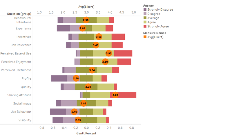
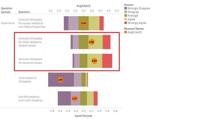
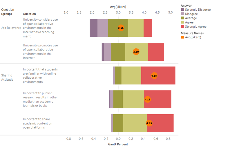
Compared to the previous stacked chart, the divergent bar chart shows the relative position of average values more accurately with reference to 3 being the average/neutral value. Negative answers and positive responses can also be quickly seen (left for negative and right for positive), with the exception the Average response (3), which is centered around 0. An equal/unequal distribution around 0 also shows normal/skewed distribution respectively.
Further Observations
With the new capability of drilling down into individual questions within each group, further insights were derived:
- Although staff members will use Wikipedia for personal and other academic issues, they do not use it to work with students or seldom use it for own field of expertise or contribute to Wikipedia, suggesting lack of adoption of Wikipedia as a pedagogical tool, but more for inquest of general knowledge.
- From the Job Relevance responses, although in general the universities might encourages use of open collaborative environment over the internet, it does not have as strong of a positive view about such environments being used as a teaching tool. I find this ironic when compared against sharing attitude responses. The universities are rather neutral toward considering use of open environments but recognize that it is important for students to be familiar and utilize online collaborative environments.
Is there a relationship between Demographic and Response?
Given some general trends identified from the previous question, the next level would be to identify if there is a relationship between Demographic information collected and question responses.
To answer this, 2 dashboards were created, the first one to visualize any relationships within demographic attributes, and the second one to visualize relationship between demographic and response. The link to these 2 dashboards can be found in the interactive dashboard segment.
Observations
- All “NIL” responses for UOC Position were staff from UPF.
- Proportion of females in Arts & Humanities and Health Science are higher.
- Correlation exists between Age group and Years of Experience. All under 30s had less than 10 year experience, most from 30-39 had less than 10 years experience.
Questions and Response Dashboard
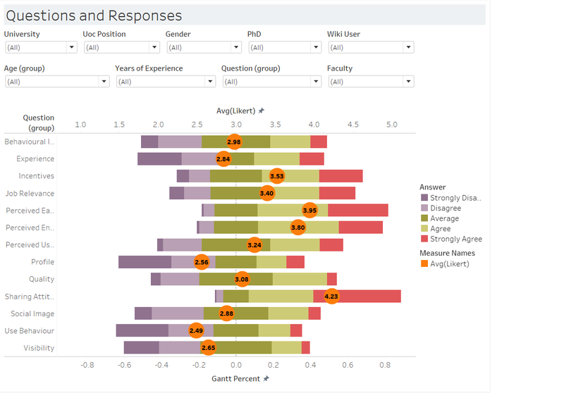
- Non-PHD holders scored higher across all question groups answered when comparing the average score
- Age groups under 30s and 30-39 scored higher across most question groups (other than incentives and job relevance; use behaviour and visibility respectively), while age groups from 40-49 and 50-59 seemed to score lower for almost all categories.
- Surprisingly, for the above 60 age group, there were a mix of responses. Not all categories scored lower. Categories like social image, use behaviour and visibility scored higher
- University seems to affect responses as well
- For Job relevance, UPF university staff seem to score lower than UOC staff, indicating that UPF doesn’t promote the use of Wikipedia or online collaborative environments as much as UOC. This is similar for Behavioural Intentions, where due to the environment, UOC staff are more likely to recommend Wikipedia to students and utilize it in teaching
- However, UPF Staff seem to believe that it is more important to share content/have an online collaborative environment than UOC staff. More people also believe that it will be useful for teaching and helping students learn. Although not used by most staff, staff response indicates that Wikipedia is still recommended to students in courses more often than in UOC.
- Faculty affects usage of Wikipedia
- Science and Engineering scored highly across most question while Law and Health Sciences scored generally had lower scores than average
How can all these be applied?
Given the above observations made, the final level would be to evaluate how all these observations can be utilized. The key issue issue that can be address are: How can universities encourage staff to use Wikipedia as a teaching tool? or How effective is Wikipedia as an online open collaborative environment?
To achieve this, the questions were filtered to only look at specific categories related to answering these questions, namely:
- Behavioral Intentions,
- Incentives,
- Job relevance,
- Perceived Ease of Use,
- Perceived Usefulness,
- Quality, and
- Use behavior
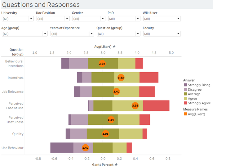
The final dashboard for questions and answers hence looks as follows:
Final Observations
It is noted from the behavioral intentions category that on average, most individuals are neutral toward use of Wikipedia. However, as observed from above, age has a correlation to perceptions of Wikipedia. Those under 40s or above 60 tend to view Wikipedia more favorably and are more receptive to the idea of Wikipedia as a teaching tool. Hence, universities should focus on targeting these individuals for higher success rate. To be more specific, they could choose to start from the Science and Engineering faculties that have a more favorable response toward use of Wikipedia.
In terms of which method would be most effective in encouraging use of Wikipedia, based on results from the Incentives questions group, having a best practices guide would have the greatest receptivity of the 4 methods listed.
However, although general opinions on Wikipedia use are neutral tending to positive (for Quality, Perceived usefulness, and perceived ease of use), it is also noticed that regardless of whether the university promotes an open collaborative environment over the internet (Job relevance), faculty staff still tend to not develop educational activities using Wikipedia (Use behavior). Perhaps this could be because staff tend to use other forms of online collaborative environments rather than Wikipedia.
Overall, the survey data is able to give much insight into Wikipedia usage in these 2 universities. Coupled with visualization techniques, such trends can be more easily identified and utilized.
Interactive Dashboard
The 2 links below show the interactive dashboard created from the dataset provided. The dashboards can be used effectively to compare results by opening multiple tabs/webpages simultaneously side by side. For instance, if you'd like to see Male vs Females for question responses, open one webpage and filter by Male and another filtering by Female. This helps in comparing the changes.
Any results/observations shown above can be recreated using either of the 2 dashboards as follows.
Edits
Given the opportunity to edit our work, I refined the dashboard by cutting down the number of questions that were relevant. Initially, all questions that were collected in the survey was visualized, which proved to be messy and irrelevant at times.
