ISSS608 2016-17 T1 Assign2 Chris Thng Ren Jing
Contents
Introduction
The data set in which this analysis will be conducted, comes from : UCI
It is about the ongoing research on university faculty perceptions and practices of using Wikipedia as a teaching resource. Based on a Technology Acceptance Model, the relationships within the internal and external constructs of the model are analyzed. Both the perception of colleagues opinion about Wikipedia and the perceived quality of the information in Wikipedia play a central role in the obtained model.
The academic professionals being survey-ed come from the Universitat Oberta de Catalunya, Barcelona, Spain.
Approach
In this assignment, my data preparation, cleaning and transformation revolved around JMP. In terms of visualization, I used Tableau alot and other programs such as Treemaps and HighD. 2 data sheets were created, 1 for Tableau and 1 for JMP. The reason behind this, Tableau requires the questions to be in stacked format as opposed to being in rows for it to develop useful visualizations. In this report, I will explore the way the data was prepared, cleaned, transformed and lastly, visualized.
Visual Analytics Application Design Process
Step 1: Identify a theme of interest
Wikipedia is considered an “un-reliable” source of information by majority of internet users. However, how is this viewed in the academic aspect? Do they still use it despite this known phenomenon? Does this perspective differ in terms of domain? Age? Work experience? Explore and identify interesting points and correlations.
Step 2: Define questions for investigations
The questions I have come up with revolve around three major themes: usage, quality and experience of Wikipedia. I will be looking at how it is being perceived by academic professionals by age, domain, work experience and etc. The aim is to find correlations and relationships between the different variables used and identify interesting points that would be useful for Wikipedia in customizing its resources to better meet the needs of the academic world.
1. What are the demographics of the educators in UoC?
2. Do different faculties (domains) perceive Wikipedia differently?
Observe the contrast between the faculties and their view on Wikipedia’s QUALITY.
3. Does working experience affect their usage of Wikipedia?
Observe the contrast between the people with different working experience (0 – 10, 10 – 20, 20 or more) and their usage (EXP field).
4. Does age affect the ease of use of Wikipedia?
Observe the contrast between the people of different age groups (Young, Middle-Age, Senior) and views on the ease of use of Wikipedia.
5. Does gender affect the use behaviour of Wikipedia for developing educational materials/interacting with students?
6. Explore a potential correlation. Does having age have an impact with on their enjoyment of Wikipedia?
7. Do the years of experience one has affect their perspective on the quality of information from Wikipedia? Does Domain have any effect on this analysis?
Observe the contrast between the faculties and their view on Wikipedia’s QUALITY.
Step 3: Find appropriate data attributes
I will be focusing on UoC academic professionals only, who have filled out all the survey questions without blanks, 1. Cleaning the data
- Identified UOC Position: "?" Filter all non-UOC members. Delete these rows to find only UOC members (1-6) for data analysis.
- Identified Domain: "?" These UOC members do not have a domain they are teaching. Not useful towards data analysis, removed.
- Identified Years of Experience: "?" These members have not filled in how many years of experience they have. Not useful for data analysis, removed.
- Identified Other Position and Other Status Column. These are UOC members that belong to other universities too. Not useful for analysis since the focus is on UOC members, removed.
- Identified User Wiki: "?" 1 Row. They have not filled up the form properly (0 or 1), hence we will remove them as we are unable to ascertain this data properly.
- Identified Domain: "6". This domain is not defined in the UoC Data Dictionary, removed as it does not have meaning towards this analysis without any definition.
- Identified Missing Values within Question Columns: "?".
All questions with “?” were given a 1000 mark in order to idenitfy those who did not fill up some questions.
Did a sum of all question columns. Identified and filtered out rows in the thousand range. Non "?" rows will be within the hundred range.
Selected rows show that the surveyee has not filled up the survey properly, removed to ensure full data accuracy and integrity.
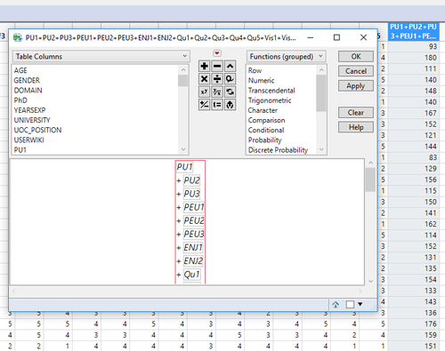
- Identified Surveyees who gave a "5" rating to every single question. Found 2 rows. Identified as odd, but left there as it is the surveyees opinion.
2. Data Transformation
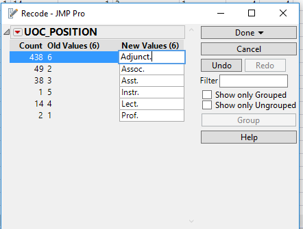
- Recoded UOC Position (1-6). Recoded based on the Data Dictionary, this will help readers to understand the information easily.
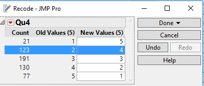
- Qu4: In my area of expertise, Wikipedia has a lower quaity than other educational resources?
This gives a negative rating towards the overall scoring. Hence, the question has been rephrased and the scoring has been adjusted proportionately.
New Q4: In my area of expertise, Wikipedia has a higher quality than other educational resources?
Scoring has been revised.
Previously scoring 1(strongly disagree) = New scoring 5(strongly agree)
Previously scoring 2(disagree) = New scoring 4(agree)
With this revision, the total scoring will show a score of how good Wikipedia is as an educational resource as opposed to being scored of how bad Wikipedia as an educational resource is.
- Rephrased the questions. This rationale behind this: after trying to input the data into a visualization, I realized that "PEU1" only provides the reader the question's unique ID and had to refer back to the Data Dictionary to find out what it meant, so I rephrased it to "PEU1: Is Wiki user-friendly?". This allows the reader to immediately identify what sort of question is being analyzed/visualized. This was done to all the questions.
- Creating a Binned column: Years of Experience from a continuous field to categorical field (0 to 10 YEARS, 10 to 20 YEARS, 20 YEARS +). Used the recode function after this step to convert the age range to characters.
- Creating a Binned column: Age from a continuous field to categorical field (25 to 35, 35 to 45, 45 onwards) -> (Young, Middle-Age, Senior). Used the recode function after this step to convert the age range to characters.
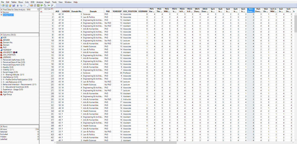
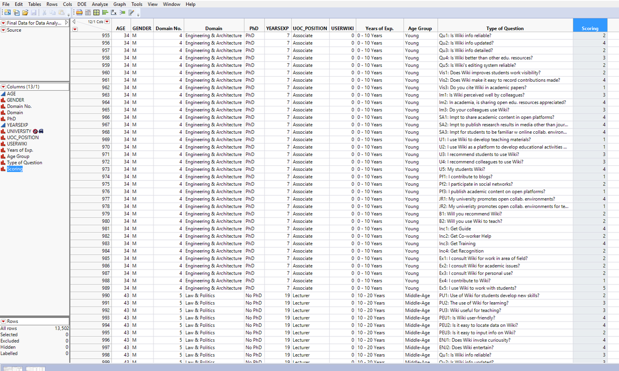
- Tableau requires the questions to be stacked so a new data sheet was created to stack the columns and convert them into rows (two new columns; Type of question and Scoring)
3. The Prepared data (Original and Stacked datasets)
Results
1. What are the demographics of the educators in UoC?
- Engineering & Architecture have the biggest faculty; Sciences has the smallest
- Engineering & Architecture has the most male lecturers; Health sciences has the least
- Arts & Humanities has the most female lecturers; Sciences has the least
- Engineering & Architecture and Sciences have a faculty which has over 20 + years in experience all have PhDs; it can be seen that the more experience the person has the higher the chance he will have a PhD
- The Arts & Humanities has the most registered wiki-users. And the largest group of registered users come from the Senior (age group) educators.

This point makes me interested in exploring the Use Behavior of Wikipedia by the educators from the Arts & Humanities domain. As seen below, it actually makes sense. The largest group that were registered users of Wikipedia were from the Senior group. This correlates to the usage; the Senior group actually used Wikipedia the most as a teaching resource for their students. This leads to a conclusion that the higher the number of Wiki registered users, the higher the Use Behavior in terms of teaching, developing educational activities, recommending students/colleagues to use Wiki. In U5, registration by educator and students using wiki have no obvious relationship.

2. Do different faculties (domains) perceive Wikipedia differently?
Observe the contrast between the faculties and their view on Wikipedia’s QUALITY.
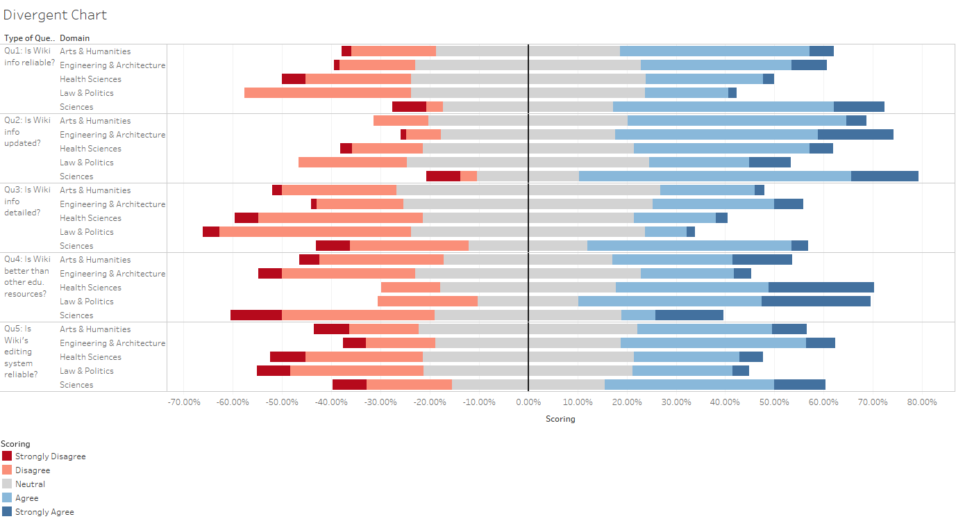
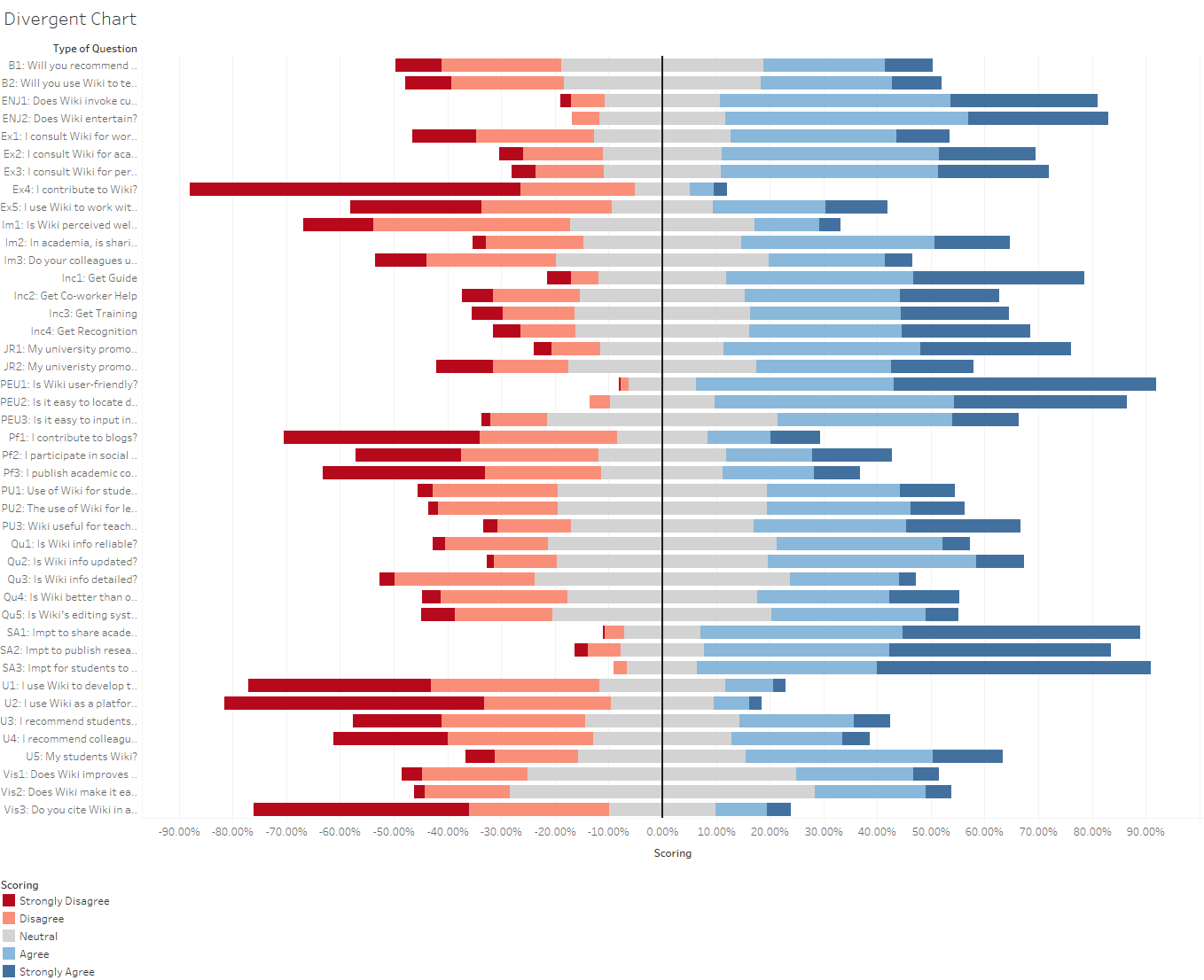
To answer this question, I will be using two different visualizations, the divergent chart and the stacked bar chart.
The divergent chart is great for analyzing the data when approaching it with the focus on the big picture.
The stacked bar chart is great for analysing the data when doing comparisons between variables. It is easy to understand and visually pleasing.

Qu1: Is Wiki info reliable?
It can be observed that Law & Politics views Wikipedia as the least reliable as compared to the other faculties. The red bar is the longest and illustrates that this domain has the most negative view towards Wikipedia’s reliability. Vice-versa; the blue bar is the shortest amongst the other domains.
This led me to wanting to find out if Law & Politics which acknowledged that Wikipedia was unreliable see if they actually used Wikipedia for their work (observe any contradiction/correlation if there is).

It can be observed that they (Law & Politics) actually do not use it in their area of expertise as what they have mentioned of Wiki being unreliable. However, an interesting point to note:
Law & Politics actually consult Wiki for academic issues, personal use and use it to work with students.
This shows that although Law & Politics educators find Wiki info unreliable, they do not use it in their area of expertise but instead use it for other aspects such as approaching academic issues, personal use and working with students. It can be seen that they are answering based on their area of work and this gives a bad representation of Wiki information as a whole, hence a better way to approach “Qu1: Is Wiki info reliable?” They could have broken it down into 2 different aspects: “Is Wiki info reliable in your area of expertise” and “Is Wiki info reliable in general”.
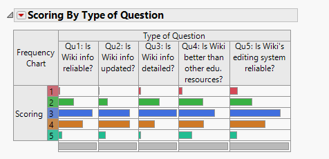
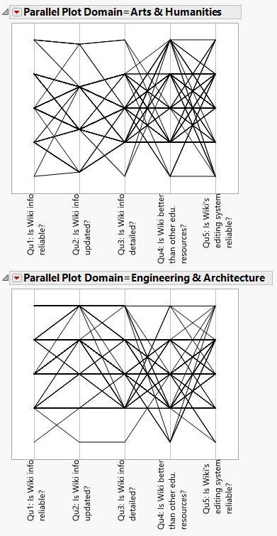
I attempted to illustrate this using JMP. However, it is extremely limited in this aspect. I had to filter out the questions (export to a new data sheet) I wanted followed by filtering the domain type. Illustrated below the visualization is much easier to comprehend as compared to Tableau (shown above). However, because JMP is weak in multi-layered analysis, Tableau was a better choice.
Domain 1:
Domain 2:
Qu2: Is Wiki info updated?
All faculties agree that Wikipedia keeps it information updated.
Qu3: Is Wiki info detailed?
As observed again, Law & Politics has the largest red bar & smallest blue bar as compared to the other domains. This domain does not find Wiki detailed.
Qu4: Is Wiki better than other edu. resources?
There is quite high agreement by the Arts & Humanities, Health Sciences, Law & Politics. There is little agreement by the Engineering & Architecture, Sciences.
Qu5: Is Wiki’s editing system reliable?
All faculties have positive views on this statement.
3. Does working experience affect their usage of Wikipedia?
Observe the contrast between the people with different working experience (0 – 10, 10 – 20, 20 or more) and their usage (EXP field).
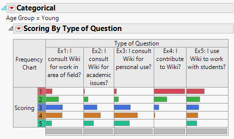
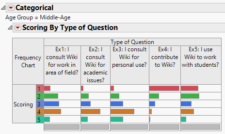
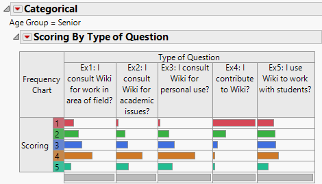

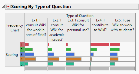
I developed 2 different visualizations for this. The first is based on categorical using JMP and the second with Tableau. From this it can be seen that Tableau is able to show the different Age Groups by Type of Question, it is far superior in terms of this visualization technique than that of JMP.
From this illustration it can be seen that generally, age does not affect the usage of Wikipedia. However, some clear differences that can be noted:
- Young people do not contribute as much to Wiki as compared to the Middle-age and Senior group.
- Young people tend to use Wiki to work with their students as compared to the other age groups.
4. Does age affect the ease of use of Wikipedia?
Observe the contrast between the people of different age groups (Young, Middle-Age, Senior) and views on the ease of use of Wikipedia.

It can be seen that Age does not affect the ease of use of Wikipedia. This shows that despite the age difference, Wikipedia still remains user friendly for everyone.
However, an interesting to point to note:
- The Middle-age and Senior group do not find inputting information on Wiki as easy as the Young Group.
5.Does gender affect the use behaviour of Wikipedia for developing educational materials/interacting with students?

It can be seen that both genders have the same tendencies. However, Males tend to agree that they use Wikipedia more as compared to their Female colleagues by a small percentage.
6. Explore a potential correlation. Does having age have an impact with on their enjoyment of Wikipedia?
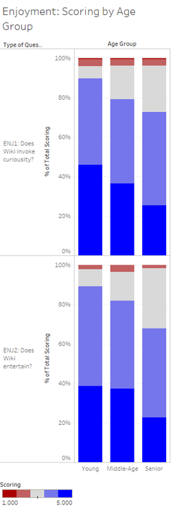
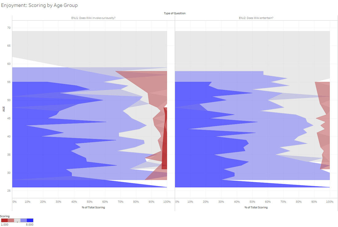
It can be seen that as one gets older, their enjoyment of Wikipedia to invoke curiosity or for entertainment purposes declines linearly
7. Do the years of experience one has affect their perspective on the quality of information from Wikipedia? Does Domain have any effect on this analysis?
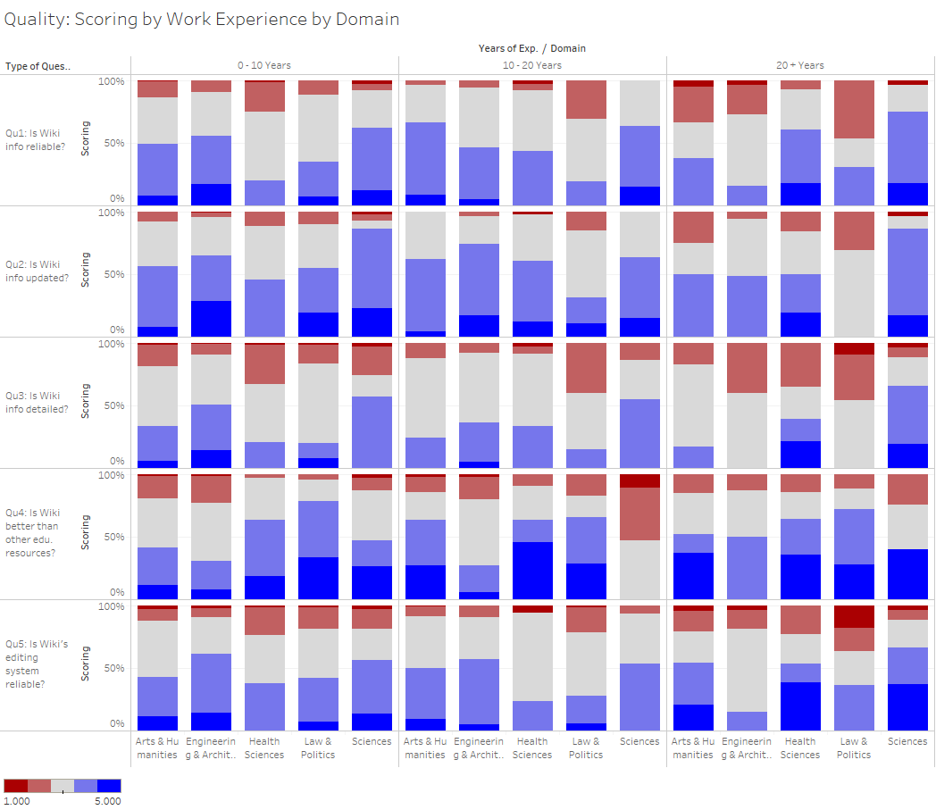
This visualization is a trellis-stacked bar chart. It shows the relationship between the years of experience one has, which domain the individual belongs to and his perspective on the quality of information from Wikipedia.
It fulfils its purpose of containing a lot of useful information within a single visualization. With this we have many options on what to look at.
Let us focus on Law & Politics and how the educators belonging to this domain feel about Wiki’s information reliability:
0 – 10 YEARS: Majority of the educators are sitting on the fence. Quite a number agree Wiki information is reliable, few disagree.
10 – 20 YEARS: The number of educators sitting on the fence has decreased. The number who agree Wiki information is reliable has decreased. However, there is an increase in the number who disagree that Wiki information is reliable.
20 + YEARS: Number of educators sitting on the fence has decreased significantly. The number who agree Wiki information is reliable has increased slightly. However, there is a significant increase in the number who disagree that Wiki information is reliable.
In summary, we can see that those with less work experience are either neutral or agree that Wiki information is reliable. However, as the number of years in work experience progresses, they tend to disagree that Wiki information is reliable. There is also less ambivalence and they tend to express their feelings either by agreeing or disagreeing to the motion.
8. The above analysis has further led to me wondering if being ambivalent (neutral) has something to do with work experience. I will explore this analysis:
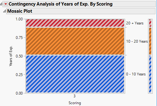
In this analysis I take all the questions, filter by the Neutral responses, categorize them by Years of Experience. Compute the running total of the Neutral responses by the data per row (questions).
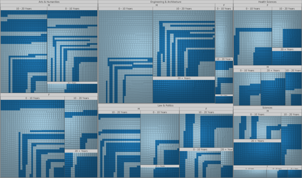
From the visualization shown below using a Line-Mark chart, it can be seen that ambivalence reduces as Years of Experience increases. Educators tend to have a stronger view with the increasing number of years of experience they have. I add in the tree-map to create a better visualization to see how many neutral responses there are per question (size of square).

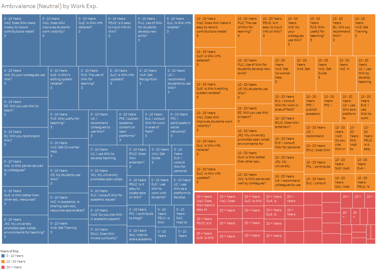
I used JMP to further analyse this result. It was able to generate a Mosaic Plot, which answers this questions most appropriately in terms of visualization.
Visualizations
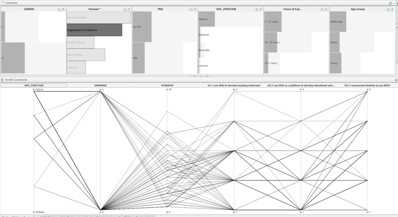
Parallel coordinates
Comments:
Parallel Coordinates are mainly used for continuous variables, however for this dataset which is based on a likert scale, it can still be used to visualize the likert scale as they are all fixed points 1-5 on the Y axis. However, in terms of usefulness it pales in comparison to Stacked bar charts and Divergent charts.
Created using JMP:
Created using High-D
Explanation Video: How to useParallel Coordinates in High D
Treillis
Created using Tableau:

Mosaic Plot
Created using JMP:

Divergent bar chart
Created using Tableau:
Treemap
Created using Tableau:

Created using: Treemaps

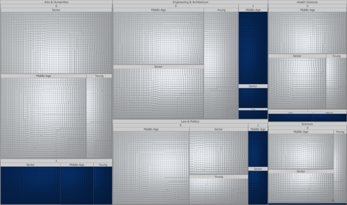
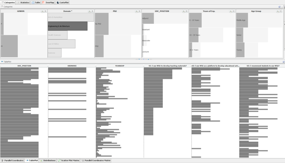
Table Plot
Using High-D
Explanation Video: How to useTable plots in High D
Tools Utilized
Tableau
Divergent Chart Interactive Workbook
Multiple Interactive Visualizations
Comments:
Tableau is highly interactive and great to use in designing data visualization tools. Its multi-layered filtering and multi-variable function allows many specialized visual analytics techniques to be utilized (e.g. Trellis, Stacked bar charts, Line charts, Multi-variate graphs)
However, some limitations I faced with Tableau was:
- Data preparation: It is not very predictive and user friendly.
- Data visualization techniques: An example would be treemaps, its present function to create treemaps cannot accomodate many variables and yet maintain its usefulness. Another example would Divergent Bar charts, it requires many steps/computations to develop an appropriate and useful Divergent Bar chart.
JMP
Comments:
JMP is extremely good for data preparation and transformation. Majority of all my data preparation and cleaning was done with JMP, its summary table, distribution, recode, row by column functions enabled me to prepare my data in a shorter span of time as compared to using other tools such as Excel or Tableau. It is fast, predictive and user-friendly in preparing data.
However some limitations I faced with JMP:
- Data visualization: It was very limited in terms of visualizing techniques, specifically for this assignment which was mainly using categorical data (likert scale).
- Multi-layered data filtering: It pales in comparison to Tableau which is highly interactive in this aspect.
Qlik Sense Desktop & Power BI
Comments:
Both programs are great in creating highly interactive dashboards. However it is limited in terms of its multi-variate analysis and the number of data visualization techniques are limited. Data preparation is not as intuitive and user-friendly as JMP.
