ISSS608 2016-17 T1 Assign2 Chen Yi Fan
Overview
In this assignment, we are tasked to analyse a survey dataset. It is regarding the Wikipedia usage in 2 of universities in Spain, Universitat Oberta de Catalunya (UOC), an internet-based open university founded in 1995 and Universitat Pompeu Fabra (UPF), a public university founded in 1990.
Dataset Preparation
The csv dataset contains 913 rows and 53 attributes. 10 attributes are respondents demographic profile. The other 43 attributes are their responses for the survey questions.
The values for the categorical attributes are entered in numeric forms. With the data dictionary from the dataset webpage, I used JMP to recode the numeric values into their string format. The missing values denoted as "?" have also been removed from the list.
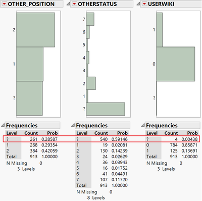
It is also noticed there are 261 or 29% rows in OTHER_POSITION and 540 or 59% rows in OTHERSTATUS are missing (denoted as “?”). These 2 attributes are not very meaningful for our analysis because more than 25% of them are missing from the entire dataset. The USERWIKI with null value are also excluded from the analysis since they are only 0.4% out of the total records.
There are no missing data detected for AGE, GENDER, UNIVERSITY and Ph D. There are only 5 scales mentioned in the data table for DOMAIN names. Hence I decoded “6” as “Others”. The following rows are also excluded from the analysis: 2 rows with the value of “?” for DOMAIN, 23 rows of missing record for YEAREXP and 113 rows of missing records for UOC_POSITION.
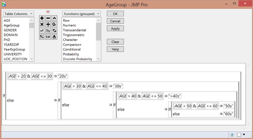
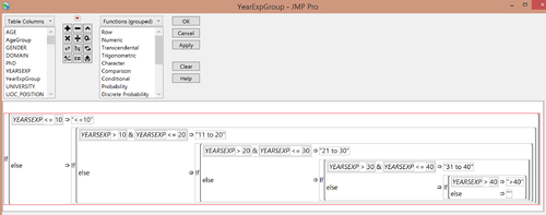
It will be difficult to analyse an attribute with too many levels, such as AGE and YEAREXP. Therefore, 2 new columns AgeGroup and YearExpGroup have been created to group the values by 10 years gap.
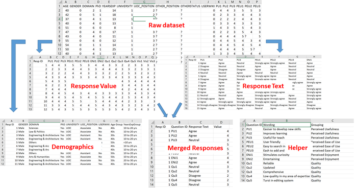
One of the techniques I learnt from the Data Revelations Founder and Pricipal Steve Wexler is to reshape the raw survey data from horizontally spread to vertical format. In the raw format, each row represents one respondent’s input for the survey. After reshaping the data, one column will contain all the attributes’ names and one column has the corresponding value for that attribute. Hence one respondent’s input will be represented by multiple rows. Meanwhile, a helper table is created to map each survey question represented in 2 characters and number to its label. Before reshaping the data, a new column RespID is created in the raw dataset to identify each entry.
After the transformation, it will be easier to look at demographics and survey question responses separately or analyze the entire dataset with the common id between the separated dataset. The data transformation is illustrated in the following diagram.
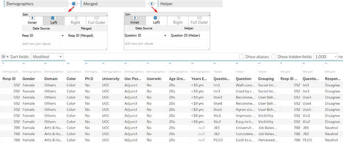
The final dataset including 3 sheets, demographics, merged responses and helper, are imported into Tableau. They are joined using RespID and Question ID
After the above data preparation, there are a few questions I would like to focus on the following aspects.
- What are the participants’ demographics?
- How different groups of respondents perceive Wikipedia?
- What are the relationship between different attributes or how does user’s view on Wikipedia affecting their behaviour?
Data Exploration
What are the participants’ demographics?
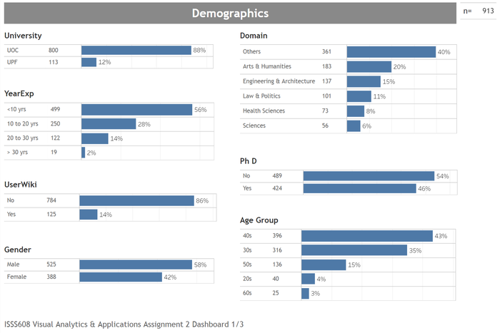
The following dashboard illustrates all respondents’ demographics in one chart which is clearer than the Parallel Set and Tree Map in first version.
We can observe from the demographics dashboard:
- 88% survey takers are from UOC compared to 12% from UPF
- More than half (56%) of the respondents have less than 10 years working experiences
- Majority (86%) are not Wikipedia registered users
- There are more male (58%) than female (42%) faculty members participated in this survey
- 54% of the respondents are not PhD
- 43% of the respondents are in the age of 40s.
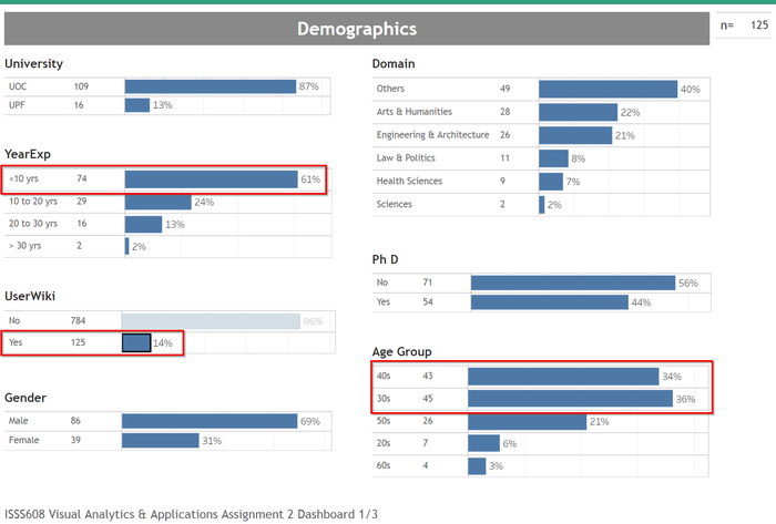
When we drill down further into the registered Wikipedia user group. We could see there are more respondents are at the age of 30s (36%) and less than 10 years working experiences (61%).
How different groups of respondents perceive Wikipedia?
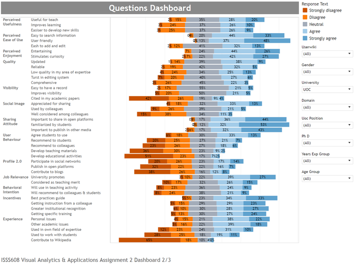
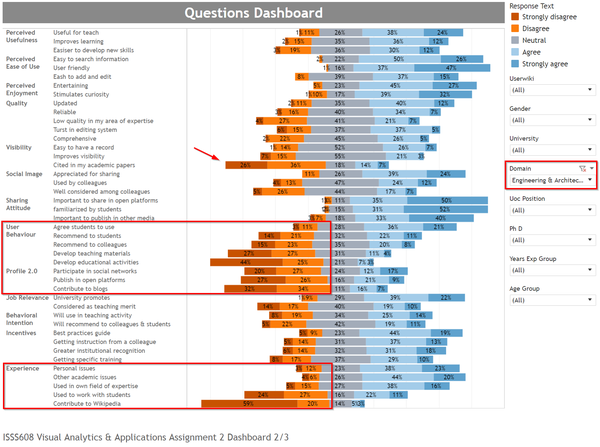
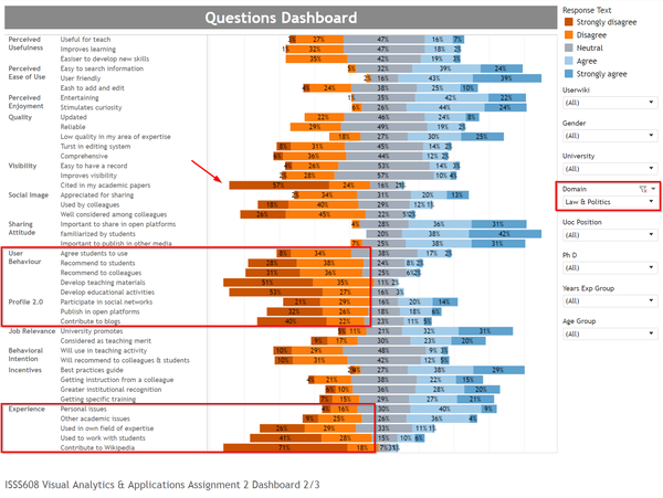
A few articles 1, 2 and 3 from Data Revelations demonstrate how to design a diverging or likert scale chart to visualize survey dataset effectively. The chart below allows user to easily select different group of respondents and analyse their views for Wikipedia.
- As an overall, the survey takers have positive perception on Wikipedia for the attributes of ease of use, enjoyment and sharing attitude.
- However, for the visibility, user behaviour, profile 2.0 and experiences attributes, the perception is largely negative.
By filtering the domains, we can see the different perception over these attributes. For example, Engineering & Architecture is more positive than Law & Politics for the above mentioned attributes as shown the following charts.
What are the relationship between different attributes or how does user’s view on Wikipedia affecting their behaviour?
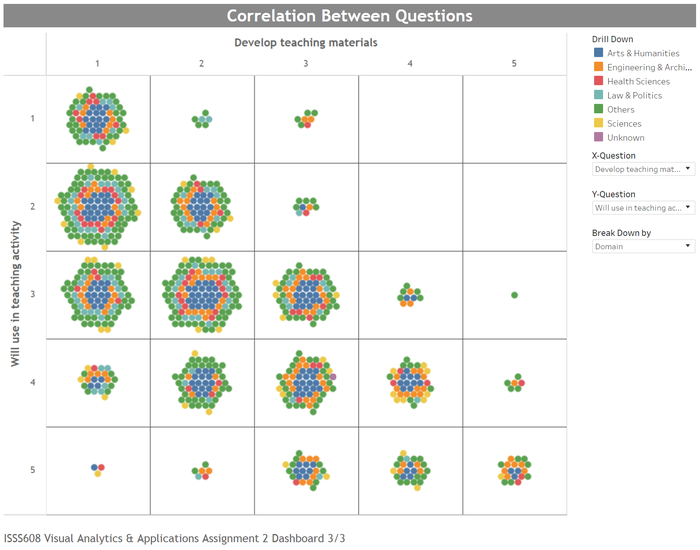
Steve Waxler presented an interesting likert packed bubble chart in his Youtube video which makes the relationship between each attributes clearly shown in one chart. Used in this assignment, each of the survey questions could be visualized in the following chart.
Compared to the previous version, it is easier to visualize the relationship between each pair of the attributes and the results are more explanatory. For example, the chart above shows that majority respondents are not in favor of using Wikipedia to develop educational activities with students. However, it is not very clear specifically which group of the users have more negative views than the other groups.
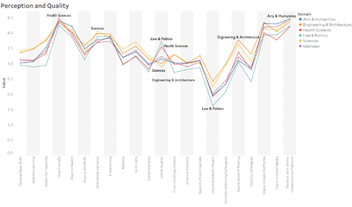
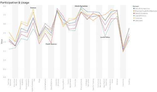
In the earlier version, I attempted to use Parallel coordinates to address this problem. It seems clearer than the bubble chart to visualize in which areas the respondents feel whether Wikipedia is useful.
For example, we could see users generally feel Wikipedia is user friendly and helpful in stimulating curiosity as well as entertaining in editing it. But it is considered not easy to add and edit information in Wikipedia. It also shows that the faculty members don’t cite Wikipedia frequently in their academic papers, especially in Law & Politics domain. This might be explained by QU4 index which indicates the quality of Wikipedia content in the area of expertise. Specifically, Wikipedia for Law & Politics and Health Sciences related contents are perceived to be lower quality than other educational resources as compared to other domains, such as Sciences and Engineering & Architecture.
It is interesting to note that although the universities do promote to use open collaborative environments in the Internet, it is however not recognized as teaching merit.
Teachers agree students to use Wikipedia in their courses. But it does not show they are willing to recommend as well as practice in their teaching activities. Wikipedia is used more often for other academic related issues and personal issues than their own field of expertise. As a result, it shows very low interest among the faculty members to contribute to Wikipedia.
The 3 dashboards are accessible through the links below:
Future Development
As commented by the instructor, analysing and visualizing a dataset is never a one-way journey. We could always find new ways or aspects to look at the data. There also might be some mistakes or wrong approach in studying the dataset in this assignment. Welcome for the readers' comments and suggestions to improve the work.
