ISSS608 2016-17 T1 Assign1 Thian Fong Mei
Abstract
Public housing has been said to be a Singapore icon, with HDB housing more than 80% of Singapore’s resident population. (http://www.hdb.gov.sg/cs/infoweb/about-us/our-role/public-housing--a-singapore-icon). Indeed, home ownership has been the aspiration for many. For first timers looking to purchase a unit in public housing, there is always the dilemma of buying a flat direct from HDB or a resale flat from the open market. Purchasing a flat direct from HDB, though cheaper, has a longer wait time depending on how long the developer takes to build the new units. With Cash over Valuations (COVs) dropping in recent years, a resale flat seems within reach for first timers again. This analysis targets the HDB resale transactions which occurred in 2015 and first half of 2016 only.
Problem and Motivation
Buying a flat is a major commitment, and one does not want to fall into the trap of behaving irrationally, and thus making a wrong decision.
One will look at time fluctuation of the resale flat prices in 2015 and first half of 2016, for price is always a major consideration in being able to service the housing loan without getting an indebtedness situation. In addition to that, it has been commonly quoted that when it comes to a property purchase, it is always about “Location, location and location”. In this analysis, besides analyzing price and location, one will also look at other attributes of the resale flat such as location, age, size, design and height of flat.
Through this analysis, it is hoped that one who is looking for a home currently is able to make an informed and rational decision for oneself.
Approaches
One aims to look at the time-series price fluctuations, and to examine the influencing attributes. In this visualization work, the following document the approaches.
Data Source
The data sets available at Data.gov.sg are explored. In narrowing down, specifically, the “resale-flat-prices-based-on-registration-date-from-march-2012-onwards” data set is used. There are 10 variables in this data set of 79,650.
Data Preparation
The data set is reviewed for missing or incomplete data. It is noted that Storey Range in the data set has some overlaps. However, there is no other source of data available to re-bin them without overlapping ranges. This could be due to how HDB had organized them with passing time. General analysis could still proceed without major impediments.
There are 2 variables which were transformed:
- month - This variable holds the string of numeric year-month. A new variable, Year, is calculated for the correct year and month format, using DateParse function.
- lease_commence_date - This variable holds the string of numeric year. A new variable is calculated for the correct year format, using DateAdd function.
Infographic
General Price & Transaction Observations
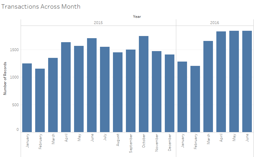
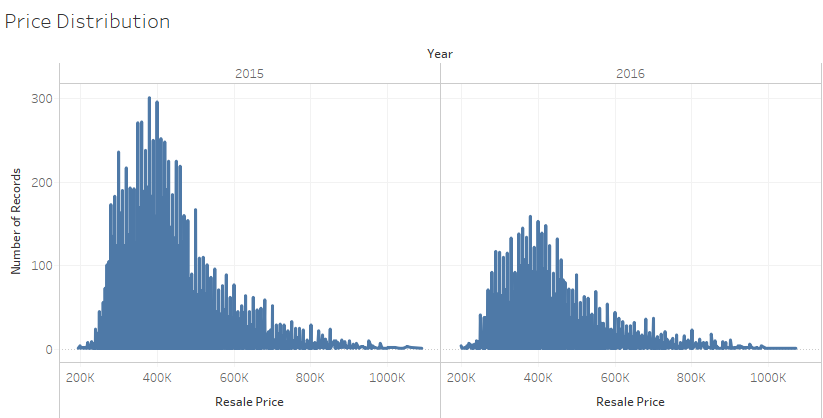
The following 2 diagrams shows the number of resale transactions across the months and the price distributions in 2015 and the first half of 2016,
- One observes that the number of resale transactions tends to taper off during beginning and end of the year.
- One also observes the right skewness of the distribution of prices across the transactions, and the price of resale flat range from 200K to slightly over $1Mil
- The first diagram uses bar charts to depict the changes across the months. Though the orientation of the labels for the months is not ideal, this is the best option to depict the changes with time on the x-axis. Hence, there is a trade-off in visualization design.
- In the second diagram, as one would like to show the distribution of prices based on the number of transactions. The consideration again is to place the continuous resale prices on the x-axis, with the number of records of transactions on the y-axis.
General Price Trending
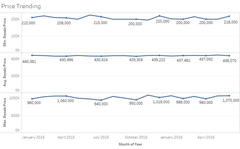
The following diagram shows the minimum, average, and maximum price trending across 2015 and the first half of 2016.
- One observes that the average price movement is generally flatter than the minimum and maximum price movement. There do not appear to be any correlation between minimum price and maximum price
- One uses line charts across time, and stack them vertically to allow comparison of the movement of prices.
- One also encodes the quarterly values (in 2015), and 2-monthly values (in 2016) for better visualization.
Note: The average price is used here for comparison, as it was checked during visual exploration that the median and average prices are close in range.
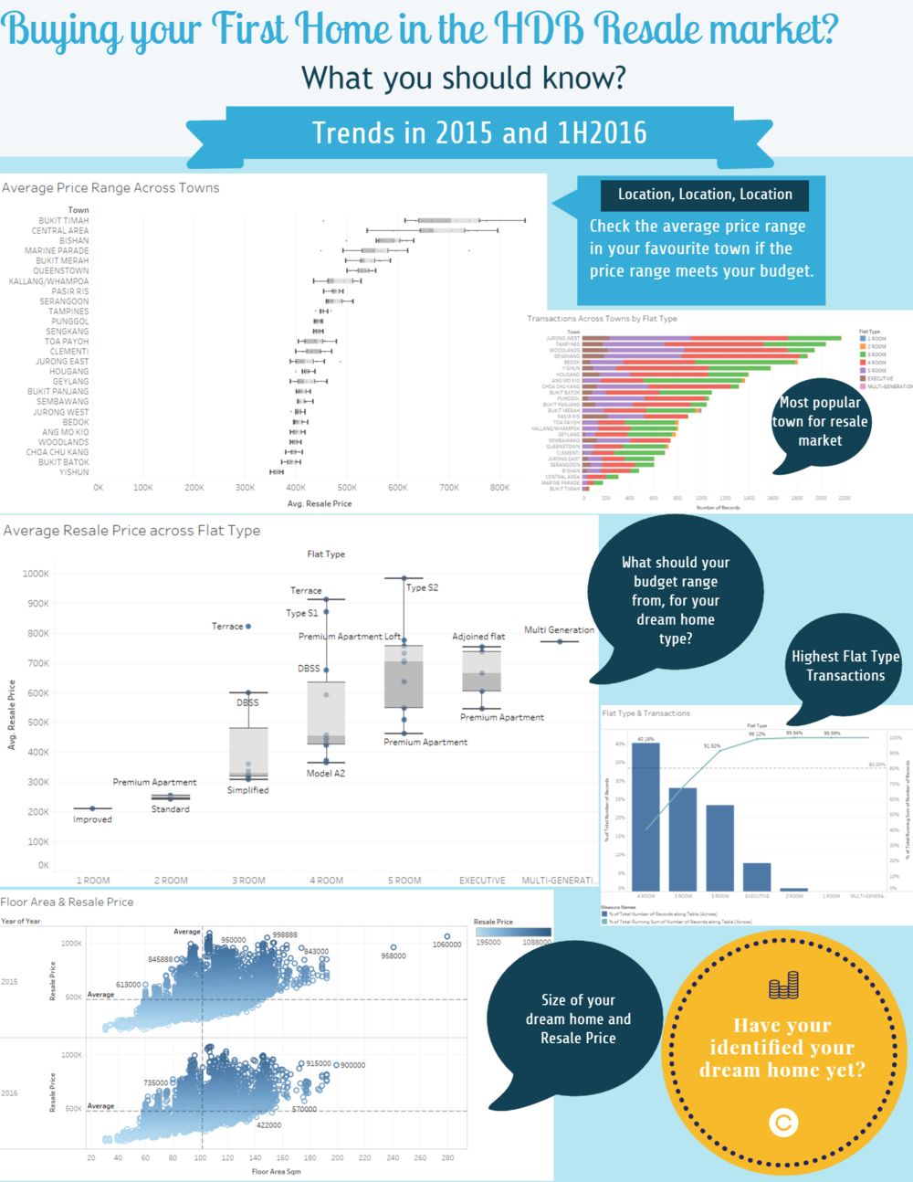
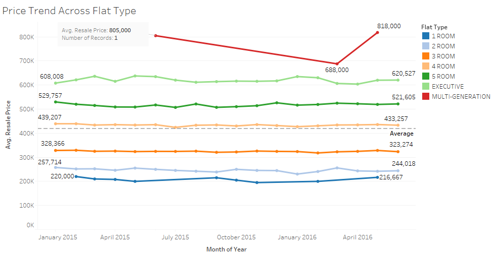
The following 2 diagrams show the price trending across 2015 and the first half of 2016 in various towns and flat types.
- One observes that towns such as Bukit Timah, Central Area, and Marine Parade have greater price fluctuations, and their average resale prices do hit beyond 700K.
- Across flat types, the average prices are generally stable. Only Multi-generational flats see higher fluctuation. It should be noted that there is only 1 transaction record each in the 3 months.
- One uses line charts across time, and uses the color marks to distinguish between each town to allow comparison.
- One also encodes some of the peak values for better visualization.
- Markers are deliberately used for the lines in the 2nd chart, so that one could easily see which if all flat types have transactions in all months. Example, one already sees MG flat has only 3 records.
- The use of 1 annotation is to draw attention to the reader on the MG flat and the nature of the transaction (1 record, and price)
Location, Transaction & Price
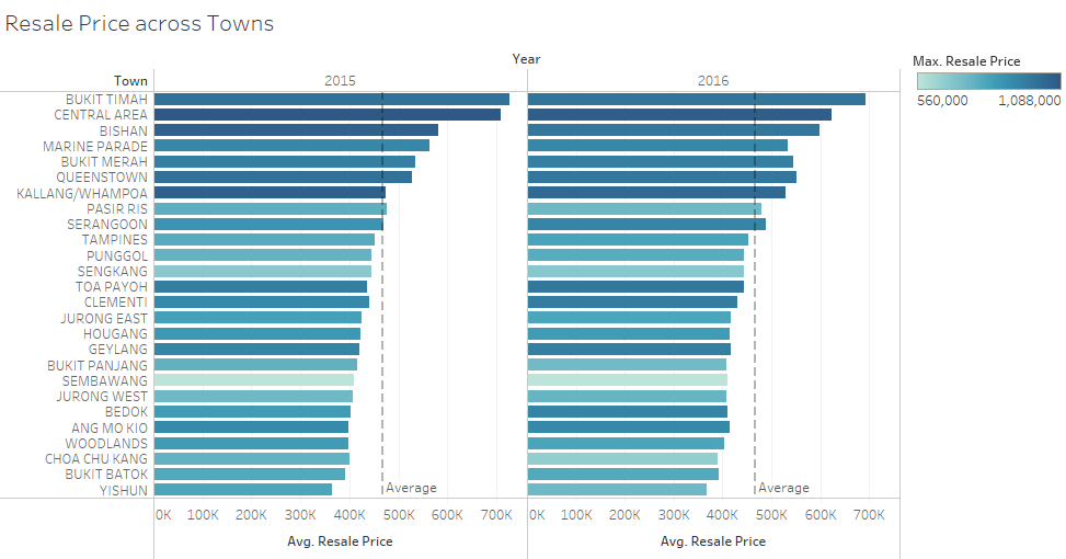
The following diagram shows average resale prices across each town in 2015 and first half of 2016.
- One observes that Bukit Timah, Central Area, and Bishan are the top 3 towns which sees the highest average prices. Marine Parade which was 4th in 2015, was replaced by Queenstown in the 4th position in 2016.
- One also observes that the average resale prices generally drops comparing across the 2 years.
- In addition, though Bukit Timah sees the highest average resale price, it is the Central Area which sees the maximum resale price transaction.
- In this instance, bar charts of average resale prices are used to make categorical comparisons across the towns.
- For maximum resale price, the colour palette of blue-teal is used to highlight the town with the highest transaction prices.
- The Town variable is placed at the Row, so that one can read off the name of the town easily.
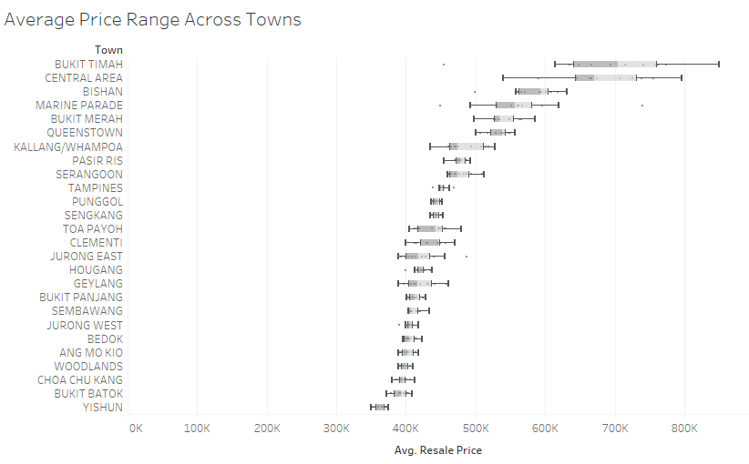
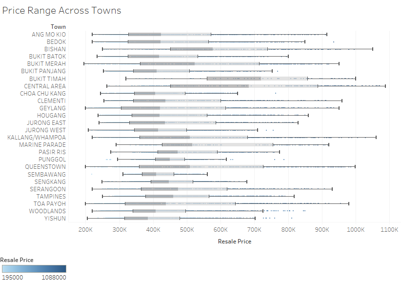
The following 2 diagrams shows average and actual resale price range across each town in 2015 and first half of 2016.
- The average resale price range is more useful in susssing out which are the more expensive towns to buy a resale flat on a scale range. At a glance, Bukit Timah, Central Area, and Bishan are again the top 3 towns
- The actual resale price range diagram is provided to complete the picture. However, it is less intuitive to know at a glance which are the more expensive towns.
- For the purpose of illustrating the range, the Box-and-whisker plots are adopted here.
- The Town variable is placed at the Row, so that one can read off the name of the town easily.
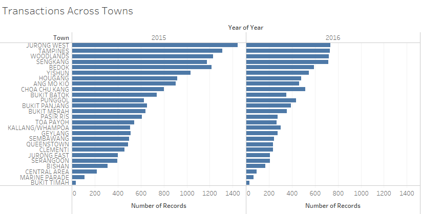
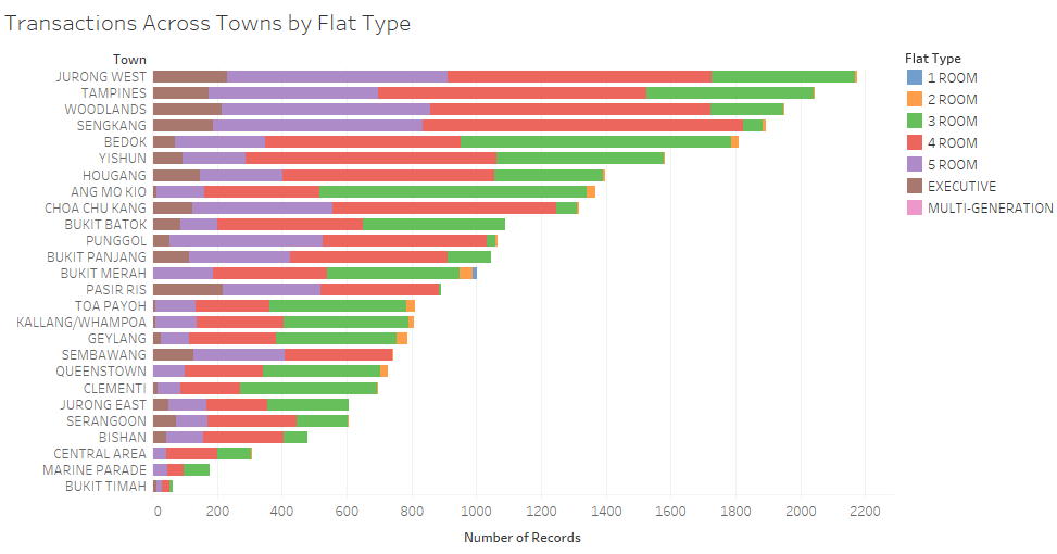
The following 2 diagrams show transactions across towns, and also illustrate by flat type in 2015 and first half of 2016.
- It can be seen that Jurong West, Tampines and Woodlands are the top 3 towns which sees many resale flats changing hands.
- In the 2nd diagram, it can be observed 4-Room and 5-Room flats are most frequently transacted.
- Again, the Town variable is placed at the Row, so that one can read off the name of the town easily.
- The chart is sorted from highest to lowest to highlight the towns which are most popular.
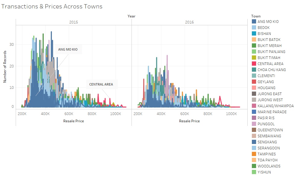
The following diagram shows the distribution of transacted prices across the towns.
- This diagram seeks to illustrate the spread of range of prices in each town, by number of transactions. For example, Central Area occupies the higher transacted price, but does not see that many transactions.
- This diagram is similar to an earlier diagram posted, without the information of towns. Again, we see the right skewness in this distribution.
Flat Type/Model, Transaction & Price
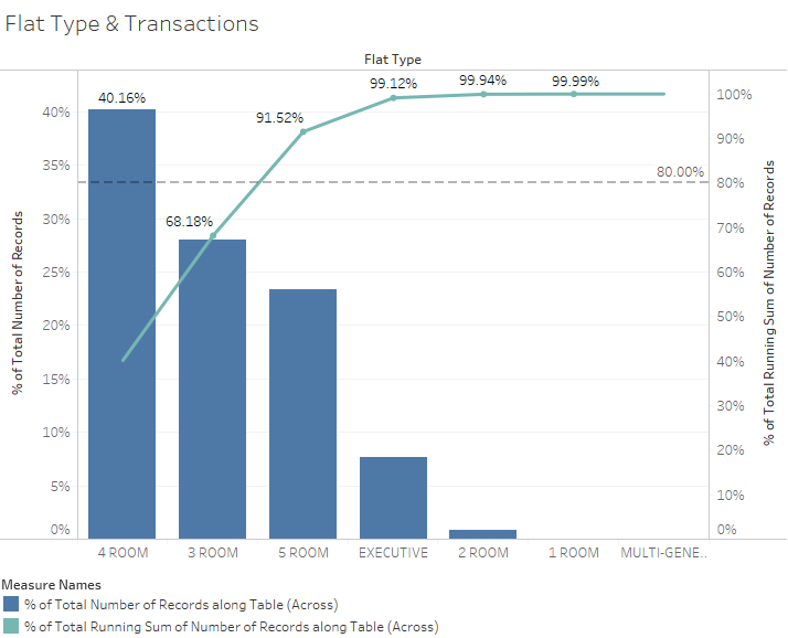
The following diagram shows percentage of transactions by flat type in 2015. The graph for 2016 is not depicted here. However, it shows similar patterns.
- One observes that the highest percentage of transactions going by descending order, goes to 4-Room, 3-Room, and then 5-Room.
- A Pareto Chart is used to illustrate the cumulative market share of number of transactions by flat type. One sees the 2 types of flat account for than 50% of the transactions.
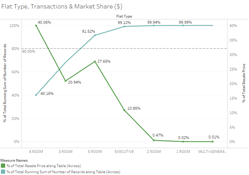
The following diagram shows the comparison between the cumulative market share of number of transactions by flat type versus the actual market share in $ amount. The graph for 2016 is not depicted here. However, it shows similar patterns
- One observes that the highest percentage of transactions goes to 4-Room at about 40.16%. Likewise in terms of market share in $ amount, 4-Room flats also account for 40.06%.
- Though more 3-Room flats are transacted, the market share in $ amount is lower than that of the 5-Room flats. This could be due much higher price premium which 5-Room flats fetch compared to 3-Room flats.
- A line chart is used on top of the Pareto line chart to illustrate the contrast.
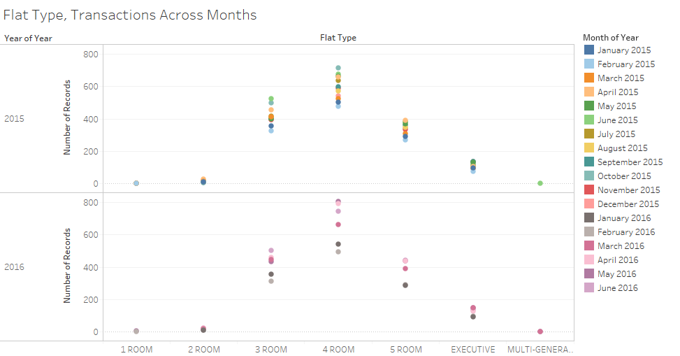
The following diagram shows the Flat Type, Transactions Across Months in 2015 and first half of 2016.
- This diagram shows the frequency of monthly transactions. Again, one observes that across months, 4-Room and 3-Room flats are generally transacted in most months.
- There are also more transactions records for 4-Room flats, illustrated by the higher vertical.
- The circle marks with different colour for each month is used, so that one could observe the frequency of occurrences by month.
- Through the verticals, one can observe the frequency of transactions.
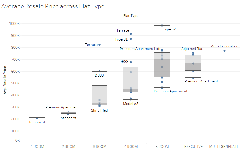
The following diagram shows Average Resale Price across Flat Type.
- This diagram shows the range of average resale price for each flat type. For example, with a budget of 400K, one should probably look at purchasing a 3-Room or 4-Room flat.
- To depict the range well, Box-and-whisker plots are used for the categorical flat type.
- The chart could be swapped to illustrate the price range horizontally. However, that would clutter the chart when labels are put in for some of the room models. Hence, the chart is kept as shown, with labels for some flat models
Flat Size, Floor Level, Transaction & Price
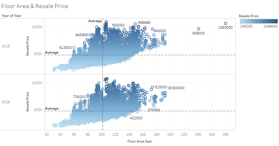
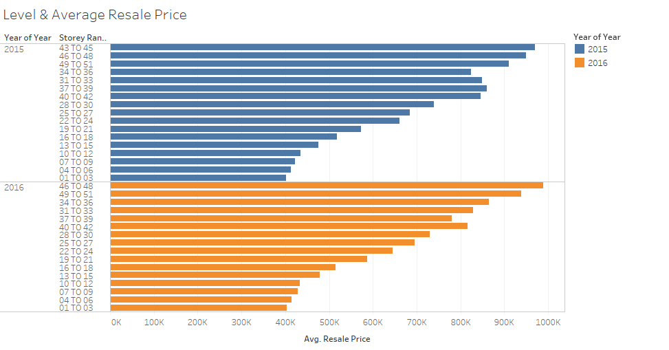
The following 2 diagrams shows the transacted resale price across the size of the flat in sq meter, and level respectively.
- In general, what is commonly said largely holds true. The larger the flat, the higher the price. The higher the flat is, the higher the price.
- Scatter plot is used for the first diagram to illustrate the spread, and to highlight the few outliers.
- Bar charts, and sorted by descending order, are used to illustrate clearly how price will change for different floor level range.
Flat Lease, Transaction & Price
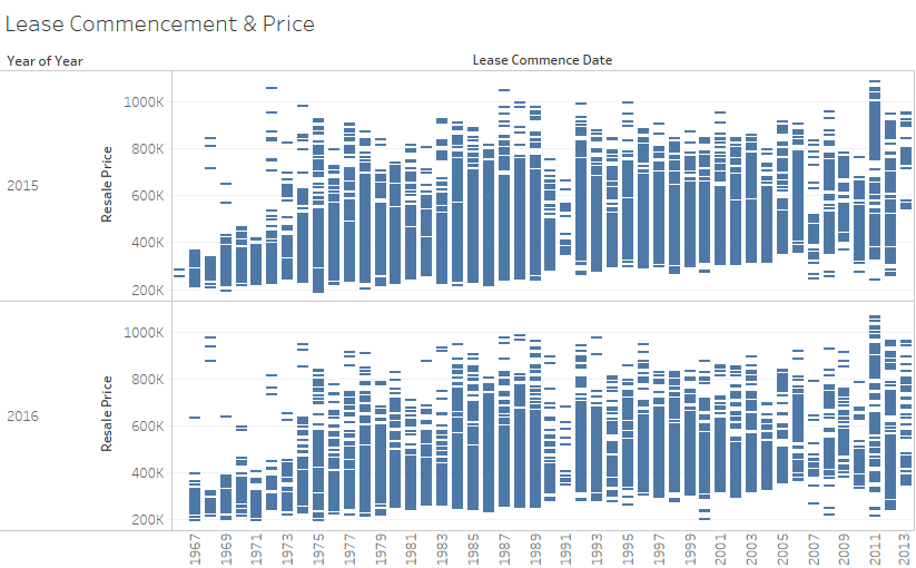
The following diagram shows resale price across different lease commencement start year (i.e. age of the flat)
- There is no distinct pattern that age of the flat would have a bearing on the price.
- Each resale price is plotted against the year to illustrate the pattern if any, in the form of Gantt Bar.
Tools Utilised
The tools used are Microsoft Excel, Tableau 10.0, and Infographic maker, Vennage(https://venngage.com)
Results
Summary
What are the shares of the resale public housing supply in 2015 (at least three observation)?
- The highest percentage of transactions going by descending order, goes to 4-Room, 3-Room, and then 5-Room, with 4-Room accounting for 40.16% of the number of transactions.
- The same observation is made across months. 4-Room and 3-Room flats are generally transacted in most months compared to other flat type.
- One observes that the highest percentage of transactions goes to 4-Room at about 40.16%. Likewise in terms of market share in $ amount, 4-Room flats also account for 40.06%.
- Though more 3-Room flats are transacted, the market share in $ amount is lower at 20.94% than that of the 5-Room flats at 27.65%. This could be due much higher price premium which 5-Room flats fetch compared to 3-Room flats.
- Jurong West, Tampines and Woodlands are the top 3 towns which sees most resale flats changing hands.
What are the distribution of the resale public housing prices in 2015 (at least three observation)?
- Bukit Timah, Central Area, and Bishan are the top 3 towns which sees the highest average prices. Marine Parade which was 4th in 2015, was replaced by Queenstown in the 4th position in 2016.
- Though Bukit Timah sees the highest average resale price, it is the Central Area which sees the maximum resale price transaction.
- The average resale price range checks out the more expensive towns to buy a resale flat on a scale range. Bukit Timah, Central Area, and Bishan are again the top 3 towns with highest average resale price range.
- In price distribution across the transactions, the distribution mirrors a right-skewed normal distribution.
With reference to the findings, compare the patterns of the first half of 2016 with the patterns of 2015?
- There is sign of the resale market picking up, as March 2016 to June 2016 sees higher transactions than the same months in the preceding year.
- In terms of price distribution across the transactions, both the distribution in 2015 and first half of 2016 mirror a right-skewed normal distribution.
- Though there appears to be a drop in average resale price in the top 2 towns of Bukit Timah and Central area in 1H 2016 compared to 2015, the overall price fluctuation across time in 2015 and 1H2016 is minimal.
Conclusion
Though time trend may not be easy to see with time period set within 2015 and first half of 2016, the analysis above provides easy to understand information for serious buyers who are looking to make a purchase commitment in the near term. Knowing the market is half the battle done.
