ISSS608 2016-17 T1 Assign1 LI Nanxun
Contents
- 1 Infographics
- 2 Abstract
- 3 Problem and Motivation
- 4 Approaches
- 5 Tools Utilized
- 6 Data Preparation
- 7 Resale Public Housing Supply Analysis
- 8 Resale Public Housing Price Analysis
- 9 Finding Summary
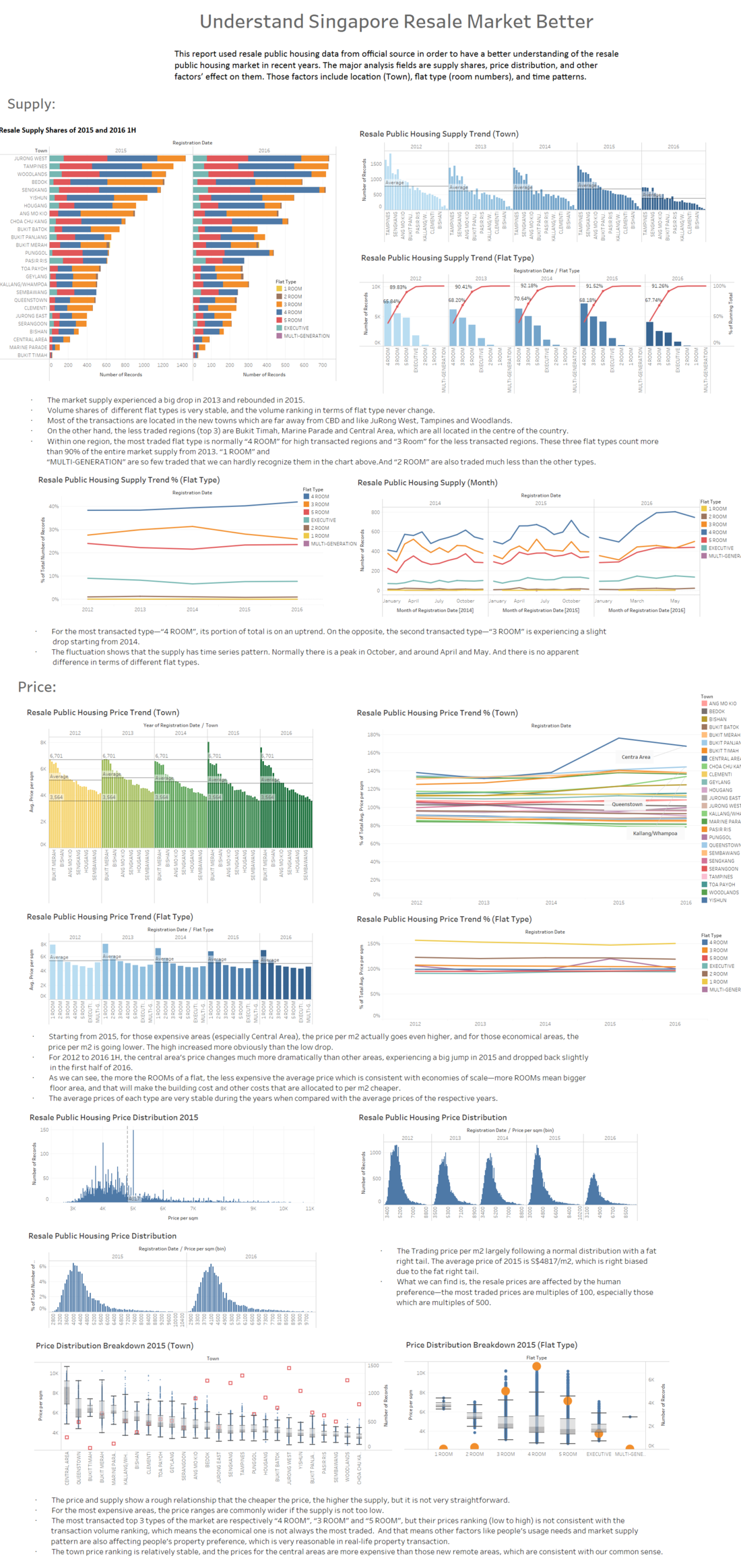
Infographics
Abstract
This report used resale public housing data from official source in order to have a better understanding of the resale public housing market in recent years. The major analysis fields are supply shares, price distribution, and other factors’ effect on them. Those factors include location (Town), flat type (room numbers), and time series. The market is relatively stable in recent years with no abnormal phenomenon. Interesting findings are: • The average prices per m2 of expensive regions are increasing, while the prices of cheap regions, which are normally far from the CBD but have more supply, are actually dropping. This phenomenon starts from 2015. • The average price per m2 keeps dropping, while the supply rebounds in 2015 after the 2013’s shrink.
Problem and Motivation
Property spending always counts or will count a big part of people who live in Singapore, especially of the relatively young generation -- us. Although the market is quite vivid and we have many convenient tools (i.e. PropertyGuru) to check the market by clicking mouse, the issue is we can only know part of the whole story if we only do the mouse clicking work. And here is a good chance to look at the whole story by analysing the official data, then, why not? This analyse will mainly focus on the major concerns of the market: price, supply, and following trend.
Problems addressed:
- What are the shares of the resale public housing supply in 2015? (Compulsory)
- What are the distributions of the resale public housing prices in 2015? (Compulsory)
- What are the factors that can affect the housing price obviously?
- Is there any difference between the patterns of resale public housing supply and price in 2015 and 2016 1H? (Compulsory). But I would like to answer this question by observe the trends from 2012 to 2016, only 2-year comparison cannot tell as much as 4 years.
In the following sections, these questions will be listed out in the respective analyses. For both supply and price, I will talk about the factors that may affect the market, such as location (Town), Flat Type (Room), in order to give a deeper understanding of the market history.
For the trend, I would like to use the data to plot the historical trends and mainly discuss the recent (2015~2016) trend features.
Approaches
The resale housing data was obtained from data.gov.sg. The resale housing data set selected covers the period of Mar-2012 to Jun-2016. It also contained the following information that can be utilized:
- Month - Showing year and month of which the flat was resold.
- Towns - District where resale flats were sold in Singapore
- Flat Type - Made up of 7 categories in terms of room numbers, where the more rooms a flat has, the larger the flat
- Storey Range - The floor range of which the flat was sold
- Floor Area (sqm) - The area of the flat
- Lease Commencement Date - Year of which the flat finished construction and was sold
- Resale Price - Price at which the flat was sold
From the above data, extra fields were derived
- Registration Date - created by transforming "Month" from "abc" to a date variable. This is the date dimension we use instead of "Month"
- Price per sqm - Derived by taking (Resale Price) ÷ (Floor Area sqm)
- Price per squm(bin) - in order to show the price distribution chart.
Type of chart used: Line Chart, Bar chart, Histogram chart, Pareto Chart, Box Plot.
Tools Utilized
In this report, only Tableau 10.0 is used.
Data Preparation
“Revise” “Month”
First, let’s look at the variables which are not consistent with common sense.
After loading the resale price excel file, we can find that in the “Dimensions” field, variable “Month” is recognized as a string variable rather than a continuous date variable. So we need to change its format to a date variable which should be recognized by Tableau. Actually we don’t revise “Month” directly, but we choose to create a new “Month” to take its place—in the following section, we will use the new variable “Registration Date” all the time and ignore the original one.
And here is how I do it:
 1.	Right click the “Dimensions” field, and select “Create Calculated Field”

 2.	Then put in the new variable name and the formula in respective places of the pop-up window.
Because we use the “DATEADD“ function, its variable type is automatically recognized as date by Tableau.
Generate Comparable Price
What we can get from the original data sheet is the total price of the flat, which is not quite good for our analysis in terms of the big differences of floor areas of the flats (range from 40 m2 to 192 m2). So based on common sense, I chose to use price per m2 (“Price per sqm”) as the main price indicator in the following analysis.
Here is how I do it:
1. Right click the “Measures” field, and select “Create Calculated Field”
2. Then put in the new variable name and the formula ([Resale Price]/[Flat Area (sqm)]) in respective places of the pop-up window.
And the new measure is created.
Resale Public Housing Supply Analysis
For this part of analysis, I will not only focus on 2015 and 20161H but take all the available data in the data resource into consideration (2012March to 2016June), so that we can have a deeper understanding about the market history, and more easier to distinguish the interesting patterns and findings.
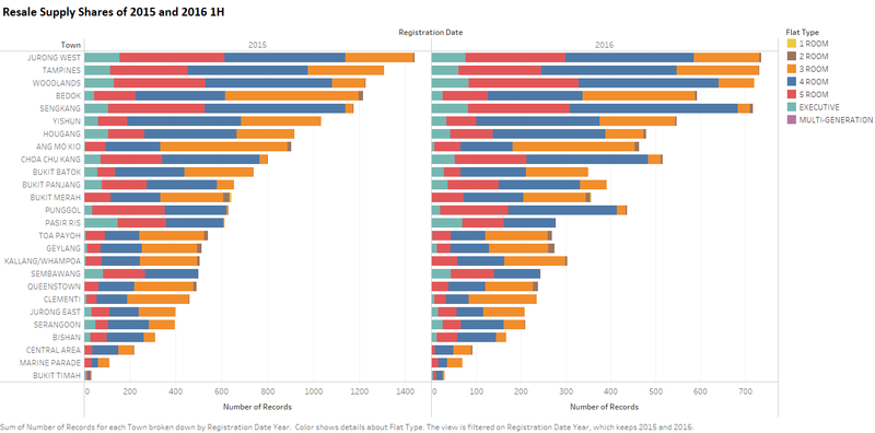
This will show the whole picture of the shares of SG resale public housing supply of 2015 & 2016 1H.
Generate The Chart
1. Drag “Number of Records” from “Measures” to “Columns”.
2. Drag “Town” to “Rows”.
3. Drag “Registration Date” to “Columns” and put it on the left of “SUM(Registration Date)”.
4. “Fit with width”.
5. “Show Me” “Horizontal Bars”.
6. Sort the chart by 2015 in descending order.
7. Drag “Registration Date” to “Filter”, select “#Year” in the pop-up window, and check “2015” and “2016” in the pop-up window after the previous one.
8. Drag “Flat Type” to “Marks”, change its type from “Detail” to “Colour”
9. Change the title to “Resale Supply Shares of 2015 and 2016 1H”.
10. Change the legend colours to colour-blind-friendly.
11. Because the supply of 2016 is only the half data, in order to make it more visually comparable, I changed the axis of 2016 by clicking “Edit Axis” and choose “Independent axis ranges for each row or column”
Main Findings
• Most of the transactions are located in the new towns which are far away from CBD and like JuRong West, Tampines and Woodlands
• On the other hand, the less traded regions (top 3) are Bukit Timah, Marine Parade and Central Area, which are all located in the centre of the country.
• Within one region, the most traded flat type is normally “4 ROOM” for high transacted regions and “3 Room” for the less transacted regions.
• “1 ROOM” and “MULTI-GENERATION” are so few traded that we can hardly recognize them in the chart above.
• And “2 ROOM” are also traded much less than the other types.
Supply Trend breakdown—Town
In this section, we will dig the relationship between supply and town deeper.
By number of records
I am sure that many people are curious about the relationship with flat location and transaction volume. And the findings will tell us the pattern of the resale public housing transactions in terms of location.
Generate The Chart
1. Drag “Number of Records” from “Measures” to “Drop field here”.
2. Drag “Town” to “Columns”.
3. Drag “Registration Date” to “Columns” and put it on the left of “Town”.
4. “Fit with width”
5. Change the title to “Resale Flat Transaction Volume Trend by Town”
6. Change the legend colours to colour-blind-friendly. And the colour will show the closer years in darker colours.
7. In order to show the total transaction volume changing trend, I add average region transaction volume line for each year. Because the region number for each year is constant, then the total supply can be reflected by the average line without changing the axis.
Main findings
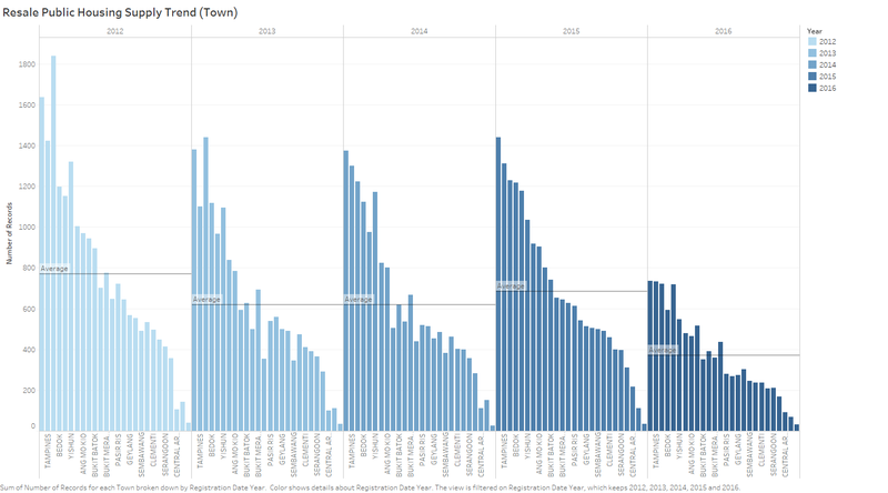
• The Supply Volume experienced a big drop in 2013 and rebounded in 2015.
• The supply ranking changes a little bit volatile.
By percentage of total
In order to see location preference trends of the market, I used the ‘percentage of total’ of the numbers of the transaction records.
The percentage numbers are generated by comparing with the average of the average town prices of each year. The reason why we don't directly plot the average town prices is because the total market performance can affect the visual impression. For example, say one town is more preferred in 2013, but because of the entire market of 2013 went down, the average price of this town dropped slightly. Although we can find that the price went stronger than other regions, but what you see is a dropping line within other dropping lines, and this line drop just slower than others. If we compare the percentage, then we will see a increasing line with other lines relatively remain the same(horizontal line), which will make the location preference easier to distinguish.
Generate The Chart
1. Keep using the previous sheet. We just need to do some changes on the previous one.
2. Drag “Town” from “Columns” to “Marks”, delete “Year(Registration Date)”, and change the type of “Town” from “Detail” to “Colour”.
3. “Show Me” “Lines(Continuous)”.
4. Add “Quick Table Calculation” to the “SUM(Number of Records)” in “Rows” as “Percentage of total” and “Edit Calculation Table” from “Table(across)” to “Table (down)”
5. Change the title to “Resale Flat Transaction Volume Trend by Town (percentage of total)”
Main Findings
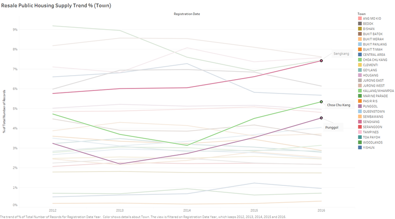
- For 2012 to 2016, the supply in terms of location changes a little bit volatile, which is the same observation in 5.2.1.
- Although the changes are obvious, the volumes of each region remain relatively the same level.
- For Sengkang, Choa Chu Kang, and Punggol, they have experienced increase at least 2 years.
Supply Trend Breakdown— Flat Type
After regional difference, lets dig deeper the relationship between the supply trend and the flat types.
By number of records
Generate The Chart
1. Drag “Number of Records” from “Measures” to “Drop field here”.
2. Drag “Flat Type” to “Columns”.
3. Drag “Registration Date” to “Columns” and put it on the left of “Town”.
4. “Entire View”
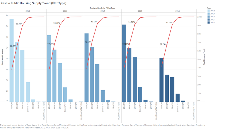
5. Change the title to “Resale Public Housing Supply Trend (Flat Type)”
6. Drag “Registration Date” to “Marks”, and change its type from “Detail” to “Colour”. Change the legend colours to colour-blind-friendly. And the colour will show the closer years in darker colours.
7. Then I would like to add a running percentage of total reference line for audience. Drag “Number of Records” from “Measures” to “Rows”. Set the right “SUM(Registration Date)” “Duel Axis” and add “Quick Table Calculation”, “Edit Table Calculation” , “Add secondary calculation” ,”Percent of Total”, “Pane (across then down)”
And the chart is done.
Main Findings
• Volume Distribution in terms of flat types is very stable by looking at the accumulated percentage supply of total of the types, the volume ranking never change.
• The most traded type is “4 ROOM”, followed by “3 ROOM” and “5 ROOM”. And these three types count more than 90% of the market.
By percentage of total
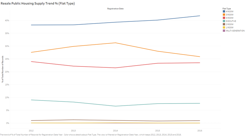
In order to see flat type preference trends of the market, I used the ‘percentage of total’ of the numbers of the transaction records. The reason why using this method is the same as the supply trend breakdown by town.
Generate The Chart
1. Keep using the previous sheet. We just need to do some changes on the previous one.
2. Delete the right “SUM(Number of Records)”.
3. Drag “Town” from “Columns” to “Marks”, delete “Year(Registration Date)”, and change the type of “Town” from “Detail” to “Colour”.
4. “Show Me” “Line (continuous)”
5. Add “Quick Table Calculation” to the “AVG(Price per sqm)” in “Rows” as “Percentage of total” and “Edit Calculation Table” from “Table(across)” to “Table (down)”
6. Change the title to “Resale Public Housing Supply Trend % (Flat Type)”
Main Findings
- The transaction pattern of the major types of flat don’t have big change, they are all fluctuating slightly.
- For the most transacted type—“4 ROOM”, its portion of total is on an uptrend. On the opposite, the second transacted type—“3 ROOM” is experiencing a slight drop starting from 2014.
Supply Trend Breakdown—Month
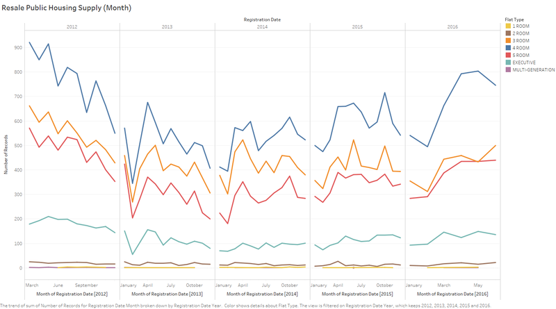
In China, there is obvious time-series pattern shown in the entire housing market. And there is a proverb for this, saying "Golden September, Silver October". So what is the time-series pattern of SG resale housing market? In order to make the chart more info-rich, I add flat type in as a marks to show whether or not the different flat types have different time-series patterns.
Generate The Chart
1. Create a new sheet.
2. Drag “Number of Records” from “Measures” to “Rows”.
3. Drag “Registration Date” to “Filter”, select “#Year” in the pop-up window, and check the years you want to observe in the pop-up window after the previous one.
4. Drag “Registration Date” to “Columns”.
5. Drag “Registration Date” to “Columns” on the right side, and change its type from year to month.
6. Change the title.
7. Drag “Flat Type” to “Marks”, change its type to “Colour”.
Main Findings
• The fluctuation shows that the supply has time series pattern. Normally there are peaks in October, and around April and May. And there is no apparent difference in terms of different flat types.
Resale Public Housing Price Analysis
For this section, we mainly focus on Question 2,3,4. Price of a flat is one of the most important factors that people care about. So what are the price? Are they going up or down(Trend)? How other important factors are affecting the price? We will answer these questions in the following sections.
Price Distribution of 2015
Analysing the Price Distribution of 2015 will give us a direct but in-depth understanding of the market.
General (no bins)
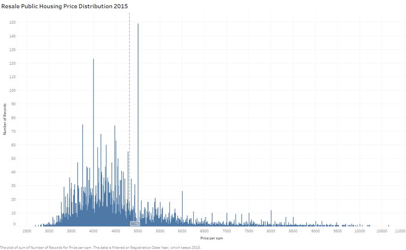
First of all, let’s look at the whole price distribution of 2015. This shows the transaction volumes for each price(bin as S$1).
Generate The Chart
1. Create a new sheet.
2. Drag “Price per sqm” from “Measures” to “Columns”. Set from “sum” to “Dimension”
3. Drag “Number of Records” to “Rows”.
4. Drag “Registration Date” to “Filter”, select “#Year” in the pop-up window, and only check “2015” in the pop-up window after the previous one.
5. “Fit with width”
6. Change the title to “Resale Public Housing Price Distribution 2015”
7. Add Reference Line by right click the X axis. Change the settings as followed screenshot.
And the chart finished.
Main Findings
• The average price of 2015 is S$4817/m2, which is right biased due to the fat right tail.
• What we can find is, the resale prices are affected by the human preference—the most traded prices are multiples of 100, especially those which are multiples of 500.
General (With bins)
Histogram is commonly used to display distribution. Instead of the discrete-like chart above, I will show easy-accepted distribution chart.
Generate The Chart
1. Create a new sheet.
2. Right click “Price per sqm” in “Measures”, “Create” “Bins”, and set the size of bins as 100, because we noticed the price pattern from the chart above.
3. Drag “Price per sqm(bin)” from “Dimensions” to “Columns”. Set from “sum” to “Dimension”
4. Drag “Number of Records” to “Rows”.
5. Drag “Registration Date” to “Filter”, select “#Year” in the pop-up window, and check the years you want to observe in the pop-up window after the previous one.
6. Drag “Registration Date” to “Columns” on the left of “Price per sqm(bin)”.
7. “Entire View”
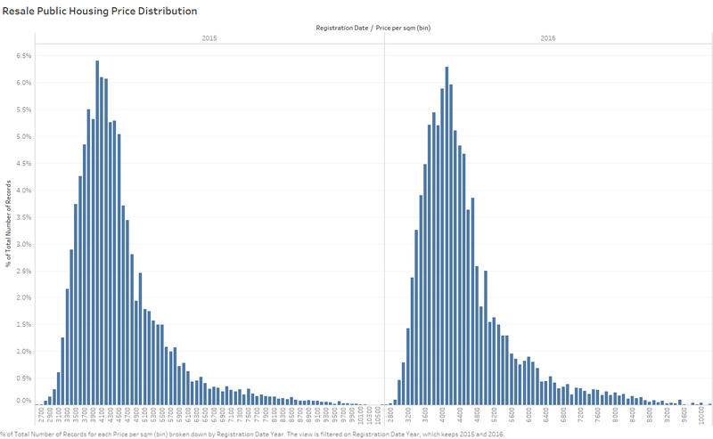
8. Change the title to “Resale Public Housing Price Distribution”
9. In Order to compare the price distribution between 2015 and 20161H, we need to add “Quick Table Calculation” “Percent of Total”, and “Compute Using” from “Table(across)” to “Pane”.
Main Findings
- The Trading price per m2 largely following a normal distribution with a fat right tail.
- The Price Distribution Patterns of 2015 and 20161H are very similar.
Break down by Town
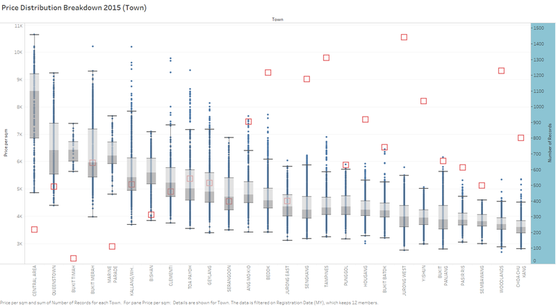
I would like to show the price distribution of 2015 bread down by Town with transaction volumes put together. This will show how the price and the transaction volume related.
Generate The Chart
1. Create a new sheet.
2. Drag “Price per sqm” from “Measures” to “Rows”. Set from “sum” to “avg.”
3. Drag “Town” from “Dimensions” to “Columns”.
4. Drag “Registration Date” to “Filter”, select “#Year” in the pop-up window, and only check “2015” in the pop-up window after the previous one.
5. “Fit with width”
6. Sort in descending order.
7. “Show me” “Box Plot”
8. Drag “Town” from “Columns” to “Marks”.
9. Set “Price per sqm” from “avg.” to “Dimension”.
10. Drag “Town” from “Marks” back to “Columns”
11. In order to reflate the price and supply relationship, I would like to add a duel axis of the supply volumes of respective regions. Drag “Number of Records” to “Rows” and put it on the right of “Price per sqm”. Set “Duel Axis”.
12. Set the configuration of “SUM(Number of Records)” in “Marks” to make it easier to recognize. (shapes, colours, size)
13. Change the title.
Main Findings
• The price and supply show a rough relationship that the cheaper the price, the higher the supply, but it is not very straightforward.
• For the most expensive areas, the price ranges are commonly wider if the supply is not too low.
Break down by Flat Type
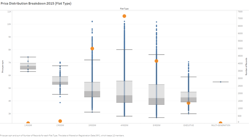
Beside Location, the Flat Type can also affect the price of flats. And based on the previous effort, we can easily get the result by slightly changing several places. So, why not have a try!
Chart
The way to generate the chart is relatively the same with the above one. What we need to change is using “Flat Type” instead of “Town”.
Main Findings
• As we can see, the more the ROOMs of a flat, the less expensive the average price (We should only look at the “2 ROOM” to “EXECUTIVE”, because their transaction volumes are big enough to tell the market. “1 ROOM”’s and “MULTI-GENERATION”’s transaction volumes are too small to be representatives of the market), which is consistent with economies of scale—more ROOMs mean bigger floor area, and that will make the building cost and other costs that are allocated to per m2 cheaper.
• The most transacted top 3 types of the market are respectively “4 ROOM”, “3 ROOM” and “5 ROOM”, but their prices ranking (low to high) is not consistent with the transaction volume ranking, which means the economical one is not always the most traded. And that means other factors like people’s usage needs and market supply pattern are also affecting people’s property preference, which is very reasonable in real-life property transaction.
Price Trend by Town
By average prices
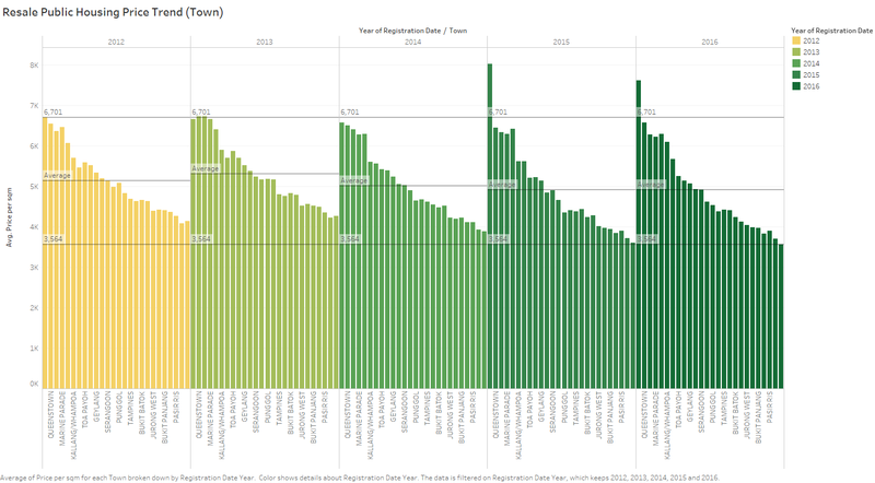
In order to fully use the data, I would like to analysis the price trend from 2012 to 2016, which will contain the answer for the compulsory question 3, which is Question 4 in my report.
Generate The Chart
1. Create a new sheet.
2. Drag “Price per sqm” from “Measures” to “Rows”. Set from sum to avg.
3. Drag “Town” to “Columns”.
4. Sort the chart by Town in descending order.
5. Drag “Registration Date” to “Columns” and put it on the left of “Town”.
6. “Entire View”
7. Change the title
8. Drag “Registration Date” to “Marks” and change its type to colour, and then change the legend colours to colour-blind-friendly by right clicking it and selecting “Edit Colour”.
9. In order to make it clearer, I added in three reference lines. One is based on the Central Area Average Price in 2012 and one is based on Choa Chu Kang’s average price of 2016, and the average prices of the regions’ average prices respective year (that’s why this average price of 2015 is not the same as mentioned in 6.1.1.).
- The town price ranking is relatively stable, and the prices for the central areas are more expensive than those new remote areas, which are consistent with our common sense.
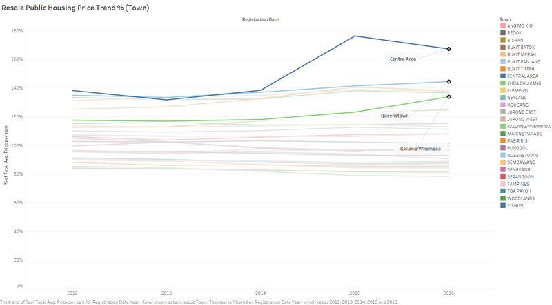
- As you can see, starting from 2015, for those expensive areas (especially Central Area), the price per m2 actually goes even higher, and for those economical areas, the price per m2 is going lower. To sum up, the high higher, the low lower.
By percentage of average price of the respective year
In order to see location preference trends of the market, I used the ‘percentage of total’ of the numbers of the transaction records.
Generate The Chart
1. Keep using the previous sheet. We just need to do some changes on the previous one.
2. Drag “Town” from “Columns” to “Marks”, delete “Year(Registration Date)”, and change the type of “Town” from “Detail” to “Colour”.
3. “Show Me” “Lines(continuous)”.
4. Add “Quick Table Calculation” to the “AVG(Price per sqm)” in “Rows” as “Percentage of total” and “Edit Calculation Table” from “Table(across)” to “Table (down)”
5. Change the title
Main Findings
- For 2012 to 2016 1H, the central area’s price changes much more dramatically than other areas, experiencing a big jump in 2015 and dropped back slightly in the first half of 2016.
- If looking at the lines closer, we can find the same observation that the high higher, the low lower. The high increased more obviously than the low drop.
Price Trend by Flat Type
The way to generate the statistic charts is relatively the same as 6.2, the only difference is that we use “Flat Type” instead of “Town”.
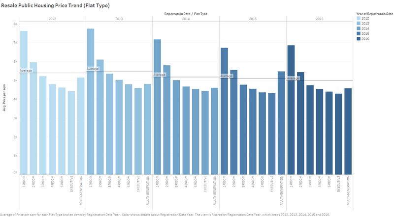
By average prices
Chart
The way to generate the chart is relatively the same with the above one. What we need to change is using “Flat Type” instead of “Town”.
Main Findings
• The transaction prices are dropping during the years. This can be observed by looking at the average prices for each year(average price for each type, can be recognized as a price level indicator.)
By percentage of the average price of the respective year
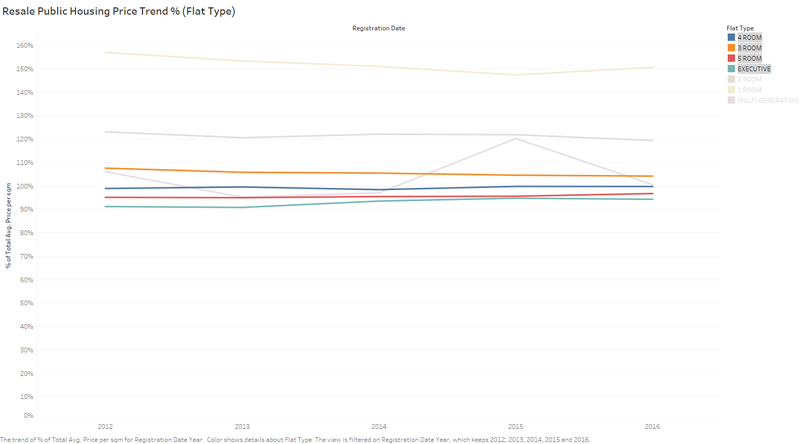
In order to see flat type preference trends of the market, I used the ‘percentage of total’ of the average of the flat price of the respective year. By looking at this chart, we will understand the pattern how the prices of different flat types change through the last 4.5 years.
Chart
The way to generate the chart is relatively the same with the above one. What we need to change is using “Flat Type” instead of “Town”.
Main Findings
• Because we have discussed about the “1 ROOM” and “MULTI-GENERATION”, which are seldom traded and their average prices cannot show the market, we should ignore them by hiding them. After hiding the records, we can easily find that the average prices of each type are very stable during the years when compared with the average prices of the respective years.
Finding Summary
General observations
The entire resale public housing market is relatively stable with price dropping slightly and volume rebounding from 2013's dive.
For Supply:
- Most of the transactions are located in the new towns which are far away from CBD and like JuRong West, Tampines and Woodlands
- On the other hand, the less traded regions (top 3) are Bukit Timah, Marine Parade and Central Area, which are all located in the centre of the country.
- Within one region, the most traded flat type is normally “4 ROOM” for high transacted regions and “3 Room” for the less transacted regions.“1 ROOM” and “MULTI-GENERATION” are so few traded that we can hardly recognize them in the chart above.And “2 ROOM” are also traded much less than the other types.
- The Supply Volume experienced a big drop in 2013 and rebounded in 2015.
- Volume Distribution in terms of flat types is very stable, and the volume ranking never change.
- The most traded type is “4 ROOM”, followed by “3 ROOM” and “5 ROOM” when talking about the total supply of each year. These three flat types count more than 90% of the market.
- The transaction pattern of the major types of flat don’t have big change, they are all fluctuating slightly.
- For the most transacted type—“4 ROOM”, its portion of total is on an uptrend. On the opposite, the second transacted type—“3 ROOM” is experiencing a slight drop starting from 2014.
- The fluctuation shows that the supply has time series pattern. Normally there is a peak in October, and around April and May. And there is no apparent difference in terms of different flat types.
For Price:
- The Trading price per m2 largely following a normal distribution with a fat right tail. The average price of 2015 is S$4817/m2, which is right biased due to the fat right tail.
- What we can find is, the resale prices are affected by the human preference—the most traded prices are multiples of 100, especially those which are multiples of 500.
- The Price Distribution Patterns of 2015 and 20161H are very similar.
- As we can see, the more the ROOMs of a flat, the less expensive the average price which is consistent with economies of scale—more ROOMs mean bigger floor area, and that will make the building cost and other costs that are allocated to per m2 cheaper.
- The most transacted top 3 types of the market are respectively “4 ROOM”, “3 ROOM” and “5 ROOM”, but their prices ranking (low to high) is not consistent with the transaction volume ranking, which means the economical one is not always the most traded. And that means other factors like people’s usage needs and market supply pattern are also affecting people’s property preference, which is very reasonable in real-life property transaction.
- The town price ranking is relatively stable, and the prices for the central areas are more expensive than those new remote areas, which are consistent with our common sense.
- As you can see, starting from 2015, for those expensive areas (especially Central Area), the price per m2 actually goes even higher, and for those economical areas, the price per m2 is going lower. To sum up, the high higher, the low lower. The high increased more obviously than the low drop.
- For 2012 to 2016 1H, the central area’s price changes much more dramatically than other areas, experiencing a big jump in 2015 and dropped back slightly in the first half of 2016.
- The transaction prices are dropping during the years.
- The average prices of each type are very stable during the years when compared with the average prices of the respective years.
