IS428 2016-17 Term1 Assign3 Lim Hui Ting
Contents
- 1 Overview
- 2 Data Preparation
- 3 1. Typical Patterns in the Prox Card Data
- 4 2. Interesting Patterns that Appear in the Building Data
- 5 3. Anomalies or Unusual Events Observed in the Data
- 6 4. Observed Relationships Between Proximity Card Data and Building Data Elements
Overview
In this assignment, we seek to help GAStech to understand its operations data by using two weeks of building and prox sensors data. The objectives of this assignment are as follows:
1. What are the typical patterns in the prox card data? What does a typical day look like for GAStech employees?
2. Describe up to ten of the most interesting patterns that appear in the building data. Describe what is notable about the pattern and explain its possible significance.
3. Describe up to ten notable anomalies or unusual events you see in the data. Prioritize those issues that are most likely to represent a danger or a serious issue for building operations.
4. Describe up to five observed relationships between the proximity card data and building data elements. If you find a causal relationship (for example, a building event or condition leading to personnel behavior changes or personnel activity leading to building operations changes), describe your discovered cause and effect, the evidence you found to support it, and your level of confidence in your assessment of the relationship.
Data Preparation
Proximity Sensor Data
1. Importing floor plan into tableau
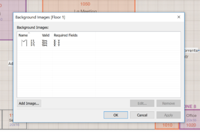
The floor plan is being imported into tableau with reference to the steps highlighted by Heng Yi Teng Mabel. However, instead of toggling between the 3 floor plans using a filter, i have created 3 sheets for each floor plan in order to better visualise the movement of the employees.
2. Create X and Y coordinates column for fixed-prox
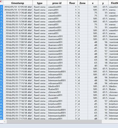
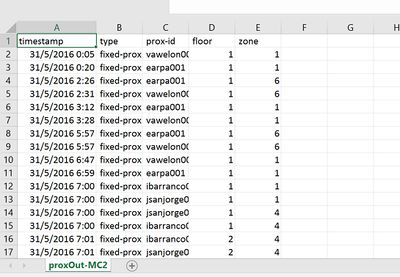
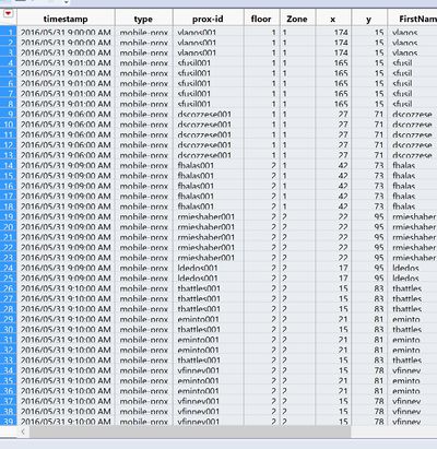
As the raw dataset for fixed prox does not have X and Y coordinates, I have manually input the X and Y coordinates based on the floor and zone column information provided. Since this is a fixed prox which means that the prox card reader is fixated at a certain place, I have randomly chosen a spot in the zone and find out the X and Y coordinates. As the floor plan provided has grids on them and the number of grids on each axis coincides with the maximum and minimum values, I made used of these grids to manually determine the X and Y coordinates.
3. Create zone column for mobile-prox
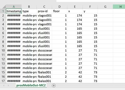
As the raw dataset for mobile prox does not have zone column, the zone of each record is determined by plotting the data using the floor column and the X and Y coordinates given on the floor plan.
4. Clean out proxid column
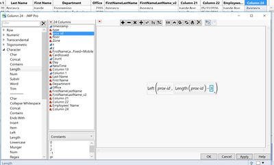
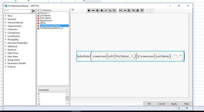
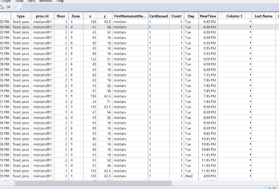
The proxid of each employee given in the dataset is a concatenation of the employee’s first name initial and his last name follow by a number. This number probably indicates the number of times that the prox card for this employee has been issued. As for the employee dataset given, the formula shown in the screenshot above has been used to concatenate the first and last name of the employee such that it is similar to proxid.
5. Join proximity sensor data with employee dataset
|
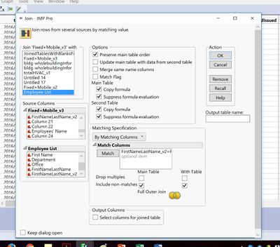
After creating the column that contains both the initial of the first name of the employee and the last name of the employee, this column is used to join the employee dataset and the combined dataset of fixed prox and mobile prox data.
6. Group timestamp to 15 minutes interval
HVAC and Hazium Data
1. Separate whole building data and zone specific data
2. Clean zone specific data columns
3. Stack zone specific data columns to a single column
4. Create floor and zone columns for zone specific dataset
1. Typical Patterns in the Prox Card Data
1.1 Overview
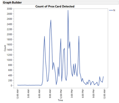
On a typical day of the week, there are 6 peaks in the prox card reader.
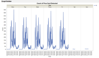
Weekdays have similar trend whereas weekends have similar trend. Weekdays peak:7.30am-7.45am,9.15am-9.30am,12pm-12.15pm,12.45pm-1pm,2pm-2.15pm,5pm-5.15pm. For Mon, Thurs and Fri, 2pm is the highest peak of the day whereas for Tue and Wed 9.15am and 2 pm peaks are quite similar in the number of occurrences.
1.2 Weekdays
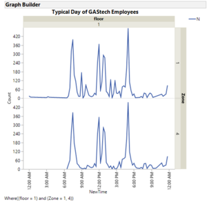
Since floor 1 zone 1 and 4 are the most common zones that employees will pass through, by looking at the time series graph of zone 1 and 4, we can observe that they have similar trends and share the same peaks at certain timings. With reference to zone 4 graph, the employees usually start work at 7.30am-7.45am as seen from the first peak. The second peak is at 12pm-12.15pm which is most likely the lunch time of the employees. Most of the employees are back from lunch time at 12.45pm-1pm as seen from the third peak. The last peak is at 5pm – 5.15pm which most likely indicate the employees knock off timing.
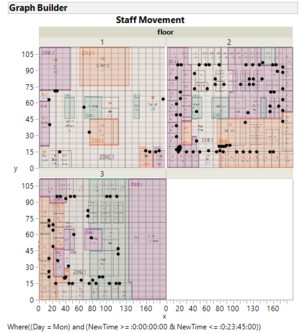
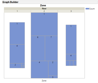
On Weekdays, there seems to have more staff movement on level 2 and 3 as compared to level 1. For Level 1, there are more staff movement in zone 1 and zone 4 and lesser staff movement in zone 8. For level 2, there are more staff movement in zone 1 and lesser staff movement in zone 3. For level 3, there are more staff movement in zone 1 and lesser staff movement in the server room.
1.3 Weekends
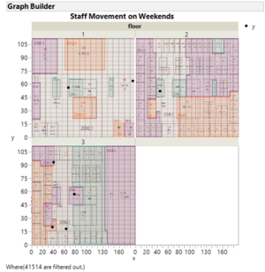
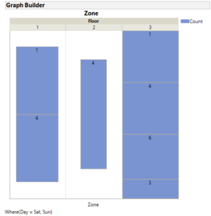
On weekends, Rosie will not be in operation and only fixed prox card readers are available. Floor 3 has more staff movement as the offices of the employees who came back to work on weekends are at level 3. For floor 2,only zone 4 is recorded which represents the elevator and stairs area. This means that the employees only stay within their floor area and do not wonder to other department offices.
2. Interesting Patterns that Appear in the Building Data
2.1 Correlations in Building Data
Supply side inlet temperature is highly negatively correlated with drybulb temperature with an r square of -0.73. Total electric demand power is highly positively correlated with drybulb temperature with an r square of 0.65. Total electric demand power is also highly negatively correlated with supply side inlet temperature with an r square of -0.61.
2.2 Trends in Building Data
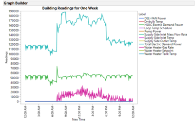
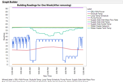
We can observed that Total electric demand power, HVAC electric demand power and water heater gas rate tend to fluctuates throughout the day. Although water heater gas rates tend to fluctuates the value will remain relatively the same throughout the day. This could be a result of scaling caused by large electric demand values. The rest of the system values seem to be at the zero line. Thus, after removing the aforementioned 3 system values, we can observed a better trend for the remaining system values. Supply side inlet temperature and deli-fan power tend to fluctuates throughout the day whereas the rest of the system status values remaining relatively unchanged throughout the day.
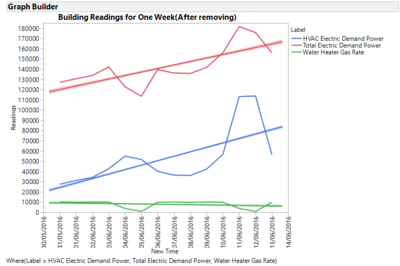
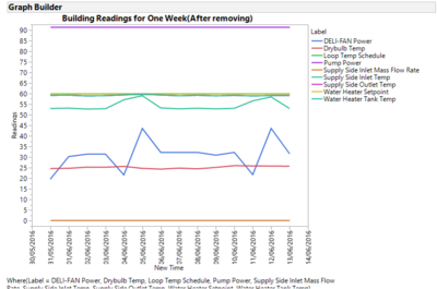
The total electricity demand for the whole building and HVAC increases across the two weeks whereas water heater gas rate remains relatively the same. Water heater gas rate will dip on every Sunday(i.e 5 June and 12 June) and increases thereafter. The value will remain relatively the same on weekdays and will drop on weekends.
The other system values remain relatively the same throughout the 2 weeks. Thus, the increase in the total electricity demand could be attributed to the increase in the electricity demand for HVAC.
2.3 Trends in HVAC Data
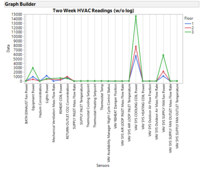
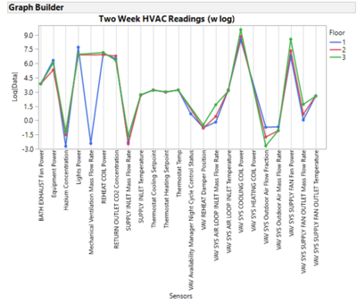
Before we log the readings, most of the readings seem to be zero as they are being scaled by the large readings in other sensors. After we log the readings to scale the data, more trends and fluctuations in other sensors can be observed which provide a more meaningful comparison across the three floors.
Currently, Mechanical Ventilation Mass Flow Rate and VAV Availability Manager Night Cycle Control Status sensors are only available on the first floor. Hazium concentration is higher on the second and third floor as compared to the first floor. The third floor has a higher VAV air loop inlet mass flow rate. The third floor also requires more VAV system cooling power which might indicate that the cooling component might not be as energy efficient as compared to the other floors even though the thermostat setpoint and temperature is about the same.
3. Anomalies or Unusual Events Observed in the Data
3.1 Abnormal Amount of Hazium Concentration
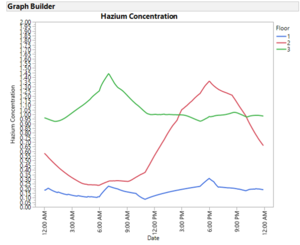
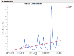
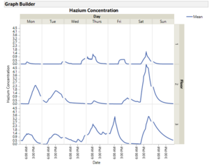
On a normal working day, hazium concentration is higher on the second and third floor. Hazium concentration on the second floor peaks at around 8am whereas it peaks at around 6pm on the third floor.There is also a sudden spike of hazium concentration on 11 June. This sudden increase in hazium concentration is most prominent on the second and third level. The amount of hazium seems to be increasing over these two weeks which might be a concern to GAStech as employees’ health, especially those on the second and third floor, will be affected if they are exposed to this potentially dangerous chemical for a long term.
3.2 Abnormal Thermostat Readings
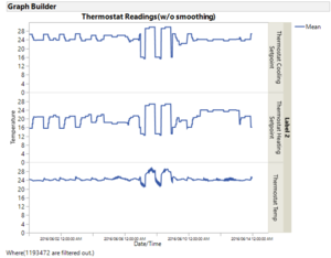
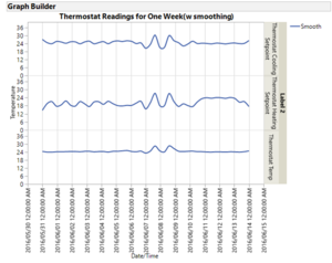
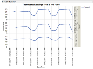
From thermostat readings, we can observed that GAStech is quite an environmental friendly company as it maintains its indoor temperature at about 24/25 degree Celsius. There is a sudden spike in the thermostat readings on 7 and 8 of June. In the wee hours of 7 and 8 of June, the thermostat cooling and heating setpoint decreases resulting in a drop in the office temperature. The employees who came to work the next day might find the temperature too cold such that they adjust the heating and cooling setpoint higher than their usual setpoints. The gradual decrease in the cooling and heating setpoint might be a result of faulty thermostat which require further investigations.
3.3 Abnormal CO2 Readings
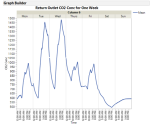
Return outlet CO2 concentration is the highest on Tuesday and Wednesday. Return outlet CO2 concentration on Monday, Thursday and Friday is relatively the same. On weekdays, CO2 concentration peaks at about 5pm which is the knock off time for most of the employees. High CO2 concentration might caused discomfort to the employees thus GAStech might want to look further into the reason why CO2 concetration peaks on Tuesday and Wednesday and whether this amount would pose any health risks to the employees.
3.4 Missing Employees
After joining employee list to the prox card reader data, some employees prox card are not captured in the 2 weeks data. It could be either they are on leave for two weeks or they have misplaced their prox card but have yet to collect a new one. If they are on leave for two weeks,the security of the building might of of a concern as most of the staff that are on leave are from the security department. If they have misplaced their cards, it is possible that their colleagues might be lending them their prox card in order for them to access the building. This means that some of the staff members are not complying to the new security measures. The management might want to relook into their current policy to see how they can improve the policy to ensure staff compliance.
3.5 Unknown Employee
Morlunv prox-id could not be matched to any names in the employee list. Further analysis might be required to check if this person is an employee of GAStech or not. If he is, GAStech might want to relook into their current database management policy to ensure that their database is updated on a timely and accurate manner.
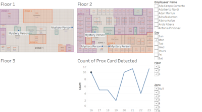
For the purpose of the analysis, I have named Morlunv id as “Mystery Person” under the employees’ names column. The Mystery Person seems to start work at about 4pm in the evening and leave the workplace at about 11pm at night. From the floor plan, this person’s office seem to be on the second floor.
3.6 Careless Employee
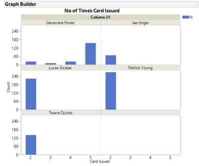
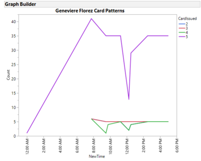
Looking at prox cards that are issued at least two times, we can observed that these employees are quite diligent in getting a new prox card from the security desk after they have misplaced their old prox card. However, we can note that a particular employee by the name of Geneviere Florez is quite careless as she has misplaced her prox card for about 5 times. From her second to fourth prox card, she has used approximately 20 times before she lost them and have the card replaced again. Upon further analysis, most of her cards(i.e 2nd,3rd and 4th) are replaced in the morning which imply that most likely she has left her card at home. It is possible that she might not be used to the new security procedures being implemented recently.
However, reissuing of prox cards to careless employees such as Geneviere Florez might be a waste of company's resources. Management might want to consider implementing a policy such that employees who have misplaced their prox card for more than 3 times will have to pay for the next prox card being reissued to them.
4. Observed Relationships Between Proximity Card Data and Building Data Elements
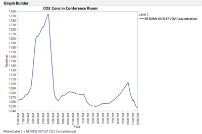
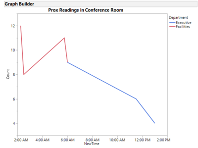
4.1 Relationship between CO2 concentration and proximity card data
CO2 concentration in conference room seem to peak between 3am-6am. There is also an increasing in the prox readings between 2am to 6 am. This is due to facilities department having a meeting in the conference room between 2am-6am. However, the CO2 concentration in the conference room continues to fluctuate although the prox card readings stop at about 1pm. Thus, my level of confidence in assessing this relationship is moderate as there seems to be other factors affecting the level of CO2 concentration in the conference room.
