IS428 2016-17 Term1 Assign3 Liang Bing
Data Exploration & Data Manipulation
The Employee List.xlsx data file does not provide enough insights by itself. Since the prox data detected by the sensors were collected from these employee's card, it makes more sense to combine employees' information with the prox sensor data so they together provide more information.
To integrate the Employee List.xlsx file and the other two sensor data files, I used Microsoft Excel.
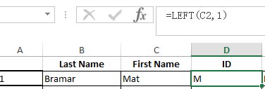
The prox ID contains the employees' names and a 3 digits number starts with "00". I created a new column in Employee List.xlsx to store the employees' prox ID without the 3 digits number, this is done by combining the first letter of the employees' last name and the employee's first name.
For the prox data table, I trim the employee Id out from their prox card id.

After that, I used "VlookUp" formula to look for the employee Id from the employee List.xlsx in order to pair up employees' record and the employees' respective office and their department. For example, the employee whose employee ID is vawelon is in office 1070 and is belongs to the facilities department.


I have also created one more field to extract the floor which the employees' office located.

The above data integration steps are repeated for Mobile readers' data set as well.
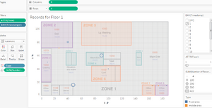
Moreover, the data collected from mobile robots and the data collected from fixed prox card readers have different ways to express their locations. i.e. the mobile robots use the coordinate (x,y) for their location when a reading was recorded, while the fixed reader use the zone for their location. This made it inconvenient to combine the mobile readers' data and the fixed readers' data for a overall visualization of the employees' activities. Therefore, it is either the fixed readers should have the x,y data or the mobile readers should have the zone it is located in order to ensure the 2 set of data being matched.
I chose to assign (x,y) coordinates to the fixed readers data. the idea is to assign one (x,y) value to one zone at that particular floor. I used Microsoft Excel for the data manipulation.
In the fixed reader data, there is a zone in at floor 3 being indicated as "server room", to standardize it with the other zones (which are recorded in numerical form), the server room is given a number 10. This is done using Excel.

To create the x and y field, I use the Calculated Field in Tableau Desk 10.0 which allows me to put conditions to define the x and y coordinates for a point. I have calculated the x and y coordinate for each zone at each floor, for example, the x,y coordinates for Zone 1 at Floor 1 is (52, 15) according to the Proximity Zones Map provided.
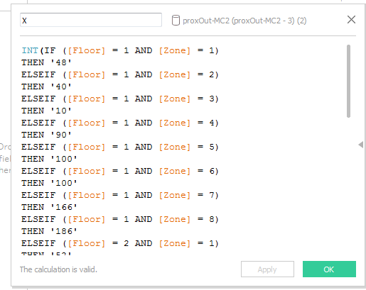
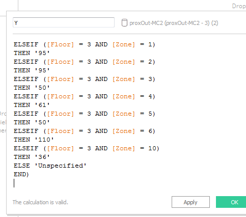
The resulted data set with newly added x and y field is then exported as csv for the data integration with Mobile readers' data.
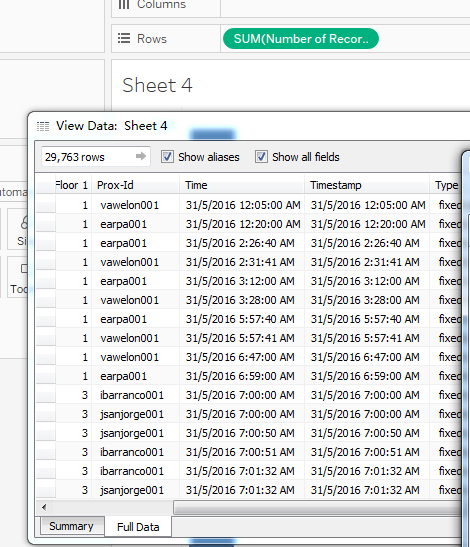
At the end of the data cleansing, manipulation and integration, the data fields left are as follow:
![]()
Task 1
What are the typical patterns in the prox card data? What does a typical day look like for GAStech employees?
Using Tableau to indicate the mobile and fixed readers' records for each floor, and use the time stamp as filter for picking the data for one day, it is very easy to see the distribution of employees' prox card readings in 3 floors in one day. In the following 3 graphs, the blue color circles indicates the fixed reader records while the orange color circles indicates the mobile reader records. The size of the circles indicates the number of records.
However, these illustrations are not enough to tell information about what kind of GAStech employees contributed to these records and therefore have limited information about these employees' activities in the company. Therefore, I use tree map to show the offices of the employees and a table to show the emplpyees' departments. Furthermore, I construct 3 similar dashboards for the 3 floors which can dynamically illustrate what kind of employees are there for each circle.
Task 2
Describe up to ten of the most interesting patterns that appear in the building data. Describe what is notable about the pattern and explain its possible significance.
Task 3
Describe up to ten notable anomalies or unusual events you see in the data. Prioritize those issues that are most likely to represent a danger or a serious issue for building operations.
Task 4
Describe up to five observed relationships between the proximity card data and building data elements. If you find a causal relationship (for example, a building event or condition leading to personnel behavior changes or personnel activity leading to building operations changes), describe your discovered cause and effect, the evidence you found to support it, and your level of confidence in your assessment of the relationship.
References
- How to export Tableau data to excel/csv file: https://community.tableau.com/docs/DOC-6172
