IS428 2016-17 Term1 Assign3 Gwendoline Tan Wan Xin
Contents
Problem & Motivation
After the successful resolution of the 2014 kidnapping at GAStech’s Abila, Kronos office, GAStech officials determined that Abila offices needed a significant upgrade. At the end of 2015, the growing company moved into a new, state-of-the-art three-story building near their previous location. The new office is built to the highest energy efficiency standard, but as with any new building, there are still several HVAC issues to work out. Each zone is instrumented with sensors that report building temperatures, heating and cooling system status values, and concentration levels of various chemicals such as carbon dioxide (abbreviated CO2) and hazium (abbreviated Haz), a recently discovered and possibly dangerous chemical. Staff members are also given proximity cards which will register their movements in the building by fixed proximity sensors in each zone and Rosie, a robotic mail delivery system equipped with proximity sensors.
With the huge amount of data collected by the various sensors installed in the building, there is a need to build an interactive data visualization tool to help the management efficiently identify typical patterns and issues of concern in building operations.
The interactive visualization can be targeted at employees from the following departments:
- Security Department: To track movement of employees within the building so as to ensure that employees are not entering prohibited zones/areas
- Facilities Department: To understand building operations and the respective building data elements so that anomalies can be spotted quickly
- Executive Department: To understand power usage of the new building so as to properly plan ahead on possible policies to implement (e.g. campaigns to save power consumption)
Dataset Analysis & Transformation Process
Before the analysis began, the dataset given is analysed to identify its respective format and attributes. There were 6 different zip files provided in the assignment and each has its own unique ways to process and make sense of the data to bring value in the analysis. This section will elaborate on the dataset analysis and transformation process for each dataset in order to prepare the data for import and analysis on an interactive visualization.
Fixed/Mobile Proximity Data & Employee List
There are 2 main types of proximity detectors installed in the building to enhance the safety and security of its employees. These detectors include fixed proximity sensors installed in each zone of the building and a mobile proximity sensor that is attached to Rosie, a robotic mail delivery system. Data will be captured when employees, holding their own proximity card, pass a proximity sensor in the building.
The formats of the captured data by both the fixed proximity sensor and mobile proximity sensor are similar. However, the fixed proximity sensor provides the zone in which employees pass through while the mobile proximity sensor provides the exact coordinates of the employee’s location. The following shows the main differences between the two different types of data captured:
The following section illustrates the issues faced in the data analysis phase leading to a need to transform the data into a specified format.
Issue: Because of the differences in the types of data captured, the data cannot be correlated with each other for display in the same chart. For example, one can plot employee’s exact location using the X/Y coordinates (from the mobile proximity sensor) but the zone coordinates (from the fixed proximity sensor) were not known and hence, could not be plotted. This will present an issue during the analysis since we are unable to clearly identify which area the employees are present on the map.
Solution: To resolve this issue, the coordinates for each zone has to be identified. This is done using an online tool that allow analysts to get coordinates for custom polygons on a map. By plotting these custom polygons on a map, we will be able to get the centre point coordinates of the zone. This will then allow us to plot the employees’ location on each zone. The following details the process of getting individual zone coordinates.
- Download the online tool from the link: https://github.com/bryantbhowell/tableau-map-pack/blob/master/draw_tableau_polygons_on_background_image.html
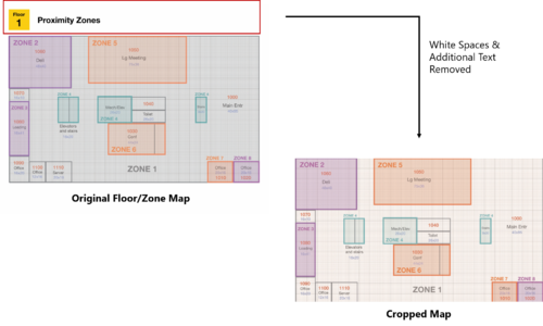
- Open the tool and choose the map to be plotted. In the zone maps given, there were white spaces and additional text that were not part of the map itself. As such, the map has to be cropped to get the actual map itself only. The following shows the cropping of maps and this process is repeated for each of the 3 levels.
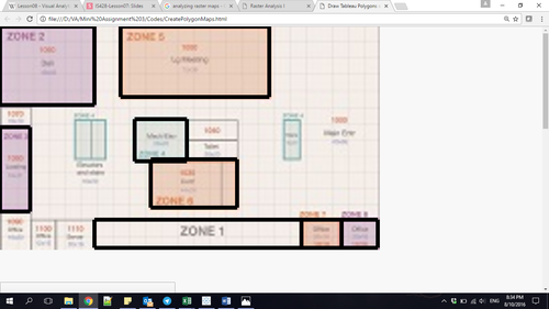
- Open the map using the online tool and plot each of the custom polygons. During the process of plotting, the following assumptions were made:
- For some areas with multiple zones separated on the map, a small area of the zone is being selected. For example, zone 4 have 3 different segments in level 1. However, they all refers to the elevators and stairs. By plotting only one of the zones, we will still be able to know that the employee is taking the stairs/elevators. There isn’t a need to identify which stairs or elevators they took. As such, for zone 4, only one of the custom polygon is drawn.
- For areas that were too big, only a small segment of the zone was plotted. For example, zone 1 encompasses the entire corridor spaces. If all the corridor spaces are drawn, the centre point will not be situated in zone 1. Therefore, only one part of the zone is drawn. As long as employees are within the same zone, they are in the corridor areas.
The outcome of plotting these polygons will result in the following display on the online tool. The same process is repeated for each of the 3 levels.
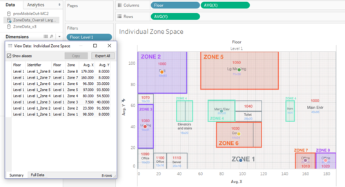
- After the polygons have been plotted, the results can be exported into a .csv file format for analysis in Tableau. Once the data has been imported into Tableau, the centre coordinates of each zone can then be retrieved. The following shows the centre points that were plotted on the chart and the ability to export the data. This will then allow us to retrieve the coordinates for each zone to be plotted onto the map.
- hello


