IS428 2016-17 Term1 Assign1 Ong Ming Hao
Contents
Infograph
Abstract
Problem & Motivation
A recent study done by the Economist Intelligence Unit (EIU) in 2016 found out that Singapore is the most expensive city in the world. [1] This report is done by comparing the cost of living in New York City with Cities around the world. From housing, food, education, etc.
In addition, according to the Singapore Real Estate Exchange, it found out that the median price for an executive apartment in Singapore is $626,000. [2] At this price, many Singaporeans would find it hard to buy a house and start their own families. Singaporeans should not have to take up exorbitant loans for basic housing.
As such, the focus of this article is to examine and analyse the following:
- 1. Singapore Property Market
- 2. Current Government Plans
- 3. Current Government Policies
By doing so, we are able to determine whether the government is doing is effective job in bringing the price of the Singapore’s Housing Market, and what more can be done to reduce the price of the average Singapore property.
Targeted Data & Policies
Rationale for choosing Data
I have chosen a few data sets from REALIS. The first data set is a list of private property transactions done in 2015. This would help me identify any trends in the private property market, in terms of location, type of housing or pricing per square foot. The next set of data that I want to analyse is vacancy and vacancy rate of private property and the amount of private property projects in progress. This would help me identify places of interest where the government should reduce building in, or change the type of building (commercial, businesses,parks,residential,etc.)
Initial Data Cleaning
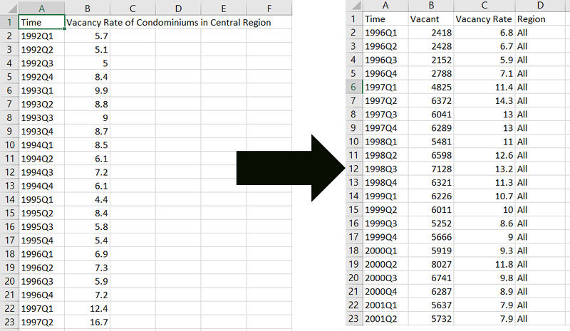
Some data that I retrieved from REALIS was needed to be appended together. Such as determining the vacancy rate and vacancy of Condominiums. As such, I had to do some data cleaning to ensure that Tableau was able to read the information.
Targeted Policies
The primary policy that i would be looking into is the Master Plan by the Urban Redevelopment Authority (URA). The master plan is the plan which is renewed by the URA every 5 years, which outlines and dictates where parks, commercial buildings, businesses and residential properties would be located at.
For this article, I would be focusing on planning regions and not planning areas due to the time constraint that I had to work with. If I have more time, I would spend a significant more time analysing the various planning areas.
Approaches
Initial Analysis
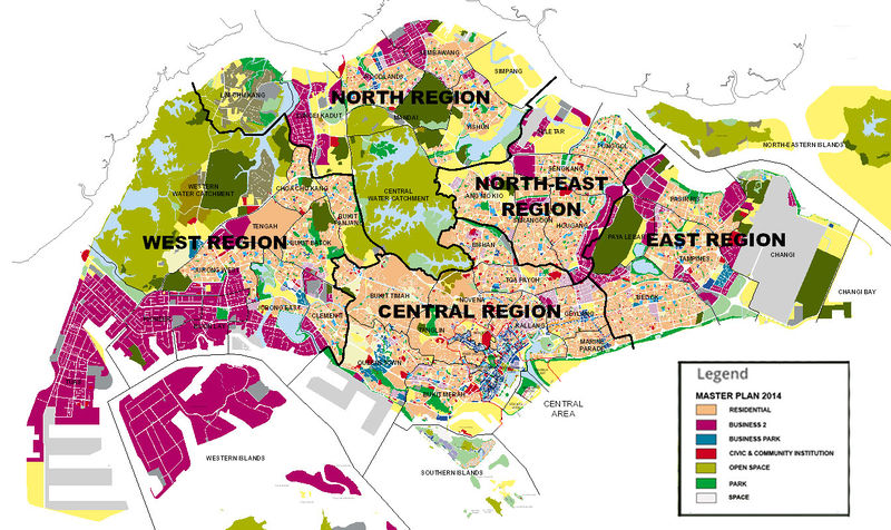
For the initial analysis, i looked into URA's Master Plan 2014 and analyzed the various places of interest. Here are my findings:
- West - Has the most businesses among all the regions
- Central - Has the most business parks and shopping centers among all the regions
- North - Has the most parks and open spaces among all the regions
Overall Analysis
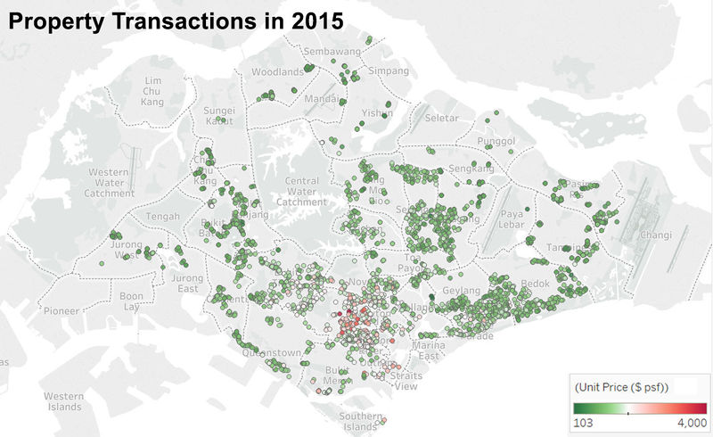
The first analysis i did was an overall map analysis of the transactions that occured in the year 2015. These are my findings:
From the map analysis above i was able to get the following insights:
- Central - Has the most expensive transactions (Unit Cost Per Square Foot)
- North - Has the least number of transactions taking place at that area.
- Punggol looked very low, even though there were many transactions taking place in North East Region
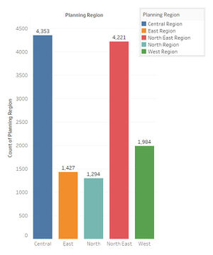
However, since i knew about the inaccuracy of a map analysis. As such, i decided to analyze all these data again to confirm my findings. I was able to replicate the results.
By using a bar graph, i was able to accurately view the amount of transactions that had occurred for the various regions. One interesting note to take note of is that for all transactions taking place in the North East, there were very little transactions taking place at Punggol, which is a place where many development work is taking place, and completed.
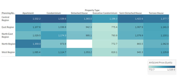
By using a highlight table, I was able to accurately view the average unit cost per square foot for the various regions, confirming that people didn't mind paying a premium for a place to live in the central. According to a study done by TreeHugger, the city (central area) is usually the most expensive as it's closer to their workplace and there are usually a wider range of entertainment there. [3]
Vacancy Rate Analysis
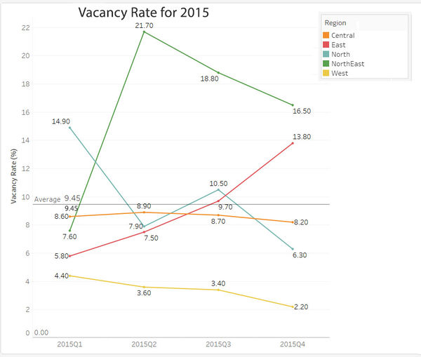
Next, i went to analyse the vacancy and vacancy rate for the Condominiums. This is what i was able to find out.
Tools
Tableau - For graph Visualization to perform analysis to find patterns and gain insights.
Microsoft Excel - Used for Data cleaning and transformation so that it can be imported into Tableau.
Adobe Photoshop - Used for creating the infographic and edit some of the graphs quickly.
Suggestions
Conclusion
Comments
Sources
[1] - http://pages.eiu.com/rs/783-XMC-194/images/EIU_WCOL2016_FreeReport_FINAL_NEW.pdf?mkt_tok=3RkMMJWWfF9wsRovuK7AZKXonjHpfsX56%2B8vXqW2lMI%2F0ER3fOvrPUfGjI4JTsthI%2BSLDwEYGJlv6SgFTbjGMbht2bgMUhU%3D
[2] - http://www.srx.com.sg/research
[3] - http://www.treehugger.com/sustainable-product-design/why-is-urban-housing-so-expensive-because-people-want-to-live-there.html
