IS428 2016-17 Term1 Assign1 Aaron Mak Kang Sheng
Contents
Abstract
Problem and Motivation
Recent cooling measures have caused private housing prices to stop rising. However, when is the right time to release these cooling measures? And how should we do it?
To tackle this problem, I’ll be looking at both the demand side and supply side trends over the past few years and come to a conclusion after a thorough review of the current cooling measures.
Approach
Data Collection
REALIS database of past projects and transactions.
Data Preparation
- Data is converted to csv files of 1000 rows each due to the download limit.
- Using a script, awk 'FNR==1 && NR!=1{next;}{print}' *.csv > master.csv , the csv files were merged.
Used QGIS for data preparation of cholorpleth map.
Tools
- Tableau
- QGIS
- iTerm2 (Terminal App)
Results
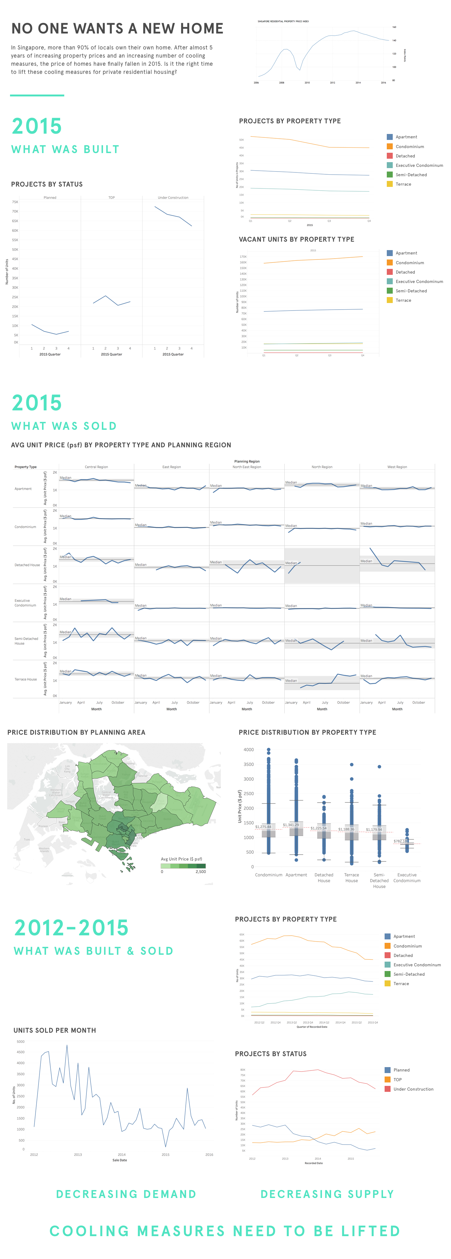
Below you will find the infographic and it's conclusion.
But before you take a look at it, let me explain my design decisions. I want to emphaisize the lack of growth in the housing market for both the supply and demand side. Consequently, I've used line graphs to show the trend over time. I’ve also used distinct but not distracting colours in the graphs to show the different categorical variables.
For the price distribution by planning area, I wanted to show the concentration of high priced private housing in the central area. I’ve also used a translucent shade to allow the viewer to see the planning area.
By colouring the section headers and conclusion a different colour, I can draw attention to it so the viewer will be able to follow the story I’m trying to tell.
