IS428 2016-17 Term1 Assign3 Lim Zi Yu Jouta
Data Preparation
...
1. What are the typical patterns in the prox card data? What does a typical day look like for GAStech employees?
Upon looking at the data for the fixed prox zones, I noticed that there is no data for 4th June. Unlike 5th, 11th or 12th June with very few records, no data has been recorded at all for 4th June. This suggests either that data was deliberately not recorded or simply no one had visited any of the fixed prox card zones in the office that day.
On the other hand, for the mobile prox zones i.e. Rosie’s prox card sensor, there are no data for 4th, 5th, 11th or 12th June, which are all weekends. I believe that this shows that Rosie does not work on weekends. Rosie makes her rounds every weekday starting from 2 time slots, 0900h and 1400h. The only exception to this is on 2nd June, when her duties were extended beyond 1000h.
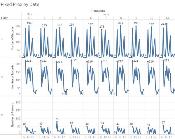
Firstly, I looked at the daily records for the 3 floors, after removing data for the 4th, 5th, 11th and 12th as I did not want to have the outliers affect things.
The data patterns for the fixed prox card sensors record count for each floor are largely the same each day.
Some patterns that I observed that seemed to be unusual:
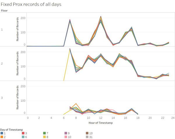
- 8th June sees a consistent number of records across all 3 floors at 6am, which is usually not observed for the 2nd and 3rd floors.
- 2nd June sees a sudden peak in number of records at 8am on the 3rd floor, which is the highest out of all data collected for the 3rd floor. Unlike most days for the 3rd floor, 2nd and 8th June sees a rise in records before dipping.
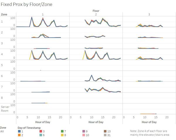
The graph above shows has each pane displaying the zone per floor, with each line representing a day of the data.
The data graphs for zone 4, the elevator and stairs area, of floor 1 and 2 shows 3 consistent peaks at the timings of 7am, 12pm, 5pm. Those timings are likely to be the timings people start work, people have lunch, people leave work. The data shown here is largely consistent, with one glaring issue being the singular point and record on floor 1 zone 5, which happened on 31st May 1128h, which is rather questionable as a lone case.
Overall for the fixed prox cards data, the records appear to be rather consistent, which can be attributed to the fixed locations of the data and routine behavior at work.
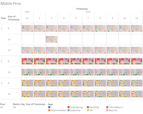
The mobile prox card data gives data for the location in the form of floor and X, Y coordinates. Using Tableau’s “Background Images” after cropping the proximity zone maps to just the map, changing the type of data for X and Y to longitude and latitude respectively, it becomes possible to display the mobile prox data points on the “map” corresponding to the coordinates. This creates a visualization showing the spatial distribution of the prox card scans, with color to show the number of records.

From this plot, we observe that the data for mobile prox scans are generally quite consistent, perhaps due to the fact that data is always captured around 9am and 2pm, with 2nd June being an outlier to it due to scans continuing into the 10am range for floor 1, likely due to Rosie’s duties being extended. Something might have taken place on 2nd June at floor 1 that lead to Rosie extending timing for her duties that does not take place on other days.
The typical day at GAStech starts at 7am, lunch at 12pm, work ends at 5pm. People generally stick to their daily routines without much deviation hence leading to similar data values recorded each day.
The prox id appears to follow the format of taking the first alphabet of the first name and join it with the last name followed by a 3-digit number. Using the prox card records and employee list, we are able to figure out the details of the prox card scans. I used Microsoft Excel to create a mapping of the employee list to the prox card scan records. One thing I noticed here is that 2 members on the employee list were not reflected in the prox card records, Alcide Pherigo and Edvard Vann from the Security Department.

