IS428 2016-17 Term1 Assign3 Lim Zi Yu Jouta
Contents
- 1 Data Preparation
- 2 Interactive Data Visualization
- 3 What are the typical patterns in the prox card data? What does a typical day look like for GAStech employees?
- 4 Describe up to ten of the most interesting patterns that appear in the building data. Describe what is notable about the pattern and explain its possible significance.
- 5 Describe up to ten notable anomalies or unusual events you see in the data. Prioritize those issues that are most likely to represent a danger or a serious issue for building operations.
- 6 Describe up to five observed relationships between the proximity card data and building data elements. If you find a causal relationship (for example, a building event or condition leading to personnel behavior changes or personnel activity leading to building operations changes), describe your discovered cause and effect, the evidence you found to support it, and your level of confidence in your assessment of the relationship.
Data Preparation
Tools Used: Microsoft Excel, JMP Pro, Tableau
I used Microsoft Excel to compile a list of Prox-IDs captured by the prox card datasets. Prox IDs in this data appear to be generated by the rule of taking the first alphabet of the first name and concatenate it with the last name, followed by a 3-digit serial number.
After compiling the list of Prox-IDs captured, I created a list of the prox-ids without the trailing 3 digits, so that I could match to the generated prox-id I have created based on the rule on the Employee List provided.
I noted that some were unable to match as the ones used in the system does not fully adhere to my supposed rule, and made manual changes to accommodate it. In the end I was able to map the prox id listed in the prox card data for fixed prox zones and mobile prox scans to the Employee List, noting that a few employees had never gotten themselves captured in the data for these few days.
With this, we can make more detailed analysis of the prox id captured to link to their individual identity or their department.
The Building Data came in one big table with each row representing a point in time whereas the different columns signified the different measurements recorded by the sensors and devices located all over the office building.
To facilitate easier use of the data for visualization, I decided to divide the data up into 3 data files, based on how the columns either measured data by floor/zone, by floor, by the office building.
Using Microsoft Excel, I selected the columns to be grouped into the 3 datasets and placed them into individual worksheets. Using JMP Pro, I used the stack function to condense the table in to 3 columns, first being the timestamp, followed by the column denoting the measurement taken, last column being the value recorded for the measurement.
Afterwards, I used both JMP Pro and Microsoft Excel to break it down further to columns denoting floor number, zone number, etc.
Interactive Data Visualization
Link to Interactive Data Visualization: https://public.tableau.com/profile/jouta#!/vizhome/Assign3_2/FixedProxscanbyDateFloor
Different Graphs/Dashboard can be accessed through the tabs on top to see the different aspects available to explore.
I mainly used line graphs due to the nature of the data being a time series data with continuous values.
For the tab "Functions for the entire building", I chose to have independent axes for each measurement as I felt that it was more important to show the patterns in the change of data rather than to compare the measurements across the same scale that would lead us to miss out details on one. Similarly the same was done for data by the floor.
For the floor/zone data, I chose to have everything on the same scale as I felt the effective analysis for such detailed breakdowns should be done by either focusing on 1 measure across all floors and zones or focusing on 1 floor and zone while viewing all measures available.
Lastly was a table to show the Fixed Prox Data reocrds and their distribution by the date broken down by floor and zone.
What are the typical patterns in the prox card data? What does a typical day look like for GAStech employees?
Upon looking at the data for the fixed prox zones, I noticed that there is no data for 4th June. Unlike 5th, 11th or 12th June with very few records, no data has been recorded at all for 4th June. This suggests either that data was deliberately not recorded or simply no one had visited any of the fixed prox card zones in the office that day.
On the other hand, for the mobile prox zones i.e. Rosie’s prox card sensor, there are no data for 4th, 5th, 11th or 12th June, which are all weekends. I believe that this shows that Rosie does not work on weekends. Rosie makes her rounds every weekday starting from 2 time slots, 0900h and 1400h. The only exception to this is on 2nd June, when her duties were extended beyond 1000h.
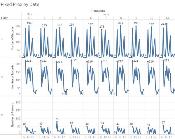
Firstly, I looked at the daily records for the 3 floors, after removing data for the 4th, 5th, 11th and 12th as I did not want to have the outliers affect things.
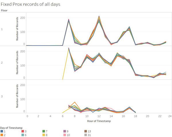
The data patterns for the fixed prox card sensors record count for each floor are largely the same each day.
Some patterns that I observed that seemed to be unusual:
- 8th June sees a consistent number of records across all 3 floors at 6am, which is usually not observed for the 2nd and 3rd floors.
- 2nd June sees a sudden peak in number of records at 8am on the 3rd floor, which is the highest out of all data collected for the 3rd floor. Unlike most days for the 3rd floor, 2nd and 8th June sees a rise in records before dipping.
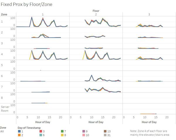
The graph above shows has each pane displaying the zone per floor, with each line representing a day of the data.
The data graphs for zone 4, the elevator and stairs area, of floor 1 and 2 shows 3 consistent peaks at the timings of 7am, 12pm, 5pm. Those timings are likely to be the timings people start work, people have lunch, people leave work. The data shown here is largely consistent, with one glaring issue being the singular point and record on floor 1 zone 5, which happened on 31st May 1128h, which is rather questionable as a lone case.
Overall for the fixed prox cards data, the records appear to be rather consistent, which can be attributed to the fixed locations of the data and routine behavior at work.
The mobile prox card data gives data for the location in the form of floor and X, Y coordinates. Using Tableau’s “Background Images” after cropping the proximity zone maps to just the map, changing the type of data for X and Y to longitude and latitude respectively, it becomes possible to display the mobile prox data points on the “map” corresponding to the coordinates. This creates a visualization showing the spatial distribution of the prox card scans, with color to show the number of records.
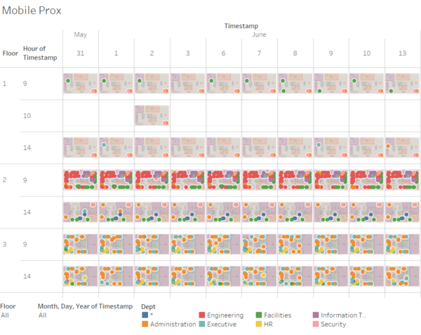
From this plot, we observe that the data for mobile prox scans are generally quite consistent, perhaps due to the fact that data is always captured around 9am and 2pm, with 2nd June being an outlier to it due to scans continuing into the 10am range for floor 1, likely due to Rosie’s duties being extended. Something might have taken place on 2nd June at floor 1 that lead to Rosie extending timing for her duties that does not take place on other days.
The typical day at GAStech starts at 7am, lunch at 12pm, work ends at 5pm. People generally stick to their daily routines without much deviation hence leading to similar data values recorded each day.
The prox id appears to follow the format of taking the first alphabet of the first name and join it with the last name followed by a 3-digit number. Using the prox card records and employee list, we are able to figure out the details of the prox card scans. I used Microsoft Excel to create a mapping of the employee list to the prox card scan records. One thing I noticed here is that 2 members on the employee list were not reflected in the prox card records, Alcide Pherigo and Edvard Vann from the Security Department.
Describe up to ten of the most interesting patterns that appear in the building data. Describe what is notable about the pattern and explain its possible significance.
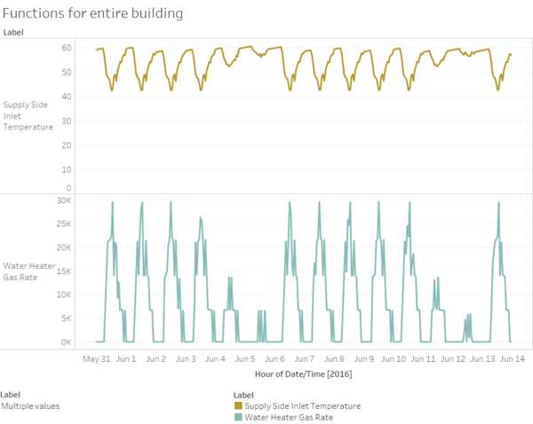
Water Heater Gas Rate peaks around 1 pm each day. Supply side inlet temperature dips at around 1 pm each day. The data reflects that the spike in gas rate happens around 1pm each day even if the temperature dip in the water coming in is not that much. Perhaps one way to save on electricity and increasing efficiency of the water heating system is for the heating to only begin when the temperature falls below a baseline set, such that unnecessary energy wasted to start each heating cycle can be minimized. The current way of managing is good in having a routine cycle but it may not be able to adjust in times of extreme changes.
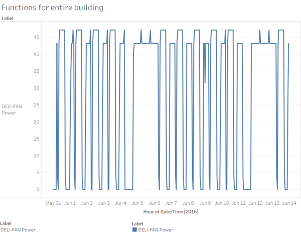
The deli exhaust fan spikes in power around timings when people start working and end work. On both weekends captured in the data however, the deli exhaust fan has been observed to run at rather high power levels throughout the weekend despite the supposed lack of people in the office.
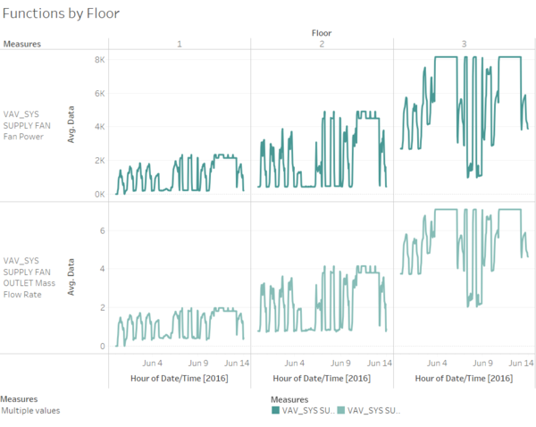
The changes in power used by the HVAC system fan is consistent with the changes in temperature of the air exiting the HVAC system to the different zones. Power is used by the HVAC system in maintaining a suitable indoors environment, whereby temperature of the working environment is one to be considered.
We also note that the average power and flow rate increases as the floor number rises. This may imply the location of the HVAC system fan to be at floor 1 hence requiring more power and flow to delivery to the upper floors.
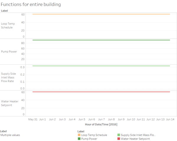
All of the measures here are mainly settings to ensure regulated maintenance of the office HVAC setting environment. The system has been efficient in keeping things maintained at the constant settings, however more consideration may be put in setting the levels to be maintained. For example, weekends when no employees are expected to be around for could see changes in the settings as the building does not need to be running at optimal settings, but could be more cost efficient by lowering the settings.
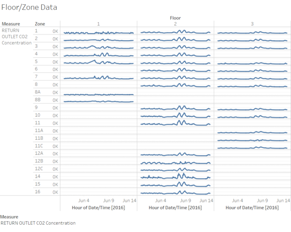
CO2 levels remain largely consistent throughout all zones for floors 2 and 3, which could be due to how floor 2 and 3 are largely offices unlike floor 1 which serves as the entrance and has facilities like the deli.
For the data on floor 2, we observe two spikes on 7th and 8th June.
Describe up to ten notable anomalies or unusual events you see in the data. Prioritize those issues that are most likely to represent a danger or a serious issue for building operations.
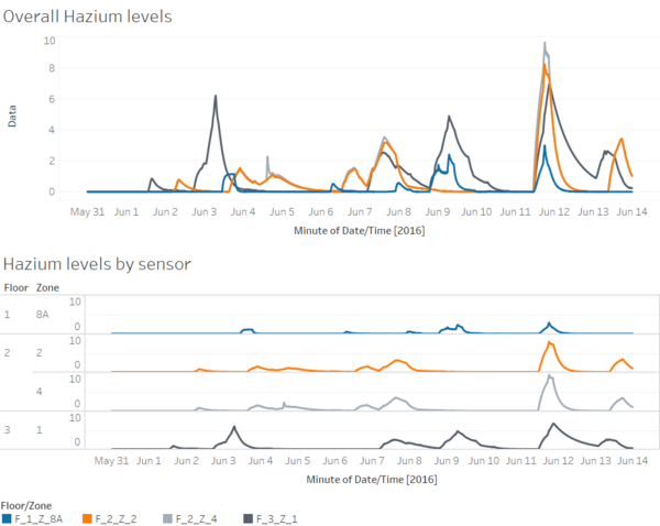
Starting from noon on 11th June, a sudden increase in Hazium levels has been recorded on all 4 zones across the 3 floors, which peaked around 6pm on the same day. Although previous spikes in Hazium levels have been recorded, 11th June marks the first time it has happened concurrently across all 4 zones together.
Prior to the Hazium level spike on 11th June, Hazium level increases have been recorded too.
3rd June morning sees a sudden spike on the 3rd floor, which sees subsequent small increases in hazium levels recorded on floors 1 and 2.
6th June evening sees a small increase in Hazium levels for both zones in floor 2, which fell but increased again the next day for floors 2 and 3. After the hazium increase for floor 2 subsided, another spike was observed for floor 3, and a small increase for floor 1.
These previous incidences may be seen as isolated incidences, but it seems more likely to be some form of a “practice” before launching a coordinated effort on 11th June across the entire office building.
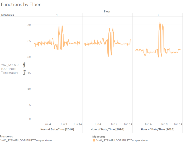
For 2 days starting 7th June, a huge variance in temperatures of air returning to the HVAC system from all zones served has been observed. The pattern for this data is generally stable and cycles around 24 degrees with low variance. Furthermore, such variation in data should not be observed since it is the temperature of the air from the office building zones, not air from the outside that would see temperature changes courtesy of nature. To observe such variation would mean there has been activity taking place that would result in temperature changes, such as tampering with the HVAC systems or the like, seeing that it is consistent for all 3 floors of the building.
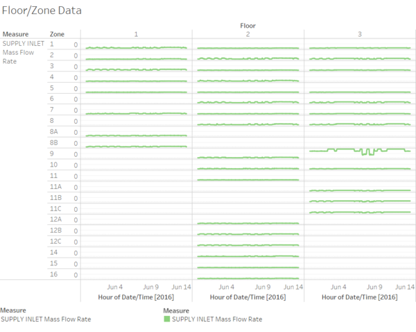
The Supply inlet mass flow rate measures the flow rate of the air entering the respective zones from its air supply box. As such, it can be seen that most of the floors and zones have it at a near constant level. Hence, floor 3 zone 9 stands out as it shows quite a bit of variation in its air flow rate, to the server room and neaby offices. The 2 major dips in air flow rates happened during office hours of 7th and 8th June. However, I could not find a reason to explain this variation. Even though other measures for F3Z9 showed variation during this time period too, those variations were uniform throughout the measurement for all other zones.
Describe up to five observed relationships between the proximity card data and building data elements. If you find a causal relationship (for example, a building event or condition leading to personnel behavior changes or personnel activity leading to building operations changes), describe your discovered cause and effect, the evidence you found to support it, and your level of confidence in your assessment of the relationship.
The major hazium incidences happened on 3rd, 6th and 11th June. Although the major incident happened on 11th June, there is not much proximity card data available for analysis as none of the mobile prox card data was collected on 11th and 12th whereas fixed prox card data for those days are rather limited. Prox card data collected does not seem sufficient to prove if any employee was responsible for the hazium levels.
On the other hand, I am more concerned as to the variation in HVAC settings mentioned above, which I believe is unlikely to be the case. Perhaps someone was able to manipulate it over the server/remotely to affect changes to induce the increase in Hazium by affecting the air flow and temperatures.
