IS428 2016-17 Term1 Assign1 Wu Wei
Contents
Abstract
Property Cooling Measures
With limited land resources in Singapore, high demand for private properties was observed in the last 20 years as a general trend. However, in recent years, private residential property segment is indeed heavily oversupplied due to some cooling measures introduced by the government. In this assignment, it analyzes the private residential properties in Singapore by using the share of supply and distribution of prices in 2015. Through this analysis, we would consider whether the property cooling measures should be lifted.
Problem & Motivation
One of my friend's father has worked in real estate industry in Singapore for more than 30 years. He once complained to me that he was experiencing a hard time currently. His salary decreased gradually over the years because he had great difficulties to secure enough tenants for those investors. He blamed the property cooling measures which almost ruined his job.
For me, this is a good opportunity to use this visual analytics project to understand the current situation for private property industry. On the other hand, I also want to get some meaningful findings which could help my friend's father to solve his problem.
Tools
- Excel for data transformation and data processing
- Tableau is used to generate all the graphs
- Piktochart is used to generate infographics
Approaches
Data Preparation
Data sets for the supply and distribution of prices are retrieved from REALIS database. Supply data can be directly retrieved from the table of Residential Supply 2015 q1-q4 through Timeseries.
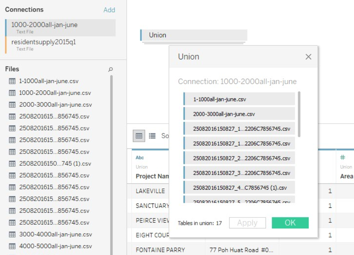
 Whereas the prices retrieval is more complecated, we need to merge a few csv files from Transaction category together in order to get a complete version of private property price distribution.

Use of Charts
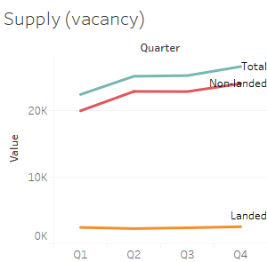
For the share of the private properties supply in 2015, we use bar charts to show the numerical change in each quarter and each category.
For the distribution of prices, we would use line charts to display how the trend varies with time.