Difference between revisions of "Staying Vigilant, Confronting Terrorism: Proposal"
Wx.tan.2013 (talk | contribs) |
Wx.tan.2013 (talk | contribs) |
||
| Line 36: | Line 36: | ||
<p>In this project, we are interested to create a visualization that helps analysts perform the following:</p> | <p>In this project, we are interested to create a visualization that helps analysts perform the following:</p> | ||
# Identify the target victims of terrorist attacks across countries | # Identify the target victims of terrorist attacks across countries | ||
| − | # Explore each country’s existing political | + | # Explore each country’s existing political climate |
| − | # Compare the political | + | # Compare the political climate of each country |
| − | # Establish possible correlations of a country’s political | + | # Establish possible correlations of a country’s political climate with the number of terrorist attacks happening in a country |
<p>By conducting the analysis, it allows respective policy makers, government or intelligence agencies to better identify potential linkages between how well a country is governed (political conditions) and the potential for future terrorist attacks. If a link between how well a country is governed and the occurrence of terrorist attacks could be established, policy makers and government agencies can take steps to improve the political conditions/way in which their country is governed. By targeting at a potential root cause of terrorist attacks, it aims to reduce the number of terrorist attacks happening across different parts of the world.</p> | <p>By conducting the analysis, it allows respective policy makers, government or intelligence agencies to better identify potential linkages between how well a country is governed (political conditions) and the potential for future terrorist attacks. If a link between how well a country is governed and the occurrence of terrorist attacks could be established, policy makers and government agencies can take steps to improve the political conditions/way in which their country is governed. By targeting at a potential root cause of terrorist attacks, it aims to reduce the number of terrorist attacks happening across different parts of the world.</p> | ||
Revision as of 16:45, 16 November 2016
After much analysis and investigation on the data, our group feels that the previous storyboard we created will not allow people to find interesting insights. This is primarily because we realised that there is not much support from the data collected to show that the economic indicators in a country will lead to higher levels of terrorist attacks in a country. The relationship between a country's economy and the number of terrorist attacks could not be established. As such, we decided to change our storyboard to show more interesting insights, as shown in this proposal. If you are interested to look at our previous proposal, please refer back to Proposal Version 1.
The threat of terrorism is growing everyday and many countries, including Singapore, have taken steps to mitigate the risks of terrorism. In the National Day Rally 2016, PM Mr. Lee Hsien Loong mentioned that diplomats and security forces have been doing their job well but despite their efforts, it does not mean that terrorist attacks will not happen in Singapore. The recent attack that attempted to fire a rocket to hit Marina Bay Sands Area from Batam was successfully intervened but this signals to the country that the terrorism threat should not be taken lightly. In response to the growing terrorist threat, the SGSecure Movement was launched to prepare the public in the event of an attack. In recent years, there is a rise in research on terrorist organizations and the activities they have performed, regardless of scale, over the years. However, more still needs to be done to analyze past terrorist activities and gain insights from it easily so that all countries could better prepare for a worst case scenario.
In this project, we are interested to create a visualization that helps analysts perform the following:
- Identify the target victims of terrorist attacks across countries
- Explore each country’s existing political climate
- Compare the political climate of each country
- Establish possible correlations of a country’s political climate with the number of terrorist attacks happening in a country
By conducting the analysis, it allows respective policy makers, government or intelligence agencies to better identify potential linkages between how well a country is governed (political conditions) and the potential for future terrorist attacks. If a link between how well a country is governed and the occurrence of terrorist attacks could be established, policy makers and government agencies can take steps to improve the political conditions/way in which their country is governed. By targeting at a potential root cause of terrorist attacks, it aims to reduce the number of terrorist attacks happening across different parts of the world.
In our analysis, we will only be using data within the year of 2000 - 2015. The rationale for the range of data selected is as follows:
- It does not provide strong relevance/insights for analysts to look at all the data in the past 45 years and attempt to predict activities of these terrorist organizations now/in the future. Due to rapid changes in the globalized world, a range of 15 years will be adequate to help analysts spot trends/patterns of terrorist activities.
- Due to limitations of the data collected on each country's governance indicators, the dataset only provides information from year 2000 - 2015.
- Due to technical limitations, loading past 45 years of data (156,773 records) into the application may cause it to become non-responsive and users may not be satisfied with the response rate. A range of 15 years (87,010 records) will yield just enough data for an insightful analysis and yet, does not sacrifice on the application's response rate.
The dataset for analysis will be retrieved from multiple databases, as elaborated below:
| Dataset/Source | Data Attributes | Rationale Of Usage |
|---|---|---|
(https://www.start.umd.edu/gtd/using-gtd/) |
|
|
(http://data.worldbank.org/data-catalog/worldwide-governance-indicators) |
|
|
(http://www.politicalterrorscale.org/Data/) |
|
|
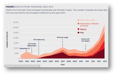
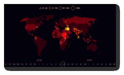
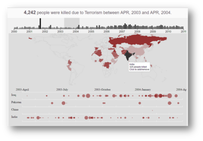
Many visual and data analysts have made use of data collected from the Global Terrorism Database to visualize and understand the extent of terrorist attacks around the world. Some of their works include the following:
| Related Works | What We Can Learn |
|---|---|
|
|
|
| |
|
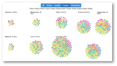
Other than looking at related works of others, we also reference and draw inspirations from interactive visualizations created by others. Some of these visualizations that we draw inspiration from, are as follows:
| Reference of Other Interactive Visualization | What We Can Learn |
|---|---|
| |
|
| Proposed Layout | How Analyst Can Conduct Analysis |
|---|---|
| |
| |
|
The following are some of the key technical challenges that we may face throughout the course of the project:
| Key Technical Challenges | How We Propose To Resolve |
|---|---|
| |
| |
| |
|
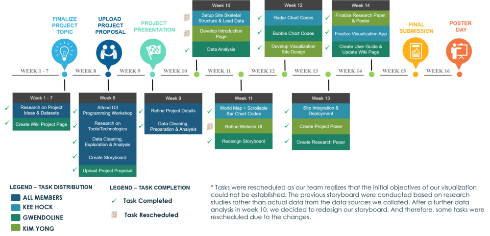
The following shows our project timeline for the completion of this project:
The following are some of the tools/technologies that we will be utilizing during the project:
- D3.js
- Chart.js
- Notepad++
- Adobe PhotoShop
- Marina Bay Attack Plot from Batam ‘Not to be Taken Lightly’ (http://www.straitstimes.com/singapore/rocket-attack-plot-not-to-be-taken-lightly)
- National Consortium for the Study of Terrorism and Responses to Terrorism (START). (2016). Global Terrorism Database [Data file]. Retrieved from http://www.start.umd.edu/gtd
- Worldwide Governance Indicators (http://data.worldbank.org/data-catalog/worldwide-governance-indicators)
- Political Terror Scale (http://www.politicalterrorscale.org/Data/)
- Educity (http://www.thiakx.com/educity/?loaded#introPage-Link)
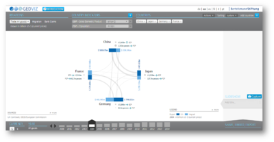
- GED Viz - Visualizing Global Economic Relations (http://viz.ged-project.de/)
- D3.js (https://d3js.org/)
- Examples By Mike Bostock (https://bost.ocks.org/mike/example/)
- CSV to JSON Converter (http://www.convertcsv.com/csv-to-json.htm)
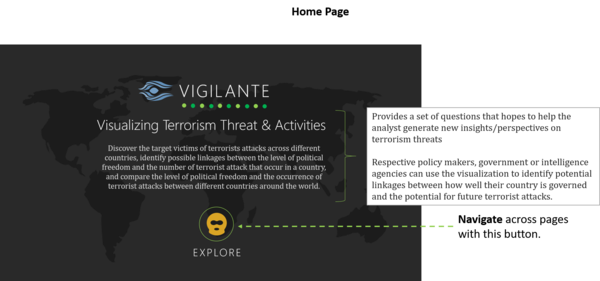
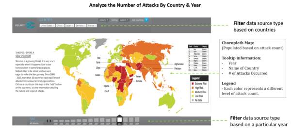
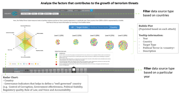
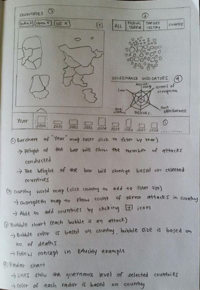
The following show the proposed storyboard that we designed during our brainstorming sessions:
The storyboard provides an overview of the various charts that we intend to employ in our web application. More information about each chart is indicated based on the labels present in the chart. Based on reasons of practicality, it is difficult to place all 3 charts in the same window and yet able to see all the information clearly. As such, when we draw our final storyboard, the charts are separated on 2 different pages. Users will be able to scroll between different charts by using their left/right arrow keys.
Feel free to comment to help us improve our project! (:

