PROBLEM & MOTIVATION
The threat of terrorism is growing everyday and many countries, including Singapore, have taken steps to mitigate the risks of terrorism. In the National Day Rally 2016, PM Mr. Lee Hsien Loong mentioned that diplomats and security forces have been doing their job well but despite their efforts, it does not mean that terrorist attacks will not happen in Singapore. The recent attack that attempted to fire a rocket to hit Marina Bay Sands Area from Batam was successfully intervened but this signals to the country that the terrorism threat should not be taken lightly. In response to the growing terrorist threat, the SGSecure Movement was launched to prepare the public in the event of an attack. In recent years, there is a rise in research on terrorist organizations and the activities they have performed, regardless of scale, over the years. However, more still needs to be done to analyze past terrorist activities and gain insights from it easily so that all countries could better prepare for a worst case scenario.
OBJECTIVES
In this project, we are interested to create a visualization that helps analysts perform the following:
- Identify terrorist organizations active in each country and the spread/types of activities they conducted to threaten the safety of the country, over different time periods
- Identify possible linkages between the number of terrorist activities occurring in a country and its development status
- Get a clearer understanding of each terrorist organization and the type of attacks they have conducted in a country/globally, over different time periods
- Compare different terrorist organizations and identify similarities and differences in their attack patterns, over different time periods
By conducting the analysis, it allows respective policy makers, government or intelligence agencies to better understand terrorist organizations and their spread internationally so that they could devise appropriate policies/measures to prevent potential attacks within their own country, regionally or globally in future.
SELECTED DATASET
In our analysis, we will only be using data within the year of 2000 - 2015. The rationale for the range of data selected is as follows:
- It does not provide strong relevance/insights for analysts to look at all the data in the past 45 years and attempt to predict activities of these terrorist organizations now/in the future. Due to the rapid changes in the globalized world, a range of 15 years will be adequate to help analysts spot trends/patterns of terrorist activities.
- Due to limitations of the data collected about each country's development status, the dataset only provides information from year 2000 - 2015.
- Due to technical limitations, loading past 45 years of data (156,773 records) into the application may cause it to become non-responsive and users may not be satisfied with the response rate. A range of 15 years (87,010 records) will yield just enough data for an insightful analysis and yet, does not sacrifice on the application's response rate.
The dataset for analysis will be retrieved from multiple databases, as elaborated below:
| Dataset/Source
|
Data Attributes
|
Rationale Of Usage
|
Global Terrorism Database (GTD)
(https://www.start.umd.edu/gtd/using-gtd/)
|
- Geographical spread of terrorist attacks
- Type of terrorist attacks
- Target of terrorist attacks
- Perpetrators of terrorist attacks
- Extent of damage in terrorist attacks
|
This dataset will be used as a main source of information in our analysis to understand the spread of terrorist activities in each country/globally.
|
Big Allied and Dangerous Database (BAAD)
(https://dataverse.harvard.edu/dataset.xhtml?persistentId=hdl%3A1902.1/16062)
|
- Information about each terrorist organization (e.g. ideology, location, state sponsored, number of allies and rivals)
|
This dataset aims to complement the main dataset by providing detailed information about each terrorist organization, in addition to the attacks that it carried out globally.
|
World Development Indicators
(Retrieved from World Bank)
|
- Annual GDP Growth (%)
- Poverty Ratio (%)
- Unemployment Rate (%)
- Adult Literacy Rate (%)
|
This dataset aims to help analysts identify possible linkages
between the number of terrorist activities occurring in the country and the development state of the selected country.
|
UIS Data Center
(Retrieved from UN Data - UNESCO Institute for Statistics)
|
|
This dataset aims to help analysts identify possible linkages
between the number of terrorist activities occurring in the country and the development state of the selected country.
|
World Telecommunications/ICT Indicators Database
(Retrieved from UN Data - International Telecommunications Union)
|
- Individuals Using Internet (%)
|
This dataset aims to help analysts identify possible linkages
between the number of terrorist activities occurring in the country and the development state of the selected country.
|
BACKGROUND SURVEY OF RELATED WORKS
Many visual and data analysts have made use of data collected from the Global Terrorism Database to visualize and understand the extent of terrorist attacks around the world. Some of their works include the following:
| Related Works
|
What We Can Learn
|
|
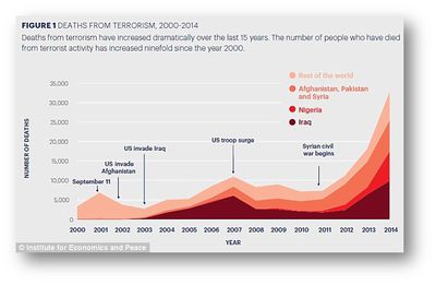
An Analysis of Death Tolls & Terrorist Incidents
Source: http://www.dailymail.co.uk/news/article-3322308/Number-people-killed-terrorists-worldwide-soars-80-just-year.html
|
- The infographic provides annotations to help the users understand major terrorist attacks that have happened overtime.
- Colour scheme used by the infographic is clean and neat.
- Use of colors on the same color scale ensures that it will not confuse the users. Also, the need to reference to a legend repeatedly will also be reduced.
|
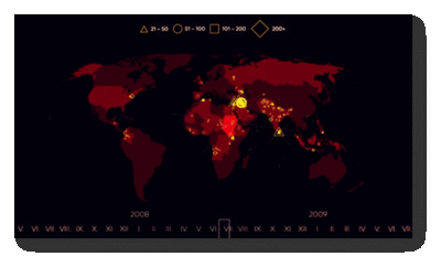
| An Animated Time-Lapse Visualization of Terror Attacks On The World Map
Source: https://www.youtube.com/watch?v=cHbYk2l9w-E
|
- The time-lapse animation provides a clear overview to users as it shows the spread of terrorist activities over the years.
|
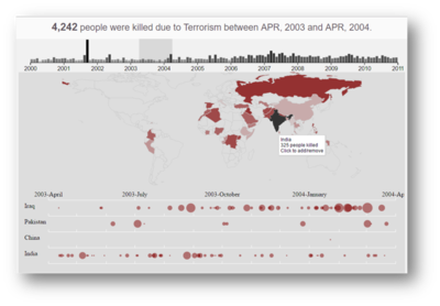
| An Interactive Visualization to Show Trends And Events Shaping History of Terrorism
Source: http://parano.github.io/Global-Terrorism-Visualization/
|
- The time-series chart allow users to make use of a scrollbar to look at a time range (of 12 months). Use of a scrollbar act as a filter to look at the selected time range and this prevents users from getting overwhelmed by the data.
- The visualization consists of 2 charts linked together and this provides a clear representation of the spread of terrorist activities overtime. Firstly, the bar chart shows the number of fatalities in each month across the years. Secondly, the world map shows the spread of terrorist activities as user selects a time series. When the user drags across the scrollbar on the bar chart, the activities in the world map changes based on the selected time series. Such linkage between charts are useful and provides a good interactive tool to help users analyze spread of terrorist activities overtime.
- Use of tooltips allow users to know more information about the number of fatalities as they interact with the map.
|
PROPOSED STORYBOARD
Our group has proposed the following storyboard to assist analysts in the use of our visual application:
| Proposed Layout
|
How Analyst Can Conduct Analysis
|
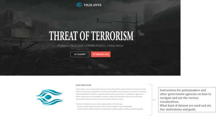
Introduction
|
- Introduce analysts to the topic of terrorism and the objectives of the visualization project
- Select an option of whether they wish to analyze terrorist activities based on each country or each terrorist organization
|
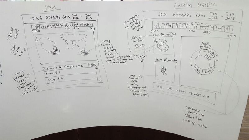
Analyze Terrorist Activities By Country
|
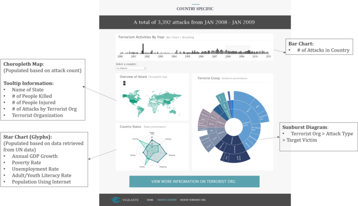
- Inspired by one of the related works mentioned previously, the filter in the page will be based on a bar chart showing the count of terrorist attacks over the years.
- A scrollbar will be implemented on the bar chart to allow users to choose the time series they are interested to look at. At any point in time, users can analyse one year of data. As the time period changes, the data in all 3 charts will change dynamically.
- A choropleth map of the country will be displayed and the count of terrorist attacks conducted in each state will be colored accordingly based on the selected time period.
- A star chart (glyph) will also be displayed to show the development state of the country for the selected time period.
- A zoomable sunburst diagram will also be displayed to show the terrorist organizations active in the country, the type of attacks conducted by each terrorist organization and their target victims.
- By selecting to view more information about the terrorist organization, the user will be directed to the next page about the terrorist organizations.
|
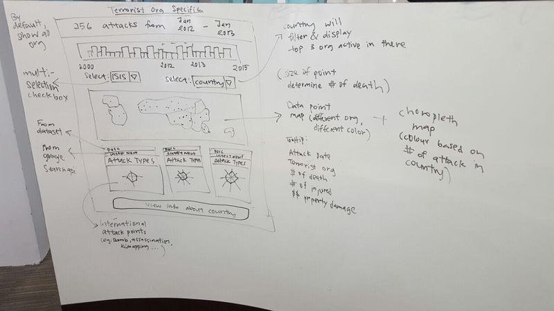
Analyze Terrorist Activities By Terrorist Organizations
|
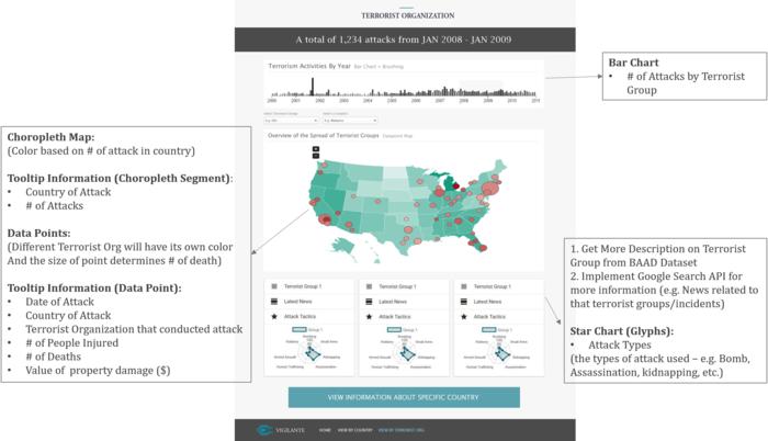
- If user enters the page from the country specific page, the top 3 active terrorist organization in the country will be shown. Otherwise, the top 3 active terrorist organization globally will be shown.
- Similar to the country specific page, a bar chart showing the count of attacks occurring globally will be shown. At any point in time, users can analyse one year of data. As the time period changes, the data in all charts will change dynamically.
- Other than the time period, users can also choose to add/remove the terrorist organizations they wish to compare against. If the country is selected as a filter, the top 3 terrorist organization in the country will be displayed.
- The choropleth world map will be colored based on the number of attacks conducted by the selected terrorist organizations.
- The data points on the choropleth world map will be colored by the different types of the terrorist organization who conducted the attack. The size of the data point will be determined by the number of deaths in the particular attack.
- More information about the terrorist organization will also be displayed. These information will come from the BAAD dataset, Google Search and the GTD dataset on the number of attacks conducted based on attack types.
|
ADDRESSING KEY TECHNICAL CHALLENGES
The following are some of the key technical challenges that we may face throughout the course of the project:
| Key Technical Challenges
|
How We Propose To Resolve
|
| Unfamiliarity of Visualization Tool Usage |
- Independent Learning on Visualization Tools
- Peer Learning
|
| Data Cleaning & Transformation |
- Work together to clean, transform and analyze the data
|
| Unfamiliarity in Programming using Javascript & D3 Libraries |
- Attend D3 Programming Workshop
- Independent Learning on D3 Libraries & Technical Tools
- Peer Learning
|
| Unfamiliarity in Implementing Interactivity and Animation Tools/Techniques in Visualization App |
- Develop a Storyboard/Design Flow
- Assign members to specialize on Interactivity/Animation Techniques
|
PROJECT TIMELINE
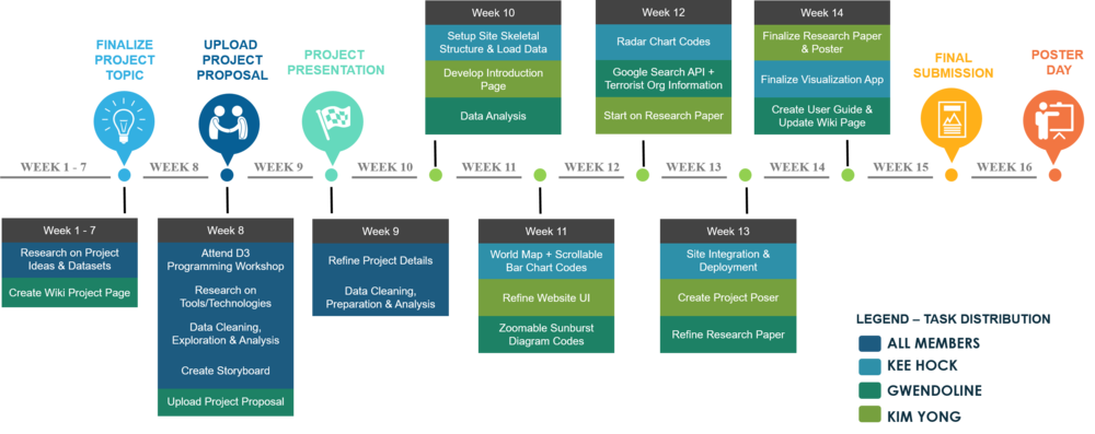
The following shows our project timeline for the completion of this project:
TOOLS/TECHNOLOGIES
The following are some of the tools/technologies that we will be utilizing during the project:
- D3.js
- Chart.js
- Google Charts
- Google Search API
- Github
- Netbeans
REFERENCES
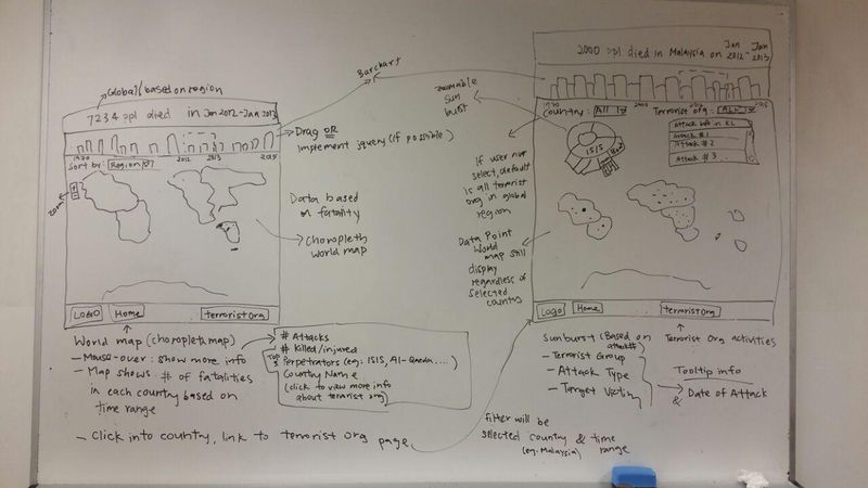
OUR BRAINSTORMING SESSIONS
The following are some of the proposed storyboard that we designed during our brainstorming sessions:
COMMENTS
Feel free to comment to help us improve our project! (:

