Difference between revisions of "IS428 2016-17 Term1 Assign3 Gwendoline Tan Wan Xin"
Wx.tan.2013 (talk | contribs) |
Wx.tan.2013 (talk | contribs) |
||
| Line 67: | Line 67: | ||
* Perform a left join between the proximity data and the employee list to correlate the employee ID together. This will allow us to identify the employee with the captured proximity card ID. The following shows the configuration of the join: | * Perform a left join between the proximity data and the employee list to correlate the employee ID together. This will allow us to identify the employee with the captured proximity card ID. The following shows the configuration of the join: | ||
<p>[[File:Tableau Data Join Of Proximity Data GwendolineTanWanXin.png|300px|center]]</p> | <p>[[File:Tableau Data Join Of Proximity Data GwendolineTanWanXin.png|300px|center]]</p> | ||
| − | <p>To process and display the dates in a | + | <p>To process and display the dates in a readable format for the analyst, each of the data sources will have a new calculated field to derive the date and day of the week. This will convert the date from the format “31/5/2016” to a format of “31 May (Tuesday)”.</p> |
<p>The formula used is as follows: </p> | <p>The formula used is as follows: </p> | ||
''STR(DATEPART('day', [Date/Time])) + " " + DATENAME('month',[Date/Time]) + " (" + DATENAME('weekday', [Date/Time]) + ")"'' | ''STR(DATEPART('day', [Date/Time])) + " " + DATENAME('month',[Date/Time]) + " (" + DATENAME('weekday', [Date/Time]) + ")"'' | ||
== Creation & Use Of Interactive Visualization Techniques == | == Creation & Use Of Interactive Visualization Techniques == | ||
| + | <p>The final interactive visualization can be accessed here: <insert link></p> | ||
| + | <p>For the best experience, adjust your screen resolution to 1366x768 and enable full screen on the browser. Adjust the dashboard so that all elements can be clearly visible without the need to scroll up/down.</p> | ||
| + | <p>Throughout all the different dashboards, useful guides/tips are provided to help users navigate through the different filters and actions so that their analysis can be performed smoothly. The following interactivity elements are also used throughout all the dashboards to maintain consistency:</p> | ||
== Interesting & Anomalous Observations == | == Interesting & Anomalous Observations == | ||
Revision as of 18:18, 22 October 2016
Contents
Problem & Motivation
After the successful resolution of the 2014 kidnapping at GAStech’s Abila, Kronos office, GAStech officials determined that Abila offices needed a significant upgrade. At the end of 2015, the growing company moved into a new, state-of-the-art three-story building near their previous location. The new office is built to the highest energy efficiency standard, but as with any new building, there are still several HVAC issues to work out. Each zone is instrumented with sensors that report building temperatures, heating and cooling system status values, and concentration levels of various chemicals such as carbon dioxide (abbreviated CO2) and hazium (abbreviated Haz), a recently discovered and possibly dangerous chemical. Staff members are also given proximity cards which will register their movements in the building by fixed proximity sensors in each zone and Rosie, a robotic mail delivery system equipped with proximity sensors.
With the huge amount of data collected by the various sensors installed in the building, there is a need to build an interactive data visualization tool to help the management efficiently identify typical patterns and issues of concern in building operations.
The interactive visualization can be targeted at employees from the following departments:
- Security Department: To track movement of employees within the building so as to ensure that employees are not entering prohibited zones/areas
- Facilities Department: To understand building operations and the respective building data elements so that anomalies can be spotted quickly
- Executive Department: To understand power usage of the new building so as to properly plan ahead on possible policies to implement (e.g. campaigns to save power consumption)
Dataset Analysis & Transformation Process
Before the analysis began, the dataset given is analysed to identify its respective format and attributes. There were 6 different zip files provided in the assignment and each has its own unique ways to process and make sense of the data to bring value in the analysis. This section will elaborate on the dataset analysis and transformation process for each dataset in order to prepare the data for import and analysis on an interactive visualization.
Fixed/Mobile Proximity Data & Employee List
There are 2 main types of proximity detectors installed in the building to enhance the safety and security of its employees. These detectors include fixed proximity sensors installed in each zone of the building and a mobile proximity sensor that is attached to Rosie, a robotic mail delivery system. Data will be captured when employees, holding their own proximity card, pass a proximity sensor in the building.
The formats of the captured data by both the fixed proximity sensor and mobile proximity sensor are similar. However, the fixed proximity sensor provides the zone in which employees pass through while the mobile proximity sensor provides the exact coordinates of the employee’s location. The following shows the main differences between the two different types of data captured:

The following section illustrates the issues faced in the data analysis phase leading to a need to transform the data into a specified format.
Issue: Because of the differences in the types of data captured, the data cannot be correlated with each other for display in the same chart. For example, one can plot employee’s exact location using the X/Y coordinates (from the mobile proximity sensor) but the zone coordinates (from the fixed proximity sensor) were not known and hence, could not be plotted. This will present an issue during the analysis since we are unable to clearly identify which area the employees are present on the map.
Solution: To resolve this issue, the coordinates for each zone has to be identified. This is done using an online tool that allow analysts to get coordinates for custom polygons on a map. By plotting these custom polygons on a map, we will be able to get the centre point coordinates of the zone. This will then allow us to plot the employees’ location on each zone. The following details the process of getting individual zone coordinates.
- Download the online tool from the link: https://github.com/bryantbhowell/tableau-map-pack/blob/master/draw_tableau_polygons_on_background_image.html
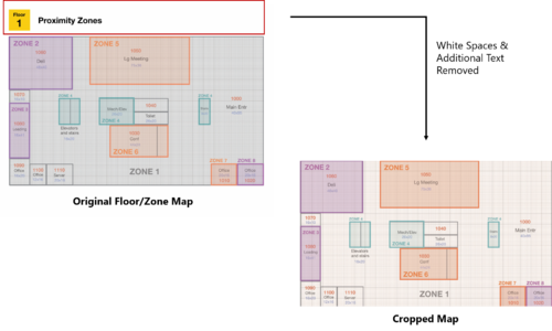
- Open the tool and choose the map to be plotted. In the zone maps given, there were white spaces and additional text that were not part of the map itself. As such, the map has to be cropped to get the actual map itself only. The following shows the cropping of maps and this process is repeated for each of the 3 levels.
- Open the map using the online tool and plot each of the custom polygons. During the process of plotting, the following assumptions were made:
- For some areas with multiple zones separated on the map, a small area of the zone is being selected. For example, zone 4 have 3 different segments in level 1. However, they all refers to the elevators and stairs. By plotting only one of the zones, we will still be able to know that the employee is taking the stairs/elevators. There isn’t a need to identify which stairs or elevators they took. As such, for zone 4, only one of the custom polygon is drawn.
- For areas that were too big, only a small segment of the zone was plotted. For example, zone 1 encompasses the entire corridor spaces. If all the corridor spaces are drawn, the centre point will not be situated in zone 1. Therefore, only one part of the zone is drawn. As long as employees are within the same zone, they are in the corridor areas.
The outcome of plotting these polygons will result in the following display on the online tool. The same process is repeated for each of the 3 levels.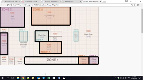
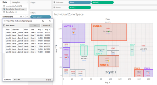
- After the polygons have been plotted, the results can be exported into a .csv file format for analysis in Tableau. Once the data has been imported into Tableau, the centre coordinates of each zone can then be retrieved. The following shows the centre points that were plotted on the chart and the ability to export the data. This will then allow us to retrieve the coordinates for each zone to be plotted onto the map.
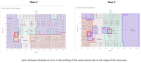
- However, in level 2 and 3, shapes of each zones were not consistent and this has resulted in errors in the centre point of the zone. The following shows the errors that has been encountered during the process.
- In order to resolve this error, a manual task has to be performed to get the coordinate point of each erroneous zone coordinate. This can be performed in Tableau using the annotate function. The following shows an example of how the annotate function can provide the X/Y coordinate values. The process is repeated for each of the erroneous centre points.
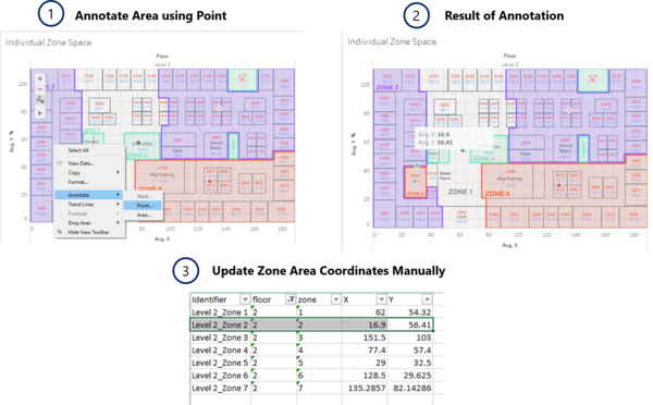
- After the completion of this process, the issue of lacking individual zone coordinates will be resolved.


Issue: Currently, the data for the fixed proximity sensors and mobile proximity sensors are in 2 separate spreadsheets. This makes the analysis process difficult with the need to blend or join data in Tableau.
Solution: To simplify the process of analysis, both the data from the fixed and mobile proximity sensors are combined into one single file. With the above process completed, we are also able to get the coordinates for each of the zone to be plotted on the chart. However, we do not have the zone information for the mobile proximity sensor. In this analysis, it does not matter as we are only interested in plotting the zone coordinates onto the chart. The following shows the data format of the transformed data:

Issue: During the process of correlating the zone data and the coordinates, the dataset has a zone that stated “Server Room”. However, there is no point coordinate for this zone on our generated polygons.
Solution: To resolve this issue, the annotate function is also used to help us get the centre point coordinate of the server room. This result is then, updated into the file for analysis.
Issue: With the zone coordinates and the X/Y coordinates from the mobile proximity sensor, the data can be plotted onto a map to identify where employees are located. However, with only the proximity ID in the captured data, we are unable to correlate the employee with each proximity ID. The employee list provided in the dataset also does not show the mapping between their name and the proximity ID.
Solution: Upon close observation of the employee name and the proximity ID, a correlation can be identified. The proximity ID is derived from the first letter of the employee’s first name and the entire string of the last name. The last three numbers refer to the number of times each employee request for a new pass. By default, the count starts from 001. The following formula is then applied to identify a correlation between the employee and the proximity ID:

Building Data Elements (HVAC Sensor Readings & Status Information)
The building data elements provide multiple readings collected from different sensors in the entire building. However, the data is not structured in a way that allows for flexibility in the choice of sensor readings to be analysed and to apply filters by different floors and zones. As a result, there is a need to reshape the data to provide for this flexibility.
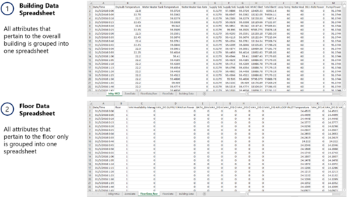
There are 3 main categories of data in the building data dataset:
- Overall Building Data (e.g. Drybulb Temperature, Pump Power etc.)
- Floor Data (e.g. Air Loop Inlet Temperature, Cooling Coil Power etc.)
- Floor/Zone Data (e.g. Reheat Coil Power, CO2 Concentration etc.)
To better analyse the data using Tableau, the following is being done:
- The entire building data dataset is grouped into different Excel Spreadsheet as follows:
- Tableau provides an Excel plugin that allow one to reshape data into a format for easy processing especially if multiple attributes were present for selection. With the use of the tool, the following is then performed to each of the grouped datasheet:
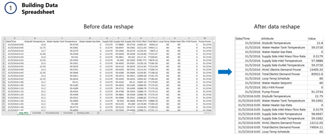
- For the building data spreadsheet, a data reshape is performed to obtain the following result:
- For the floor data spreadsheet, a data reshape is performed. The output of the reshaped data is similar to the building data, with the exception of the difference in attributes between the overall building and each floor attributes.
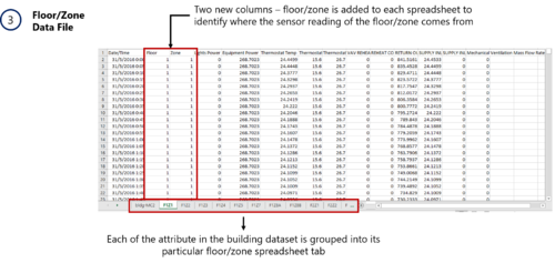
- For the floor/zone data spreadsheet, a data reshape is also performed on its attributes. However, due to the volume of the data generated, additional processing needs to be done as follows:
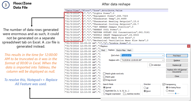
- For the building data spreadsheet, a data reshape is performed to obtain the following result:


With the reshaped data, it can then be imported into Tableau for analysis.
Hazium Readings
The sensor readings for hazium concentration level were saved as 4 different files in the given dataset. These readings are consolidated into one single file. The result is similar to the building dataset elements. As such, similar processing techniques were used to process the data - Excel Tableau’s plugin for data reshape. The following illustrates the steps taken to achieve the final transformed dataset.

Dataset Import Structure & Process
With the dataset analysis and transformation phase completed, the following files will have to be imported into Tableau for analysis:

Each of the data file is added as a data source in Tableau. The relationships defined between each data source is the timestamp, floor and zone. This will allow analysis to be conducted across all the data sources at any one point.
Additional processing is performed to the first data source - Proximity Data and Employee List.
- Import the proximity data as a data source.
- Add new data connections to the proximity data source. The new data connection file will be the Employee List.
- Perform a left join between the proximity data and the employee list to correlate the employee ID together. This will allow us to identify the employee with the captured proximity card ID. The following shows the configuration of the join:

To process and display the dates in a readable format for the analyst, each of the data sources will have a new calculated field to derive the date and day of the week. This will convert the date from the format “31/5/2016” to a format of “31 May (Tuesday)”.
The formula used is as follows:
STR(DATEPART('day', [Date/Time])) + " " + DATENAME('month',[Date/Time]) + " (" + DATENAME('weekday', [Date/Time]) + ")"
Creation & Use Of Interactive Visualization Techniques
The final interactive visualization can be accessed here: <insert link>
For the best experience, adjust your screen resolution to 1366x768 and enable full screen on the browser. Adjust the dashboard so that all elements can be clearly visible without the need to scroll up/down.
Throughout all the different dashboards, useful guides/tips are provided to help users navigate through the different filters and actions so that their analysis can be performed smoothly. The following interactivity elements are also used throughout all the dashboards to maintain consistency: