Difference between revisions of "IS428 2016-17 Term1 Assign2 Lim Kim Yong"
(Created page with "== Theme of Interest: Industry Accident Tracking == Each industry plays a critical role in contributing to Singapore's economy. It is essential to enforce and encourage a safe...") |
|||
| Line 16: | Line 16: | ||
== Data Transformation Process == | == Data Transformation Process == | ||
| − | + | In this assignment, I have decided to use Workplace Injuries data in 2014 attained from Assign2 at https://wiki.smu.edu.sg/1617t1IS428g1/Assign2 and with reference to WSHI National Statistics Report 2014. The excel sheets have been cleaned up to suit the needs of the various visualization tools used. | |
| + | |||
| + | <br><br><b>Sub Industry + Accident Type Category + Victim’s Age</b> | ||
| + | I had filtered and removed unnecessary data, perform data formatting and, lastly organizing it in a clearer manner. | ||
[[File:01 Explanation of Dataset GwendolineTanWanXin.png|center|800px|Explanation of Dataset]] | [[File:01 Explanation of Dataset GwendolineTanWanXin.png|center|800px|Explanation of Dataset]] | ||
| + | |||
| + | |||
| + | |||
| + | |||
| + | |||
| + | |||
| + | |||
| + | |||
<br/>After understanding the format of the data, the following is performed to transform the data into a format that could be used for analysis. | <br/>After understanding the format of the data, the following is performed to transform the data into a format that could be used for analysis. | ||
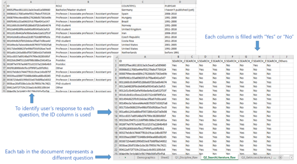
# Firstly, the columns in the initial dataset is grouped into its own respective questions. Each question will have its own sheet. For all demographics questions (e.g. role, country etc.), it will be grouped together into a single sheet. To identify the user who answered each question, the ID column will be present in all the spreadsheets.<p></p> | # Firstly, the columns in the initial dataset is grouped into its own respective questions. Each question will have its own sheet. For all demographics questions (e.g. role, country etc.), it will be grouped together into a single sheet. To identify the user who answered each question, the ID column will be present in all the spreadsheets.<p></p> | ||
Revision as of 01:55, 25 September 2016
Contents
Theme of Interest: Industry Accident Tracking
Each industry plays a critical role in contributing to Singapore's economy. It is essential to enforce and encourage a safe working environment for all workers in different industries. One of the utmost concerns when a person chooses a job is Safety First. Despite the expansion of Singapore’s population over the years, poor working environment has been known to deter many individuals from joining these industries. Moreover, certain age group has shown to be more susceptible to injured themselves at work. This is a growing concern for Singapore as individuals becoming more skeptical of the industries which greatly affect the labor force and the economic growth of Singapore in the future. I decide to specifically focus on the accident types. Some of the questions I will be examining are:
Analytical/Investigation Questions
- Which industry and sub-industry has the highest number of cases by accident types?
- What are the most common types of accidents occurring by sub industry?
- Which month has the highest number of cases reported by sub industry?
Selected Data Attributes for Analysis
The following data attributes are selected for analysis:
- Reported Date
- Major Industry
- Sub Industry
- Accident Type Category
- Victim's Age
Data Transformation Process
In this assignment, I have decided to use Workplace Injuries data in 2014 attained from Assign2 at https://wiki.smu.edu.sg/1617t1IS428g1/Assign2 and with reference to WSHI National Statistics Report 2014. The excel sheets have been cleaned up to suit the needs of the various visualization tools used.
Sub Industry + Accident Type Category + Victim’s Age
I had filtered and removed unnecessary data, perform data formatting and, lastly organizing it in a clearer manner.

After understanding the format of the data, the following is performed to transform the data into a format that could be used for analysis.
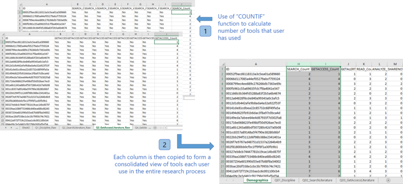
- Firstly, the columns in the initial dataset is grouped into its own respective questions. Each question will have its own sheet. For all demographics questions (e.g. role, country etc.), it will be grouped together into a single sheet. To identify the user who answered each question, the ID column will be present in all the spreadsheets.
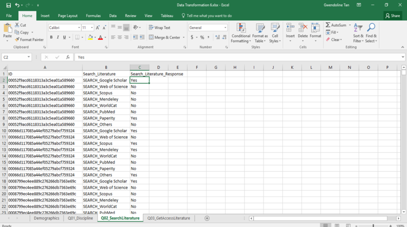
- For each column, the response is either a “Yes” (user use the tool) or a “No” (user don’t use the tool). To allow better visualization, empty fields are filled with “No” and fields that are filled are changed to “Yes”. This is done using Excel’s Replace All feature. The resulting dataset will then look like the following:
- It is difficult to perform analysis and processing on the data even though they have now been grouped into its own sheet. To make the data readable by Tableau, the data needs to be reshaped. This is done using Tableau’s Excel Add-In. The usage of the tool is as shown in the following steps:
- Install the Tableau Add-In in Excel and make use of the “Reshape Data” Feature. Enter the cell to begin the data reshaping process.

- A progress bar will be shown as the data is been reshaped. The end result of the reshaped data will look like this:
- Install the Tableau Add-In in Excel and make use of the “Reshape Data” Feature. Enter the cell to begin the data reshaping process.
- The dataset is now transformed and it will be imported into the tools (e.g. Tableau, PowerBI) for analysis and processing.


Analysis & Visualization Construction Process
The following section elaborates on the analysis and visualization construction process. It details how various graphs are generated, analyzed and how the dataset are further transformed/rearranged to lead to the final visualization constructed.
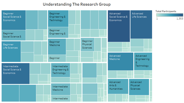
- [Analysis] To facilitate better understanding in the data collected, a chart was created to show an overview of the survey participants. As there were multiple attributes (career stage, discipline and role), a treemap was plotted to view the distribution of the research participants’ demographics. These 3 attributes could serve as factors that affect the way in which how people use tools throughout the research process.
Other than using Tableau, I also attempted to import the data into PowerBI to perform analysis. A good function that PowerBI supports is the ability to drill down into each category. As such, it won’t be directly confusing for a user when they look at the treemap directly. As they drill up and down, they can view information clearer as compared to the one in Tableau. However, the way in which data is segmented is not as clear as compared to a similar one generated in Tableau when it has been broken down into its respective levels. The following shows a chart generated in PowerBI. Given the same data, the chart above (generated by Tableau) allows one to view information clearer. As such, I have preferred to display the chart in Tableau for better visualization.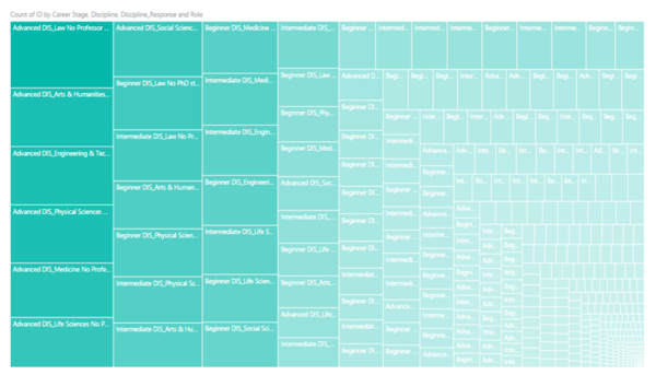
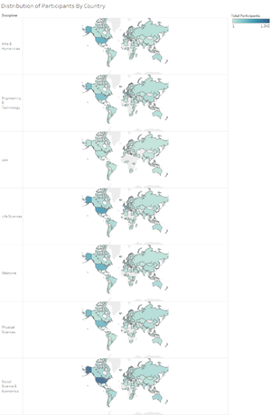
- [Analysis & Intermediate Visualization] Another possible factor to look at is the distribution of research participants across the world. This aims to identify whether there are any countries that have a lot of research participants in one discipline but not the other. Based on the chart, majority of the research participants are congregated in the United States across all disciplines. This does not provide much useful information as to whether countries may affect the way in which how people use tools. As such, I have decided to continue with the analysis and look back at the region later on to decide if it could be a factor that influence participant’s choice of tools/sites during their research process.
- [Data Rearrangement] After knowing possible factors that could affect people’s choice of tools/sites, I aim to identify which phases of the research process requires the most number of tools. In order to retrieve this value, there is a need to identify the number of tools that each participant uses during each stage of the research process. This data is currently not available and therefore, new data has to be added into the transformed dataset. This is done by using Excel’s COUNTIF function to count the number of “Yes” in each row. This is done for all the questions and the data column is imported into the “Demographics” sheet. The following illustrates the addition of new data into the transformed dataset.
- [Analysis & Intermediate Visualization] The data source from Step 3 is then, imported into JMP Pro to perform analysis. Initially, I attempted to plot the number of tools that each person used throughout the entire research process. The following diagram illustrates the chart generated in JMP Pro. However, the graph looks messy and because the data values are almost similar, they pass through similar points. This is not useful when displayed in a parallel coordinates plot. I attempted to use Parallel Sets to display the data instead but the tool crashed repeatedly.

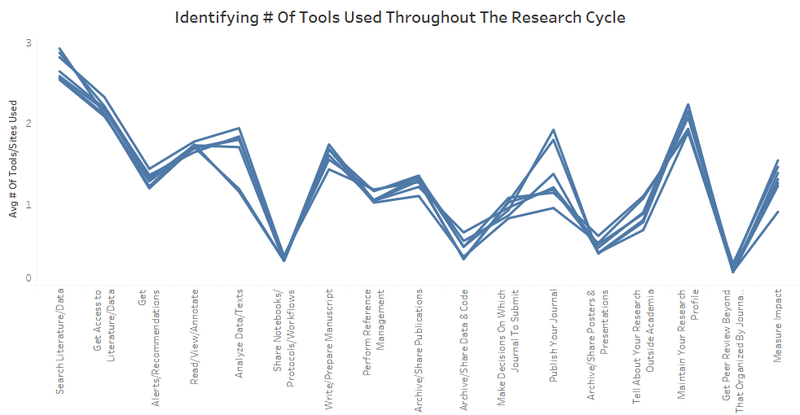
- [Analysis] To find other alternatives, I attempted to plot an average of the number of search tools/sites used across disciplines. The data source is refreshed in Tableau to reflect the new columns added from Step 3. Tableau’s average function is then used to calculate the average number of tools used for each discipline across the research process. A parallel coordinates plot (as shown below) is then created to show the distribution of number of tools used during each stage of the research process according to their research discipline.
- [Analysis & Question Evolution] From the parallel coordinates plot, we can see that the majority of the users are using a lot more tools in the phase of searching for literature and data. However, for phases like archiving codes or posters/presentations, they typically don’t use any or use at most 1 tool to do so. As such, the question narrows down to look at which tools are actually the most popular in helping users to search data.This aims to answer the main question in identifying possible factors that could affect one's choice of tools, by first narrowing the analysis process into one main phase - search literature/data.
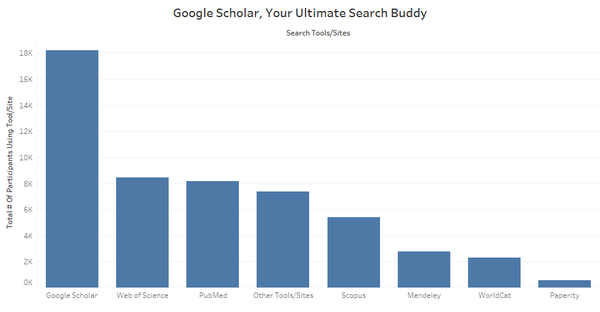
- [Analysis & Question Evolution] To identify which search tools/sites are the most popular, a bar chart was plotted to show the total number of users using each of the search tool/site. Based on the chart plotted (as shown below), we can see that majority of the users are using Google Scholar. However, there were tools/sites like Web of Science, PubMed or Other Tools/Sites that participants used commonly. From this chart, the question is further evolved into identifying what are the factors that may affect people’s choice of search tools/sites they use throughout the research process.
- Previously, it has been identified that 4 factors (career stage, role, discipline, country) could affect people’s choice of tools/sites throughout the research process. As such, the following analysis targets at each of these 4 factors to identify which will affect people’s choice of search tools/sites.
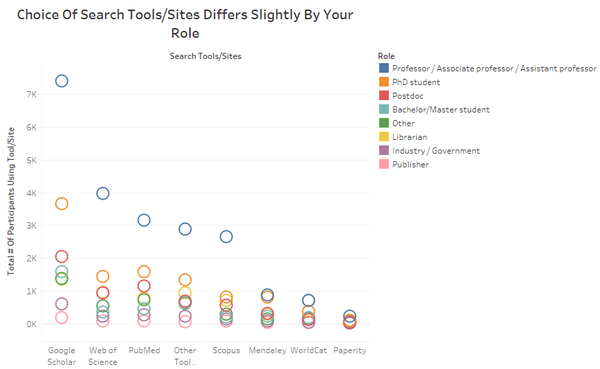
- [Analysis] A chart was plotted to show the total number of people using each search tool/site based on their roles. From the colours of the circle view chart (as shown below), we can see that they go in almost the same order. This shows that despite its role, there is not much difference in the way they use these tools/sites. However, minor differences do exist. From the chart, we can see that librarian use WorldCat more often than a PhD student. Such minor differences can only be spotted if one analyse closes enough or interact with the filters repeatedly. As such, we can conclude that the role of the user does play a part but it's rather insignificant, in determining the choice of search tools/sites that people will use.
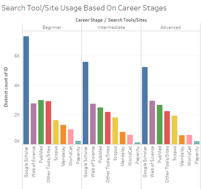
- [Analysis & Intermediate Visualization] Looking at the second factor – career stage, a chart was plotted to show the total number of people using each tool/site based on their career stages. From the chart, we can see that people in the intermediate and advanced levels used almost similar tools as compared to people in the beginner level. However, it does not provide much information as to what kinds of people use these tools other than its career stage.
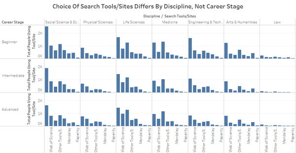
- [Analysis] To provide more in-depth comparison, I attempted to look at the discipline of participants in addition to its career stages. From this chart, we can see that across all disciplines, the choice of search tools/sites used by people are different. For example, participants in the Medicine field use PubMed more than they use Google Scholar. This was not the case for the other disciplines. However, when we look at people in the same discipline with different career stages, the patterns on the type of tools they used to assist them in searching for literature/data were relatively similar. As such, we could potentially identify that discipline is one factor that affect participant's choice of tools/sites used.
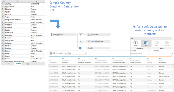
- [Data Rearrangement] Previously, we have identified that countries may not play a huge factor in determining the way how people use search tool/site. We would like to look further into this and identify whether it is indeed true. However, there were too many countries and by plotting them individually will produce an ultimately huge chart. As such, I decided to group countries into their continents. To do so, I retrieved a list of UN countries and continents and convert it into a form of “.csv” file format. This new data is imported into Tableau. In order to group the countries into its continent, it is performed via a left outer join.
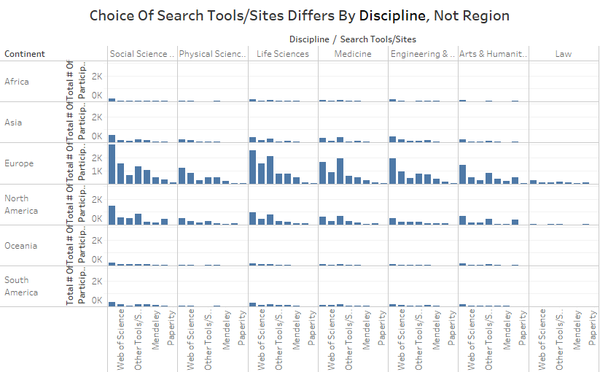
- [Analysis] With the users grouped into their continents, a chart can be plotted to show whether the region or discipline will affect the choice of search tools/sites that people use. From the chart, we can see that people’s choice of search tools/sites varies across disciplines. However, within the same discipline, different regions use the same tools/sites to search for literature/data. Supporting our analysis in Step 11, discipline is a main factor in determining participant's choice of tools/sites used.


_GwendolineTanWanXin.png)

_GwendolineTanWanXin.png)
From the entire analysis, we will then be able to answer the question on the factors that influence people’s choice of tools/sites used during their research process.
Final Visualization
Based on the entire analysis process, multiple charts were combined to create a dashboard to form a final story on the analysis. The final visualization can be accessed via this URL: https://public.tableau.com/views/Assignment2_v1_5/Story1?:embed=y&:display_count=yes
Caption for Final Visualization: The analysis process aims to identify possible factors that could influence the choice of tools/sites that people use throughout the research process. To do so, the interactive visualization focuses on tools/sites to search literature and data. The rationale for focusing on search tools/sites is due to the fact that most research participants use the most number of tools/sites in this phase throughout the entire research process. As such, more data will be available to perform an analysis. By making use of the interactive visualization, one can identify that a participant’s discipline is a main factor that affects its choice of tools/sites throughout the research process.
Using The Interactive Visualization To Answer Questions Posed
Using the final visualization constructed, one could perform the visualization process in the following steps to answer the questions posed:
- The analysis begins with the illustration of the demographics of the research participants who took part in the 101 Innovations Research Survey. These are possible factors that could affect participants' choice of tools/site usage throughout the research process.
- After looking at participants’ demographics, we move on to look at the average number of tools used by participants in each stage of the research process based on their discipline. We conclude that people use the most number of tools in searching for literature and data. As such, the next part of the analysis will be focused on search tools/sites to identify what are the factors that could affect the way how people use tools/sites.
- The analysis process begins by looking at participants’ roles, career stages, regions and disciplines. By interacting with the 3 charts, we can identify that the main factor which affects the way participants' choice of tools/sites usage during the research process is based on their discipline. Their role may play a slight role in determining their choice of tools/sites used but the level of influence was not significant. In addition, participants’ career stages and region does not impact their choices on the type of tools/sites used during their research process.
Tools & References
The following tools were used throughout the data transformation, analysis and visualization construction process:
- Microsoft Excel 2016
- Tableau
- Microsoft PowerBI
- JMP Pro
The following websites provided additional guidance on the completion of this assignment:
- Dataset for 101 Innovations - Research Tools Survey (https://www.kaggle.com/bmkramer/101-innovations-research-tools-survey)
- Using Tableau To Visualize Survey Data Part 1 (http://www.datarevelations.com/using-tableau-to-visualize-survey-data-part-1.html)
- Using Tableau To Visualize Survey Data Part 2 (http://www.datarevelations.com/using-tableau-to-visualize-survey-data-part-2.html)
- Creating Parallel Coordinates In Tableau (https://www.youtube.com/watch?v=kD1iEQYtMYo)