IS428 2016-17 Term1 Assign2 Lim Kim Yong
Contents
Theme of Interest: Industry Accident Tracking
Each industry plays a critical role in contributing to Singapore's economy. It is essential to enforce and encourage a safe working environment for all workers in different industries. One of the utmost concerns when a person chooses a job is Safety First. Despite the expansion of Singapore’s population over the years, poor working environment has been known to deter many individuals from joining these industries. Moreover, certain age group has shown to be more susceptible to injured themselves at work. This is a growing concern for Singapore as individuals becoming more skeptical of the industries which greatly affect the labor force and the economic growth of Singapore in the future. I decide to specifically focus on the accident types. Some of the questions I will be examining are:
Analytical/Investigation Questions
- Which industry/sub-industry has the highest number of cases by accident types?
- What are the most common types of accidents occurring in industry/sub industry?
- Which month has the highest number of cases reported based on the industry/sub industry?
Selected Data Attributes for Analysis
The following data attributes are selected for analysis:
- Reported Date
- Accident Day
- Major Industry
- Sub Industry
- Accident Type Category
- Victim's Age
Data Transformation Process
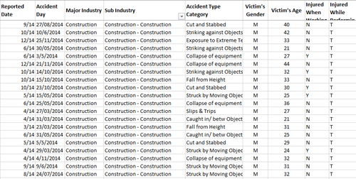
In this assignment, I have decided to use Workplace Injuries data in 2014 attained from Assign2 at https://wiki.smu.edu.sg/1617t1IS428g1/Assign2 and with reference to WSHI National Statistics Report 2014. The excel sheets have been cleaned up to suit the needs of the various visualization tools used.
Sub Industry + Accident Type Category + Victim’s Age
I had filtered and removed unnecessary data, perform data formatting and, lastly organizing it in a clearer manner.
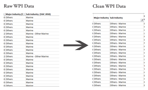
Under the Sub Industry, I have combined the ‘Marine-Other Marine’ provided by the Raw Data into ‘Others –Marine’ in the Clean WPI Data as they refer to the same sub Industry. This is to avoid confusion and the inaccuracy of information retrieve when analyzing data.
Major Industry & Sub Industry + Age Group
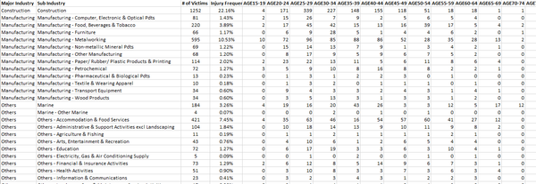
Based on the total number of reported cases by industry/Sub industry, I have created a new worksheet with age group ranging from Age 15 all the way to Age 80 to identify which age group has the highest number of accidents in the respective industries.
As such, we proceed with the analysis and Visualization construction process as follows:
Visualization 1
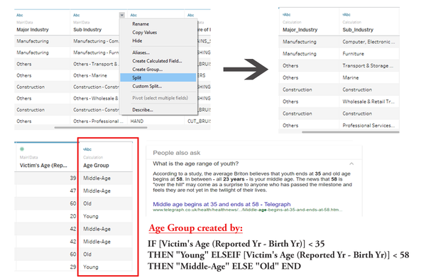
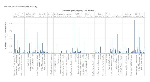
Firstly, I used Tableau to visualize the Clean WPI Data of which Sub industry has the highest number of reported cases based on their accident types. Before I move on to generate the visualizations, I split up the Sub industry based on its separator (‘-‘) and created a new column – Age Group to facilitate my analysis.
At a glance, the bar graph is by far one of the most common graphs that everyone will use to show the distributions of number of reported cases by Sub industry in each accident type. This is not a high-dimensional graph and the purpose of this visualization is to see if there is any relationship or pattern between Accident Type, Sub Industry and Number of Reported cases. My reason of this graph is to help me visualize what other possible questions that I could come up with and what visualizations would probably be better to derive my answers for my questions.
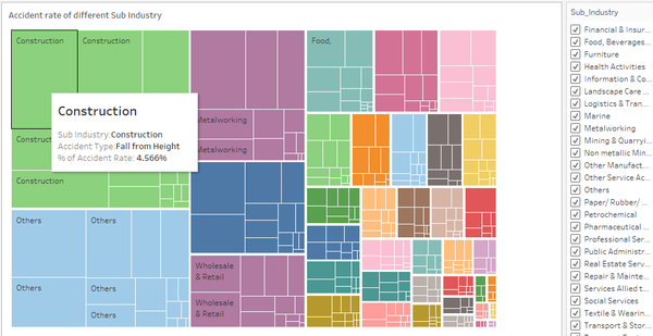
I have selected “TreeMap” as it provides a dynamic data visualization paradigm that facilitates the representation and understanding of large and multivariate data. From the TreeMap we can clearly see that the Construction industry has one of the highest reported cases. Besides, when we hovered over each segment within the Sub industry, the tooltips will be able to show us the underlying data such as the type of accidents (e.g. Fall from Height) and what is the rate of the accident based on the no. of reported cases as shown below:
The rationale of choosing treeMap is because Major Industry and Sub Industry are both categorical attributes and they also hierarchical. Furthermore, some of the industries have only small amount of reported cases and thus cannot be easily spotted in the bar chart. Therefore, we can also use the "Filter" function to find out more on those sub-industries that are visually insignificant for us to see.
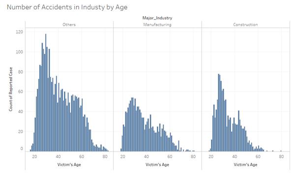
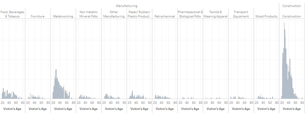
Subsequently, I went to explore on the age Group by the Major industry and based on my findings I found out that Young adults of between 15 to 34 years of age are more susceptible to accidents than the graying seniors in all the Major industries. From my perspective, one reason that might attribute to such accidents is the lack of proper introduction into the jobs or tasks assigned or given to them. Employers in those industries do not fork out their time to provide information on the procedures and safety rules. As such, the younger age group has seen its accident number increased dramatically. However, as we go deeper into analyzing the Sub industry, we realized that the number of accidents is also based on the nature of the job and not just the specific age group itself. As shown in the graph below, for example, Construction and Metalworking industries have more number of reported cases as compared to other industries.
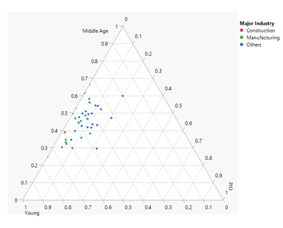
Additionally, I also try using JMP’s ternary plot to see the distribution of accidents by age group in the various industry. Ternary plot allows us to visualize the proportion of the victims across various age group – Young, Middle age, and Old from various Major Industry. Each major industry is given a colour which is indicated in the legend. Generally, both Young and Middle age group are susceptible to accidents at work.
Visualization 2
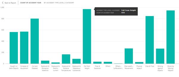
From data visualization 1, it seemed that Construction industry has the highest number of accident cases than other industries. As such, I went on to make use of Power BI tools to visualize the most common types of accidents occurred in Construction and also the other Sub industries. As shown from the bar graph below, the top 3 most common accidents type happened in all Industries are- Fall from Height, Struck by Moving Objects and Slips & Trips.
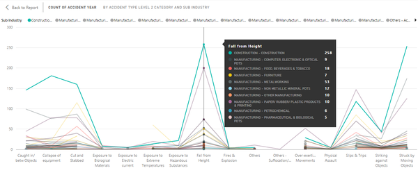
So moving forward, I continue to investigate what are the common types of accidents that happened in all industries. I decided to create a parallel coordinate as the no. of reported cases is discrete variable rather than continuous variable. It automatically creates a reference line and provides you with the flexibility to drag the line along the x-axis hovering over data points displaying tooltips with all its underlying data. From there I am able to identify the particular accident type, from the highest to lowest reported cases and by which industry. As such, the graph below showed that construction industry has the highest amount of reported cases of 258 while the pharmaceutical & biological pdts industry has only 5 reported cases on the accident type of falling from heights.
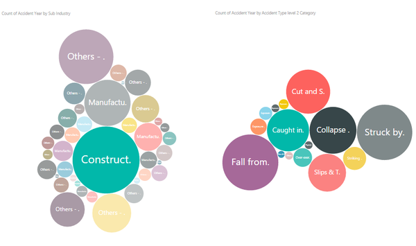
Additionally, we can also use the bubble chart provides a quick and easy way for user to read (Which industry has the highest number of accidents cases? Based on the selected industry, what are some of the top few accident types?) The circles in the bubble chart uses area to represent numbers. For example, the higher the number of reported cases in an industry, the bigger the area of the circle will be. As such, you will be able to see that Construction has the highest number of accidents and some of the most common accidents are fall from height, struck by moving objects and so on and so forth. One good thing of using Power BI tool is that every chart will be given full control without any necessary configurations unlike Tableau (e.g. Tableau actions). It automatically synchronized all the charts and allows users to selects a data point of one visualization and then sees what happens on the other visualizations.
Visualization 3
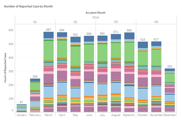
My final visualization is to find out whether different months plays a part in contributing to the number of reported cases. Ultimately, the stacked graph below showed the distribution of reported cases by their months, and we can see that the month of January has the least cases followed by February and December. The rest of the months are relatively the same in pattern. As such, based on my opinion, January, February and December usually have quite a lot of public holidays (e.g. Christmas Day, New Year, Chinese New Year). Therefore, employees or workers at those periods are either clearing/taking/extending their leaves, hence the number of accident rates tends to be lower as compared to other months. Additionally, there are also two possible reasons. Firstly, the volume of jobs or tasks given were not so intensive during January and February, therefore, employees/workers have the luxury of time to focus on their safety when comes to completing their tasks. However, from the start of Q2 to Q4, more tasks are usually given and expected to quickly and efficiently delivery. This definitely caused employees/workers to feel more pressured and wanting to be more productive and neglected on their safety. Secondly, information on the safety procedures and rules might be briefed at the beginning of the year. As such, those regulations are fresh and instilled in them for the first two months and gradually employees/workers will forget about it as the months goes by.
I chose stacked graph because this visualization was sufficient in allowing me to view the distribution of reported cases by all Sub industries across all the months in Year 2014. Any significance differences in the respective Sub industry can be more noticeable by applying the filter function to focus on only one Sub industry at a time.
Tools used and Lesson learnt
The following tools were used throughout the data transformation, analysis and visualization construction process:
- Microsoft Excel 2016
- Tableau 10.0
Used to construct visualizations such as Bar chart, Parallel Coordinates, Tree Map, Stacked graph, Histogram and an interactive dashboard. After that, the constructed interactive dashboard is published onto Tableau public which provides users a cloud platform to host their Tableau workbooks/dashboards as a webpage for others to interact or see.
- Microsoft PowerBI
When using Power BI as one of the data visualization toolkit, we need to pay attention to the Excel file extension that we are using. There are basically two types of file extension for Excel, XLS and XLSX. The XLS is a binary format while XLSX is an Open XML format. If you try to import the .XLS data sheet into Power BI you will encounter an error. However, you could simply resolve this issue by just saving or changing the workbook as an .XLSX file and try to import again.
- JMP Pro
Conclusion
The interactive dashboard can be accessed via this URL: https://public.tableau.com/views/TreeMap_VA_2/DashBoard-IndustryAccidentTracking?:embed=y&:display_count=yes&:toolbar=no
In conclusion, many insights can be found when visualizing the data with the right usage of charts and graphs. With the kind of information gathered from the aforementioned questions, it provides a better guidance for the Observatory for WSH Landscape (OWL) 1 to convey and communicate the changes quickly and effectively to the respective individuals (e.g. policy makers, work-safety inspectors, industries). For example, policy makers can implement better policies especially on industries with high number of accident cases. Subsequently, work-safety inspectors can also perform their routine checks more effectively and efficiently based on various months to save on resources and efforts. As such, this makes Singapore’s industries a safe working environment for everyone to feel motivated and safe to work in.
The following websites provided additional guidance on the completion of this assignment:
- Workplace Safety&Health Profile 2014 (http://www.mom.gov.sg/~/media/mom/documents/safety-health/reports-stats/wsh-profile/wsh-profile-2014.pdf)
- The Power of Tableau Actions (http://www.clearlyandsimply.com/clearly_and_simply/2010/08/the-power-of-tableau-actions.html)
