Difference between revisions of "Talk:Lesson08"
| Line 20: | Line 20: | ||
Hi everyone, just like to share a github repo visualizer called Gource. It visualizes the commits in a Git repo as an animated network, where nodes represent 'main' modules in a project, and with the person flying around to see what he/she interacted with. Colors represent the type of modules. In this example, it is how Mike Bostock and fellow open source developers created d3.js from scratch: https://www.youtube.com/watch?v=pIbvNRL8mPY | Hi everyone, just like to share a github repo visualizer called Gource. It visualizes the commits in a Git repo as an animated network, where nodes represent 'main' modules in a project, and with the person flying around to see what he/she interacted with. Colors represent the type of modules. In this example, it is how Mike Bostock and fellow open source developers created d3.js from scratch: https://www.youtube.com/watch?v=pIbvNRL8mPY | ||
| − | Not sure if it is just me, but the visualization is oddly satisfying watch, and it would be interesting to implement something similar for other domains such as | + | Not sure if it is just me, but the visualization is oddly satisfying watch, and it would be interesting to implement something similar for other domains such as risk analysis and/or blockchain tracking. Some of the advantages I thought this had was to tell a story in a fun way for social networks - from start to finish, rather than a static snapshot in time. However, it does not let you interact with the nodes/edges such as with Gephi or d3.js, which may lose out on analysis capabilities for finding further insights. You can give it a go here: http://gource.io/ |
- Thomas Thio - | - Thomas Thio - | ||
Revision as of 22:51, 17 October 2016
UCINET vs Gephi
Hi everyone, so Prof Kam has introduced use to a neat visualization tool "Gephi" and we even had a homework on it that helped us explore it further. I am currently taking social networks this semester and would like to share the program we are using in that class and perhaps give my two cents worth on the differences between the two.
Introducing UCINET
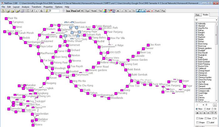
This is UCINET.(See Figure 1)

Figure 1
As with Gephi, UCINET is both a visualization and analytical tool used for social network analysis. To me, UCINET feels alot more user friendly. Unlike Gephi, we are able to interact with the interface more freely. Additionally, predefined filtering nodes make it easy for us to remove any isolates or choose which nodes to focus on. Another key feature I feel UCINET has power on is the analytical aspect of it. For a more complex statistical analysis of social network data, UCINET excels in this aspect compared to Gephi. Having said that, just from figure 1 alone, you might have guessed it, Gephi definitely does a better job at visualizing our data. UCINET generally provides visuals at its bare minimum and figure 1 kind of show cases the best its got. Thus, having experienced Gephi and UCINET, I realized that both softwares has its ups and downs and I feel that to get the best of both worlds, one should do analysis using UCINET and subsequently visualize it on Gephi. In this way, we get to enjoy both the analytical power from UCINET and the beautiful visuals from Gephi. If you are interested to test out UCINET, do follow this link (http://www.analytictech.com/ucinet/) and download the 30 day trial.
Oh and one more thing, I found another social network software called "NodeXL" too! I wonder how it compares with both UCINET and Gephi. From the looks of it, it seems to be a combination of both plus points from both softwares. Check it out here if you are interested! (http://nodexl.codeplex.com/)
- Timothy
Visualizing Github Repos
Hi everyone, just like to share a github repo visualizer called Gource. It visualizes the commits in a Git repo as an animated network, where nodes represent 'main' modules in a project, and with the person flying around to see what he/she interacted with. Colors represent the type of modules. In this example, it is how Mike Bostock and fellow open source developers created d3.js from scratch: https://www.youtube.com/watch?v=pIbvNRL8mPY
Not sure if it is just me, but the visualization is oddly satisfying watch, and it would be interesting to implement something similar for other domains such as risk analysis and/or blockchain tracking. Some of the advantages I thought this had was to tell a story in a fun way for social networks - from start to finish, rather than a static snapshot in time. However, it does not let you interact with the nodes/edges such as with Gephi or d3.js, which may lose out on analysis capabilities for finding further insights. You can give it a go here: http://gource.io/
- Thomas Thio -