Talk:Lesson08
Contents
UCINET vs Gephi
Hi everyone, so Prof Kam has introduced use to a neat visualization tool "Gephi" and we even had a homework on it that helped us explore it further. I am currently taking social networks this semester and would like to share the program we are using in that class and perhaps give my two cents worth on the differences between the two.
Introducing UCINET
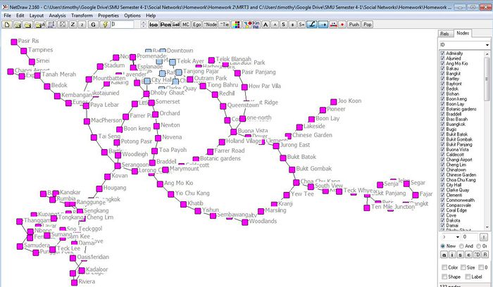
This is UCINET.(See Figure 1)

Figure 1
As with Gephi, UCINET is both a visualization and analytical tool used for social network analysis. To me, UCINET feels alot more user friendly. Unlike Gephi, we are able to interact with the interface more freely. Additionally, predefined filtering nodes make it easy for us to remove any isolates or choose which nodes to focus on. Another key feature I feel UCINET has power on is the analytical aspect of it. For a more complex statistical analysis of social network data, UCINET excels in this aspect compared to Gephi. Having said that, just from figure 1 alone, you might have guessed it, Gephi definitely does a better job at visualizing our data. UCINET generally provides visuals at its bare minimum and figure 1 kind of show cases the best its got. Thus, having experienced Gephi and UCINET, I realized that both softwares has its ups and downs and I feel that to get the best of both worlds, one should do analysis using UCINET and subsequently visualize it on Gephi. In this way, we get to enjoy both the analytical power from UCINET and the beautiful visuals from Gephi. If you are interested to test out UCINET, do follow this link (http://www.analytictech.com/ucinet/) and download the 30 day trial.
Oh and one more thing, I found another social network software called "NodeXL" too! I wonder how it compares with both UCINET and Gephi. From the looks of it, it seems to be a combination of both plus points from both softwares. Check it out here if you are interested! (http://nodexl.codeplex.com/)
- Timothy
Visualizing Github Repos
Hi everyone, just like to share a github repo visualizer called Gource. It visualizes the commits in a Git repo as an animated network, where nodes represent 'main' modules in a project, and with the person flying around to see what he/she interacted with. Colors represent the type of modules. In this example, it is how Mike Bostock and fellow open source developers created d3.js from scratch: https://www.youtube.com/watch?v=pIbvNRL8mPY
Not sure if it is just me, but the visualization is oddly satisfying watch, and it would be interesting to implement something similar for other domains such as risk analysis and/or blockchain tracking. Some of the advantages I thought this had was to tell a story in a fun way for social networks - from start to finish, rather than a static snapshot in time. However, it does not let you interact with the nodes/edges such as with Gephi or d3.js, which may lose out on analysis capabilities for finding further insights. You can give it a go here: http://gource.io/
- Thomas Thio -
Computational Thinking and Graph Visualization
Today's topic reminded me of the Computational Thinking module that I've taken last year. There was a project which models after Twitter whereby we had to show how a potential Twitter account can reach out to its various followers. While it focused on the technical aspects, I felt that the visualization lesson we just went through was more interesting as it helped any user to see how he or she plays a role as a connector in the bigger picture.
In today's world where there is a lot of focus on the use of social media, i think graph visualization is pretty relevant, with big companies such as Facebook releasing Graphs API and the Open Graph Protocol to allow developers to make use of. Visualizing such connections between users provide a lot of insights and opportunities marketing, as it helps us to find that one big node which can connect or reach everything we need.
I thought this project from Stanford was pretty interesting: http://vis.stanford.edu/jheer/projects/vizster/ This is a software called vizster, which allows for visualization and interactivity for large scale social networks, and also allows for playing around with attributes such as gender and nationality to identify communities and cliques.
And I think this concept of graph visualization not only to social media, but for the internet where each webpage is like a node and the edges are the links to other pages. In hardware, this applies too, with internet routers connected to another to provide us with the hardware infrastructure to connect to the Internet. Hence there seems to be a lot of content and materials to visualize and gain insights.
--Bong Jun Hao--
Sci-Fi Movies & Dystopia/Utopia
I would like to share a real world application using Radial Hierarchical Graph Layout:
- Sci-Fi Movies & Dystopia/Utopia http://www.dystopia-utopia.com/
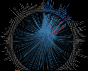
This Graph shows the different theme each movie contains. There are 2 types of nodes : movies and themes. I find the interactive highlighting very useful since you can clearly link a specific movie with its themes even with this relatively large amount of data. It also support 2-way linking: You can either find the corresponding themes by movie name (red lines) or find which movies has a specific theme (green lines).

-Yang Chengzhen
Introduction to graph-tool
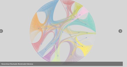
Hi, guys, I would like to to share with you an effective python module for manipulation and statistical analysis of network graphs. For those who are more familiar with C/C++, graph-tool should be a better choice as the core algorithms and data structures of graph-tool are written in C++. Most of the time, you can expect the algorithms to run just as fast as if graph-tool were a pure C/C++ library. Similar to D3.JS, you can call a variety of algorithms and output formats from online library and easily implement your network graph design in a HTML page. If you are interested, you can find more at the following link:
Here is a sample image of a graph-tool implementation:

-Wu Wei