Difference between revisions of "Staying Vigilant, Confronting Terrorism: Proposal"
Wx.tan.2013 (talk | contribs) |
|||
| (38 intermediate revisions by one other user not shown) | |||
| Line 1: | Line 1: | ||
| + | [[File:Group7 TeamLogo.png|center|150px]] | ||
| + | <p></p><br/> | ||
<!--Sub Header Start--> | <!--Sub Header Start--> | ||
{| style="background-color:white; color:white padding: 5px 0 0 0;" width="100%" height=50px cellspacing="0" cellpadding="0" valign="top" border="0" | | {| style="background-color:white; color:white padding: 5px 0 0 0;" width="100%" height=50px cellspacing="0" cellpadding="0" valign="top" border="0" | | ||
| − | | style="vertical-align:top;width:16%;" | <div style="padding: 3px; font-weight: bold; text-align:center; line-height: wrap_content; font-size:16px; border-bottom:1px solid #3D9DD7; font-family:helvetica"> [[Staying Vigilant, Confronting Terrorism| <b>Home</b>]] | + | | style="vertical-align:top;width:16%;" | <div style="padding: 3px; font-weight: bold; text-align:center; line-height: wrap_content; font-size:16px; border-bottom:1px solid #3D9DD7; border-top:1px solid #3D9DD7; font-family:helvetica"> [[Staying Vigilant, Confronting Terrorism| <b>Home</b>]] |
| + | |||
| + | | style="vertical-align:top;width:16%;" | <div style="padding: 3px; font-weight: bold; text-align:center; line-height: wrap_content; font-size:16px; border-bottom:1px solid #3D9DD7; border-top:1px solid #3D9DD7; font-family:helvetica"> [[Staying Vigilant, Confronting Terrorism: Proposal | <b>Proposal</b>]] | ||
| + | |||
| + | | style="vertical-align:top;width:16%;" | <div style="padding: 3px; font-weight: bold; text-align:center; line-height: wrap_content; font-size:16px; border-bottom:1px solid #3D9DD7; border-top:1px solid #3D9DD7; font-family:helvetica"> [[Staying Vigilant, Confronting Terrorism: Poster | <b>Poster</b>]] | ||
| + | |||
| + | | style="vertical-align:top;width:16%;" | <div style="padding: 3px; font-weight: bold; text-align:center; line-height: wrap_content; font-size:16px; border-bottom:1px solid #3D9DD7; border-top:1px solid #3D9DD7; font-family:helvetica"> [[Staying Vigilant, Confronting Terrorism: Application | <b>Application</b>]] | ||
| + | |||
| + | | style="vertical-align:top;width:16%;" | <div style="padding: 3px; font-weight: bold; text-align:center; line-height: wrap_content; font-size:16px; border-bottom:1px solid #3D9DD7; border-top:1px solid #3D9DD7; font-family:helvetica"> [[Staying Vigilant, Confronting Terrorism: Research Paper | <b>Research Paper</b>]] | ||
| + | |} | ||
| + | |||
| + | {| style="background-color:white; color:white padding: 5px 0 0 0;" width="100%" height=50px cellspacing="0" cellpadding="0" valign="top" border="0" | | ||
| + | |||
| + | | style="vertical-align:top;width:10%;" | | ||
| − | | style="vertical-align:top;width: | + | | style="vertical-align:top;width:10%;" | <div style="padding: 3px; font-weight: bold; text-align:center; line-height: wrap_content; font-size:16px; border-bottom:1px solid #3D9DD7; font-family:helvetica"> [[Staying Vigilant, Confronting Terrorism: Proposal Version 1 | <b>Version 1</b>]] |
| − | | style="vertical-align:top;width: | + | | style="vertical-align:top;width:10%;" | <div style="padding: 3px; font-weight: bold; text-align:center; line-height: wrap_content; font-size:16px; border-bottom:1px solid #3D9DD7; font-family:helvetica"> [[Staying Vigilant, Confronting Terrorism: Proposal | <b>Version 2</b>]] |
| − | | style="vertical-align:top;width: | + | | style="vertical-align:top;width:20%;" | |
| − | | style="vertical-align:top;width: | + | | style="vertical-align:top;width:20%;" | |
|} | |} | ||
<!--Sub Header End--> | <!--Sub Header End--> | ||
<p></p><br/> | <p></p><br/> | ||
| + | <p>After much analysis and investigation on the data, our group feels that the previous storyboard we created will not allow people to find interesting insights. This is primarily because we realised that there is not much support from the data collected to show that the economic indicators in a country will lead to higher levels of terrorist attacks. The relationship between a country's economy and the number of terrorist attacks could not be established. As such, we decided to change our storyboard to show more interesting insights, as shown in this proposal. If you are interested to look at our previous proposal, please refer back to [[Staying Vigilant, Confronting Terrorism: Proposal Version 1|Proposal Version 1]]. </p><br/> | ||
<div style="background: #364558; padding: 15px; font-weight: bold; line-height: 0.3em; text-indent: 15px;letter-spacing:-0.08em;font-size:20px"><font color=#fbfcfd face="Century Gothic">PROBLEM & MOTIVATION</font></div> | <div style="background: #364558; padding: 15px; font-weight: bold; line-height: 0.3em; text-indent: 15px;letter-spacing:-0.08em;font-size:20px"><font color=#fbfcfd face="Century Gothic">PROBLEM & MOTIVATION</font></div> | ||
| − | The threat of terrorism is growing everyday and many countries, including Singapore, have taken steps to mitigate the risks of terrorism. In the National Day Rally 2016, PM Mr. Lee Hsien Loong mentioned that diplomats and security forces have been doing their job well but despite their efforts, it does not mean that | + | The threat of terrorism is growing everyday and many countries, including Singapore, have taken steps to mitigate the risks of terrorism. In the National Day Rally 2016, PM Mr. Lee Hsien Loong mentioned that diplomats and security forces have been doing their job well but despite their efforts, it does not mean that terrorist attacks will not happen in Singapore. The recent attack that attempted to fire a rocket to hit Marina Bay Sands Area from Batam was successfully intervened but this signals to the country that the terrorism threat should not be taken lightly. In response to the growing terrorist threat, the SGSecure Movement was launched to prepare the public in the event of an attack. In recent years, there is a rise in research on terrorist organizations and the activities they have performed, regardless of scale, over the years. However, more still needs to be done to analyze past terrorist activities and gain insights from it easily so that all countries could better prepare for a worst case scenario. |
<br/><div style="background: #364558; padding: 15px; font-weight: bold; line-height: 0.3em; text-indent: 15px;letter-spacing:-0.08em;font-size:20px"><font color=#fbfcfd face="Century Gothic">OBJECTIVES</font></div> | <br/><div style="background: #364558; padding: 15px; font-weight: bold; line-height: 0.3em; text-indent: 15px;letter-spacing:-0.08em;font-size:20px"><font color=#fbfcfd face="Century Gothic">OBJECTIVES</font></div> | ||
| − | + | <p>In this project, we are interested to create a visualization that helps analysts perform the following:</p> | |
| − | # | + | # Identify the target victims of terrorist attacks across countries |
| − | # | + | # Explore each country’s existing political climate |
| + | # Compare the political climate of each country | ||
| + | # Establish possible correlations of a country’s political climate with the number of terrorist attacks happening in a country | ||
| + | <p>By conducting the analysis, it allows respective policy makers, government or intelligence agencies to better identify potential linkages between how well a country is governed (political climate) and the potential for future terrorist attacks. If a link between how well a country is governed and the occurrence of terrorist attacks could be established, policy makers and government agencies can take steps to improve the political conditions/way in which their country is governed. By targeting at a potential root cause of terrorist attacks, it aims to reduce the number of terrorist attacks happening across different parts of the world.</p> | ||
<br/><div style="background: #364558; padding: 15px; font-weight: bold; line-height: 0.3em; text-indent: 15px;letter-spacing:-0.08em;font-size:20px"><font color=#fbfcfd face="Century Gothic">SELECTED DATASET</font></div> | <br/><div style="background: #364558; padding: 15px; font-weight: bold; line-height: 0.3em; text-indent: 15px;letter-spacing:-0.08em;font-size:20px"><font color=#fbfcfd face="Century Gothic">SELECTED DATASET</font></div> | ||
| − | The dataset for analysis will be retrieved from | + | In our analysis, we will only be using data within the year of 2000 - 2015. The rationale for the range of data selected is as follows: |
| + | * It does not provide strong relevance/insights for analysts to look at all the data in the past 45 years and attempt to predict activities of these terrorist organizations now/in the future. Due to rapid changes in the globalized world, a range of 15 years will be adequate to help analysts spot trends/patterns of terrorist activities. | ||
| + | * Due to limitations of the data collected on each country's governance indicators, the dataset only provides information from year 2000 - 2015. | ||
| + | * Due to technical limitations, loading past 45 years of data (156,773 records) into the application may cause it to become non-responsive and users may not be satisfied with the response rate. A range of 15 years (87,010 records) will yield just enough data for an insightful analysis and yet, does not sacrifice on the application's response rate. <br/> | ||
| + | The dataset for analysis will be retrieved from multiple databases, as elaborated below:<br/> | ||
| + | {| class="wikitable" style="background-color:#FFFFFF;" width="100%" | ||
| + | |- | ||
| + | ! style="font-weight: bold;background: #536a87;color:#fbfcfd;width: 30%;" | Dataset/Source | ||
| + | ! style="font-weight: bold;background: #536a87;color:#fbfcfd;width: 30%" | Data Attributes | ||
| + | ! style="font-weight: bold;background: #536a87;color:#fbfcfd;" | Rationale Of Usage | ||
| + | |- | ||
| + | | <center>Global Terrorism Database (GTD)<br/> | ||
| + | (https://www.start.umd.edu/gtd/using-gtd/) </center> | ||
| + | || | ||
| + | * Geographical spread of terrorist attacks | ||
| + | * Target of terrorist attacks | ||
| + | * Extent of damage in terrorist attacks (no. of deaths in an attack) | ||
| + | || | ||
| + | <center>This dataset will be used as a main source of information in our analysis to understand the spread of terrorist activities in each country/globally.</center> | ||
| + | |- | ||
| + | | <center>Worldwide Governance Indicators<br/> | ||
| + | (http://data.worldbank.org/data-catalog/worldwide-governance-indicators)</center> | ||
| + | || | ||
| + | * Control of Corruption (Estimate) | ||
| + | * Government Effectiveness (Estimate) | ||
| + | * Political Stability & Absence of Violence/Terrorism (Estimate) | ||
| + | * Rule of Law (Estimate) | ||
| + | * Regulatory Quality (Estimate) | ||
| + | * Voice & Accountability (Estimate) | ||
| + | || | ||
| + | <center>This dataset aims to complement the main dataset by providing detailed information about each country's level of governance across different time periods. This will allow us to compare and establish possible linkages between how well a country is governed and the number of terrorist attacks that took place in the country.</center> | ||
| + | |- | ||
| + | | <center>Political Terror Scale<br/> | ||
| + | (http://www.politicalterrorscale.org/Data/)</center> | ||
| + | || | ||
| + | * Levels of State Perpetrated Human Rights Violation | ||
| + | || | ||
| + | <center>This dataset is derived from reports by Amnesty International and coders were tasked to measure the levels of political violence and terror that a country experiences based on a 5-level terror scale, originally developed by Freedom House. This dataset aims to help analysts identify possible linkages between the number of terrorist activities occurring and the level of state perpetrated human rights violation in the country.</center> | ||
| + | |- | ||
| + | |} | ||
| − | <br/><div style="background: #364558; padding: 15px; font-weight: bold; line-height: 0.3em; text-indent: 15px;letter-spacing:-0.08em;font-size:20px"><font color=#fbfcfd face="Century Gothic">RELATED WORKS</font></div> | + | <br/><div style="background: #364558; padding: 15px; font-weight: bold; line-height: 0.3em; text-indent: 15px;letter-spacing:-0.08em;font-size:20px"><font color=#fbfcfd face="Century Gothic">BACKGROUND SURVEY OF RELATED WORKS</font></div> |
Many visual and data analysts have made use of data collected from the Global Terrorism Database to visualize and understand the extent of terrorist attacks around the world. Some of their works include the following: | Many visual and data analysts have made use of data collected from the Global Terrorism Database to visualize and understand the extent of terrorist attacks around the world. Some of their works include the following: | ||
| − | + | {| class="wikitable" style="background-color:#FFFFFF;" width="100%" | |
| − | * An | + | |- |
| − | + | ! style="font-weight: bold;background: #536a87;color:#fbfcfd;width: 50%;" | Related Works | |
| − | * | + | ! style="font-weight: bold;background: #536a87;color:#fbfcfd;" | What We Can Learn |
| + | |- | ||
| + | | | ||
| + | <p><center>'''An Analysis of Death Tolls & Terrorist Incidents''' </center></p> | ||
| + | [[File:Related Works - Infographic Group7.jpg|400px|center]] | ||
| + | <p><center>'''Source''': http://www.dailymail.co.uk/news/article-3322308/Number-people-killed-terrorists-worldwide-soars-80-just-year.html</center></p> | ||
| + | || | ||
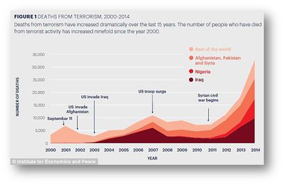
| + | * The infographic provides annotations to help the users understand major terrorist attacks that have happened overtime. | ||
| + | * Colour scheme used by the infographic is clean and neat. | ||
| + | * Use of colors on the same color scale ensures that it will not confuse the users. Also, the need to reference to a legend repeatedly will also be reduced. | ||
| + | |- | ||
| + | | <p><center> '''An Animated Time-Lapse Visualization of Terror Attacks On The World Map''' </center></p> | ||
| + | [[File:Related Works - Time Lapse Group7.gif|400px|center]] | ||
| + | <p><center> '''Source''': https://www.youtube.com/watch?v=cHbYk2l9w-E </center> </p> | ||
| + | || | ||
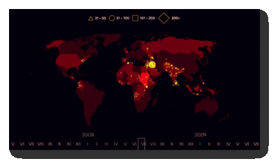
| + | * The time-lapse animation provides a clear overview to users as it shows the spread of terrorist activities over the years. | ||
| + | |- | ||
| + | | <p><center> '''An Interactive Visualization to Show Trends And Events Shaping History of Terrorism''' </center></p> | ||
| + | [[File:Related Works - Interactive Visualization Group7.png|400px|center]] | ||
| + | <p><center> '''Source''': http://parano.github.io/Global-Terrorism-Visualization/ </center></p> | ||
| + | || | ||
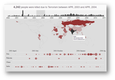
| + | * The time-series chart allow users to make use of a scrollbar to look at a time range (of 12 months). Use of a scrollbar act as a filter to look at the selected time range and this prevents users from getting overwhelmed by the data. | ||
| + | * The visualization consists of 2 charts linked together and this provides a clear representation of the spread of terrorist activities overtime. Firstly, the bar chart shows the number of fatalities in each month across the years. Secondly, the world map shows the spread of terrorist activities as user selects a time series. When the user drags across the scrollbar on the bar chart, the activities in the world map changes based on the selected time series. Such linkage between charts are useful and provides a good interactive tool to help users analyze spread of terrorist activities overtime. | ||
| + | * Use of tooltips allow users to know more information about the number of fatalities as they interact with the map. | ||
| + | |} | ||
| − | <br/><div style="background: #364558; padding: 15px; font-weight: bold; line-height: 0.3em; text-indent: 15px;letter-spacing:-0.08em;font-size:20px"><font color=#fbfcfd face="Century Gothic"> | + | <br/><div style="background: #364558; padding: 15px; font-weight: bold; line-height: 0.3em; text-indent: 15px;letter-spacing:-0.08em;font-size:20px"><font color=#fbfcfd face="Century Gothic">DESIGN INSPIRATIONS</font></div> |
| − | + | Other than looking at related works of others, we also reference and draw inspirations from interactive visualizations created by others. Some of these visualizations that we draw inspiration from, are as follows: | |
| + | |||
| + | {| class="wikitable" style="background-color:#FFFFFF;" width="100%" | ||
| + | |- | ||
| + | ! style="font-weight: bold;background: #536a87;color:#fbfcfd;width: 50%;" | Reference of Other Interactive Visualization | ||
| + | ! style="font-weight: bold;background: #536a87;color:#fbfcfd;" | What We Can Learn | ||
| + | |- | ||
| + | | <p><center>'''An Analysis of PSC's Scholar's Demographics''' </center></p> | ||
| + | [[File:Related Works - Educity TeamVigilante.png|400px|center]] | ||
| + | <p><center>'''Source''': http://www.thiakx.com/educity/?loaded#scholarPage-Link/1</center></p> | ||
| + | || | ||
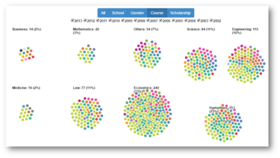
| + | * By having different demographic filters, we can easily see the different demographic indicators that we are interested in, on just one single page. This reduces the need for users to move between different pages or get confuse on multiple charts in order to understand the scholars' demographics. | ||
| + | * Each bubble in the chart represents each scholar. This means that users can easily hover over each bubble in order to know more information about the scholar. With just a single page, users will be able to analyze the information of each scholar easily. | ||
| + | |- | ||
| + | | <p><center>'''An Analysis of Global Economic Relations''' </center></p> | ||
| + | [[File:Related Works - GedViz TeamVigilante.png|400px|center]] | ||
| + | <p><center>'''Source''': http://viz.ged-project.de/</center></p> | ||
| + | || | ||
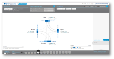
| + | * There are multiple filters that users could apply in order to interact and analyze the economic relations between different countries. Use of multiple filters help users to zoom into particular countries and variables that they are of interest. This would greatly reduce the amount of time required for users to sieve through different sets of variables, in order to get useful insights. | ||
| + | * The entire visualization is focused on one single chart. This allows them to fully concentrate on the chart and draw useful insights from it, without much distractions from other charts. | ||
| + | |} | ||
| + | |||
| + | <br/><div style="background: #364558; padding: 15px; font-weight: bold; line-height: 0.3em; text-indent: 15px;letter-spacing:-0.08em;font-size:20px"><font color=#fbfcfd face="Century Gothic">PROPOSED STORYBOARD</font></div> | ||
| + | {| class="wikitable" style="background-color:#FFFFFF;" width="100%" | ||
| + | |- | ||
| + | ! style="font-weight: bold;background: #536a87;color:#fbfcfd;width: 50%;" | Proposed Layout | ||
| + | ! style="font-weight: bold;background: #536a87;color:#fbfcfd;" | How Analyst Can Conduct Analysis | ||
| + | |- | ||
| + | | [[File:Homepage TeamVigilante.png|600px|center]] | ||
| + | || | ||
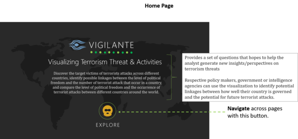
| + | # Introduce analysts to the topic of terrorism and the objectives of the visualization project | ||
| + | # Upon clicking "Explore", analysts will then begin their process of exploration | ||
| + | |- | ||
| + | | [[File:ChoroplethMap TeamVigilante.png|600px|center]] | ||
| + | || | ||
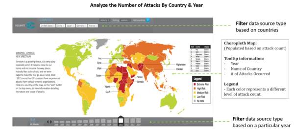
| + | # In the first phase of data exploration, analysts will be presented with a choropleth map of the world. Varying colors intensity will be shown in the choropleth map based on the number of attacks that took place in the country in a particular year. | ||
| + | # Using the world map as a filter condition, analysts can add countries of interest into a list to help them in their next phase of exploration by clicking on the country in the world map. | ||
| + | # The bar chart at the bottom of the page shows the number of attacks that took place in the particular year. By default, 3 countries will be selected to show a clear relationship between different data-sets. Of course, users can change the selection of countries to suit their interest. | ||
| + | |- | ||
| + | | [[File:Radar BubbleChart TeamVigilante.png|600px|center]] | ||
| + | || | ||
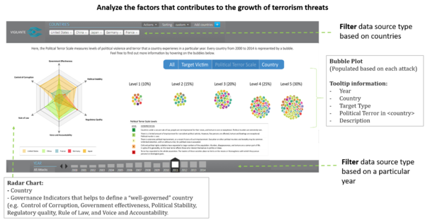
| + | # In the next phase of the exploration, data will be displayed based on the countries that analysts have selected previously. | ||
| + | # The radar chart shows 6 different governance indicators that defines how well a country is governed. The closer the area is to the center of the chart, the less well governed the country is. Upon mouse-over of each area, one can also retrieve the exact values of each governance indicator. | ||
| + | # The bubble plot groups attacks based on 3 main categories - country, target victim and political terror scale. Firstly, by grouping based on country, one can better visualize the number of attacks that took place in each country and contrast it with the data presented in the radar chart. Secondly, by grouping based on target victims, one can also establish the most common targets of these terrorist attacks that took place. This will bring analysts further in the data exploration, especially if there are high numbers of attacks targeting at certain groups of people. Lastly, grouping by political terror scale allow the analysts to contrast information with the radar chart. In addition, by looking at the count of attacks in each scale, one can also identify interesting patterns. | ||
| + | # In the bubble plot, each bubble represents an attack. When the analyst mouse-over each bubble, they can see more information about each attack and this helps to bring context to the analyst in their data exploration phase. Due to technical limitations and to avoid excessive clutter on the page, only attacks that have resulted in more than 15 deaths will be shown. This is in conjunction with the assumption that analysts would be more interested to look at attacks that have caused great harm to the public. | ||
| + | # By looking at both charts, the analyst will then be able to compare and establish possible linkages between how well a country is governed and the number of terrorist attacks that took place in the country. As such, these 2 charts are placed side by side to assist the analyst in their data exploration. | ||
| + | # Similarly to the previous page, the bar chart at the bottom of the page will show the number of attacks that took place for all selected countries. | ||
| + | |} | ||
| + | |||
| + | <br/><div style="background: #364558; padding: 15px; font-weight: bold; line-height: 0.3em; text-indent: 15px;letter-spacing:-0.08em;font-size:20px"><font color=#fbfcfd face="Century Gothic">ADDRESSING KEY TECHNICAL CHALLENGES</font></div> | ||
| + | The following are some of the key technical challenges that we may face throughout the course of the project: | ||
| + | {| class="wikitable" style="background-color:#FFFFFF;" width="100%" | ||
| + | |- | ||
| + | ! style="font-weight: bold;background: #536a87;color:#fbfcfd;width: 50%;" | Key Technical Challenges | ||
| + | ! style="font-weight: bold;background: #536a87;color:#fbfcfd;" | How We Propose To Resolve | ||
| + | |- | ||
| + | | <center> Unfamiliarity of Visualization Tool Usage </center> || | ||
| + | * Independent Learning on Visualization Tools | ||
| + | * Peer Learning | ||
| + | |- | ||
| + | | <center> Data Cleaning & Transformation </center> || | ||
| + | * Work together to clean, transform and analyze the data | ||
| + | |- | ||
| + | | <center> Unfamiliarity in Programming using Javascript & D3 Libraries </center> || | ||
| + | * Attend D3 Programming Workshop | ||
| + | * Independent Learning on D3 Libraries & Technical Tools | ||
| + | * Peer Learning | ||
| + | |- | ||
| + | | <center> Unfamiliarity in Implementing Interactivity and Animation Tools/Techniques in Visualization App </center> || | ||
| + | * Develop a Storyboard/Design Flow | ||
| + | * Assign members to specialize on Interactivity/Animation Techniques | ||
| + | |} | ||
| + | |||
| + | <br/><div style="background: #364558; padding: 15px; font-weight: bold; line-height: 0.3em; text-indent: 15px;letter-spacing:-0.08em;font-size:20px"><font color=#fbfcfd face="Century Gothic">PROJECT TIMELINE</font></div> | ||
| + | <p>The following shows our project timeline for the completion of this project:</p> | ||
| + | [[File:Project Schedule v2 GwendolineTanWanXin.png|1000px|center]] | ||
| + | |||
| + | <br/><div style="background: #364558; padding: 15px; font-weight: bold; line-height: 0.3em; text-indent: 15px;letter-spacing:-0.08em;font-size:20px"><font color=#fbfcfd face="Century Gothic">TOOLS/TECHNOLOGIES</font></div> | ||
| + | <p>The following are some of the tools/technologies that we will be utilizing during the project:</p> | ||
| + | * D3.js | ||
| + | * Chart.js | ||
| + | * Notepad++ | ||
| + | * Adobe PhotoShop | ||
| + | |||
| + | <br/><div style="background: #364558; padding: 15px; font-weight: bold; line-height: 0.3em; text-indent: 15px;letter-spacing:-0.08em;font-size:20px"><font color=#fbfcfd face="Century Gothic">REFERENCES</font></div> | ||
| + | * Marina Bay Attack Plot from Batam ‘Not to be Taken Lightly’ (http://www.straitstimes.com/singapore/rocket-attack-plot-not-to-be-taken-lightly) | ||
| + | * National Consortium for the Study of Terrorism and Responses to Terrorism (START). (2016). Global Terrorism Database [Data file]. Retrieved from http://www.start.umd.edu/gtd | ||
| + | * Worldwide Governance Indicators (http://data.worldbank.org/data-catalog/worldwide-governance-indicators) | ||
| + | * Political Terror Scale (http://www.politicalterrorscale.org/Data/) | ||
| + | * Educity (http://www.thiakx.com/educity/?loaded#introPage-Link) | ||
| + | * GED Viz - Visualizing Global Economic Relations (http://viz.ged-project.de/) | ||
| + | * D3.js (https://d3js.org/) | ||
| + | * Examples By Mike Bostock (https://bost.ocks.org/mike/example/) | ||
| + | * CSV to JSON Converter (http://www.convertcsv.com/csv-to-json.htm) | ||
| + | |||
| + | <br/><div style="background: #364558; padding: 15px; font-weight: bold; line-height: 0.3em; text-indent: 15px;letter-spacing:-0.08em;font-size:20px"><font color=#fbfcfd face="Century Gothic">OUR BRAINSTORMING SESSIONS</font></div> | ||
| + | <p>The following show the proposed storyboard that we designed during our brainstorming sessions:</p> | ||
| + | [[File:Sketch of Dashboard TeamVigilante.jpg|400px|center]] | ||
| + | The storyboard provides an overview of the various charts that we intend to employ in our web application. More information about each chart is indicated based on the labels present in the chart. Based on reasons of practicality, it is difficult to place all 3 charts in the same window and yet able to see all the information clearly. As such, when we draw our final storyboard, the charts are separated on 2 different pages. Users will be able to scroll between different charts by using their left/right arrow keys. | ||
<br/><div style="background: #364558; padding: 15px; font-weight: bold; line-height: 0.3em; text-indent: 15px;letter-spacing:-0.08em;font-size:20px"><font color=#fbfcfd face="Century Gothic">COMMENTS</font></div> | <br/><div style="background: #364558; padding: 15px; font-weight: bold; line-height: 0.3em; text-indent: 15px;letter-spacing:-0.08em;font-size:20px"><font color=#fbfcfd face="Century Gothic">COMMENTS</font></div> | ||
| − | Feel free to comment | + | <p>Feel free to comment to help us improve our project! (:</p> |
| + | |||
| + | |||
| + | I like your implementation of the bubble chart. The moving animations made the visualization feels more interactive. However, the mouseover detail of each bubble can be abit difficult especially when alot of bubbles are cluttered in a small area. Overall, it's still a good effort! :D - Arnold | ||
Latest revision as of 16:30, 22 November 2016
After much analysis and investigation on the data, our group feels that the previous storyboard we created will not allow people to find interesting insights. This is primarily because we realised that there is not much support from the data collected to show that the economic indicators in a country will lead to higher levels of terrorist attacks. The relationship between a country's economy and the number of terrorist attacks could not be established. As such, we decided to change our storyboard to show more interesting insights, as shown in this proposal. If you are interested to look at our previous proposal, please refer back to Proposal Version 1.
The threat of terrorism is growing everyday and many countries, including Singapore, have taken steps to mitigate the risks of terrorism. In the National Day Rally 2016, PM Mr. Lee Hsien Loong mentioned that diplomats and security forces have been doing their job well but despite their efforts, it does not mean that terrorist attacks will not happen in Singapore. The recent attack that attempted to fire a rocket to hit Marina Bay Sands Area from Batam was successfully intervened but this signals to the country that the terrorism threat should not be taken lightly. In response to the growing terrorist threat, the SGSecure Movement was launched to prepare the public in the event of an attack. In recent years, there is a rise in research on terrorist organizations and the activities they have performed, regardless of scale, over the years. However, more still needs to be done to analyze past terrorist activities and gain insights from it easily so that all countries could better prepare for a worst case scenario.
In this project, we are interested to create a visualization that helps analysts perform the following:
- Identify the target victims of terrorist attacks across countries
- Explore each country’s existing political climate
- Compare the political climate of each country
- Establish possible correlations of a country’s political climate with the number of terrorist attacks happening in a country
By conducting the analysis, it allows respective policy makers, government or intelligence agencies to better identify potential linkages between how well a country is governed (political climate) and the potential for future terrorist attacks. If a link between how well a country is governed and the occurrence of terrorist attacks could be established, policy makers and government agencies can take steps to improve the political conditions/way in which their country is governed. By targeting at a potential root cause of terrorist attacks, it aims to reduce the number of terrorist attacks happening across different parts of the world.
In our analysis, we will only be using data within the year of 2000 - 2015. The rationale for the range of data selected is as follows:
- It does not provide strong relevance/insights for analysts to look at all the data in the past 45 years and attempt to predict activities of these terrorist organizations now/in the future. Due to rapid changes in the globalized world, a range of 15 years will be adequate to help analysts spot trends/patterns of terrorist activities.
- Due to limitations of the data collected on each country's governance indicators, the dataset only provides information from year 2000 - 2015.
- Due to technical limitations, loading past 45 years of data (156,773 records) into the application may cause it to become non-responsive and users may not be satisfied with the response rate. A range of 15 years (87,010 records) will yield just enough data for an insightful analysis and yet, does not sacrifice on the application's response rate.
The dataset for analysis will be retrieved from multiple databases, as elaborated below:
| Dataset/Source | Data Attributes | Rationale Of Usage |
|---|---|---|
(https://www.start.umd.edu/gtd/using-gtd/) |
|
|
(http://data.worldbank.org/data-catalog/worldwide-governance-indicators) |
|
|
(http://www.politicalterrorscale.org/Data/) |
|
|
Many visual and data analysts have made use of data collected from the Global Terrorism Database to visualize and understand the extent of terrorist attacks around the world. Some of their works include the following:
| Related Works | What We Can Learn |
|---|---|
|
|
|
| |
|
Other than looking at related works of others, we also reference and draw inspirations from interactive visualizations created by others. Some of these visualizations that we draw inspiration from, are as follows:
| Reference of Other Interactive Visualization | What We Can Learn |
|---|---|
| |
|
| Proposed Layout | How Analyst Can Conduct Analysis |
|---|---|
| |
| |
|
The following are some of the key technical challenges that we may face throughout the course of the project:
| Key Technical Challenges | How We Propose To Resolve |
|---|---|
| |
| |
| |
|
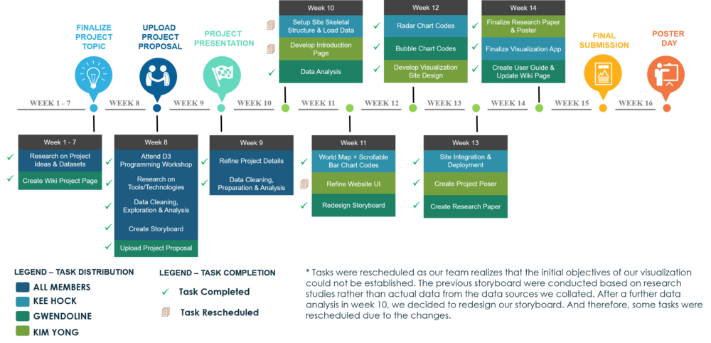
The following shows our project timeline for the completion of this project:
The following are some of the tools/technologies that we will be utilizing during the project:
- D3.js
- Chart.js
- Notepad++
- Adobe PhotoShop
- Marina Bay Attack Plot from Batam ‘Not to be Taken Lightly’ (http://www.straitstimes.com/singapore/rocket-attack-plot-not-to-be-taken-lightly)
- National Consortium for the Study of Terrorism and Responses to Terrorism (START). (2016). Global Terrorism Database [Data file]. Retrieved from http://www.start.umd.edu/gtd
- Worldwide Governance Indicators (http://data.worldbank.org/data-catalog/worldwide-governance-indicators)
- Political Terror Scale (http://www.politicalterrorscale.org/Data/)
- Educity (http://www.thiakx.com/educity/?loaded#introPage-Link)
- GED Viz - Visualizing Global Economic Relations (http://viz.ged-project.de/)
- D3.js (https://d3js.org/)
- Examples By Mike Bostock (https://bost.ocks.org/mike/example/)
- CSV to JSON Converter (http://www.convertcsv.com/csv-to-json.htm)
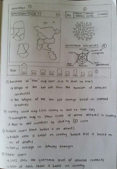
The following show the proposed storyboard that we designed during our brainstorming sessions:
The storyboard provides an overview of the various charts that we intend to employ in our web application. More information about each chart is indicated based on the labels present in the chart. Based on reasons of practicality, it is difficult to place all 3 charts in the same window and yet able to see all the information clearly. As such, when we draw our final storyboard, the charts are separated on 2 different pages. Users will be able to scroll between different charts by using their left/right arrow keys.
Feel free to comment to help us improve our project! (:
I like your implementation of the bubble chart. The moving animations made the visualization feels more interactive. However, the mouseover detail of each bubble can be abit difficult especially when alot of bubbles are cluttered in a small area. Overall, it's still a good effort! :D - Arnold

