Team Collision
Contents
Problem and Motivation
In United Kingdom (UK), road traffic accidents have resulted in 1,732 deaths in the year 2015, which is a 2% dip as compared to the year 2014. Despite the drop in the number of deaths, the casualties across all severities remained at an alarming figure of 186,130. As there is an increasing demand for the use of public roads, there is a strong need for us to prevent road traffic accidents and make the public roads as safe as possible. In order to prevent such accidents, it is therefore crucial to understand what are the different factors that contribute to road traffic accidents, and these understandings may then be used to prevent road traffic accidents from occurring.
Objective
The objective of the project is to:
- Understand the demographics of drivers
- Distribution of age of drivers.
- Understand the demographics of casualties
- Distribution of age of casualties.
- Distribution of severity of casualties.
- Distribution of type of casualties.
- Examine the underlying factors which contributes to accidents. The following are some factors, but not limited to:
- Temporal patterns: Accident records based on time.
- Weather conditions: Which type of weather conditions would cause more accidents?
- Road conditions: Which type of road conditions would cause more accidents?
- Develop appropriate interactive visualisation to allow discovery of insights from multiple dimensions from the dataset.
Data
In this project, our team will be focusing on 2015 road safety data. The data is obtained from data.gov.uk (https://data.gov.uk/dataset/road-accidents-safety-data). It contains only personal injury accidents on public roads that are reported to the police and recorded using the UK STATS19 accident reporting form. It consists a total of 3 datasets that provide information about the accidents, the types of vehicles involved and the demographics of the casualties. Most of the data attributes are coded and re-coding would be done with the lookup tables provided by data.gov.uk.
The following data attributes are used in this project:
- Accident Dataset [Accidents_2015.csv]
- Accident_Index [Accident No.]
- Date
- Day_of_Week
- Time
- Weather_Conditions
- Road_Surface_Conditions
- Vehicles Dataset [Vehicles_2015.csv]
- Accident_Index [Accident No.]
- Vehicle_Reference [Vehicle No.]
- Age_of_Driver
- Casualties Dataset [Casualties_2015.csv]
- Accident_Index [Accident No.]
- Vehicle_Reference [Vehicle No.]
- Casualty_Reference [Casualty No.]
- Casualty_Class [Driver/Rider, Passenger or Pedestrian]
- Age_of_Casualty
- Casualty_Severity
Research Visualisation
| Visualisations | Comments |
|---|---|
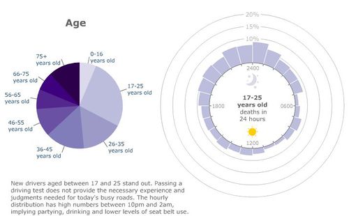
(http://news.bbc.co.uk/2/hi/in_depth/uk/2009/crash/8414354.stm)
| |
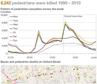
(http://www.bbc.co.uk/news/uk-15975564)
|
Visualisation Strategy *Revised*
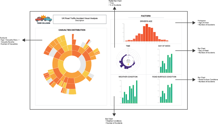
| Revised Strategy: After preliminary assessment on the initial visualisation strategy, we modified the initial visualisation ensure that the graphical furniture can fit within 1 single page. We intend to instead use a top-down approach, where our visualisation is being segmented into 2 major portions (e.g., left with general details, and right shows the detailed factors).
From the left, the first visualisation (Left) serves as the main navigation, where users can focus on the types of casualties to analyse on. On the right, the graphical furniture shows the underlying factors. This will allow the users to study how the various factors in the data contribute to different casualties for different age-groups. |
Tools
The following tools are used in this project:
- JMP Pro
- Tableau 10
- D3.js
- Text Editor
Technical Challenges
| Technical Challenges | Action Plan |
|---|---|
| |
Implementation of Interactivity/Animation |
|
Schedule and Milestones *Revised*
References
- Reported Road Casualties in Great Britain, 2015: https://www.gov.uk/government/statistics/reported-road-casualties-in-great-britain-main-results-2015
- Road Safety Data: https://data.gov.uk/dataset/road-accidents-safety-data
- Interactive Visualisation to Track Fatal Accidents: http://news.bbc.co.uk/2/hi/in_depth/uk/2009/crash/8414354.stm
- Replacement for an Oil Price Radial Chart: http://peltiertech.com/replacement-for-oil-price-radial-chart/
- Interactive Visualization to Rush Hour Danger: http://www.bbc.co.uk/news/uk-15975564
- The Data Visualisation Catalogue: http://www.datavizcatalogue.com/index.html


