Talk:Lesson10
Contents
Creating Good Dashboards
Hi everyone! I think Prof has already covered the main bulk of the importance of designing a good dashboard. Creating a purposeful dashboard is really crucial as it is the first thing that the audience see. Dashboards help to provide a bird’s eye view of the KPIs that the business has set. An interactive dashboard allows the report to be constantly updated and you can zoom in into details for greater analysis. However, I often make the mistake of cluttering up my dashboards with vanity metrics. In the end, my dashboard would look nice but they don’t lead to action. A good dashboard helps organizations get on the same page, speed decision-making and improve ROI. They help create organizational alignment because everyone is looking at the same thing. So dashboards are effective. They work. The questions are: how can they work for you?
Here are some really good dashboard designs!
http://www.hongkiat.com/blog/dashboard-design-examples-resources/
-- Dina Heng Li Gwek
Reflections on Information Dashboard Design
Here are my reflections for Week 10:
Dashboard is very important to understand how to make it. It is very important to take many things into account, such as audience, the industry, colour themes, etc. The purpose of a dashboard to give the users an overview of everything, finding any problems with the data, coming out with insights from the data, etc. without much effort.
One thing that struck me is when prof said that even if you create your dashboard, it may not be an effective one. You need to take a lot of things into account, so I believe that a lot of planning and experience to create an effective dashboard. So, you should never give up and continue trying to create dashboards.
One thing that I would like to reflect is the Design Process. I would be using this process in my final project, and would even conduct studies to see whether the dashboard that my group that created would reach some of ours goals on whether the data is meaningful, beautifully constructed, etc.
-- Ong Ming Hao
Importance of Dashboards
Since I am studying Business I was very pleased that the class was talking about dashboards because it is something that we are discussing as really important in companies. It adds definetely value to the company because it helps to take good decisions and make a better profit. Of course it does not mean that without dashboard an enterprise won't be able to take good decisions but here it will be faster and clearer. It will allow the executives to have access to the crucial informations easily and fastly. Managers of department have already a lot to do and it can take time for us to follow the informations to the executives sometimes. I see dashboards like a necessity in big companies, specially when communication is impeded by size and complexity. If you are not convinced of this importance of the dashboards with what we already have discussed here or in class, I invite you to read this article: https://www.matillion.com/insights/how-important-is-a-bi-dashboard/
-- Margot Stelleman
Free dashboard software reviews
In class, we have dabbled with great paid software such as Tableau (Desktop and Public) and Power BI. While there are plenty of great dashboard software out there in the market, I think it is great that most of them allow for a free trial for us to dabble with it a bit more so that we will have some experience and knowledge of the different softwares out there when we enter into the workforce knowing which dashboard softwares are better.
Having said that, we can always explore some free trial dashboard softwares as below. For these softwares, all that is required is a business email (we can use the smu one for a free trial before you use your company’s email!) Then perhaps one you get comfortable with using the software you can upgrade to the paid version. The comments below are my own, and I do not intend to endorse any software or anything, just sharing the reviews there are out there :D
Zoho Reports
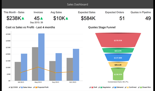
Zoho Reports
is a very simple and beautiful dashboards with great interactivity and filters. In my opinon good for a very quick dashboard builder and scan for that last minute presentation that you have to give off the cuff. Users have rated this an 8.3/10 on overall based on their ease of use, features and functionality.
Clicdata
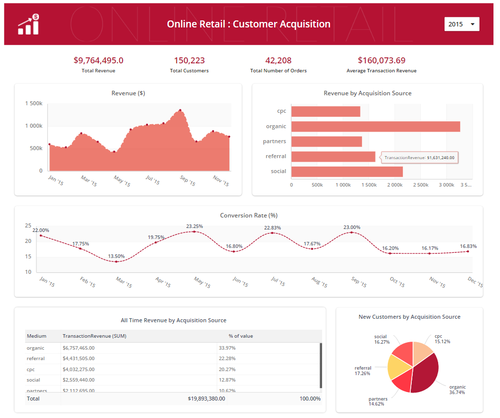
Clicdata
is a clean and professional look with bright colours and live dashboard interactivity. It enables connection to many systems and databases from MySQL, Google Analytics and even Facebook. They are strong in their customer support and users rate them a 7.8/10 on overall. It is worth exploring too!
Source:
http://www.predictiveanalyticstoday.com/open-source-dashboard-software/
--Albert Bingei
Performance of Dashboard
As I realized that most people are talking about the design and importance of dashboard, I feel that another aspect of dashboard is equally important; performance. While going through the tough journey of building dashboard for Mini Assignment 3, I start to realize that the dashboard gets increasingly slow as more background images are involved or more data are involved, and this reduced performance has a direct impact on the usability of the dashboard.
As such I have looked up Tableau's forum and discover a set of measures, which can help to reduce load times. If you are like me, interested in more techie details, you can look up the resolution to performance issues at http://kb.tableau.com/articles/issue/slow-dashboard-workbook-performance
Taking it one step further, I thought it will be good to understand the architecture side of tableau, and how it might affect performance. Link at https://www.tableau.com/sites/default/files/whitepapers/whitepaper_tableau-for-the-enterprise_0.pdf
--Chua Feng Ru
Dashboard principles
I understand that many has already shared guidelines to a good dashboard design but i thought this link is pretty good as it is simple and clear, if one doesnt have time to read much, this essentially covers the essence:
https://www.sisense.com/blog/4-design-principles-creating-better-dashboards/
I think the 5 second rule mentioned inside is rather interesting and i agree with it, that a good dashboard should provide the relevant information within 5 seconds. This means being able to priortize important information and making sure that users can find them as fast as possible, instead of having to look through a cluttered dashboard for minutes before understanding and making sense.
It also touches on the importance of simplicity, which i thought is true too as we tend to cram our dashboards with as much information and visualization as we can, but we do learn and understand from cognitive psychology that there is only so much the human brain can process at one time, anything more than this and it just becomes incoherent to a normal human.
Lastly, they also mentioned about the logical pyramid, for the logical layout, which is about placing the most significant insights on the top part, followed by trends in the middle and granular details at the bottom, which allows the user to first get the big picture before slowly drilling down to get more details if he or she requires.
So there you have it, 4 simple design principles to follow for a good dashboard design!
-- Bong Jun Hao
Some tips regarding alert for dashboard design
After reading through one of the references at the last page of slides
http://www.perceptualedge.com/articles/Whitepapers/Dashboard_Design.pdf
I have picked up some useful tips regarding alert for good dashboard design.
- Avoid too many alert conditions
The good practice only alerts to information which urgently requires a response. For example, excess using of color coding may lose readers' attention on important information. One more thing to take note is that good signs may also need alert as long as it requires a response.
- Avoid alerts that can't be differentiated
The combination of red and green is very bad because persons with color blindness can't distinguish between green and red and the way how the traffic light works for those people is by their positions: top for red, middle for yellow and bottom for green.
- Stick to a single visual means to draw attention
Try not to use more than 2 types of alerts at most and the better way is to use a single hue with various intensity from light to dark for situation awareness
--Chen Huiyan
Clean and Simple Dashboards
Leonardo da Vinci once said "Simplicity is the ultimate sophistication".
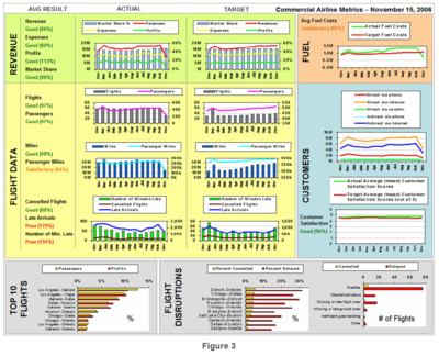
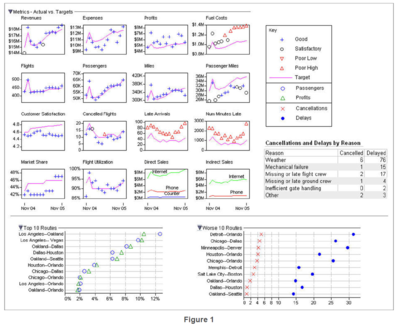
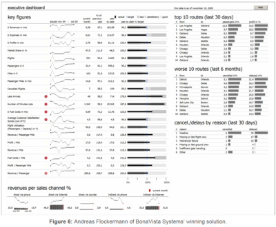
The article Dashboard Design for Rich and Rapid Monitoring explains this saying very well as it aims to compare certain dashboards which were tackling the same problem statement. The author brought to light certain dashboards that fell short of his expectations, dashboards that were note worthy, and lastly, the winning dashboard. I observed the stark difference in terms of simplicity between the "losing" dashboard and the winning one, as shown below.
| Dashboards falling short of expectations | Winning Dashboard |
|---|---|
  |
|
It turns out that labelling graphs or sets of graphs according to colour is not the best way to display the various elements in a dashboard. For the winning entry, it was very easy to know where to look, based on the red icons, because this is the only non-gray-scale color that appears on the dashboard. The author even mentioned that "The simplicity of this design, with almost no unnecessary visual content, provides an exceptionally clean presentation of the information, causing it to stand out and tell its story with a clear voice."
This is a good reminder, especially in the midst of creating a dashboard for our VA project - to not be too ambitious and to keep the dashboard interface clean and simple for better user experience.
-- Cornelia Tisandinia Larasati