IS428 2016 17T1 Group1 Proposal
| Project Proposal | Poster | Data Visualization Application | Application Report |
|---|
Contents
Team Members
- Thomas Thio
- Margot Stelleman
- Li Wei Qiao
Our Motivations & Problems We Want To Solve
Problem is that there is currently no clear ways to compare between economic indicators of countries, especially in time series, and know what indicators impact another, or where external information such as news makes meaning to us when they report the new changes to these indicators . We would like to make it intuitive for users to interpret macro trends and their impacts by economic indicators by Regions, Countries and Industries. These economic indicators are GDP, Unemployment Rate, CPI, Currency power, and Industrial Indexes, as well as their changes over time to understand or interpret geopolitical forces as possible impacts.
In doing so, one can tell when a region, country or industrial is in a growth or decline stage, and correctly understand which aspects of the economy relate to one another, and test whether there was a lag period after a policy came into effect. This would help users such as retail investors, economists tracking the economy on a macro perspective, or job seekers and migrants wishing to find the best prospects by country and industry.
| Related Work | Pros | Cons | Link |
|---|---|---|---|
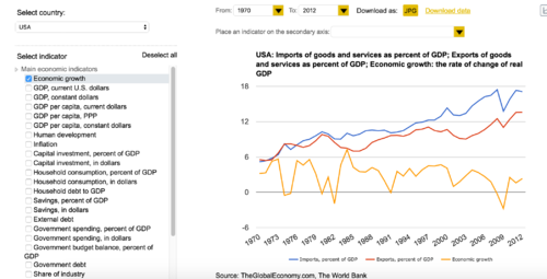
| The Global Economy | The site allows comparisons of multiple indicators, and between countries. It has a wide range of indicators to select from | Does not have comparisons by region, or animation of indicators over time to see how it changes. Charts are limited to bars, scatterplot, stacked bars and geographic maps. | http://www.theglobaleconomy.com/compare-countries/ |
| Geopolitical Futures | This website gives a static visualization' of countries. It represents a snapshot of its current state. | It does not allow users to compare between times to understand what has changed. | https://geopoliticalfutures.com/gdp-and-unemployment-in-europe/ |
| Index Mundi | Interactive spatial chart representing economic indicators, one at a time, and one period at a time | Comparisons and over time | http://www.indexmundi.com/map/?v=74 |
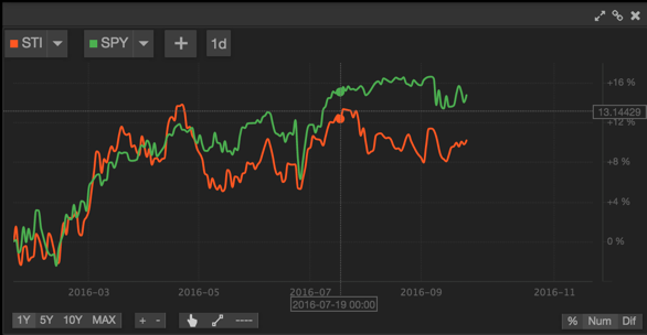
| UE Economics | Lets you see one type of economic indicator at a time. | To do cross-analysis you would need multiple displays. You could plot them over each other, but in basic ways such as line or area graphs, without any interactivity or cross-filtering between charts. | http://ueconomics.com/ |
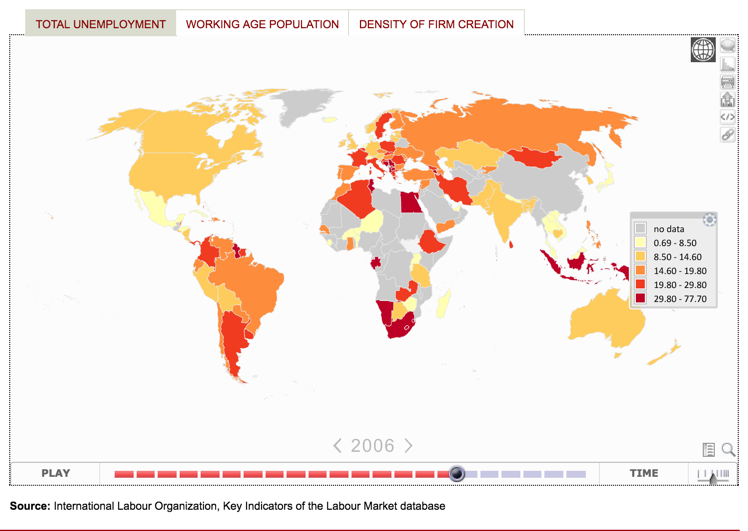
| World Bank | It is a series visualization that shows the development of countries over time. | Does not allow you to interact or compare against other indicators. | http://www.worldbank.org/ |
| Bloomberg | In-built Charts. Data is available, but you have to plot each indicator one at a time. For industry data, these are in a separate section altogether. | Charts cannot be pre-set to generate them again - Cannot be found for student edition, unsure for industry edition. | http://www.bloomberg.com/asia |
| Gapminder motion charts | Great for displaying visualizations across time, and the change between 3 variables. Notable example is Hans Rosling visualization of GDP, population and annual income. | Does not give us a way to test our hypothesis that some country’s policies had affected another, or a snapshot comparison and drilling down into the industries that are flourishing or in trouble. However, the limitation is still on 3 variables only, thus there is some limitation in analyzing multiple dimensions. | http://gapminder.org |
| Tableau | Similar to gapminder. | Not providing drill down capability. |
Illustrations
- UEconomics
- World Bank
- The Global Economy
Approaches to solve the problem
Regarding all the different related works, what makes our approach different from those existing is that the: i) element of time is made as key theme for interactivity in all charts ii) Being able to compare amongst the economies by perspective ii) See relationship between industries of countries or regions and iv) To see what industries and economic indicators have changed to make user’s decision-making more flexible.
Methods used and early prototypes
Users will be given a choice to see the visualization by:
- Global: An aggregated total of all economic indicators and industry indexes belonging to regions.
- Single country or region: Economic indicators and industry indexes for that country or region only.
- Select between 2-3 countries or regions: Economic indicators and industry indexes comparing between countries and regions.
The user will be able to filter the economic indicators to see them by a certain perspective - for example, economic health showing GDP, unemployment, inflation - and change another perspective such as employment, showing unemployment, wages and hours worked.
The user can then “play”, “pause” or “go to” a certain time period, and see the respective indicators and indexes change over time in the charts. Thus, this visualization intends to display and compare the economic state of countries, regions and industries over time.
Glyph/Star plot
This is to represent economic indicators and how they perform over time.
The aggregates are used in generating the values and percentages for each dimension of the glyph. For example if it is by region, each region is represented by its color, thus if multiple regions are selected, two are plotted on the same glyph plot in a different color.
- Reference:
http://bl.ocks.org/nbremer/6506614
- Answering Possible Questions:
In a certain time range, which countries are in growth or decline stage? Which countries are more employable? Which country has healthier economies?
If I were to get a job there, are what are the costs of living like? Will wages be enough for a decent standard of living compared to another? Would inflation affect my spending/saving power?
Stacked area chart
This is to represent the industry indexes belonging to a single country or region or global view, and how they perform over time.
- Reference:
http://code.shutterstock.com/rickshaw/examples/extensions.html
- Possible questions:
Which country is a better option to get a job, regarding the skills relevant to an industry in a certain time range? E.g. Country make be prospering, but not in the industry suitable for the person’s skillsets.
Horizon chart by industry, and stacked area chart for each industry
This is to represent the industries index, and how each country fares compared to one another. This will be used in place of the single stacked area chart as multiple countries are compared against another (i.e. 2-3 countries/regions selected)
Possible Technical Challenges
- Economic data may be accessible by country, but data on industries by country are scattered (not from the same source). This needs to be integrated behind the scenes, or using Javascript to simulate that they are linked (i.e. data is separated, but the interaction makes it seem that they are related)
- Related to the above, there is a time dimension that both economic data and industry data must follow. If the user changes the point in time, the rest of the charts and the following filters must follow as well. Additionally, not all data may be available if the periods of time are small. Yearly data is likely to be obtained, but quarterly or monthly may not be as consistent.
- Filtering by Global, Country and Region must handle a "universal" view (i.e. global only), Singular country or region, and be able to know when user has selected multiple countries OR (inclusive) regions that the visualization will change to support comparisons, rather than simply displaying data. This means allowing users to compare region-country or global/region-country
- For Stacked Area chart, it would have to change according to what the user has selected for comparison, or for a singular view. Stacked Area charts would need to change from global or one country/region only, to multiple stacked area chart by industry the moment the user selects multiple options for comparison.
- Selected options should be represented by the same colors. For example, comparing country A (red) and B (blue), the glyph plots of A & B will have the same color as the individual stacked area charts by industry.
- Reference:
Currently none - no one has done this type of horizon chart comparing industries and countries at the same time.
- Answering Possible questions:
By industry, which are the countries that were performing in a certain time range?
- Considerations:
When comparing, is it better to plot multiple regions/categories onto the same chart, or have them on separate charts?
Should number of regions/countries be fixed?
Does the user compare industries doing well/worse before selecting the country they want to work/migrate to?
Do people compare between regions/countries/industries based on highest % change, or based on hearsay/assumptions?
Timeline
References
Unemployment and GDP in Europe | Geopolitical Futures. (2016). Geopoliticalfutures.com. Retrieved 28 September 2016, from https://geopoliticalfutures.com/gdp-and-unemployment-in-europe/
Unemployment rate by country - Thematic Map - World. (2016). Indexmundi.com. Retrieved 28 September 2016, from http://www.indexmundi.com/map/?v=74
UECONOMICS. (2016). Ueconomics.com. Retrieved 28 September 2016, from http://ueconomics.com/
World Bank Group. (2016). World Bank Group. Retrieved 28 September 2016, from http://www.worldbank.org/
Bloomberg - Asia Edition. (2016). Bloomberg.com. Retrieved 28 September 2016, from http://www.bloomberg.com/asia
Gapminder: Unveiling the beauty of statistics for a fact based world view.. (2016). Gapminder.org. Retrieved 28 September 2016, from https://www.gapminder.org/


