IS428 2016-17 Term1 Assign3 Thomas Joseph Thio Kit Sun
Contents
- 1 Link To Visualization
- 2 Building the visualization
- 3 Answers to Questions
- 3.1 1. What are the typical patterns in the prox card data? What does a typical day look like for GAStech employees?
- 3.2 2. Describe up to ten of the most interesting patterns that appear in the building data. Describe what is notable about the pattern and explain its possible significance.
- 3.3 3. Describe up to ten notable anomalies or unusual events you see in the data. Prioritize those issues that are most likely to represent a danger or a serious issue for building operations.
- 3.4 4. Describe up to five observed relationships between the proximity card data and building data elements. If you find a causal relationship (for example, a building event or condition leading to personnel behavior changes or personnel activity leading to building operations changes), describe your discovered cause and effect, the evidence you found to support it, and your level of confidence in your assessment of the relationship.
- 4 Comparisons Between Software
- 5 Areas For Improvement
Link To Visualization
https://bl.ocks.org/ThomThio/raw/6fc4c4fce3908e0dfa97ffc6f4c9d17d/
Building the visualization
=== 1. Exploration ===
I used a parallel coordinates chart using d3.js on the general building data to see relationships. Same variables were not helping at all, such as Loop temp schedule, Pump power, water heater supply as these remained constant throughout. HVAC electric demand power and total electric demand power seems to have a few outliers, which could be worth looking at. Water heater temp tank temperature were also right-skewed, while water heater gas rate was left-skewed.
2. Unifying data by time
Thereafter, I thought of plotting the proximity data onto the provided maps, helping me to visualize the movements or detections or the mobile and fixed sensors respectively. This was done using Tableau, which has the 'Page' feature, allowing me to animate the movements across the three levels. This would come in useful for the cross-analysis with hazium levels and building data in general and at per level. However, encountered extremely slow rendering due to the large data points if I added minute data. Hourly data could work, but since the data all had different timestamps, it seemed to make more sense to see fluctuations by day, and zoom down after to see which were the variables (staff/hazium/building data) that could be causing any issues. In this way, I could use standard deviations and represent fluctuations or abnormalities using boxplots or a heatmap. However, given the large number of dimensions, there would be some limitation to use boxplots as the screen width could reduce its effectiveness of comparison analysis.
I had to decide on a common 'timestep', that is, should the animation be played in intervals of minutes or hours? Would this choice make us miss interesting patterns?
Thereafter, how would we track the movements of the staff? Thankfully Tableau also comes with tracking the last N number of steps, creating a trail left behind when the staff 'move' from location to location. I also added the added a the ID column in the employee list so that we can match the employee's movements and which departments they are in rather than seeing raw movement patterns of people in general. This was done using JMP's substring, lowercase and concatenation features. Some data cleaning had to be done, for example staff names with hyphens took the first components rather than the full last name. There were some mismatches in the given employee list - example is the last name paredes, but the employee lists ID is 'parades'. I took the given employee list ID as the source as truth to simplify things.
It was useful to join the employee list and fixed/mobile proximity tables though, as I could now represent the movements by the employee and departments where they are.
To look at the patterns staff would take, Tableau allows selected specific targets and tracking their last paths, to see common movement on a daily basis. This way, we can see if they have deviated from their usual path.
3. Organization & Flow of Analysis
The HVAC system energy map was used, as this was what the floor and zones referred to. We can check the relationship between employees and building data patterns or anomalies based on this map.
The main concern was how to help users hunt/show strange fluctuations for over 20+ variables, for each floor! One way to do this was use average, median - however, since we are looking out for 'strange' activity, we want to tune in to outliers - standard deviation could thus be used instead of plotting all values of each variable. Tableau's highlighting feature could help compare the values of a specific day and hour of one chart with another.
However, the organization of these charts would matter to the end user - and there is a limitation here to what I perceive as clear to my users, as my own understanding of HVAC systems or building infrastructure is limited. At the time of this writing, I am merely reading some books and applying my assumptions on how I group or generalize the data presented to produce meaningful findings - thus accuracy of the findings may not be realistic or practical, unless done by a practitioner in the field. Nevertheless, this is my attempt at organizing the data into coherent parts, so they can be cross-analyzed one by one:
As hazium levels were given for selected floors and levels, they were included in the aspects of the visualization for that specific floor and zone.
Employee Data
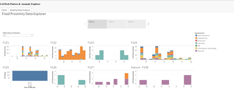
Fixed proximity analysis, by floor
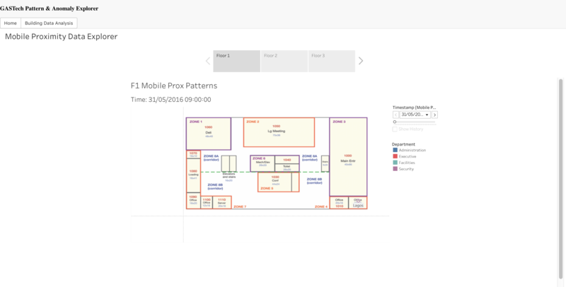
Mobile proximity analysis, by floor
Building data
Building data related to the environment and hazium were grouped by the following:
Building Temperature:
Dry Bulb Temp (Celsius): Drybulb measuring the temperature of the outside air, aka external temperature
Supply Side Inlet Temp (Celsius): Temperature of the air entering the zone from its air supply box
Supply Side Outlet Temp (Celsius): Temperature of the water exiting the hot water heater
Supply Side Inlet Mass Flow Rate (kg/s): Flow rate of water entering the hot water heater
Building Power:
Total Electric Demand Power (Watts): Total power used by the building
Deli Fan Power (Watts: Power used by the deli exhaust fan
Pump Power (Watts): Power used by the hot water system pump Water Heater
HVAC Electric Demand Power (Watts: Total power used by the building's HVAC system including coils, fans and pumps.
Building Water:
Water Heater Tank Temp (Celsius): Temperature of the water inside the hot water heater
Water Heater Gas Rate (Watts): Rate at which the water heater burns natural gas
Water Heater Setpoint (Celsius): Water heater set point temperature
Loop Temp Schedule (Celsius): Temperature set point of the hot water loop. This is the temperature at which hot water is delivered to hot water appliances and fixtures.
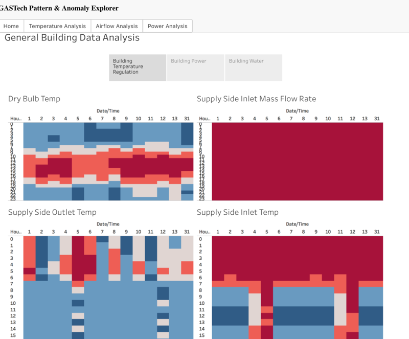
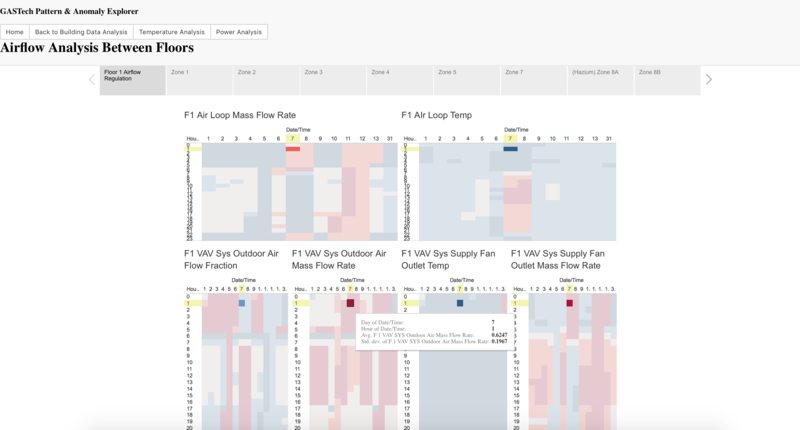
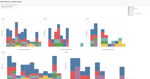
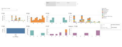
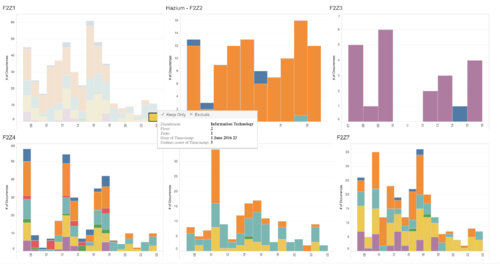
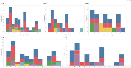
The visualization for building data looks like this:
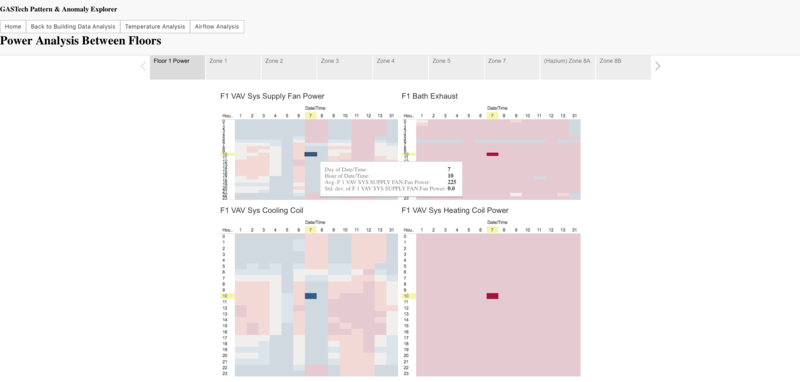
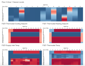
With each floor having its own Tableau visualization to as to split the computation of graphics, the Zones' charts each had their Temperature, Airflow and Power analysis. If the zone had hazium data, it would be included in the zones' grid:
TEMPERATURE Thermostat Cooling Setpoint (Celsius): Cooling set point schedule for the zone
Thermostat Heating Setpoint (Celsius): Heating set point schedule for the zone
Thermostat Temp (Celsius): Temperature of the air inside the zone
Supply Inlet Temp (Celsius): Temperature of the air entering the zone from its air supply box
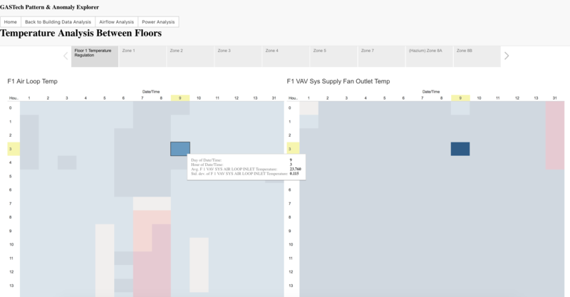
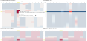
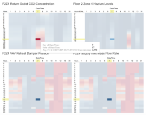
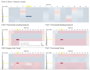
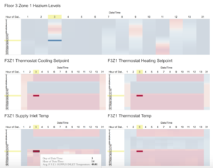
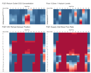
An example of the highlighting effect is shown. As the user hovers their mouse over one of charts, the rest of the grid highlights the data point in the specific day and time, allowing easier reference by time alone.
AIR FLOW
Return Outlet CO2 Concentration (parts per million): Concentration of C02 measured at the zone's return air grille
Mechanical Ventilation Mass Flow Rate (kg/s): Ventilation rate of the zone exhaust fan, where applicable (not all zones have this)
VAV Reheat Damper Position (Open or Closed): Position of the zone's air supply box damper. 1 corresponds to fully open, 0 corresponds to fully closed
Supply Inlet Mass Flow Rate (kg/s): Flow rate of the air entering the zone from its air supply box
POWER
Reheat Coil Power (Watts): Power used by the zone air supply box reheat coil
Equipment Power (Watts): Power used by the electric equipment in the zone
Lights Power (Watts: Power used by the lights in the zone
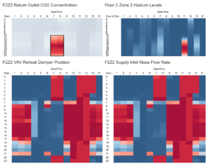
The visualization would be best displayed at 80%, allowing Tableau's grids and embedded html frames to fill the white space. Analysis is then conducted by viewing charts in a grid form. Hovering over any date/time in its matrix highlights the relevant dateay/times in the rest of the charts in the grid. The idea is that side-by-side comparison of relevant data points can allow simpler comparison, reducing the common inspection dimension to just time. Should the user find an interesting observation a pattern, they just need to note down the day and time, and find somewhere else with interesting patterns or anomalies with the same time and form inferences from there. Thus, we need to keep track of specific days and times to do a cross-analysis from another dimension, for example temperature data on a specific floor and zone.
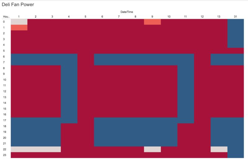
The gray-blue-red levels for each building data chart denote increasing levels of the building or hazium data - grayish-blue would indicate normal, average levels, while red indicates goes beyond the average and one can visually see when it is in the normal range or not just by color and by area of the chart. The intention is for the user to visually scan across the variables they want to compare, for example, temperature analysis on a specific floor or zone, and zoom in to a reddish spot or patterns that denote anomalies for further investigation.
I conducted my analysis based on a general approach (i.e. general building data given), followed by analysis of temperature, airflow and power. The analysis were done by floor and by zone, prioritizing the zones with hazium data, then interesting zones/areas were employees displayed erratic behavior out of their norm. By doing so, we can start to see patterns between building or hazium data, and the behaviour of the employees - eventually we may find interesting insights that let us know on possible causes between any of the three dimensions.
Answers to Questions
1. What are the typical patterns in the prox card data? What does a typical day look like for GAStech employees?
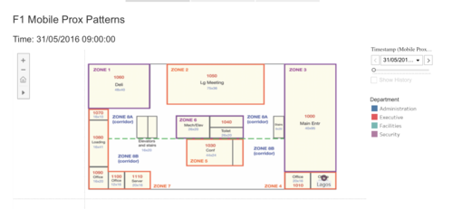
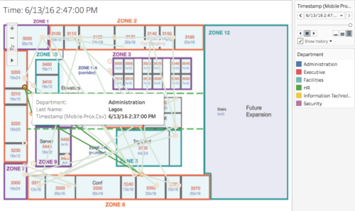
As each floor has its own form of movement, drawing trails and last locations would be key to let users uncover insights. This is possible on Tableau desktop, but not available on Tableau server! This is the intended result for each floor:
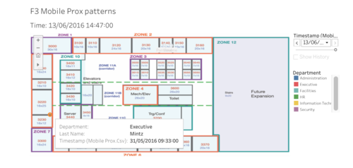
The following screenshots are based on what is able to be derived from the view on Tableau Server. If needed, some are extracted directly from Tableau Desktop so as to uncover the insights otherwise difficult with Tableau Server.
General pattern:
- The day begins at 9am, cuts off at 9:47 - possibly lunch periods - and resumes from 2:30, and the day 'ends' at 2:45 for mobile proximity data
Floor 1 patterns:
- On Floor 1, Security (Fusil & Lagos) are in office (zone 8) the earliest at 9am.
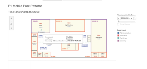
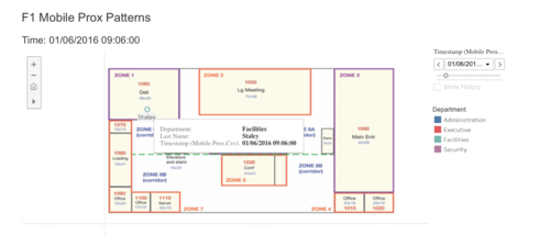
- At 9.06, Facilities staff are usually at the Deli - the staff getting breakfast rotates between different staff, possibly taking turns to buy breakfast.
Floor 2 patterns:
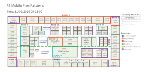
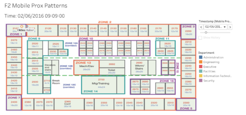
- Most of the facilities members appear to be outside the meeting/training room in the mornings at 9.13AM, possibly a for daily standup before the rest of the day starts.
- Dedos and Haber from Engineering and Administration respectively are often seen in their offices, being one of the earliest.
Floor 3 patterns:
- Floor 3 seems like the executive floor, with the largest number of activity coming from executives (red)
- Lagos from Administration appears to be moving around the most
- Mintz, another exeuctive, is perpetually in his office. In contrast to Vasco, there are no paths created at all for Mintz, even if the we have set the date and time to the last time period.
2. Describe up to ten of the most interesting patterns that appear in the building data. Describe what is notable about the pattern and explain its possible significance.
To answer this question, I approached it from asking from step-by-step approach. Based on Temperature/Airflow/Power at a specific day and time, are there any anomalies? Is this recurring? Any changes that had a lasting effect? In doing so, I would use these findings to highlight and see the patterns in other data by time.
Upon highlight, if a color is dominant, it means it is of 'normal' levels. Any other color that are small in proportion to the rest of the color grid means a possible anomaly. Blue represent the lowest value, gray as moderate, and red as high. The interpretation is made simple for the matter of comparison - and units of measure are either in Celsius (Temperature analysis), kg/s or ppm (Airflow analysis), or Watts (Power analysis).
As such, I attempted to reduce the complexity by organizing the data analysis into three overarching segments, namely Temperature, Airflow and Power analysis. Before going into each Floor's analysis, I conducted one for the general building data:
General Building Data Analysis
- The deli fan power seems to be on from 8am to 4pm daily, with exception of the 4th. This could mean that the deli is open 6 days a week, taking a break on the sunday (5th)
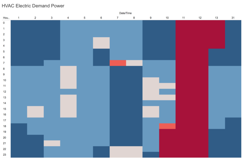
- HVAC electric demand peaked from the 11th-13th for the entire day - this rise in electricity usage for the HVAC system started from 6pm on 10th. This was peculiar as the electricity usage for HVAC was not as high on the other days.
Temperature analysis
Floor 2:
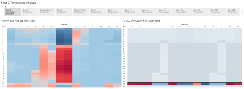
- VAV supply fan outlet temperature rises 7 out of the 14 days at 10pm.
Floor 3:
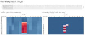
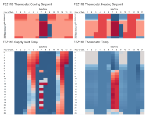
- VAV supply fan outlet temperature has perculiar behavior on the 7th, alternating between rising and falling 2 degrees every hour starting from 11am. This pattern is seen on the 8th, but stops by 1pm.
Airflow analysis
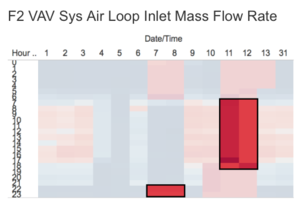
- In Floor 1, Air loop mass flow starting rising at 1am on the 7th and 8th, and peaked at 6am. This was almost twice the usual amount flowing during the night - presumably when no one was in the office. The same amounts of airflow were seen on the 10th starting from 5pm - the volume does not normalize to standard levels (blue/gray) until 3 days later at 5am. Floor 2 displayed a similar pattern during wee hours of the morning on the 7th, but started from midnight and normalizes by 7am. Air loop mass flow rate remained high on the 10th, lasting till the 13th at 5am as well.
Floor 3:
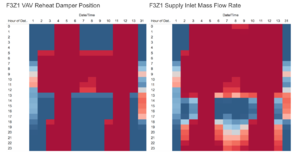
- Floor's reheat damper is open, and supply inlet mass flow rate has a very large proportion of high levels even in the early hours of the morning and late to the night, indicating high usage of the air flow system, possibly air conditioning left on. Levels only go down at 2pm till about 6pm everyday where it starts to increase everyday - this is also inclusive of weekends!
Power Analysis
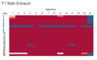
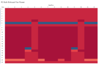
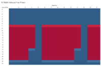
- In all floors except floor 3, the bath exhaust fan power is seen to drop significantly for 12 out of 14 days at 6pm, before rising back to its higher values in the 47 watt region.
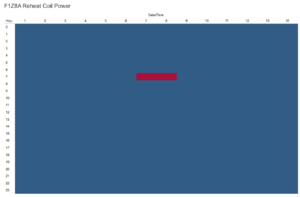
- In Floor 1's hazium zone 8A, reheat coil power is at its highest only at 7am on the 7th and 8th. The rest of the days and times it is at its normal level.
Floor 2:
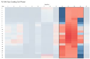
- The cooling coil power spiked on the 7th and 8th at 10m, and did not go back down to normal levels from the 10th starting from 8am
Floor 3:
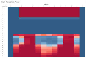
- In Floor 3's Hazium area Zone 1, reheat coil power rises at 6pm and only normalizes at 4am the next day. This is also peculiar as it happens after office hours.
3. Describe up to ten notable anomalies or unusual events you see in the data. Prioritize those issues that are most likely to represent a danger or a serious issue for building operations.
Dangerous Hazium & CO2 Concentration Levels
Floor 1:
- In Floor 1's Hazium area Zone 8A, the CO2 concentration peaking on the 6th from 7-10pm seems rather dangerous. On other days, their levels are also in the 400 levels from 7pm onwards, only with exception of the 31st, 5th and 11-13th. Additionally, Hazium levels increased from 6am onwards on the 9th, before normalizing by 11am. It rose to high levels again on the 11th, this time from 3pm to 10pm. For both Hazium & CO2 concentration periods of peaking, the reheat damper position are open, and supply inlet mass flow rate are at their highest levels, indicating maximum levels.
- This was the only floor and zone where both hazium and CO2 levels increased with the position and supply inlet mass flow rate values. If the CO2 and hazium (assuming carried by air) were to circulate, this would be very dangerous to the people in Zone 8 being exposed to both harmful elements - This is where the security personnel Fusil & Lagos work at!
Floor 2:
- In Floor 2, the same concerns for hazium & CO2 concentration levels can brought up in Zones 2 & 4. A slight difference from Floor 1's patterns are that the reheat damper and supply inlet mass flow rate were open and at their highest only when hazium levels were also high.
- What is troubling is that CO2 levels were high when reheat damper and supply inlet mass flow rates were normal, indicating that the CO2 has somehow got into floor 2 without help from the HVAC system, and that hazium could be carried via the HVAC system.
Floor 3:
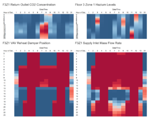
- In Floor 3's hazium area Zone 1, as compared to the rest of the Floor's zones, this one had the most number of occurrences of hazium levels spiking. Floor 3 had the similar timings of CO2 and hazium levels increasing in Floor 2, but both having additional occurrences. CO2 levels increased earlier and lasted longer, starting from 8am on the 8th and lasted till 12am. The occurrence on the 7th lasted till midnight as well. This could indicate floor 3 zone 1 either being a source, or where CO2 has difficulty dissipating. High Hazium levels were apparent on the 3rd and 9th from 4am till about 9am, and which similar occurrence on the 11th lasting much longer - till 6am on the 12th. This could indicate floor 3 zone 1 being a source of hazium/CO2, or where they have difficulty dissipating.
Malfunctioning HVAC System?
Floor 3:
- The VAV supply fan outlet temperature has peculiar behavior on the 7th, rising and falling 2 degrees every hour starting from 11am. This pattern is seen on the 8th, but stops by 1pm. The only zone displaying this erratic pattern on similar magnitude was zone 9 and 11B.
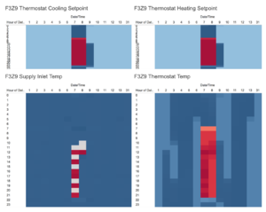
- From the 2nd to the 13th, this particular floor and zone had unusual temperature patterns. For example, the thermostat cooling and heating setpoints were high (red, 32-35 degrees) for most of the day, starting from 1pm till 4am the next day. Setpoint temperature goes back to normal (blue, 10 degrees) from 5am to 12pm.
- It is also worth nothing that the temperature levels are as high, if not higher than that of the dry bulb temperature! At the highest, supply inlet temperature shows an average of 40 degrees celsius - this meant that Zone 1 was as hot as the outside temperature, even on weekends.
- Supply inlet and thermostat temperature followed one another naturally, but never seemed to go down after day 2, even on weekends. Perhaps someone or something had permanently changed the heating and cooling setpoints.
- The floor's reheat damper and supply inlet mass flow rate has a very large proportion of high levels even in the early hours of the morning and late to the night, indicating high usage of the air flow system, possibly HVAC system running. Levels only go down at 2pm till about 6pm everyday where it starts to increase everyday - this is also inclusive of weekends! This means there is something worth investigating to unravel the causes - possibly a malfunctioning HVAC system, or something/someone else causing it to behave in a peculiar manner.
4. Describe up to five observed relationships between the proximity card data and building data elements. If you find a causal relationship (for example, a building event or condition leading to personnel behavior changes or personnel activity leading to building operations changes), describe your discovered cause and effect, the evidence you found to support it, and your level of confidence in your assessment of the relationship.
I formed my inferences on the conclusions based on the relationships between the anomalies by HVAC system, hazium and CO2 concentration, and any erratic or constant employee - each could affect one or another in some way
HVAC System Malfunctioning, or a valid reason?
- There are staff working from 7pm till midnight from Mon-Fri, possibly explaining the HVAC system data anomalies during non-working hours on Floor 1 and 2, including weekends. An exception to this is an executive (red) who came back to work till 4pm, but no one stays till midnight.
- In particular for Floor 2, staff are working till midnight, and covering more zones:
- However there is no one on Floor 3 working till midnight, and the fluctuations in data still cannot be explained
Peculiar temperature patterns on Floor 3
We previously isolated that floor 3 had nobody staying till midnight, thus it could be the HVAC system on floor 3 that is malfunctioning, or someone/something else had affected the setpoints.
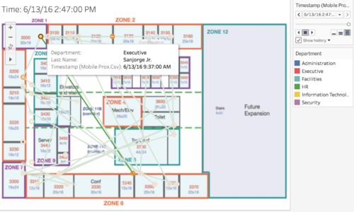
- During the 11th at 1pm, thermostat cooling and heating setpoints were very high, at 35 degrees. This started from 1pm, of which this was the last recorded instance of an executive at zone 1. This is the room where an executive (Sanjorge Jr) is frequently at, where he seems to be the only one frequenting this room for the 14 days meaning it is his office. The orange circles denote his recorded positions, and the green lines represent the 'path' he could have taken.
- On the 3rd, the last to leave the zone at 6pm was an executive. On the 9th, a facilities personnel was the last at 6pm. On the 11th, the last instance was the executive at 1pm. These two occurences can be supported by the fact that he is the only person in the room - if anyone adjusted the setpoints, it was highly likely to be that Sanjorge Jr. had something to do with the change in temperature settings.
Comparisons Between Software
In this section, I cover some of the findings regarding usage of different software for the analysis.
The main aim is for the software to provide smooth delivery in implementing the visualization - organization, analysis and interaction capabilities - and deploying it to how the user can uncover the same insights on their own. I compare between Tableau, JMP Pro & QlikSense.
The visualization was split into different parts, as Tableau could not render all the charts to explore or deploy for it to be productive. An optimal working size seemed to be any data for one floor only. Tableau seems to render these charts
Compared to its peers, Tableau renders the charts the slowest - I believe that it works well for small data sets, but scales poorly when dealing with large datasets - especially one dealing with spatio-temporal aspects. JMP was one of the fastest, but I did not use it as it lacked the interactive dashboard capability. It does do extremely well with its Data cleaning features and Graph Builder feature creating time series comparisons amongst each variable such as building data quickly. In comparison, Tableau takes some time to load each of the variables, and loading them all at once even causes Tableau to crash!
Tableau is also quite inflexible when joining multiple data files. It does not let you do a full join or right join as they consider it a deprecated feature... thus manual data cleaning would have to be done. To get all the timestamps synced with one another, I created all the possible minutes, hours and days and joined them to the existing building data excel, then replacing the old timestamps. There would be some blanks in building data, but these were to ensure the joins with the rest of the proximity and hazium data could be synced properly.
As mentioned, Tableau did crash several times when creating the worksheets required to represent each floor/zone, and by pattern/anomaly detection. The more worksheets that were created, the slower the rendering of dashboards - thus I had to split the visualization into parts. I wanted to keep them coherent, so I split by Employee Patterns, General Building Data, Building Data by Floors, but hard performance limits of either Tableau or the computer does pose a challenge when dealing with data with large dimensions.
Tableau server does not have the same features as Tableau desktop - an important component was the Play and Pause button, which was supposed to play the animation of staff moving around the floor maps, and this would allow users to find unusual employee behavior patterns easily. In Tableau Server, one can only click on a specific time and use it like a filter. Furthermore, large dimensions found in these data sets such as this one would be better visualized in custom displays, such as a parallel coordinates chart: See screenshot, with various interactions which could help the user see relevant information either side-by-side, or open up the filtered information on the page itself.
I also attempted to use QlikSense for this project. On first use though, QlikSense is very slow when conducting data exploration, as variables have to be dragged or selected one by one. Upon looking closer at their visualization features, I realized there were more oriented towards building business intelligence dashboards, rather than a custom made one. Furthermore, the data importing with QlikSense seemed to take awhile, whereas Tableau could get this done very quickly with some simple joins. After finally figuring how the data should be imported, QlikSense menus then posed a challenge in finding what I needed to start working on building the visualization. Tableau has a much cleaner and intuitive user interface.
Either I was unable to optimize Tableau to only require one workbook, or my computer was non-optimal for the job. In any case, Tableau was the clear choice as compared to other other options for this particular project, even though facing some limitations in performance or customization of hierarchies or views. In summary, Tableau is great for data exploration of data consisting of small dimensions. I think Tableau still needs other software, especially data cleaning ones like JMP to complement it well. Tableau Desktop seems fine, but in order to give the same experience to other users, Tableau Server should have the same scope of features too.
Areas For Improvement
I do think there are limitations to my current visualization and approach. The key to unravelling more insights would be a flexible application, custom made in the sense that the charts it uses are linked together in meaningful ways such as using Crossfilter.js, but being able to be re-used if GasTech has new records of their building of employee data. In this way, the visualization is reusable.
These are some of my learning points and reflections at the end of the project:
- Have a way to compare the 'normal' temperature, airflow or power from the general building against the individual floors. This way, we can get an accurate idea of how much it deviated from the norm. At present, we only used Drybulb temperature to note that the temperature at floor 3 was as hot as the outside.
- Having capability to analyze by zone or employee, and to a specific building data chart. This is to help unravel more causal relationships between building data and employees, or vice versa. As the dimension space is large for visualization, some of the good charts to use are Sankey Diagrams for the building data over time, and Network Graphs for employees and the zones they visit over time. However, these also need to be supported by a fixed standard mentioned in the point above, and there needs to be additional data such as the Edges and Nodes to be represented correctly.

