IS428 2016-17 Term1 Assign3 Teo Hui Min
Contents
- 1 Overview
- 2 Task
- 3 Data Preparation
- 4 Visualisation
- 4.1 Typical day of GAStech employee
- 4.2 Interesting patterns
- 4.2.1 1. Equipment and Power consumption at different floors
- 4.2.2 2. Total Flow Rate flowing from HVAC system fan to zones and back
- 4.2.3 3. Temperature of air flowing from HVAC system fan to zones and back
- 4.2.4 4. Temperature of air in various zones and temperature of air flowing into the zones
- 4.2.5 5. Temperature of water temperature entering and exiting the water heater
- 4.3 Data anomalies
- 4.4 Relationship between proximity card & building data elements
- 5 Improvements
Overview
After the successful resolution of the 2014 kidnapping at GAStech’s Abila, Kronos office, GAStech officials determined that Abila offices needed a significant upgrade. At the end of 2015, the growing company moved into a new, state-of-the-art three-story building near their previous location. Even though the employee morale rose somewhat with the excitement of the new building, there are still a few disgruntled employees in the company.The new office is built to the highest energy efficiency standard, but as with any new building, there are still several HVAC issues to work out. The building is divided into several HVAC (heating, ventilation, and air conditioning) zones. Each zone is instrumented with sensors that report building temperatures, heating and cooling system status values, and concentration levels of various chemicals such as carbon dioxide (abbreviated CO2) and hazium (abbreviated Haz), a recently discovered and possibly dangerous chemical. CEO Sten Sanjorge Jr. has read about hazium and requested that these sensors be included. However, they are very new and very expensive, so GAStech can afford only a small number of sensors.
With their move into the new building, GAStech also introduced new security procedures, which staff members are not necessarily adopting consistently. Staff members are now required to wear proximity (prox) cards while in the building. The building is instrumented with passive prox card readers that cover individual building zones. The prox card zones do not generally correspond with the HVAC zones. When a prox card passes into a new zone, it is detected and recorded. Most, but not all, areas are still open to staff members even if they forget their prox cards. People are somewhat careless with their prox cards, but some diligent staff members will go to the security desk and pick up a new prox card if their old one is mislaid. As part of the deal to entice GAStech to move into this new building, the builders included a free robotic mail delivery system. This robot, nicknamed Rosie, travels the halls periodically, moving between floors in a specially designed chute. Rosie is equipped with a mobile prox sensor, which identifies the prox cards in the areas she travels through.
Task
In this assignment, I will be discovering patterns form the data and answer the following questions:
1. What are the typical patterns in the prox card data? What does a typical day look like for GAStech employees?
2. Describe up to ten of the most interesting patterns that appear in the building data. Describe what is notable about the pattern and explain its possible significance.
3. Describe up to ten notable anomalies or unusual events you see in the data. Prioritize those issues that are most likely to represent a danger or a serious issue for building operations.
4. Describe up to five observed relationships between the proximity card data and building data elements. If you find a causal relationship (for example, a building event or condition leading to personnel behavior changes or personnel activity leading to building operations changes), describe your discovered cause and effect, the evidence you found to support it, and your level of confidence in your assessment of the relationship.
Data Preparation
Floor Plan
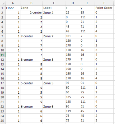
2 floor plans are given, one is the proximity zone and the other is the energy zone. With the given floor plan, I have created my floor plan in Tableau to be used for the visualisation. The floor plan was created by manually calculating the dimensions of each zone and then manually creating an excel sheet to draw out the floor plan as shown below:
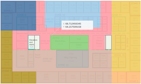
For zones which does not allow proper calculation of dimensions, I have used the ‘Annotate’ feature in Tableau to get the dimensions of the zone.
The same steps are performed on all floors and zones to get final floor plan.
Transform data
Data transformation was performed on the proxOut dataset, which is the proximity card data and on the building dataset. Transformations were performed using JMP.
Proximity card data
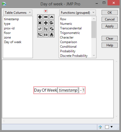
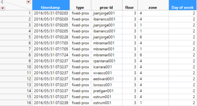
With the timestamp given in the proximity card data, I have derived the day of week through JMP formula.
Then in Tableau, I edited Aliases to display the numbers in words instead which is easier to read and understand.
Building data
I have split the building data into 4 different sets of data which shared common datatime. I have split them according to how the variable are labelled in the raw data for easy splitting of the variable into floor, zones and type.
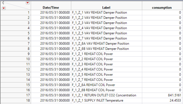
Firstly the data were transformed using the ‘Stack’ function in JMP to get the data in the format below.
Then the values under ‘Label’ is further split up into floor, zone and type using JMP formula to get the dataset in the format as shown below. The same operation was performed 2 more times to get the 4 different datasets for building.
Visualisation
The visualisation can be viewed here.
Typical day of GAStech employee
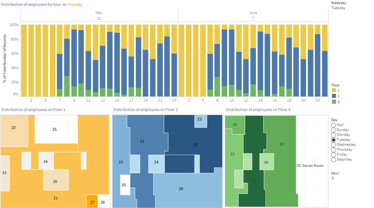
A typical day would refer to working days, Monday to Friday. The bar chart shows the distribution of employees by hour on weekdays. As two weeks of data is given, a comparison is made between the dates of a weekday for discovering similar trends (i.e. By selecting Thursday, it compares the distribution of employees on 2 June and 9 June where both are Thursday). By looking at the distribution of employees by hour at the different floor for each of the weekdays, the trend throughout the week is roughly similar where most of the employees are concentrated at floor 2 during the working hours.
Then, we can further look at the zones where the employees are concentrated to understand the location of the employees throughout the day. So what is a typical day for the employees? We will look at the distribution of employees at each floor and throughout the hours of a day using the visualisation shown above.
Let us focus on floor 2 first, where most of the employees are at. The distribution of employees are the different time of the day can is as follows:
7am, 8am : Zone 1 : arriving at office
9am : Zone 7 and 1 : arriving at office
10 am: Zone 1 and 6 : having training
11 am : Zone 1, 4, 2 : moving to different levels and working in their own office
12 noon : Zone 1 and 4 : moving to different levels
1 pm: Zone 1 : taking a break
2 pm : Zone 6 : having training and working in their own office
3 pm : Zone 1 and 7 : working in their office
4pm, 5pm: Zone 1 and 4 : moving to different levels
6pm: Zone 1, 4, 6 : end of training hence concentrated at zone 4 and 1
Throughout the day, employees at floor 1 are mostly concentrated at zone 1 moving through the different floors, as there are limited number of offices at that floor 1. Only at 9am, employees at floor 1 are concentrated at zone 7, which can be explained by employees working in that office arriving for work.Only a small number of employees are at floor 3. Employees at floor 3 mostly spend their day at zone 1 and 4, which includes the office space and elevators and stairs as they may have to travel to the different floors, and zone 2 and 6 which are their own office.
Interesting patterns
1. Equipment and Power consumption at different floors
Floor 1
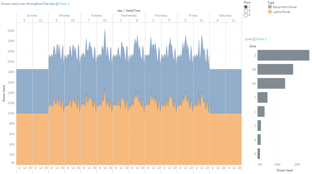
Power used on weekends is always the lowest and is constant throughout the days. There is a correlation between Equipment and Light power, where when equipment power used is high, light power will also be high and vice versa. Power consumption is the highest throughout the day at zone 3, which is the main entrance. This is understandable as the main entrance should always be brightly lit.
Floor 2
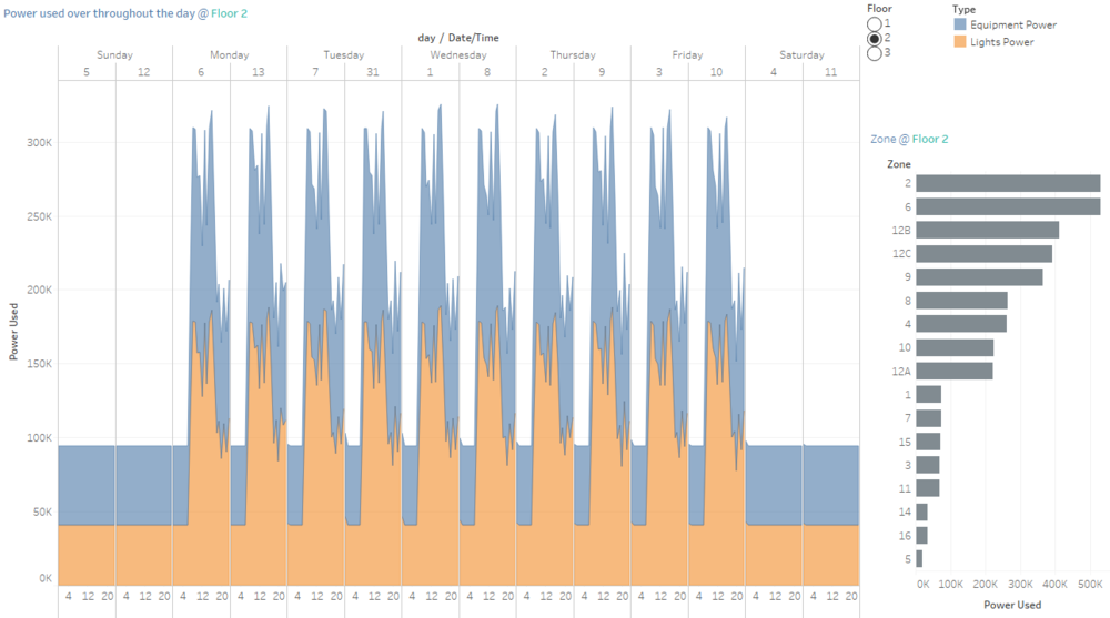
However at floor 2, another pattern is observed where the equipment and light power used is higher during working hours between 9am to 5pm and at time eg. 12noon, the equipment and light power consumption is lesser probably because employees are out for lunch. The power consumption is also higher and fluctuates more as compared to floor 1. The zone which has the high power consumption is zone 2 and 6 where the offices are located. Hence this could explain why the power used are always high during working hours and low during lunch hour.
The power consumption at floor 3 is the highest among the floors and zone 9 has the highest power used. Zone 9 is where the server room is located, thus it explains why the consumption is much higher than the trends observed at other floors. The power consumption is always high during work hours and lower after work hours. However the power consumption is high even if it is after work hours.
2. Total Flow Rate flowing from HVAC system fan to zones and back
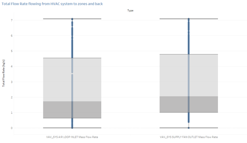
The total flow rate of air from HVAC system to the zones and back is generally similar. However when comparing the median of the total flow rate of air, more air is flowing out from the HVAC system to the zones than flowing back.
3. Temperature of air flowing from HVAC system fan to zones and back
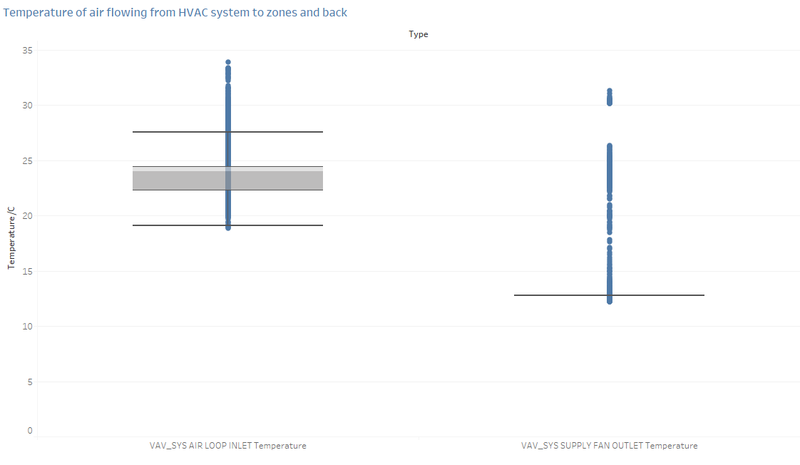
The air releasing from the HVAC system to the zones is cooler than the air returning to the HVAC system. By looking at the median of the temperate of both variable, the air releasing is at 12.8 C while the air returning is 24 C.
4. Temperature of air in various zones and temperature of air flowing into the zones
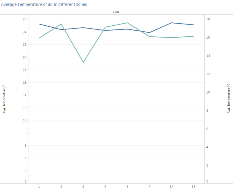
The average temperature of the air in the various zones are generally constant throughout the day. The temperature of the zones does not seem to affect the temperature of the air that in flowing into the zones from the HVAC system. Rather, the temperature of air flowing into the zones is especially cooler during work hours and at Floor 1 Zone 3, which is the main entrance. At zone 3, the air temperature flowing into the zones are pretty similar, however at time 1pm onwards, the air flowing into zone 1 is generally warmer than the other zones.
5. Temperature of water temperature entering and exiting the water heater
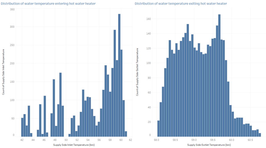
The water temperature exiting the water heater is rather constant throughout, however the water temperature of water entering the hot water heater varies across a larger range. Even though the water entering the water heater may be much cooler, the water is always heated between 58 to 62C.
Data anomalies
Outdoor Air Mass Flow Rate and Bath Exhaust Fan Power
To detect anomalies in the data, I have used a control chart to look at the variation in the data over the time. The building data was plotted using control chart to look at the variation in the building data over the hours. 2 anomalies were found where the data point actually falls outside the 3 standard deviation. If the data point falls outside the limit, it can be considered as an outlier.
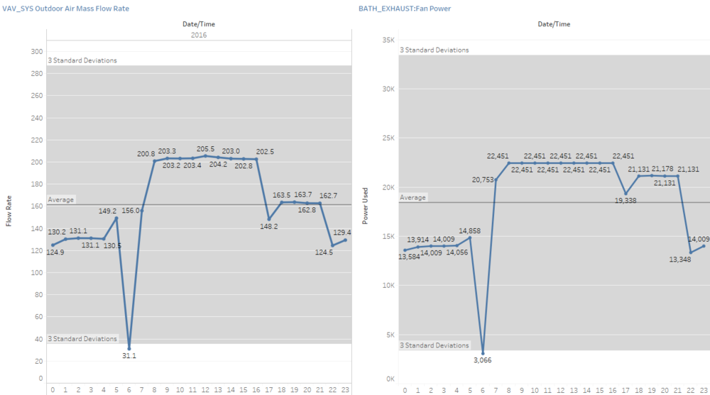
The 2 anomalies that I have found in the data is the Outdoor Air Mass Flow Rate and the Bath Exhaust Fan Power. Outdoor Air Mass Flow Rate is the flow rate of outside air entering the HVAC zones, whereas Bath Exhaust Fan power is the power used by the bathroom exhaust fan. The anomalies detected are firstly, the flow rate of the outside air is extremely low at hour 6 and similarly at hour 6, the power used by the bathroom exhaust fan is extremely low. Although this observation is understandable as at hour 6, most of the employees will not be in the office, hence the power used and flow rate will be low. However looking at the other hours such as midnight where employees are also most likely not in the office, the flow rate and power used is generally lower than average, however not as low as the outlier seen.
Relationship between proximity card & building data elements
1. Hazium concentration and employee’s location
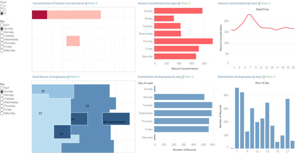
The above visualisation look at the concentration of hazium and the distribution of employees at each of the floor. The purpose is to see where the employees are at where there is a high concentration of hazium which is harmful to the employees.
Hazium concentration at floor 1 are detected at areas which employees are less concentrated, hence, this will not post a serious issue to the health of the employees. Similarly for floor 2, hazium concentration is also concentrated at zones where there are lesser employees, hence the employees working at floor 2 are also safe from the chemicals. However employees who are working in floor 3 need to be careful as the hazium are concentrated at areas where the employees are mostly seen at through the day.
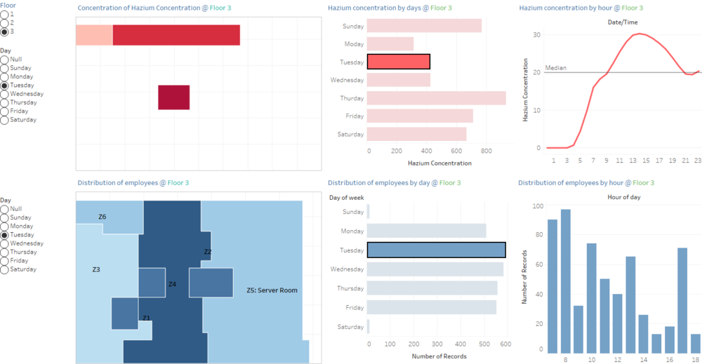
For example on a Tuesday, hazium is concentrated at the center of the floor plan. That area is also the place where employees are moving around. Furthermore, if we were to look at the hazium concentration throughout the day at different hour, the concentration is high at hour 9am to 8pm. Between that period, is also when most employees are working at that area.
2. Equipment power and employee’s location
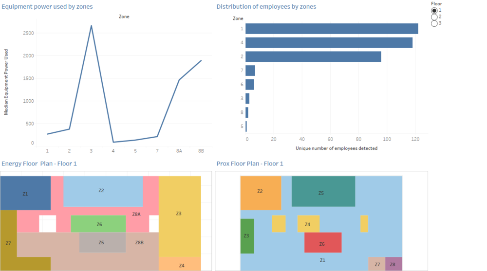
When there is a lesser number of employees at a zone, the equipment power consumption is also lesser. In the above visualisation we will be looking at the media equipment power used against the unique number of employees detected at a zone. Let us take floor 1 as an example. The equipment power consumption is the highest at Zone 3 and Zone 8B of the energy zone. This is equivalent to Zone 1 of the Proximity Zones. Looking at the location which has the highest number of employees, Zone 1 of the proximity zone has the highest number of employees. This shows that when the number of employee at a zone is high, the power consumption is also higher. Looking at the zone with the lowest power consumption which is zone 4, this is equivalent to zone 7 and zone 8 of the proximity zones, which also has low number of employees. Hence, the number of employees do affect the equipment power used.
Improvements
Better use of the floor plan created as the current floor plan has restrictions on linking with the different datasets. Hence the floor plan is underutilized as I could not make use of the floor plan to show the distribution of employees or the other variables, due to some linking issue with the datasource as shown below.
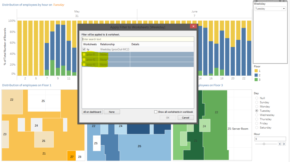
Due to the error, I could not create actions in the dashboard as well. Moreover I think it can be improved by exploring more of the variables to see how more variables can be linked together.
